Change screen size and orientation of a canvas app in Power App
Change screen size and orientation of a canvas app in Power App
Customize a canvas app by changing its screen size and orientation.
Change screen size and orientation
-
Sign in to Power Apps.
-
Open the app to edit.
-
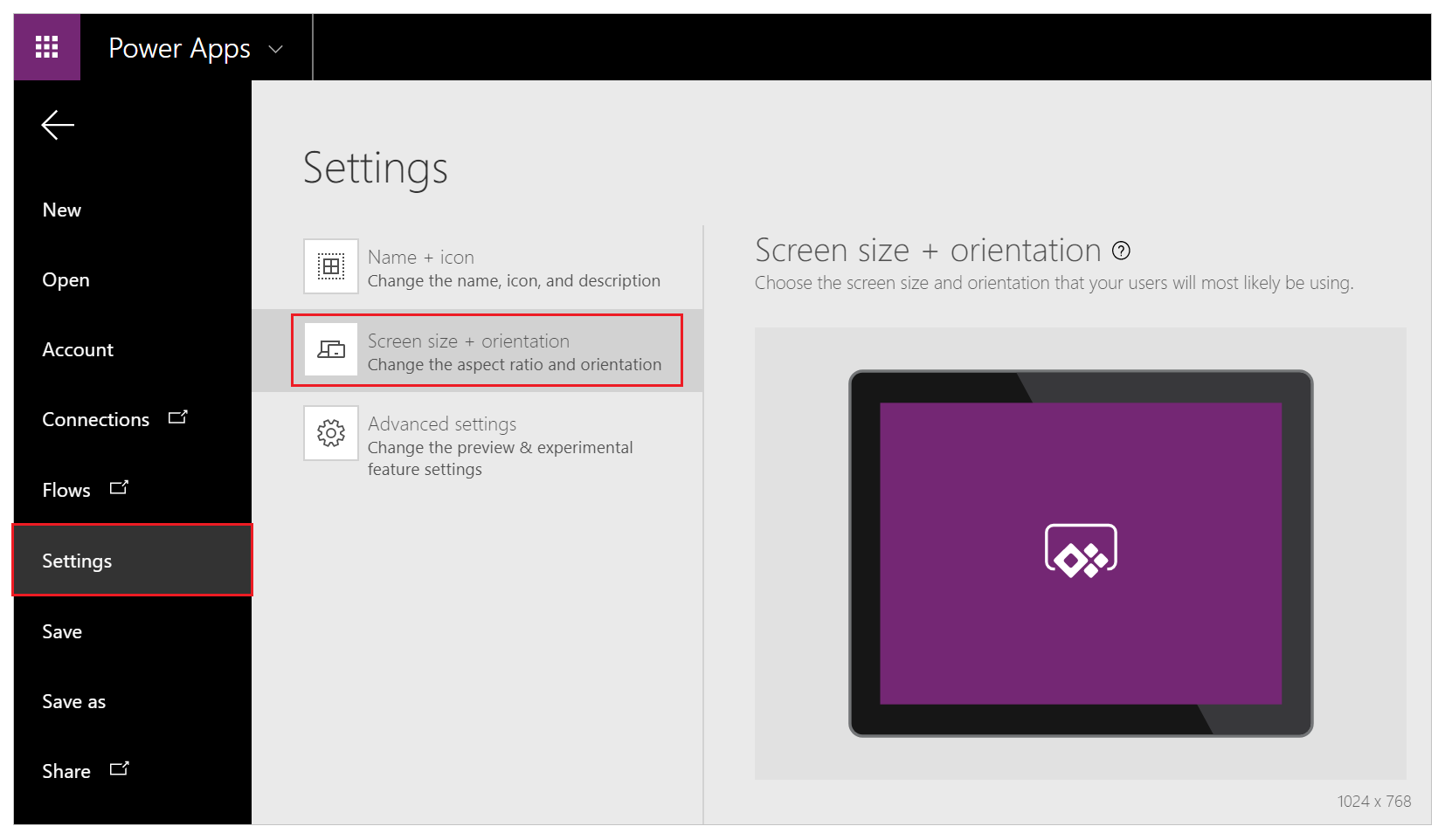
Select File menu.
-
Select Settings.
-
Select Screen size + orientation.

-
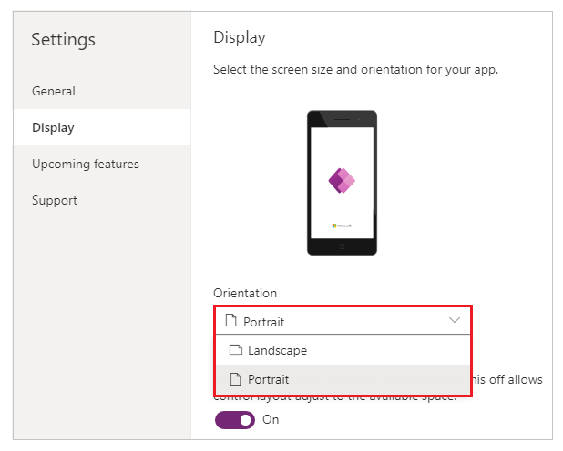
In the Orientation list, select Portrait or Landscape.

-
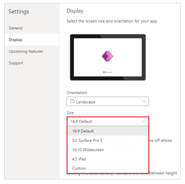
(Tablet apps only) Under Aspect ratio, perform either of these steps:
- Select the ratio that matches the target device for this app.
- Select Custom to set your own size, and then specify a width between 50 - 3840 and a height between 50 - 2160.

Note
Size is only available for apps with Tablet layout.
-
Under Scale to fit, specify either On or Off.

This setting is on by default so that app screens resize to fit the available space on the device. When this setting is on, the app's Width property matches its DesignWidth, and the app's Height matches its DesignHeight.
If you turn this setting off, the app adjusts to the aspect ratio of the device on which it's running and takes up all of the available space. The app doesn't scale and, as a result, screens can show more information.
When this setting is turned off, Lock aspect ratio is automatically turned off and disabled. In addition, the Width property of all screens is set to
Max(App.Width, App.DesignWidth), and their Height property is set toMax(App.Height, App.DesignHeight)so that they track the dimensions of the window in which the app is running. With this change, you can create apps that respond to different devices and window dimensions. More information: Create responsive layout -
Under Lock aspect ratio, specify either On or Off.

If this setting is on, the app retains the screen orientation and aspect ratio that you specified in steps 2 and 3, no matter the device. For example, a phone app that's running in a web browser retains the ratio for a phone, showing a dark bar on each side instead of filling the window.
If this setting is off, the app adjusts to the aspect ratio of the device on which it's running (and distorting the UI if necessary).
-
Under Lock orientation, specify either On or Off.

If you lock the app's orientation, the app retains the orientation that you specify. If the app is running on a device for which the screen is in a different orientation, the app displays incorrectly and may show unwanted results. If you unlock the app's orientation, it adjusts to the screen orientation of the device on which it's running.
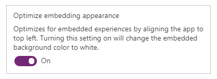
You can also modify the app's orientation by enabling Optimize embedding appearance in Advanced settingsunder Experimental features. This feature top-left aligns the app when it's embedded and changes the background color of the hosting canvas to white.

-
Select Apply to save the changes.
Important
Ensure you select Apply to reflect the screen size and orientation changes to your app.
-
Save and publish your app.
posted on 2021-02-24 19:39 lingdanglfw 阅读(508) 评论(0) 编辑 收藏 举报


【推荐】国内首个AI IDE,深度理解中文开发场景,立即下载体验Trae
【推荐】编程新体验,更懂你的AI,立即体验豆包MarsCode编程助手
【推荐】抖音旗下AI助手豆包,你的智能百科全书,全免费不限次数
【推荐】轻量又高性能的 SSH 工具 IShell:AI 加持,快人一步
· Linux系列:如何用 C#调用 C方法造成内存泄露
· AI与.NET技术实操系列(二):开始使用ML.NET
· 记一次.NET内存居高不下排查解决与启示
· 探究高空视频全景AR技术的实现原理
· 理解Rust引用及其生命周期标识(上)
· DeepSeek 开源周回顾「GitHub 热点速览」
· 物流快递公司核心技术能力-地址解析分单基础技术分享
· .NET 10首个预览版发布:重大改进与新特性概览!
· AI与.NET技术实操系列(二):开始使用ML.NET
· 单线程的Redis速度为什么快?
2011-02-24 get record count of form datasource