使用css实现垂直居中的方法总结
写在前面的话:
在编写html页面的时候最常考虑的就是应该是类的命名吧,其次就是该使用怎样的布局方式使得页面的适应性比较高。居中在页面布局中是最常用的布局之一了,根据度娘和本人开发经验总结出以下三种可用性比较高的居中方案,如有补充请在评论区留言指正。话不多说开搞!
正文
1.第一种:
使用 position:absolut+transform 实现垂直居中
<style>
    .parent{
                width: 100%;
                height: 500px;
                border: #008000 1px solid;
                position: relative;
                margin-bottom: 10px;
            }
            .content{
                width: 100px;
                height: 100px;
                border: #ccc 1px solid;
            }
            .content1{
                background-color: #1effcc;
                position: absolute;
                top: 50%;
                left: 50%;
                transform: translateY(-50%) translateX(-50%);
            }
</style>
    <div class="parent">
            <div class="content content1">
            position:absolut+transform
            </div>
        </div>
效果图如下: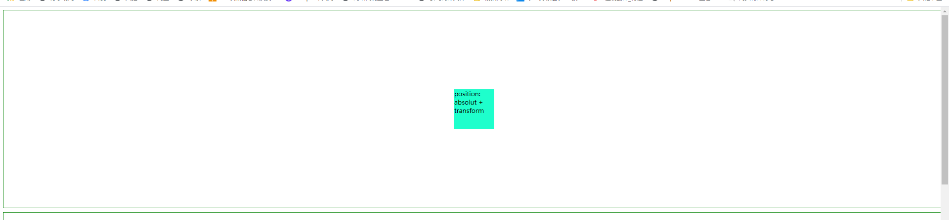
重点是将父类元素的position设置为relative,再将子元素的position设置为absolute,之后进行绝对定位(top:50%,left:50%),最后通过使用transform对元素进行修正位置,使得元素处于居中的位置。
2.第二种:
使用position: absolute+margin: auto;
<style>
    body{
                height: 100%;
                width: 100%;
                overflow-x: hidden;
            }
            .parent{
                width: 100%;
                height: 500px;
                border: #008000 1px solid;
                position: relative;
                margin-bottom: 10px;
            }
            .content{
                width: 100px;
                height: 100px;
                border: #ccc 1px solid;
            }
            .content2{
                background-color: #11d5ff;
                position: absolute;
                top: 0;
                left: 0;
                right: 0;
                bottom: 0;
                margin: auto;
            }
</style>
    <div class="parent">
            <div class="content content2">
                <span>
                position:
                absolut
                +
                margin
                </span>
            </div>
        </div>
该方法同样可以得到居中的效果,其重点也是父类元素(.parent)的元素position设置为relative,子类设置为absolute,与第一种方式不同的是使用margin:auto 属性使得元素居中,值得一提的是top属性和bottom属性的值要一样,right和left的值要一样,这样才能保证元素
居中,为了方便都设置为0。
3.第三种:
使用vertical-align: middle;display: inline-block;
<style>
    body{
                height: 100%;
                width: 100%;
                overflow-x: hidden;
            }
            .parent{
                width: 100%;
                height: 500px;
                border: #008000 1px solid;
                position: relative;
                margin-bottom: 10px;
            }
.content{
                width: 100px;
                height: 100px;
                border: #ccc 1px solid;
                background: #FFA500;
            }
.parent2{
                text-align: center;
                line-height: 500px;
            }
.content5{
                vertical-align: middle;
                display: inline-block;
                line-height: 18px;
            }
</style>
    <div class="parent parent2">
            <div class="content content5">
                vertical-align: middle;
                display: inline-block;
            </div>
        </div>
将子类元素(.content)display设置inline-block 父类元素使用line-height的方式(设置line-height的高度为.parent 父类元素的高度)使得在垂直上对齐。
微信公公众号 搜索 “不正经小前端” 并关注,和我一起学习海量前端技术
本文来自博客园,作者:七分暖,转载请注明原文链接:https://www.cnblogs.com/lin494910940/p/13474750.html
