
小程序开发-基础组件icon/text/progress入门
小程序的基础组件——基础内容
基础内容分为三大组件:
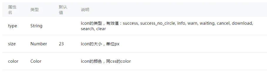
1. icon——图标
index.wxml
<view class="group">
  <block wx:for="{{iconSize}}">
    <icon type="success" size="{{item}}"/>
  </block>
</view>

<view class="group">
  <block wx:for="{{iconType}}">
    <icon type="{{item}}" size="45"/>
  </block>
</view>

<view class="group">
  <block wx:for="{{iconColor}}">
    <icon type="success" size="45" color="{{item}}"/>
  </block>
</view>
index.js
Page({
  data: {
    iconSize: [20, 30, 40, 50, 60, 70],
    iconColor: [
      'red', 'orange', 'yellow', 'green', 'rgb(0,255,255)', 'blue', 'purple'
    ],
    iconType: [
      'success', 'info', 'warn', 'waiting', 'safe_success', 'safe_warn',
      'success_circle', 'success_no_circle', 'waiting_circle', 'circle', 'download',
      'info_circle', 'cancel', 'search', 'clear'
    ]
  }
})
效果图
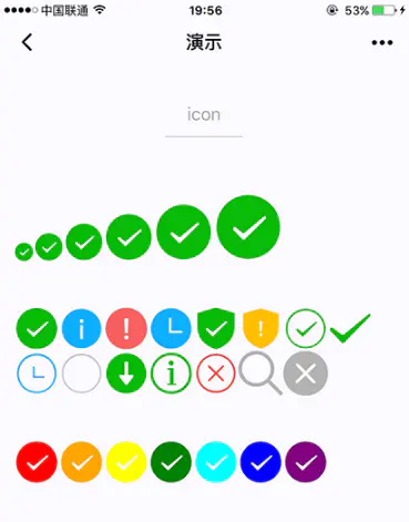
2. text——文本
index.wxml
<view class="btn-area">
  <view class="body-view">
    <text>{{text}}</text>
    <button bindtap="add">add line</button>
    <button bindtap="remove">remove line</button>
  </view>
</view>
var initData = 'this is first line\nthis is second line'
var extraLine = [];
Page({
  data: {
    text: initData
  },
  add: function(e) {
    extraLine.push('other line')
    this.setData({
      text: initData + '\n' + extraLine.join('\n')
    })
  },
  remove: function(e) {
    if (extraLine.length > 0) {
      extraLine.pop()
      this.setData({
        text: initData + '\n' + extraLine.join('\n')
      })
    }
  }
})
效果图
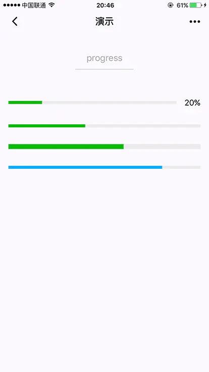
3. progress——进度条

<progress percent="20" show-info />
<progress percent="40" stroke-width="12" />
<progress percent="60" color="pink" />
<progress percent="80" active />

 浙公网安备 33010602011771号