
实现一个圆形进度条
现在的一些数据运营活动h5页面中,通常回涉及到圆形的进度条,比如京东白条,蚂蚁芝麻分。最近做了一个类似的,当然前期想法是用canvas做,但是考虑到低端安卓手机的渲染能力,最终以纯原生css+js实现,总结一下
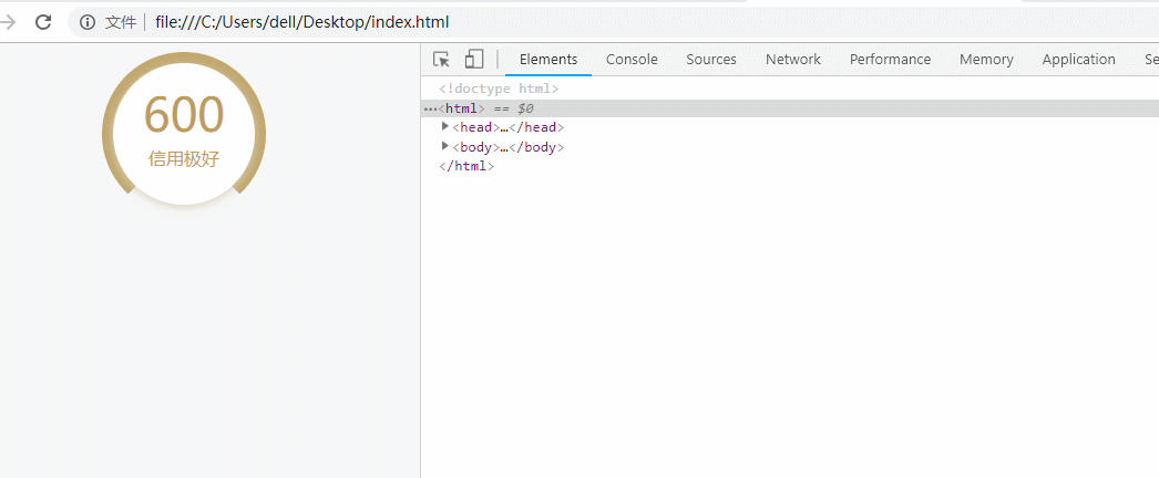
效果图

思路
index0底层一个色值#c1a76b的圆,中间index1一个三角形,也就是底边缺的效果,上层index2是白色全圆(带阴影,600和信用极好包裹在里面),另外左右50%各铺一个index3,index4透明层,这个层overflow:hidden,两个层里面都有一个#f7f7f7的填充,通过旋转这两个填充物来实现圆形进度效果(先左边旋转180deg完,再旋转右边)
动态图
贴代码
<!DOCTYPE html>
<html>
    <head>
        <style>
            body {
                background-color: #f7f7f7;
            }
            .new-cricle {
                position: relative;
                width: 148px;
                height: 148px;
                border-radius: 50%;
                background-color: #c1a76b;
                margin: 0 auto;
                z-index: 0;
            }

            .new-cricle .cricle-text {
                position: absolute;
                top: 20px;
                width: 130px;
                left: 50%;
                margin-left: -65px;
                z-index: 5;
                text-align: center;
            }
            .new-cricle .cricle-text.p0 {
                top: 28px;
                font-size: 42px;
                color: #C09B5B;
                font-family: DINAlternate-Bold;
            }
            .new-cricle .cricle-text.txt2 {
                top: 85px;
                font-size: 16px;
                color: #C09B5B;
                font-family: PingFangSC-Medium;
            }

            .cricle-left-area {
                position: absolute;
                top: -1px;
                left: -1px;
                width: 75px;
                height: 150px;
                background-color: transparent;
                overflow: hidden;
            }
            .cricle-left {
                position: absolute;
                width: 75px;
                height: 150px;
                background-color: #f7f7f7;
                border-radius: 75px 0 0 75px;
                transform-origin: right center;
                z-index: 1;
                transition: 1.5s all;
                transform: rotate(35deg);
            }

            .cricle-right-area {
                position: absolute;
                top: -1px;
                right: -1px;
                width: 75px;
                height: 150px;
                background-color: transparent;
                overflow: hidden;
            }
            .cricle-right {
                position: absolute;
                width: 75px;
                height: 150px;
                background-color: #f7f7f7;
                border-radius: 0 75px 75px 0;
                transform-origin: left center;
                z-index: 2;
                transition: 1.5s all;
            }
            .triangle {
                width: 0;
                height: 0;
                border-width: 0 80px 80px;
                border-style: solid;
                border-color: transparent transparent #f7f7f7;/*透明 透明  白*/
                position: absolute;
                bottom: -10px;
                left: 50%;
                margin-left: -80px;
                z-index: 3;

            }
            .cricle-all {
                position: relative;
                width: 128px;
                height: 128px;
                border-radius: 50%;
                background-color: #fff;
                box-shadow: 0 2px 15px 0 #D8CEBB;
                margin: 0 auto;
                z-index: 4;
                top: 10px;
            }
        </style>
    </head>
    <body>
        <div class="new-cricle">
            <div class="cricle-left-area">
                <div class="cricle-left" id="cricleLeft"></div>
            </div>

            <div class="cricle-right-area">
                <div class="cricle-right" id="cricleRight"></div>
            </div>

            <div class="triangle"></div>
            <div class="cricle-all"></div>

            <div class="cricle-text p0">600</div>
            <div class="cricle-text txt2">信用极好</div>
        </div>
    </body>

    <script>
        var $cricleLeft = document.getElementById('cricleLeft')
        var $cricleRight = document.getElementById('cricleRight')

        var angle = 360; //旋钮角度

        setTimeout(function(){
            if(angle >= 180){
                $cricleLeft.style.transform = 'rotate(180deg)';
                setTimeout(function(){
                    $cricleRight.style.transform = 'rotate('+ (angle - 180) +'deg)';
                }, 1400)
            }else{
                $cricleLeft.style.transform = 'rotate(' + angle + 'deg)';
            }
        }, 1000)


    </script>
</html>
在线demo地址
存在问题
- 左边当旋转到180deg有一个放缓慢的效果
分类:
前端


【推荐】国内首个AI IDE,深度理解中文开发场景,立即下载体验Trae
【推荐】编程新体验,更懂你的AI,立即体验豆包MarsCode编程助手
【推荐】抖音旗下AI助手豆包,你的智能百科全书,全免费不限次数
【推荐】轻量又高性能的 SSH 工具 IShell:AI 加持,快人一步
· 如何编写易于单元测试的代码
· 10年+ .NET Coder 心语,封装的思维:从隐藏、稳定开始理解其本质意义
· .NET Core 中如何实现缓存的预热?
· 从 HTTP 原因短语缺失研究 HTTP/2 和 HTTP/3 的设计差异
· AI与.NET技术实操系列:向量存储与相似性搜索在 .NET 中的实现
· 周边上新:园子的第一款马克杯温暖上架
· Open-Sora 2.0 重磅开源!
· 分享 3 个 .NET 开源的文件压缩处理库,助力快速实现文件压缩解压功能!
· Ollama——大语言模型本地部署的极速利器
· DeepSeek如何颠覆传统软件测试?测试工程师会被淘汰吗?