Visualizing the stock market structure of sklearn
Visualizing the stock market structure
https://scikit-learn.org/stable/auto_examples/applications/plot_stock_market.html#stock-market
此例使用了集中非监督学习技术, 从历史报价波动中提取股票市场结构。
分析的目标量值为股票日变化,包括 开市报价,和闭市报价。
报价 === quotes
This example employs several unsupervised learning techniques to extract the stock market structure from variations in historical quotes.
The quantity that we use is the daily variation in quote price: quotes that are linked tend to cofluctuate during a day.
Learning a graph structure ---- 使用逆协方差矩阵
使用稀疏的逆协方差矩阵估计,来找出报价之间的条件相关性。
逆协方差矩阵描绘了一个图, 图中元素是 两只股票的 关联关系 -- 相关关系。
股票代码之间的连接,有助于表示股票价格的波动。例如 一个股票当天跌了, 另外一个相关度最高的股票,大概率也是下跌的情况。
Symbol === 股票代码。
We use sparse inverse covariance estimation to find which quotes are correlated conditionally on the others.
Specifically, sparse inverse covariance gives us a graph, that is a list of connection.
For each symbol, the symbols that it is connected too are those useful to explain its fluctuations.
逆协方差矩阵
https://www.quora.com/What-is-the-inverse-covariance-matrix-What-is-its-statistical-meaning#:~:text=The%20inverse%20covariance%20matrix%2C%20commonly%20referred%20to%20as,variable%20j%20by%20reading%20off%20the%20%28i%2Cj%29-th%20index.
协方差矩阵,往往带有噪声。
例如 x -》 y -》 z 这样计算xz之间的相关关系,其中包括了 xy 和 yz的相关度。
逆协方差矩阵,屏蔽这些噪音, 只计算偏相关关系。
xy 和 yz, 并不计算 xz之间的相关性。
Another view to add to the previous answers:
# Covariance is a measure of how much two variables move in the same direction (i.e. vary together).
ISSUE: Covariance between two variables also captures the effects of the others. For example, strong covariance between variable 1 and variable 2 with a third variable 3 will induce a covariance between variable 1 and variable 2.
In other words, the correlation matrix captures a lot of noise.
# Therefore, in order to gain in interpretability, one can derive the inverse covariance matrix (also called precision matrix).
It gives covariation of two variables while conditioning on the potential influence of the other ones involved in the analysis. In other words, it removes the effect of other variables. The precision matrix thus allows to obtain direct covariation between two variables by capturing partial correlations. It gives the conditional independent covariation between two variables. Say differently, variable 1 and variable 2 are not connected if the covariance can be explain by a third variable 3.
The precision matrix makes the interactions between variables more interpretative and more robust to the confounds.
# Sources: Varoquaux et al, 2010, smith et al, 2011, Varoquaux and Craddock, 2013.
偏相关性存在于逆协方差矩阵。
So here's another perspective, to add to Charles H Martin and Vladimir Novakovski's answer.
The inverse covariance matrix, commonly referred to as the precision matrix displays information about the partial correlations of variables.
With the covariance matrix Σ
, one observes the unconditional correlation between a variable i, to a variable j by reading off the (i,j)-th index. It may be the case that the two variables are correlated, but do not directly depend on each other, and another variable k explains their correlation. If we displayed this information on a conditional independence graph, it would look like:
i−k−j
So for example: if k is the event that it rains, i is the event that your lawn is wet and j is the event that your driveway is wet, then you will notice that i and j are heavily correlated, but once you condition on k - they are pretty uncorrelated. (If you don't believe that, for sake of argument - say you hose the lawn pretty sporadically, and wash your car on the driveway whenever you arbitrarily remember to, and those are the only other ways your lawn / driveway gets wet).A partial correlation describes the correlation between variable i and j, once you condition on all other variables. If i and j are conditionally independent, such as in the example, then the (i,j)-th element of your precision matrix
Σ−1i,j
will equal zero. Also, if your data follows a multivariate normal then the converse is true, a zero element implies conditional independence. Deriving information about conditional independence is really helpful in understanding how your covariates relate to one another. Short of drawing a full causal graph, this is probably the best summary of covariate relations that you can hope to extract.
https://scikit-learn.org/stable/auto_examples/covariance/plot_sparse_cov.html#sphx-glr-auto-examples-covariance-plot-sparse-cov-py
其与协方差矩阵同等重要。
To estimate a probabilistic model (e.g. a Gaussian model), estimating the precision matrix, that is the inverse covariance matrix, is as important as estimating the covariance matrix. Indeed a Gaussian model is parametrized by the precision matrix.
Clustering
使用紧密度传播聚类方法,来发现报价行为相似的股票。
紧密度传播不强制聚类的大小,自动选择聚类的中心。
协方差方法探索的是 变量之间的条件关系, 而聚类方法则表示有相似影响。
We use clustering to group together quotes that behave similarly. Here, amongst the various clustering techniques available in the scikit-learn, we use Affinity Propagation as it does not enforce equal-size clusters, and it can choose automatically the number of clusters from the data.
Note that this gives us a different indication than the graph, as the graph reflects conditional relations between variables, while the clustering reflects marginal properties: variables clustered together can be considered as having a similar impact at the level of the full stock market.
Embedding in 2D space
为了可视化, 需要将不同的股票映射到二维空间。
利用流行学习(非线性降维方法),将股票行为降解到二维空间。
For visualization purposes, we need to lay out the different symbols on a 2D canvas. For this we use Manifold learning techniques to retrieve 2D embedding.
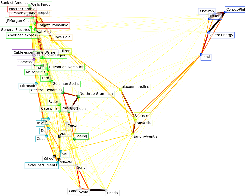
Visualization
图中每个节点表示一个股票。
边表示 股票之间的相关程度 -- 粗细表示, 来自于 稀疏逆协方差矩阵。
节点的颜色, 表示聚类结果。
The output of the 3 models are combined in a 2D graph where nodes represents the stocks and edges the:
cluster labels are used to define the color of the nodes
the sparse covariance model is used to display the strength of the edges
the 2D embedding is used to position the nodes in the plan
This example has a fair amount of visualization-related code, as visualization is crucial here to display the graph. One of the challenge is to position the labels minimizing overlap. For this we use an heuristic based on the direction of the nearest neighbor along each axis.
Out:
Fetching quote history for 'AAPL'
Fetching quote history for 'AIG'
Fetching quote history for 'AMZN'
Fetching quote history for 'AXP'
Fetching quote history for 'BA'
Fetching quote history for 'BAC'
Fetching quote history for 'CAJ'
Fetching quote history for 'CAT'
Fetching quote history for 'CL'
Fetching quote history for 'CMCSA'
Fetching quote history for 'COP'
Fetching quote history for 'CSCO'
Fetching quote history for 'CVC'
Fetching quote history for 'CVS'
Fetching quote history for 'CVX'
Fetching quote history for 'DD'
Fetching quote history for 'DELL'
Fetching quote history for 'F'
Fetching quote history for 'GD'
Fetching quote history for 'GE'
Fetching quote history for 'GS'
Fetching quote history for 'GSK'
Fetching quote history for 'HD'
Fetching quote history for 'HMC'
Fetching quote history for 'HPQ'
Fetching quote history for 'IBM'
Fetching quote history for 'JPM'
Fetching quote history for 'K'
Fetching quote history for 'KMB'
Fetching quote history for 'KO'
Fetching quote history for 'MAR'
Fetching quote history for 'MCD'
Fetching quote history for 'MMM'
Fetching quote history for 'MSFT'
Fetching quote history for 'NAV'
Fetching quote history for 'NOC'
Fetching quote history for 'NVS'
Fetching quote history for 'PEP'
Fetching quote history for 'PFE'
Fetching quote history for 'PG'
Fetching quote history for 'R'
Fetching quote history for 'RTN'
Fetching quote history for 'SAP'
Fetching quote history for 'SNE'
Fetching quote history for 'SNY'
Fetching quote history for 'TM'
Fetching quote history for 'TOT'
Fetching quote history for 'TWX'
Fetching quote history for 'TXN'
Fetching quote history for 'UN'
Fetching quote history for 'VLO'
Fetching quote history for 'WFC'
Fetching quote history for 'WMT'
Fetching quote history for 'XOM'
Fetching quote history for 'XRX'
Fetching quote history for 'YHOO'
/home/circleci/miniconda/envs/testenv/lib/python3.9/site-packages/numpy/core/_methods.py:202: RuntimeWarning: invalid value encountered in subtract
  x = asanyarray(arr - arrmean)
Cluster 1: Apple, Amazon, Yahoo
Cluster 2: Comcast, Cablevision, Time Warner
Cluster 3: ConocoPhillips, Chevron, Total, Valero Energy, Exxon
Cluster 4: Cisco, Dell, HP, IBM, Microsoft, SAP, Texas Instruments
Cluster 5: Boeing, General Dynamics, Northrop Grumman, Raytheon
Cluster 6: AIG, American express, Bank of America, Caterpillar, CVS, DuPont de Nemours, Ford, General Electrics, Goldman Sachs, Home Depot, JPMorgan Chase, Marriott, 3M, Ryder, Wells Fargo, Wal-Mart
Cluster 7: McDonald's
Cluster 8: GlaxoSmithKline, Novartis, Pfizer, Sanofi-Aventis, Unilever
Cluster 9: Kellogg, Coca Cola, Pepsi
Cluster 10: Colgate-Palmolive, Kimberly-Clark, Procter Gamble
Cluster 11: Canon, Honda, Navistar, Sony, Toyota, Xerox
Code
相比原始代码,添加了打印,分析每个过程的含义。
# Author: Gael Varoquaux gael.varoquaux@normalesup.org
# License: BSD 3 clause

import sys

import numpy as np
import matplotlib.pyplot as plt
from matplotlib.collections import LineCollection

import pandas as pd

from sklearn import cluster, covariance, manifold

print(__doc__)


# #############################################################################
# Retrieve the data from Internet

# The data is from 2003 - 2008. This is reasonably calm: (not too long ago so
# that we get high-tech firms, and before the 2008 crash). This kind of
# historical data can be obtained for from APIs like the quandl.com and
# alphavantage.co ones.

symbol_dict = {
    'TOT': 'Total',
    'XOM': 'Exxon',
    'CVX': 'Chevron',
    'COP': 'ConocoPhillips',
    'VLO': 'Valero Energy',
    'MSFT': 'Microsoft',
    'IBM': 'IBM',
    'TWX': 'Time Warner',
    'CMCSA': 'Comcast',
    'CVC': 'Cablevision',
    'YHOO': 'Yahoo',
    'DELL': 'Dell',
    'HPQ': 'HP',
    'AMZN': 'Amazon',
    'TM': 'Toyota',
    'CAJ': 'Canon',
    'SNE': 'Sony',
    'F': 'Ford',
    'HMC': 'Honda',
    'NAV': 'Navistar',
    'NOC': 'Northrop Grumman',
    'BA': 'Boeing',
    'KO': 'Coca Cola',
    'MMM': '3M',
    'MCD': 'McDonald\'s',
    'PEP': 'Pepsi',
    'K': 'Kellogg',
    'UN': 'Unilever',
    'MAR': 'Marriott',
    'PG': 'Procter Gamble',
    'CL': 'Colgate-Palmolive',
    'GE': 'General Electrics',
    'WFC': 'Wells Fargo',
    'JPM': 'JPMorgan Chase',
    'AIG': 'AIG',
    'AXP': 'American express',
    'BAC': 'Bank of America',
    'GS': 'Goldman Sachs',
    'AAPL': 'Apple',
    'SAP': 'SAP',
    'CSCO': 'Cisco',
    'TXN': 'Texas Instruments',
    'XRX': 'Xerox',
    'WMT': 'Wal-Mart',
    'HD': 'Home Depot',
    'GSK': 'GlaxoSmithKline',
    'PFE': 'Pfizer',
    'SNY': 'Sanofi-Aventis',
    'NVS': 'Novartis',
    'KMB': 'Kimberly-Clark',
    'R': 'Ryder',
    'GD': 'General Dynamics',
    'RTN': 'Raytheon',
    'CVS': 'CVS',
    'CAT': 'Caterpillar',
    'DD': 'DuPont de Nemours'}


print("-------------sorted(symbol_dict.items())-------------------")
print(sorted(symbol_dict.items()))


symbols, names = np.array(sorted(symbol_dict.items())).T


print("-------------symbols-------------------")
print(symbols)

print("-------------names-------------------")
print(names)


quotes = []

for symbol in symbols:
    print('Fetching quote history for %r' % symbol, file=sys.stderr)
    url = ('https://raw.githubusercontent.com/scikit-learn/examples-data/'
           'master/financial-data/{}.csv')
    quotes.append(pd.read_csv(url.format(symbol)))

close_prices = np.vstack([q['close'] for q in quotes])
open_prices = np.vstack([q['open'] for q in quotes])

# The daily variations of the quotes are what carry most information
variation = close_prices - open_prices


# #############################################################################
# Learn a graphical structure from the correlations
edge_model = covariance.GraphicalLassoCV()

# standardize the time series: using correlations rather than covariance
# is more efficient for structure recovery
X = variation.copy().T
X /= X.std(axis=0)
edge_model.fit(X)

print("-------- edge_model.covariance_ -----------")
print(edge_model.covariance_)

print("-------- edge_model.precision_ -----------")
print(edge_model.precision_)


# #############################################################################
# Cluster using affinity propagation

_, labels = cluster.affinity_propagation(edge_model.covariance_,
                                         random_state=0)


print("-------- labels -----------")
print(labels)

n_labels = labels.max()

for i in range(n_labels + 1):
    print('Cluster %i: %s' % ((i + 1), ', '.join(names[labels == i])))

# #############################################################################
# Find a low-dimension embedding for visualization: find the best position of
# the nodes (the stocks) on a 2D plane

# We use a dense eigen_solver to achieve reproducibility (arpack is
# initiated with random vectors that we don't control). In addition, we
# use a large number of neighbors to capture the large-scale structure.
node_position_model = manifold.LocallyLinearEmbedding(
    n_components=2, eigen_solver='dense', n_neighbors=6)

embedding = node_position_model.fit_transform(X.T).T

print("-------- X.shape -----------")
print(X.shape)

print("-------- X.T.shape -----------")
print(X.T.shape)

print("-------- X.T -----------")
print(X.T)

print("-------- embedding.shape -----------")
print(embedding.shape)

print("-------- embedding -----------")
print(embedding)


# #############################################################################
# Visualization
plt.figure(1, facecolor='w', figsize=(10, 8))
plt.clf()
ax = plt.axes([0., 0., 1., 1.])
#plt.axis('off')

# Display a graph of the partial correlations
partial_correlations = edge_model.precision_.copy()

print("-------- np.diag(partial_correlations) -----------")
print(np.diag(partial_correlations))


print("-------- np.sqrt(np.diag(partial_correlations)) -----------")
print(np.sqrt(np.diag(partial_correlations)))


d = 1 / np.sqrt(np.diag(partial_correlations))


print("-------- d -----------")
print(d)


partial_correlations *= d


print("-------- partial_correlations -----------")
print(partial_correlations)


print("-------- d[:, np.newaxis] -----------")
print(d[:, np.newaxis])

partial_correlations *= d[:, np.newaxis]


print("-------- partial_correlations -----------")
print(partial_correlations)


print("-------- np.triu(partial_correlations, k=1) -----------")
print(np.triu(partial_correlations, k=1))


print("-------- np.abs(np.triu(partial_correlations, k=1)) -----------")
print(np.abs(np.triu(partial_correlations, k=1)))


non_zero = (np.abs(np.triu(partial_correlations, k=1)) > 0.02)

print("-------- non_zero -----------")
print(non_zero)


# Plot the nodes using the coordinates of our embedding
plt.scatter(embedding[0], embedding[1], s=100 * d ** 2, c=labels,
            cmap=plt.cm.nipy_spectral)

# Plot the edges
start_idx, end_idx = np.where(non_zero)


print("-------- start_idx -----------")
print(start_idx)

print("-------- end_idx -----------")
print(end_idx)


# a sequence of (*line0*, *line1*, *line2*), where::
#            linen = (x0, y0), (x1, y1), ... (xm, ym)
segments = [[embedding[:, start], embedding[:, stop]]
            for start, stop in zip(start_idx, end_idx)]

print("-------- segments -----------")
print(segments)


values = np.abs(partial_correlations[non_zero])

print("-------- values -----------")
print(values)


print("-------- values.max() -----------")
print(values.max())


lc = LineCollection(segments,
                    zorder=0, cmap=plt.cm.hot_r,
                    norm=plt.Normalize(0, .7 * values.max()))

lc.set_array(values)
lc.set_linewidths(15 * values)
ax.add_collection(lc)


# Add a label to each node. The challenge here is that we want to
# position the labels to avoid overlap with other labels
for index, (name, label, (x, y)) in enumerate(
        zip(names, labels, embedding.T)):

    dx = x - embedding[0]
    dx[index] = 1

    dy = y - embedding[1]
    dy[index] = 1

    this_dx = dx[np.argmin(np.abs(dy))]
    this_dy = dy[np.argmin(np.abs(dx))]
    if this_dx > 0:
        horizontalalignment = 'left'
        x = x + .002
    else:
        horizontalalignment = 'right'
        x = x - .002
    if this_dy > 0:
        verticalalignment = 'bottom'
        y = y + .002
    else:
        verticalalignment = 'top'
        y = y - .002
    plt.text(x, y, name, size=10,
             horizontalalignment=horizontalalignment,
             verticalalignment=verticalalignment,
             bbox=dict(facecolor='w',
                       edgecolor=plt.cm.nipy_spectral(label / float(n_labels)),
                       alpha=.6))

plt.xlim(embedding[0].min() - .15 * embedding[0].ptp(),
         embedding[0].max() + .10 * embedding[0].ptp(),)
plt.ylim(embedding[1].min() - .03 * embedding[1].ptp(),
         embedding[1].max() + .03 * embedding[1].ptp())

plt.show()

 浙公网安备 33010602011771号