文字渐变和边框渐变
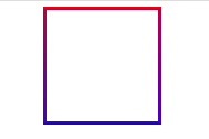
边框渐变:
1 border-image: -webkit-linear-gradient( red , blue) 30 30;
2 border-image: -moz-linear-gradient( red, blue) 30 30;
3 border-image: linear-gradient( red , blue) 30 30;
文字渐变:(只支持-webkit-)
1 background-image: -webkit-gradient(linear, 0 0, 0 80%, from(nth($color7, 3)), to(nth($color7, 4)));
2 -webkit-background-clip: text;
3 -webkit-text-fill-color: transparent;

背景渐变:

1 filter: alpha(opacity=100 finishopacity=50 style=1 startx=0,starty=0,finishx=0,finishy=150) progid:DXImageTransform.Microsoft.gradient(startcolorstr=red,endcolorstr=blue,gradientType=0);
2 -ms-filter: alpha(opacity=100 finishopacity=50 style=1 startx=0,starty=0,finishx=0,finishy=150) progid:DXImageTransform.Microsoft.gradient(startcolorstr=red,endcolorstr=blue,gradientType=0);
3 background: red; /* 一些不支持背景渐变的浏览器 */
4 background: -moz-linear-gradient(top, red, blue);
5 background: -webkit-gradient(linear, 0 0, 0 bottom, from(red), to(blue));


 浙公网安备 33010602011771号