通过CSS设置渐变色边框
实现渐变色边框的方式有很多,这里示例用css的定位和伪类来实现。
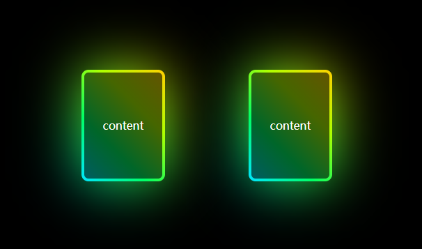
效果图:
直接上代码:
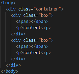
html部分:
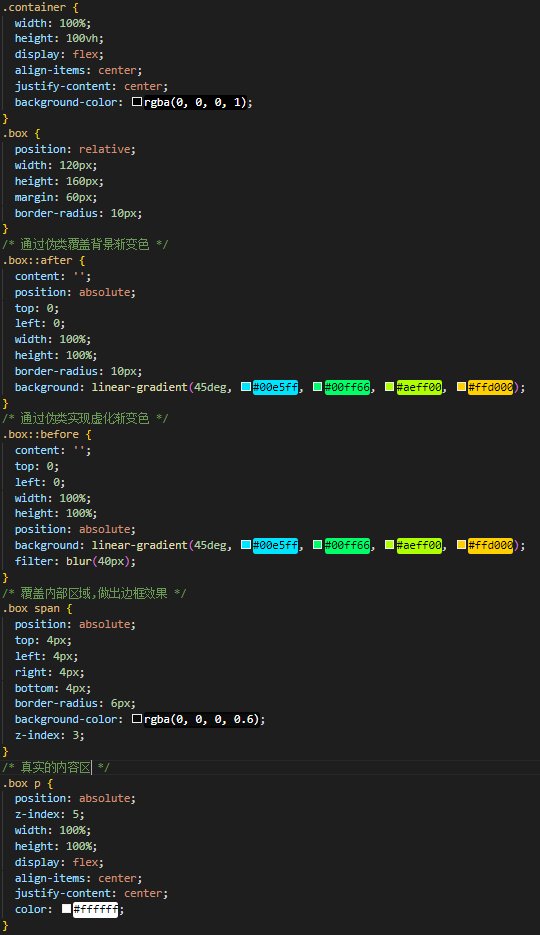
css部分:
代码:
<!DOCTYPE html>
<html lang="en">
<head>
<meta charset="UTF-8" />
<meta http-equiv="X-UA-Compatible" content="IE=edge" />
<meta name="viewport" content="width=device-width, initial-scale=1.0" />
<title>边框渐变色</title>
</head>
<body>
<div class="container">
<div class="box">
<span></span>
<p>content</p>
</div>
<div class="box">
<span></span>
<p>content</p>
</div>
</div>
</body>
</html>
<style>
* {
padding: 0;
margin: 0;
}
.container {
width: 100%;
height: 100vh;
display: flex;
align-items: center;
justify-content: center;
background-color: rgba(0, 0, 0, 1);
}
.box {
position: relative;
width: 120px;
height: 160px;
margin: 60px;
border-radius: 10px;
}
/* 通过伪类覆盖背景渐变色 */
.box::after {
content: '';
position: absolute;
top: 0;
left: 0;
width: 100%;
height: 100%;
border-radius: 10px;
background: linear-gradient(45deg, #00e5ff, #00ff66, #aeff00, #ffd000);
}
/* 通过伪类实现虚化渐变色 */
.box::before {
content: '';
top: 0;
left: 0;
width: 100%;
height: 100%;
position: absolute;
background: linear-gradient(45deg, #00e5ff, #00ff66, #aeff00, #ffd000);
filter: blur(40px);
}
/* 覆盖内部区域,做出边框效果 */
.box span {
position: absolute;
top: 4px;
left: 4px;
right: 4px;
bottom: 4px;
border-radius: 6px;
background-color: rgba(0, 0, 0, 0.6);
z-index: 3;
}
/* 真实的内容区 */
.box p {
position: absolute;
z-index: 5;
width: 100%;
height: 100%;
display: flex;
align-items: center;
justify-content: center;
color: #ffffff;
}
</style>

 浙公网安备 33010602011771号