
各路画半圆、小圆弧方法
半圆/圆弧的绘制
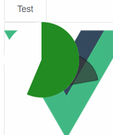
1.div方块的border-radius
半圆和正圆用这个最方便
2.SVG
正圆或者嵌套其他复杂图形的用SVG
3.CSS
不能动,要动的版本涉及到transition的一个什么六参数函数,很痛苦
  <div>
    <el-button @click="test">Test</el-button>

    <div class="box">
      <div class="bg1"></div>
      <div class="bg2"></div>
      <div class="pr1"></div>
      <div class="pr2"></div>
    </div>
  </div>
</template>

<script>
export default {
  methods: {
    test() {
      // let obj = document.getElementsByClassName("pr1")[0];
      // console.log(obj, " obj.cssStyle: ", obj.cssStyle);

      // obj.cssStyle = { transform: "rotate(" + (100 % 360) + "deg)" };
    },
  },
};
</script>

<style>
.box {
  position: relative;
}
.bg1 {
  position: absolute;
  width: 60px;
  height: 120px;
  border-radius: 120px 0 0 120px;
  z-index: 3;
  background: rgb(255, 255, 255);
}
.bg2 {
  left: 60px;
  position: absolute;
  width: 60px;
  height: 120px;
  border-radius: 0px 120px 120px 0;
  z-index: 1;
  background: white;
}
.pr1 {
  position: absolute;
  left: 60px;
  width: 60px;
  height: 120px;
  border-radius: 0px 120px 120px 0px;
  z-index: 2;
  background: forestgreen;
  transform: rotate(-80deg);
  transform-origin: 0px 60px;
  animation: pr1A 5s infinite linear forwards;
}
.pr2 {
  position: absolute;
  left: 60px;
  border-radius: 0px 120px 120px 0px;
  z-index: 4;
  background: forestgreen;
  transform: rotate(-180deg);
  transform-origin: 0px 60px;
  animation: pr2A 5s infinite linear forwards;
}
@keyframes pr1A {
  0% {
    transform: rotate(-180deg);
  }
  50% {
    transform: rotate(0deg);
  }
  100% {
    transform: rotate(0deg);
  }
}
@keyframes pr2A {
  0% {
    transform: rotate(-180deg);
  }
  100% {
    width: 60px;
    height: 120px;
    transform: rotate(180deg);
  }
}
</style>
这个是四分之一圆的加载动画,很漂亮
<template>
  <div>
    <div class="simple-spinner"></div>
  </div>
</template>

<script>
export default {
  mounted() {},
};
</script>

<style lang="scss" scoped>
.simple-spinner {
  height: 1px;
  width: 1px;
  border: 20px solid rgba(150, 150, 150, 0.2);
  border-radius: 50%;
  border-top-color: rgb(150, 150, 150);
  animation: rotate 1s 0s infinite ease-in-out alternate;
}
// @keyframes rotate {
//   0% {
//     transform: rotate(0);
//   }
//   100% {
//     transform: rotate(360deg);
//   }
// }
</style>

4.CANVAS
我直接吹爆
没有SVG那么多标签,简单地线条绘制与填充,加上自己的动画,很好很强大。
<template>
  <div class="alapha">
    <canvas
      id="ctx"
      width="300"
      height="300"
      style="border: 1px solid #d3d3d3"
    />
  </div>
</template>

<script>
export default {
  mounted() {
    let c = document.getElementById("ctx");
    let ctx = c.getContext("2d");
    let x = 100;
    let y = 100;
    let RADIUS = 50;

    ctx.beginPath();

    ctx.arc(x, y, RADIUS, degToArc(0), degToArc(80), false); //sAngle 90 ,eAngle 180
    ctx.fillStyle = "#333";
    ctx.lineTo(x, y);
    ctx.fill();
    ctx.restore();
    ctx.stroke();

    function degToArc(num) {
      return (Math.PI / 180) * (num - 90);
    }
  },
};
</script>

<style>
.alapha {
  width: 300px;

  background-image: url("../assets/logo.png");
}
#ctx {
  opacity: 0.7;
}
</style>
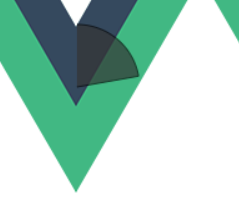
5,CSS STYLE
画饼图
效果如下
人生到处知何似,应似飞鸿踏雪泥。
