
SwiftUI 入门
1 组件
1.1 基础组件
Text
Text("Hamlet")
    .font(.largeTitle)
    .fontWeight(.bold)
    .italic()

Text("Hello")
    .font(.system(size: 20, weight: .bold, design: .serif))
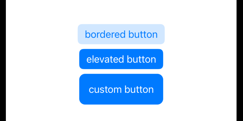
Button
三种风格
Button("bordered button") {}
    .buttonStyle(.bordered)
    .tint(.blue)

Button("elevated button") {}
    .buttonStyle(.borderedProminent)
    .tint(.blue)

Button {} label: {
    Text("custom button")
        .padding()
}
.buttonStyle(.borderless)
.foregroundColor(.white)
//.accentColor(.blue) accentColor 通常用在父组件,作为主题色使用,且这里会被 foregroundColor 覆盖
//.backgroundStyle(.blue) backgroundStyle 不起作用
.background(.blue)
.cornerRadius(10)
效果:
自定义按钮风格
struct NeumorphicButtonStyle: ButtonStyle {
    var bgColor: Color

    func makeBody(configuration: Self.Configuration) -> some View {
        configuration.label
            .padding(20)
            .background(
                ZStack {
                    RoundedRectangle(cornerRadius: 10, style: .continuous)
                        .shadow(color: .white, radius: configuration.isPressed ? 7 : 10, x: configuration.isPressed ? -5 : -15, y: configuration.isPressed ? -5 : -15)
                        .shadow(color: .black, radius: configuration.isPressed ? 7 : 10, x: configuration.isPressed ? 5 : 15, y: configuration.isPressed ? 5 : 15)
                        .blendMode(.overlay)
                    RoundedRectangle(cornerRadius: 10, style: .continuous)
                        .fill(bgColor)
                }
            )
            .scaleEffect(configuration.isPressed ? 0.95 : 1)
            .foregroundColor(.primary)
            .animation(.spring())
    }
}

// 使用
Button("Neumorphic", action: {}).buttonStyle(NeumorphicButtonStyle(bgColor: .neuBackground))
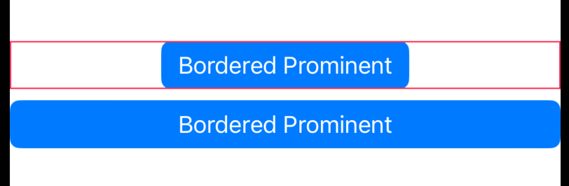
全屏宽度
VStack {
    //无法 fullwidth
    Button("Bordered Prominent") {}
            .buttonStyle(.borderedProminent)
            .frame(maxWidth: .infinity)
            .border(.pink)
    //正确
    Button {

    } label: {
        Text("Bordered Prominent")
            .frame(maxWidth: .infinity)
    }
    .buttonStyle(.borderedProminent)
}
效果:
Image
字体图标
HStack {
    Image(systemName: "folder.badge.plus")
    Image(systemName: "heart.circle.fill")
    Image(systemName: "alarm")
}
//monochrome 默认值, palette, multicolor, hierarchical
.symbolRenderingMode(.monochrome)
.font(.largeTitle)
图片全屏
Image("sea")
    .resizable()
    // 等价于 .aspectRatio(contentMode: .fill)
    .scaledToFill()
    // 忽略安全区
    .ignoresSafeArea(.container, edges: .all)
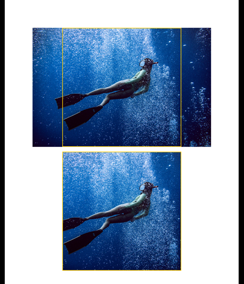
图片裁剪
// 保持比例不变,进行缩放并裁剪 frame + scaledToFill + clipped
VStack {
    Image("sea")
        .resizable()
        // 作用:以最大宽或高为基础,择其较大者,按原比例调整大小
        // scaledToFill 等价于 .aspectRatio(contentMode: .fill)
        // 举例:这里就是以最大高200为基础进行缩放
        .scaledToFill()
        .frame(maxWidth: 200, maxHeight: 200)
        .border(.yellow)

    Image("sea")
        .resizable()
        .scaledToFill()
        .frame(width: 200, height: 200)
        .border(.yellow)
        // scaledToFill 放大后,可将超出的部分进行裁剪
        .clipped()
}
效果:
Label
Label("你们好", systemImage: "heart")
    .labelStyle(.titleAndIcon)
    .font(.largeTitle)
自定义 labelStyle
struct AdaptiveLabelStyle: LabelStyle {
    @Environment(\.verticalSizeClass) var verticalSizeClass: UserInterfaceSizeClass?

    func makeBody(configuration: Configuration) -> some View {
        if verticalSizeClass == .compact {
            HStack {
                configuration.icon
                configuration.title
            }
        } else {
            VStack {
                configuration.icon
                configuration.title
            }
        }
    }
}

struct ContentView: View {
    var body: some View {
        VStack(spacing: 20) {
            Label("Favorites", systemImage: "heart")
                .labelStyle(AdaptiveLabelStyle())
        }
    }
}
使用 @ViewBuilder
// @ViewBuilder 方式
Label {
    Text("Favorites")
        .bold()
        .foregroundColor(.pink)
} icon: {
    Image(systemName: "heart")
        .symbolVariant(.fill)
        .foregroundColor(.pink)
}
Shapes
HStack {
    Rectangle()
        .foregroundColor(.blue)
    Circle()
        .foregroundColor(.orange)
    RoundedRectangle(cornerRadius: 15, style: .continuous)
        .foregroundColor(.green)
    //胶囊
    Capsule()
}
.aspectRatio(4.0, contentMode: .fit)
1.2 布局组件
线性布局
HStack {
    TrainCar(.rear)
    Spacer()
    TrainCar(.middle)
    Spacer()
    TrainCar(.front)
}
布局平滑切换
struct ContentView: View {
    @State private var isHorizontal = true

    var body: some View {
        let layout: AnyLayout = isHorizontal ? AnyLayout(HStackLayout()) : AnyLayout(VStackLayout())

        VStack(spacing: 20) {
            // ① 移除旧的组件,创建新的组件
            // 动画:fading transition
            if isHorizontal {
                HStack {
                    Text("1")
                        .frame(width: 50)
                        .border(.yellow)
                    Text("2")
                        .frame(width: 100)
                        .border(.blue)
                    Text("3")
                        .frame(width: 200)
                        .border(.green)
                }
                .border(.pink)
                .font(.title)
            } else {
                VStack {
                    Text("1")
                        .frame(width: 50)
                        .border(.yellow)
                    Text("2")
                        .frame(width: 100)
                        .border(.blue)
                    Text("3")
                        .frame(width: 200)
                        .border(.green)
                }
                .border(.pink)
                .font(.title)
            }

            // ② 布局平滑切换,组件的 identity 保持不变(还是同一个组件)
            // 动画:smooth transition
            layout {
                Text("1")
                    .frame(width: 50)
                    .border(.yellow)
                Text("2")
                    .frame(width: 100)
                    .border(.blue)
                Text("3")
                    .frame(width: 200)
                    .border(.green)
            }
            .border(.pink)
            .font(.title)

            Spacer().frame(height: 50)

            Button("Toggle Layout") {
                withAnimation {
                    isHorizontal.toggle()
                }
            }
        }
    }
}
ZStack 布局
ZStack(alignment: .topTrailing) {
    Image(systemName: symbel.name)
        .resizable()
        .scaledToFit()
        .symbolRenderingMode(.hierarchical)
        .foregroundColor(.accentColor)
        .ignoresSafeArea(.container, edges: .bottom)
        .cornerRadius(8)
    if isEditing {
        Button {} label: {
            Image(systemName: "xmark.square.fill")
                .font(.title)
                .symbolRenderingMode(.palette)
                .foregroundStyle(.white, .red)
        }
        .offset(x: 7, y: -7)
    }
}
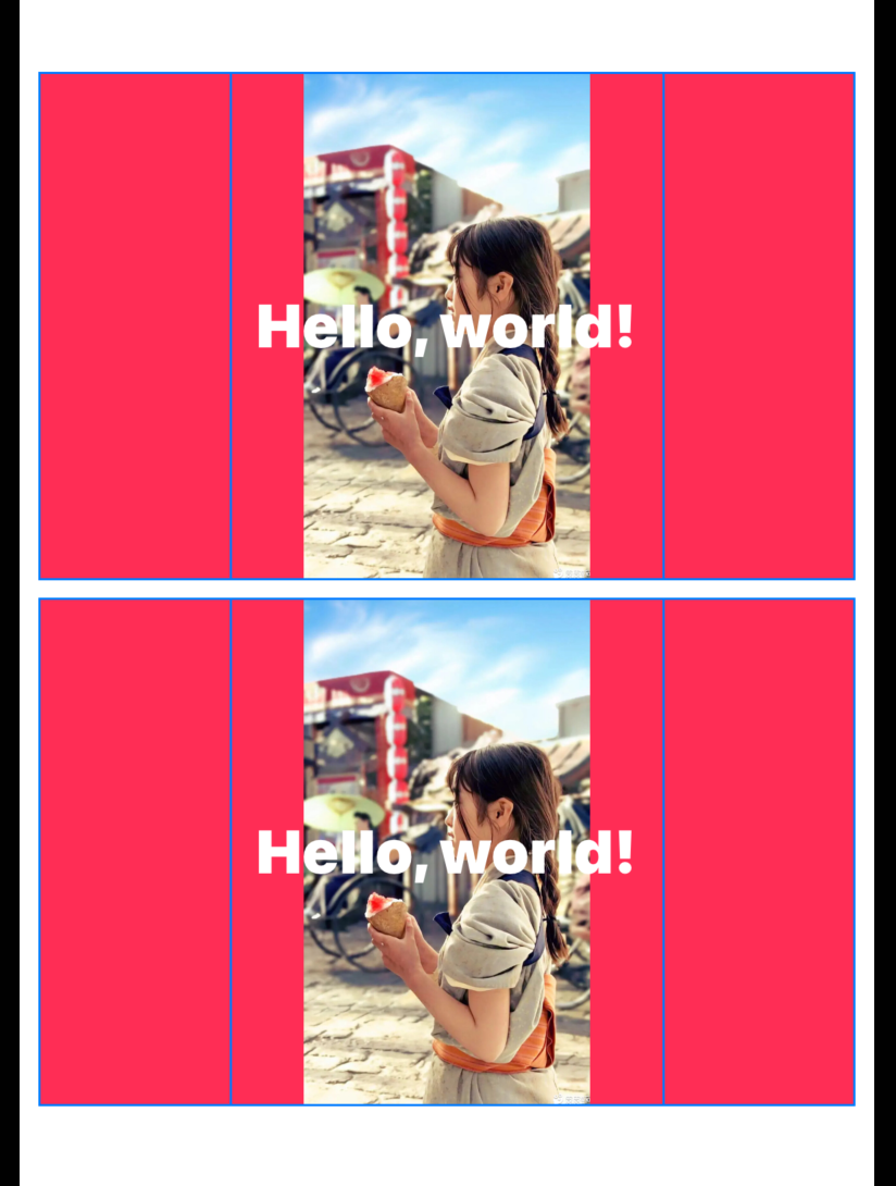
ZStack 的优先级容器
VStack {
    // 在 ZStack 中,使用 layoutPriority 提高某个组件的优先级
    ZStack {
        Image("girl")
            .resizable()
            .scaledToFit()
            .frame(width: 200)
            .border(Color.blue)

        Text("Hello, world!")
            .foregroundColor(.white)
            .font(.system(size: 28, weight: .black))
            .padding(100)
            .border(Color.blue)
            // 提高优先级,将 ZStack容器大小限制为该组件大小
            .layoutPriority(1)
    }
    .background(.pink)

    // 使用 .backgroud 自带优先级
    Text("Hello, world!")
        .foregroundColor(.white)
        .font(.system(size: 28, weight: .black))
        .padding(100)
        .border(Color.blue)
        .background {
            Image("girl")
                .resizable()
                .scaledToFit()
                .frame(width: 200)
                .border(Color.blue)
        }
        .background(.pink)
}
效果:
Grid 布局
1、LazyVGrid
struct ContentView: View {
    // horizontal spacing = 0
    let columns = Array(repeating: GridItem(spacing: 0), count: 3)

    var body: some View {
        ScrollView {
            // vertical spacing = 0
            LazyVGrid(columns: columns, spacing: 0) {
                ForEach(0 ..< 100) { i in
                    Text("Item \(i)")
                        .frame(maxWidth: .infinity, minHeight: 50)
                        .background(.yellow)
                        .padding(0)
                }.padding(0)
            }
        }
    }
}
GridItem 的各种用法
let columns = [
    GridItem(.fixed(50)),
    GridItem(.fixed(100)),
    GridItem(.fixed(200))
]

let columns = [
    GridItem(.flexible(minimum: 10, maximum: 100)),
    GridItem(.flexible(minimum: 200, maximum: 200)),
    GridItem(.flexible(minimum: 10, maximum: 300))
]

let columns = [
    // adaptive 相比于 flexible,针对的是剩余的每个子项,而不是单个项目
    GridItem(.adaptive(minimum: 100, maximum: 150)),
    GridItem(.fixed(300))
]

let columns = [
    GridItem(.fixed(50), spacing: 0),
    GridItem(.fixed(50), spacing: 20)
]

let columns = [
    GridItem(.fixed(40)),
    GridItem(.fixed(100), alignment: .top),
    GridItem(.fixed(100), alignment: .center)
]
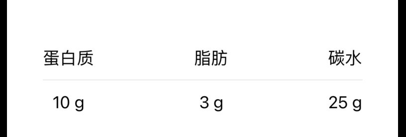
2、Grid
类似于 Table 组件
Grid(horizontalSpacing: 100, verticalSpacing: 12) {
    GridRow {
        Text("蛋白质")
        Text("脂肪")
        Text("碳水")
    }

    Divider()
        .gridCellUnsizedAxes(.horizontal)

    GridRow {
        Text("10 g")
        Text("3 g")
        Text("25 g")
    }
}
效果:
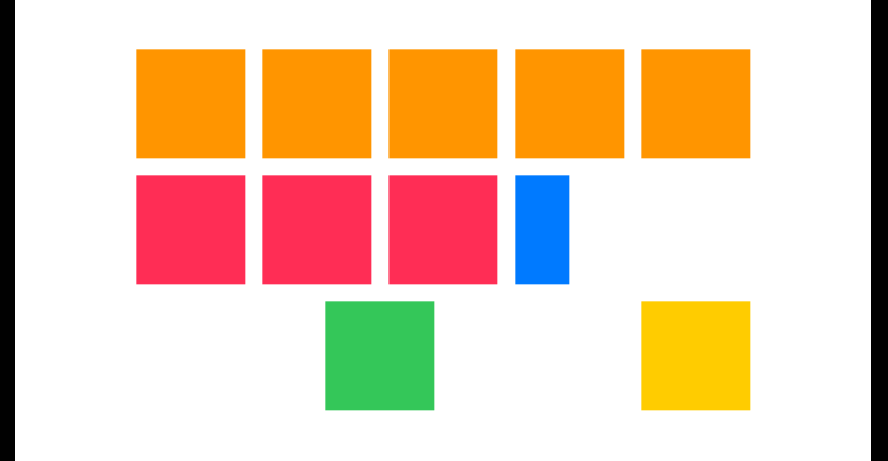
合并单元格
struct ColorSquare: View {
    let color: Color

    var body: some View {
        color
        .frame(width: 50, height: 50)
    }
}

struct HalfColorSquare: View {
    let color: Color

    var body: some View {
        color
        .frame(width: 25, height: 50)
    }
}

struct ContentView: View {

    var body: some View {
        Grid(alignment: .center) {
            GridRow {
                ForEach(0..<5) { _ in
                    ColorSquare(color: .orange)
                }
            }
            GridRow {
                ForEach(0..<3) { _ in
                    ColorSquare(color: .pink)
                }
                // 默认居中,现在改成居左
                HalfColorSquare(color: .blue)
                    .gridColumnAlignment(.leading)
            }
            GridRow {
                // 合并4个项目,且居中
                ColorSquare(color: .green)
                    .gridCellColumns(4)
                ColorSquare(color: .yellow)
            }
        }
    }
}
效果:
1.3 表单组件
Toggle
@State private var longerTrain = true

Toggle("Long Train", isOn: $longerTrain)
Step
Stepper(columnsText, value: $numColumns, in: 1...6, step: 1) { _ in
    withAnimation { gridColumns = Array(repeating: GridItem(.flexible()), count: numColumns) }
}
Picker
struct ContentView: View {
    @State private var selectedColor = FavoriteColor.red

    var body: some View {
        VStack {
            Picker("Favorite Color", selection: $selectedColor, content: {
                ForEach(FavoriteColor.allCases, content: { color in
                    // 由于使用 ForEach,可以省略 .tag()
//                    Text(color.rawValue.capitalized).tag(color.id)
                    Text(color.rawValue.capitalized)
                })
            })
//风格:inline, wheel, menu, segmented
            .pickerStyle(.segmented)
            Text("Selected color: \(selectedColor.rawValue.capitalized)")
        }
    }
}
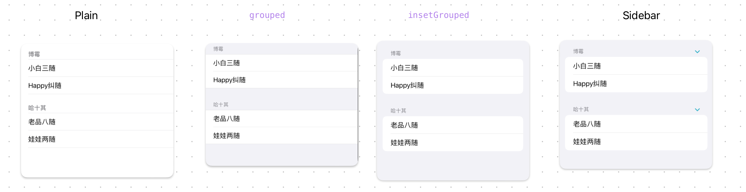
1.4 列表类组件
List
List + Section 组件的使用
List {
    Section("博霉") {
        Text("小白三随")
        Text("Happy纠随")
    }
    Section("哈十其") {
        Text("老品八随")
        Text("娃娃两随")
    }
}
.listStyle(.insetGrouped)
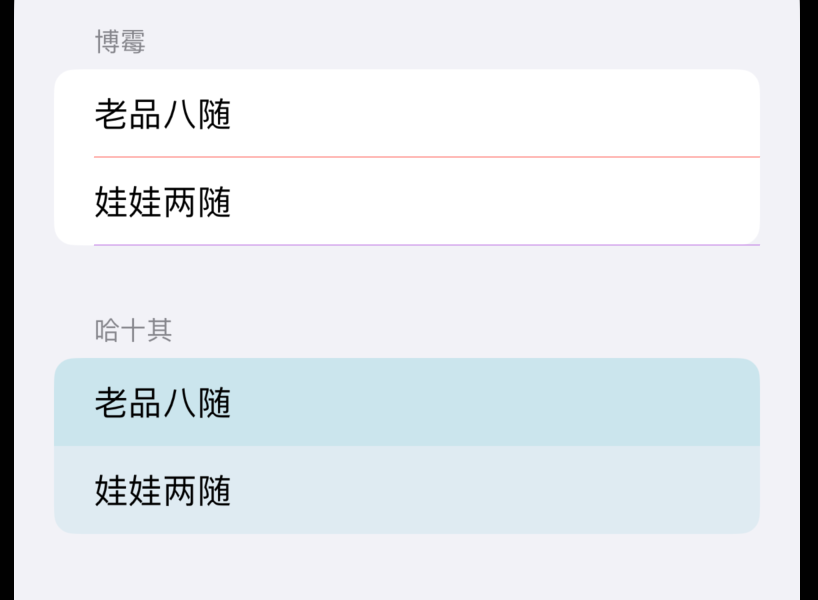
ListStyle 的4种风格:
除了风格还可以设置 item 的背景色与线条
let pomeranian: [String] = ["老品八随", "娃娃两随"]
let husky: [String] = ["老品八随", "娃娃两随"]
var body: some View {
    List {
        Section("博霉") {
            ForEach(pomeranian, id: \.self) { dog in
                Text(dog)
            }
            // 分割线
            .listRowSeparatorTint(.red)
            .listSectionSeparator(.visible, edges: .bottom)
            .listSectionSeparatorTint(.purple, edges: .all)
        }
        Section("哈十其") {
            ForEach(husky.indices, id: \.self) { index in
                Text(husky[index])
                    // 背景色
                    .listRowSeparator(.hidden)
                    .listRowBackground(Color.teal.opacity(index % 2 == 0 ? 0.2 : 0.1))
            }
        }
    }
    .listStyle(.insetGrouped)
}
效果:
ScrollView
// [.horizontal, .vertical] 同时支持水平、垂直滚动
// showsIndicators: false 不显示滚动条
ScrollView([.horizontal, .vertical], showsIndicators: false) {
    VStack(spacing: 20) {
        ForEach(0..<20) { row in
            HStack {
                ForEach(0..<20) { column in
                    Text("\(row),\(column)")
                        .foregroundColor(.white)
                        .frame(width: 100, height: 100)
                        .background(Color.pink)
                        .cornerRadius(50)
                }
            }
        }
    }.frame(maxWidth: .infinity)
}.font(.largeTitle)
1.5 弹窗组件
Alert
struct ContentView: View {
    @State private var presentAlert = false

    var body: some View {
        HStack {
            Button {
                presentAlert = true
            } label: {
                Text("Press this!")
            }
            .buttonStyle(.bordered)
        }
        .alert(isPresented: $presentAlert) {
            Alert(title: Text("good"),
                  primaryButton: .destructive(Text("Delete"), action: { print("deleted")
                  }), secondaryButton: .cancel())
        }
    }
}
注:iOS 15 支持简化写法:
struct ContentView: View {
    @State private var presentAlert = false

    var body: some View {
        HStack {
            Button {
                presentAlert = true
            } label: {
                Text("Press this!")
            }
            .buttonStyle(.bordered)
        }
        .alert("Title", isPresented: $presentAlert, actions: {
            Button("Destructive", role: .destructive, action: {})
        }, message: {
            Text("iOS 15")
        })
    }
}
第二种用法
struct AlertInfo: Identifiable {
    let id = UUID()
    let title: String
}


struct ContentView: View {
    @State private var alertInfo: AlertInfo?

    var body: some View {
        HStack {
            Button {
                alertInfo = AlertInfo(title: "hello")
            } label: {
                Text("Press this!")
            }
            .buttonStyle(.bordered)
        }
        .alert(item: $alertInfo) { info in
            Alert(title: Text(info.title))
        }
    }
}
第三种用法
struct AlertInfo: Identifiable {
    let id = UUID()
    let title: String
    let message: String
}

class AlertController: ObservableObject {
    @Published var info: AlertInfo?
}

@main
struct SwiftUIDemoApp: App {
    @StateObject private var alertController = AlertController()

    var body: some Scene {
        WindowGroup {
            ContentView()
                .environmentObject(alertController)
                .alert(item: $alertController.info, content: { info in
                    Alert(title: Text(info.title),
                          message: Text(info.message))
                })
        }
    }
}

struct ContentView: View {
    @EnvironmentObject var alertController: AlertController

    var body: some View {
        HStack {
            Button {
                alertController.info = AlertInfo(title: "hello", message: "good job")
            } label: {
                Text("Press this!")
            }
            .buttonStyle(.bordered)
        }
    }
}
2 调整器
2.1 间距 padding
// 只在水平有间距
Color.red
    .padding([.horizontal], 10)

// 可简写为
Color.red
    .padding(.horizontal, 10)

// 仅在上方和底部有间距
Color.red.padding([.top, .bottom], 50)
2.2 大小 frame
Image(systemName: hobby)
    .resizable()
    .frame(maxWidth: 80, maxHeight: 60)
固有尺寸
struct CustomView: View {
    var body: some View {
        Rectangle()
            .frame(idealWidth: 200, idealHeight: 200)
            .foregroundColor(Color.pink)
    }
}

struct ContentView: View {
    var body: some View {
        // 默认是铺满全屏
        CustomView()
//            .fixedSize()
            .fixedSize(horizontal: true, vertical: false)
    }
}
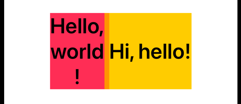
固有尺寸(如果 .fixedSize修饰的组件有多个子组件,则固有尺寸最高的子组件高度即为容器的高度)
HStack {
    VStack {
        Text("Hello,")
        Text("world")
        Text("!")
    }
    .frame(maxHeight: .infinity)
    .background(.pink)
    Text("Hi, hello!")
        .frame(maxHeight: .infinity)
        .background(.yellow)
}
.fixedSize(horizontal: false, vertical: true)
.background(.orange)
.font(.system(size: 36).bold())
效果:
2.3 ShapeStyle
// ShapStyle 可以是颜色
Circle().fill(.teal.gradient)

// ShapStyle 可以是图片
Circle().fill(.image(Image("dinner"), scale: 0.2))

// ShapStyle 可以是渐变层
Circle()
    .fill(
        .linearGradient(colors: [.pink, .indigo],
                        startPoint: .topLeading,
                        endPoint: .bottomTrailing)
    )

//在非 shape 组件中可以用 foregroundStyle 调整器
Text("Hello")
    .foregroundStyle(
        .linearGradient(colors: [.pink, .indigo],
                        startPoint: .topLeading,
                        endPoint: .bottomTrailing)
    )
2.4 overlay
Circle().fill(.teal)
    // 上层
    .overlay {
        Text("Hello")
            .font(.system(size: 100))
            .foregroundStyle(
                .linearGradient(colors: [.pink, .indigo],
                                startPoint: .topLeading,
                                endPoint: .bottomTrailing)
            )
    }
    // 底层
    .background {
        Color.brown
            .scaleEffect(x: 1.5, y: 1.3)
    }
2.5 背景
Text(text)
  .padding()
  // 背景色与形状
  .background(Color("TextContrast").opacity(0.75),
              in: RoundedRectangle(cornerRadius: 10.0, style: .continuous))
  .padding()
// 背景可以是一个 stack
.background {
    ZStack(alignment: .top) {
        Rectangle()
            .frame(maxHeight: stripeHeight)
    }
    .foregroundColor(.teal)
}
设置全屏背景
① 使用 background 修饰符
VStack {
    Text("Hello, SwiftUI!")
        .font(.largeTitle)
        .bold()
    Button("Getting Started") {}
}
.frame(maxWidth: .infinity, maxHeight: .infinity) // 1
.accentColor(Color.black)
.background(Color.pink)
② 使用 ZStack
ZStack {
    Color.pink.ignoresSafeArea() // 1
    VStack {
        Text("Hello, SwiftUI!")
            .font(.largeTitle)
            .bold()
        Button("Getting Started") {}
    }
}
.accentColor(Color.black)
struct ContentView: View {

    // 渐变色
    let backgroundGradient = LinearGradient(
        gradient: Gradient(colors: [Color.pink, Color.yellow]),
        startPoint: .top, endPoint: .bottom)

    var body: some View {
        ZStack {
            backgroundGradient
                .ignoresSafeArea()
            VStack {
                Text("Hello, SwiftUI!")
                    .font(.largeTitle)
                    .bold()
                Button("Getting Started") {}
            }
        }
        .accentColor(Color.black)
    }
}
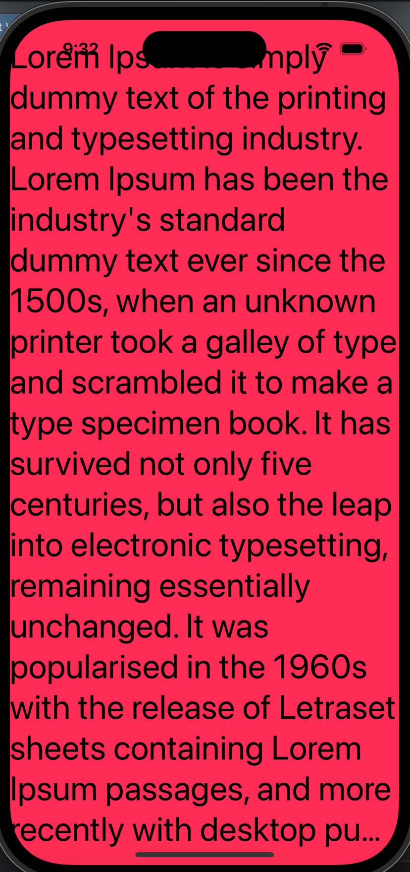
注:尽量不要直接在 ZStack 上使用 ignoresSafeArea,这样屏幕文字都会被安全区覆盖。
ZStack {
    Color.pink
    Text("Lorem Ipsum is simply dummy text of the printing and typesetting industry. Lorem Ipsum has been the industry's standard dummy text ever since the 1500s, when an unknown printer took a galley of type and scrambled it to make a type specimen book. It has survived not only five centuries, but also the leap into electronic typesetting, remaining essentially unchanged. It was popularised in the 1960s with the release of Letraset sheets containing Lorem Ipsum passages, and more recently with desktop publishing software like Aldus PageMaker including versions of Lorem Ipsum.")
        .font(.largeTitle)
}
.ignoresSafeArea()
效果:
③ 使用 overlay
Color.pink
    .ignoresSafeArea()
    .overlay(
        VStack {
            Text("Hello, SwiftUI!")
                .font(.largeTitle)
                .bold()
            Button("Getting Started") {}
        }
    )
    .accentColor(Color.black)
2.6 裁剪
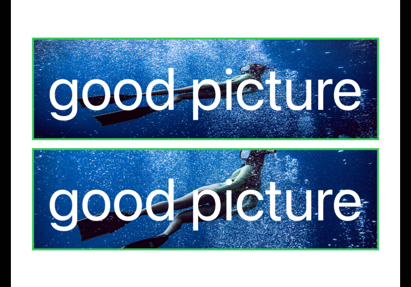
1、背景图片剪切 clipped
VStack {
    Text("good picture")
        .font(.system(size: 60))
        .foregroundColor(.white)
        .padding()
        .border(Color.green, width: 2)
        .background(
            // 图片被拉伸至文字大小
            Image("sea").resizable()
        )

    // background + aspectFill + clipped
    Text("good picture")
        .font(.system(size: 60))
        .foregroundColor(.white)
        .padding()
        .border(Color.green, width: 2)
        .background(
            // .fit 图片尽可能小,且不改变原图比例
            // .fill 图片尽可能大,但不改变原图比例
            Image("sea").resizable().aspectRatio(contentMode: .fill)
        )
        // 搭配 .clipped,将背景图超出部分进行裁剪
        .clipped()
}
效果:
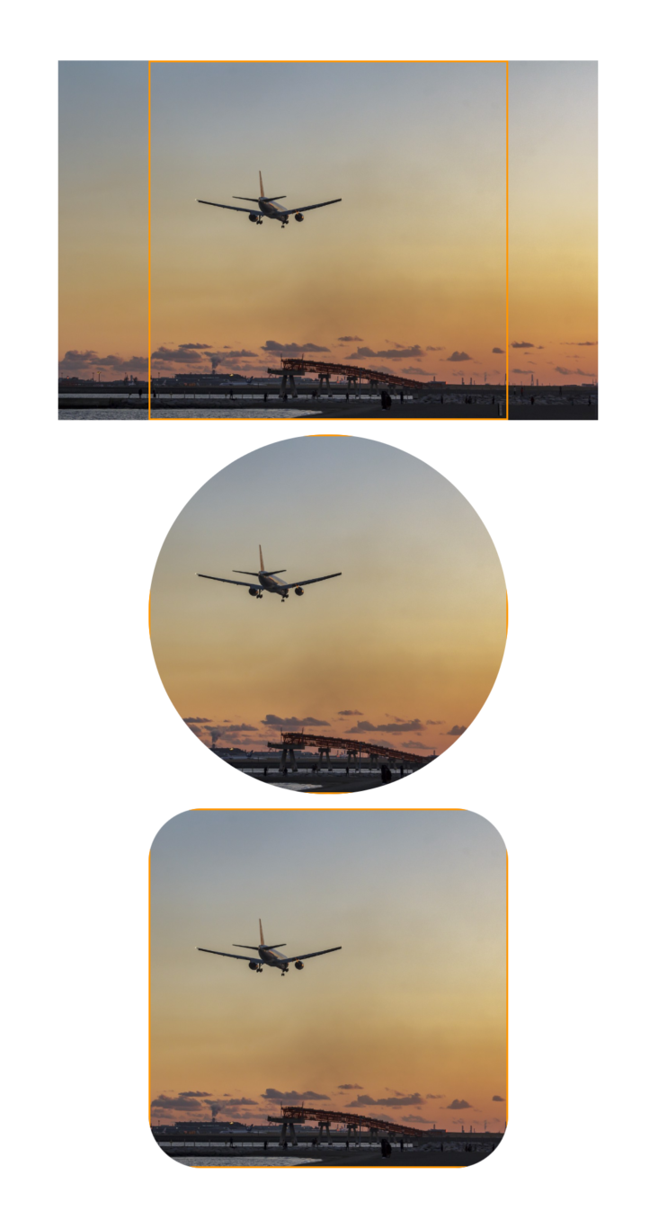
2、头像裁剪
// frame + scaledToFill + clipShape

VStack {
    Image("airplane")
        .resizable()
        .scaledToFill()
        .frame(width: 200, height: 200)
        .border(.orange)

    Image("airplane")
        .resizable()
        .scaledToFill()
        .frame(width: 200, height: 200)
        .border(.orange)
        .clipShape(Circle())

    Image("airplane")
        .resizable()
        .scaledToFill()
        .frame(width: 200, height: 200)
        .border(.orange)
        .clipShape(RoundedRectangle(cornerRadius: 30))
}
效果:
3、自定义形状
// 左上是原点

struct NFTShape: Shape {
    func path(in rect: CGRect) -> Path {
        Path { path in
            // 1
            // let width: CGFloat = 200
            // let height: CGFloat = 200
            let width: CGFloat = rect.width
            let height: CGFloat = rect.height

            path.move(
                to: CGPoint(
                    x: 0.2 * width,
                    y: 0 * height
                )
            )

            path.addLine(
                to: CGPoint(
                    x: 0.8 * width,
                    y: 0 * height
                )
            )

            path.addLine(
                to: CGPoint(
                    x: 1 * width,
                    y: 0.5 * height
                )
            )

            path.addLine(
                to: CGPoint(
                    x: 0.8 * width,
                    y: 1 * height
                )
            )

            path.addLine(
                to: CGPoint(
                    x: 0.2 * width,
                    y: 1 * height
                )
            )

            path.addLine(
                to: CGPoint(
                    x: 0 * width,
                    y: 0.5 * height
                )
            )

            path.closeSubpath()
        }
    }
}

// 构建 AvatarView 组件
struct AvatarView: View {
    let name: String
    var body: some View {
        Image(name)
            .resizable()
            .scaledToFill()
            .frame(width: 200, height: 200)
//            .clipShape(Circle())
            .clipShape(NFTShape())
    }
}

AvatarView(name: "avatar")
2.7 标题栏与工具栏
NavigationView {
    RecipeListView(selection: $selection, selectedSidebarItem: selectedSidebarItem)
    //导航标题
        .navigationTitle(selectedSidebarItem.title)
.navigationTitle("Navigation Title")
//导航工具栏主题,iOS 16 可用
//.toolbarColorScheme(.dark, for: .navigationBar)
//设置工具栏背景透明
//.toolbarBackground(.hidden, for: .navigationBar)
//设置工具栏背景色
.toolbarBackground(.pink, for: .navigationBar)
//主题色
.preferredColorScheme(.light)
//标题行内联
.navigationBarTitleDisplayMode(.inline)
//隐藏导航栏
//.navigationBarHidden(true)
//隐藏返回按钮
//.navigationBarBackButtonHidden(true)
    //工具栏
        .toolbar {
            ToolbarItem(placement: .primaryAction) {
                Button(isEditing ? "Done" : "Edit") {
                    withAnimation { isEditing.toggle() }
                }
            }
            ToolbarItem(placement: .navigationBarTrailing) {
                Button {
                    isAddingSymbol = true
                } label: {
                    Image(systemName: "plus")
                }
                .disabled(isEditing)
            }
        }
}
2.71 菜单路由跳转
NavigationStack {
    VStack {
        Text("立即启动")
            .foregroundColor(.accentColor)
            .font(.largeTitle)
    }
    .toolbar {
        ToolbarItemGroup(placement: .navigationBarTrailing) {
            Menu {
                NavigationLink {
                    NodesView()
                } label: {
                    Label("节点", systemImage: "server.rack")
                }
                NavigationLink {
                    SettingsView()
                } label: {
                    Label("设置", systemImage: "gearshape.fill")
                }
                Divider()
                Button {
                    print("check update")
                } label: {
                    Label("检查更新", systemImage: "arrow.up.circle")
                }

            } label: {
                Label("主菜单", systemImage: "ellipsis")
                    .labelStyle(.iconOnly)
                    .padding(.horizontal, 12)
                    .padding(.vertical, 20)
                    .background(
                        RoundedRectangle(cornerRadius: 12)
                            .fill(Color(.quaternarySystemFill))
                    )
            }
        }
    }
}
2.8 底部 TabView
展示 badge
struct ContentView: View {

    @State var unreadNotifications: Int = 111

    var badgeValue: String? {
        if unreadNotifications > 99 {
            return "99+"
        } else if unreadNotifications == 0 {
            return nil

        } else {
            return unreadNotifications.description
        }
    }

    var body: some View {
        TabView {
            Group {
                Text("Home")
                    .tabItem {
                        Label("Home", systemImage: "house")
                    }
                Text("Search")
                    .tabItem {
                        Label("Search", systemImage: "magnifyingglass")
                    }
                Text("Notification")
                    .tabItem {
                        Label("Notification", systemImage: "bell")
                    }
                    .badge(badgeValue)
                Text("Settings")
                    .tabItem {
                        Label("Settings", systemImage: "gearshape")
                    }
            }
        }
    }
}
2.9 事件
点击 onTapGesture
Image(systemName: "star")
    .symbolVariant(value <= rating ? .fill : .none)
    .foregroundColor(.accentColor)
    .onTapGesture {
        if value != rating {
            rating = value
        } else {
            rating = 0
        }
    }
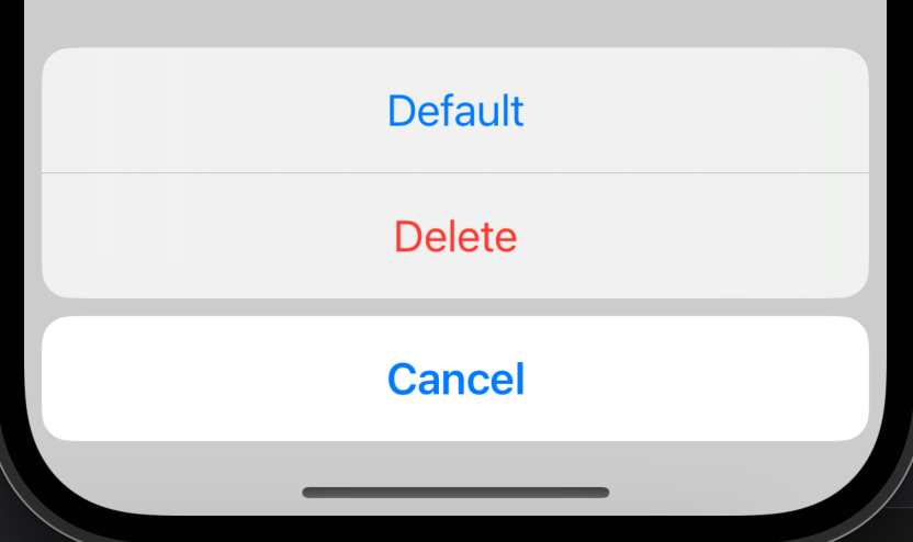
滑动 swipeActions
List {
    Text("Item 1")
        .swipeActions {
            Button("Default", action: {})
            Button("Delete", role: .destructive, action: {})
        }
}
2.10 弹出层
确认框 .confirmationDialog
VStack {
    Button("Bottom Sheet") {
        isPresented = true
    }
    .buttonStyle(.borderedProminent)
}
.confirmationDialog("Confirmation Dialog", isPresented: $isPresented, actions: {
    Button("Default", action: {})
    Button("Cancel", role: .cancel, action: {})
    Button("Delete", role: .destructive, action: {})
})
效果:
底部弹出层 .sheet
struct ContentView: View {
    @State var presentSheet = false

    var body: some View {
        NavigationView {
            Button("Modal") {
                presentSheet = true
            }
            .navigationTitle("Main")
        }.sheet(isPresented: $presentSheet) {
            Text("Detail")
//                三种方式设置止动距离
//                .presentationDetents([.height(50)])
//                .presentationDetents([.fraction(0.1)])
                .presentationDetents([.medium, .large])
//             隐藏拖拉指示器
//                .presentationDragIndicator(.hidden)
        }
    }
}
3 动画
3.1 飞行动画
Group {
    if isExpanded {
        VStack {
            RoundedRectangle(cornerRadius: 10)
                .foregroundColor(Color.pink)
                .frame(width: 60, height: 60)
                .matchedGeometryEffect(id: "rect", in: namespace)
            Text("Hello SwiftUI!").fontWeight(.semibold)
                .matchedGeometryEffect(id: "text", in: namespace)
        }
    } else {
        HStack {
            Text("Hello SwiftUI!").fontWeight(.semibold)
                .matchedGeometryEffect(id: "text", in: namespace)
            RoundedRectangle(cornerRadius: 10)
                .foregroundColor(Color.pink)
                .frame(width: 60, height: 60)
                .matchedGeometryEffect(id: "rect", in: namespace)
        }
    }
}.onTapGesture {
    withAnimation {
        isExpanded.toggle()
    }
}
效果:
5 机制
5.1 遍历
ForEach(information.foods, id: \.self) {food in
    Text(food)
}
通过索引遍历
struct ContentView: View {
    let positions = ["First", "Second", "Third"]

    var body: some View {
        ForEach(0..<positions.count) { index in
            Text(positions[index])
        }
    }
}
5.2 条件渲染
//不渲染
HStack {
    Image(systemName: "train.side.rear.car")
    if longerTrain {
        Image(systemName: "train.side.middle.car")
    }
    Image(systemName: "train.side.front.car")
}
//隐藏
Image(systemName: "train.side.middle.car")
    .opacity(longerTrain ? 1 : 0)
5.3 动态尺寸
struct ContentView: View {
    // 辅助模式字体放大的情况, margin, padding, or anything around text 默认不会放大,
    // @ScaledMetric,则会将这些原本不变的尺寸随着字体同比例进行放大
    @ScaledMetric(relativeTo: .body) var scaledPadding: CGFloat = 20

    var body: some View {
        VStack {
            Color.red
                .padding(scaledPadding)

            Color.red
                .padding(20)
        }
    }
}
5.4 调整器的复用
struct FontStyle: ViewModifier {
    var size: CGFloat
    func body(content: Content) -> some View {
        content
            .font(.system(size: size, weight: .medium, design: .rounded))
            .foregroundColor(.brown)
    }
}

struct ContentView: View {
    var body: some View {
        VStack {
            Text("Hello")
                .modifier(FontStyle(size: 50))
        }
    }
}
5.5 @Environment 注解
参考 https://developer.apple.com/documentation/swiftui/environmentvalues
5.6 格式化
日期
Date().formatted()
// 6/28/2021, 1:38 PM

Date().formatted(date: .long, time: .omitted)
// June 28, 2021

Date().formatted(.dateTime.year())
// Jun 2021
数字、货币
0.2.formatted()
// 0.2

0.2.formatted(.number.precision(.significantDigits(2)))
// 0.20

1.5.formatted(.currency(code: "thb"))
// THB 1.50
List
["Alice", "Bob", "Trudy"].formatted()
// Alice, Bob, and Trudy

["Alice", "Bob", "Trudy"].formatted(.list(type: .or))
// Alice, Bob, or Trudy
5.7 布局组件 Layout
// 自定义布局容器组件
struct BackslashStack: Layout {
    func sizeThatFits(proposal: ProposedViewSize, subviews: Subviews, cache: inout ()) -> CGSize {
        // 来自父组件的约束
        print("proposal.width \(proposal.width)")

        let subviewSizes: [CGSize] = subviews.map { proxy in
            proxy.sizeThatFits(.unspecified)
        }

        let combinedSize: CGSize = subviewSizes.reduce(.zero) { currentSize, subviewSize in
            // 长为子组件的长之和,宽为子组件的宽之和
            CGSize(
                width: currentSize.width + subviewSize.width,
                height: currentSize.height + subviewSize.height)
        }
        // 当前组件的固有size
        print("combinedSize.width \(combinedSize.width)")
        return combinedSize
    }

    func placeSubviews(in bounds: CGRect, proposal: ProposedViewSize, subviews: Subviews, cache: inout ()) {
        let subviewSizes = subviews.map { proxy in
            proxy.sizeThatFits(.unspecified)
        }

        // 当前组件的固有区域尺寸
        print("bounds.width \(bounds.width)")

        // 当前组件固有区域的左上坐标
        var x = bounds.minX
        var y = bounds.minY

        for index in subviews.indices {
            let subviewSize = subviewSizes[index]
            let sizeProposal = ProposedViewSize(
                width: subviewSize.width,
                height: subviewSize.height)

            // 设定子组件偏移量与约束
            subviews[index]
                .place(
                    // 子组件的偏移量
                    at: CGPoint(x: x, y: y),
                    // 原点坐标:左上
                    anchor: .topLeading,
                    // 约束
                    proposal: sizeProposal)

            x += subviewSize.width
            y += subviewSize.height
        }
    }
}

struct ContentView: View {
    var body: some View {
        BackslashStack {
            Text("1")
                .frame(width: 50)
                .border(.yellow)
            Text("2")
                .frame(width: 100)
                .border(.blue)
            Text("3")
                .frame(width: 200)
                .border(.green)
        }
//        .frame(width: 80, height: 80)
        .border(.pink)
        .font(.title)
    }
}
效果:

 浙公网安备 33010602011771号