flutter 常见组件的特殊用法 —— SliverAppBar
SliverAppBar 的滚动布局
特殊属性说明
primary: true
不同于 AppBar 通常有 Scaffold 包裹,其最大高度由父类约束。SliverAppBar 完全由自身决定。
当 primary 等于 true 时,其 topPadding 等于状态栏高度;若为 false,则 topPadding 等于 0,并且整体高度也会缩小(减去状态栏高度)。
collapsedHeight
最小高度由3部分组成:状态栏高度(47) + 传入的 collapsedHeight 高度 + 底栏高度(48)。
当 collapsedHeight 为空时,默认等于工具栏高度(56),除非当前配置为 固定、悬浮并且底栏不为空,则默认等于 0。
相关源码:
final double collapsedHeight = (widget.pinned && widget.floating && widget.bottom != null)
    ? (widget.collapsedHeight ?? 0.0) + bottomHeight + topPadding
    : (widget.collapsedHeight ?? widget.toolbarHeight) + bottomHeight + topPadding;

//...

@override
double get minExtent => collapsedHeight;
expandedHeight
最大高度,其值最小为 collapsedHeight,否则等于 状态栏高度 + 传入的 expandedHeight 高度。
当 expandedHeight 为空时,expandedHeight 默认等于 toolbarHeight 工具栏高度 + _bottomHeight 底栏高度。
相关源码:
  @override
  double get maxExtent => math.max(topPadding + (expandedHeight ?? (toolbarHeight ?? kToolbarHeight) + _bottomHeight), minExtent);
SliverAppBar 源码分析
@override
Widget build(BuildContext context) {
  assert(!widget.primary || debugCheckHasMediaQuery(context));
  final double bottomHeight = widget.bottom?.preferredSize.height ?? 0.0;
  // 若 primary 属性为 false,则 topPadding 等于 0,且整体高度缩小。
  // 注:跟 AppBar 不同,AppBar 外层由 Scaffold 包裹,其最大高度没有改变,只是整体向上移了。
  final double topPadding = widget.primary ? MediaQuery.of(context).padding.top : 0.0;
  // 最小高度 minExtent = 状态栏高度 + 传入的 collapsedHeight 高度 + 底栏高度
  final double collapsedHeight = (widget.pinned && widget.floating && widget.bottom != null)
      ? (widget.collapsedHeight ?? 0.0) + bottomHeight + topPadding
      : (widget.collapsedHeight ?? widget.toolbarHeight) + bottomHeight + topPadding;

  return MediaQuery.removePadding(
    context: context,
    removeBottom: true,
    // SliverPersistentHeader 用于实现固定、悬浮等效果
    child: SliverPersistentHeader(
      floating: widget.floating,
      pinned: widget.pinned,
      delegate: _SliverAppBarDelegate(
        vsync: this,
        leading: widget.leading,
        automaticallyImplyLeading: widget.automaticallyImplyLeading,
        title: widget.title,
        actions: widget.actions,
        flexibleSpace: widget.flexibleSpace,
        bottom: widget.bottom,
        elevation: widget.elevation,
        scrolledUnderElevation: widget.scrolledUnderElevation,
        shadowColor: widget.shadowColor,
        surfaceTintColor: widget.surfaceTintColor,
        forceElevated: widget.forceElevated,
        backgroundColor: widget.backgroundColor,
        foregroundColor: widget.foregroundColor,
        brightness: widget.brightness,
        iconTheme: widget.iconTheme,
        actionsIconTheme: widget.actionsIconTheme,
        textTheme: widget.textTheme,
        primary: widget.primary,
        centerTitle: widget.centerTitle,
        excludeHeaderSemantics: widget.excludeHeaderSemantics,
        titleSpacing: widget.titleSpacing,
        expandedHeight: widget.expandedHeight,
        collapsedHeight: collapsedHeight,
        topPadding: topPadding,
        floating: widget.floating,
        pinned: widget.pinned,
        shape: widget.shape,
        snapConfiguration: _snapConfiguration,
        stretchConfiguration: _stretchConfiguration,
        showOnScreenConfiguration: _showOnScreenConfiguration,
        toolbarHeight: widget.toolbarHeight,
        leadingWidth: widget.leadingWidth,
        backwardsCompatibility: widget.backwardsCompatibility,
        toolbarTextStyle: widget.toolbarTextStyle,
        titleTextStyle: widget.titleTextStyle,
        systemOverlayStyle: widget.systemOverlayStyle,
      ),
    ),
  );
}
_SliverAppBarDelegate 源码
@override
Widget build(BuildContext context, double shrinkOffset, bool overlapsContent) {
  // shrinkOffset = math.min(scrollOffset, maxExtent)
  // (注:scrollOffset 属性表示滚动滑出Viewport边界的距离,未到达顶部之前都是 0。)
  // 通常来说,完全展开时为 0;完全缩小时等于 kToolBarHeight,亦即导航栏向上滑出的距离。
  final double visibleMainHeight = maxExtent - shrinkOffset - topPadding;
  final double extraToolbarHeight = math.max(minExtent - _bottomHeight - topPadding - (toolbarHeight ?? kToolbarHeight), 0.0);
  // visibleToolbarHeight 工具栏显示出来的高度,当工具栏恰好隐藏的时候为 0. 可
  // 以简单理解为 currentExtent - bottomHeight
  final double visibleToolbarHeight = visibleMainHeight - _bottomHeight - extraToolbarHeight;

  final bool isScrolledUnder = overlapsContent || (pinned && shrinkOffset > maxExtent - minExtent);
  // isPinnedWithOpacityFade 满足条件:导航处于固定悬浮状态,即之前提到的工具栏向上滚动时会隐藏
  final bool isPinnedWithOpacityFade = pinned && floating && bottom != null && extraToolbarHeight == 0.0;
  // 文字的透明度:
  // 注意从隐藏到显示出来的过程是由完全透明(0)到不透明(1)(具体效果是白色由浅到深)。
  // 其余情况一律不透明。
  final double toolbarOpacity = !pinned || isPinnedWithOpacityFade
      ? (visibleToolbarHeight / (toolbarHeight ?? kToolbarHeight)).clamp(0.0, 1.0)
      : 1.0;

  final Widget appBar = FlexibleSpaceBar.createSettings(
    minExtent: minExtent,
    maxExtent: maxExtent,
    //当前滚动的高度(最大是 expandedHeight,即 SliverAppBar 完全展开时)
    currentExtent: math.max(minExtent, maxExtent - shrinkOffset),
    toolbarOpacity: toolbarOpacity,
    isScrolledUnder: isScrolledUnder,
    child: AppBar(
      leading: leading,
      automaticallyImplyLeading: automaticallyImplyLeading,
      title: title,
      actions: actions,
      flexibleSpace: (title == null && flexibleSpace != null && !excludeHeaderSemantics)
          ? Semantics(
        header: true,
        child: flexibleSpace,
      )
          : flexibleSpace,
      bottom: bottom,
      elevation: forceElevated || isScrolledUnder ? elevation : 0.0,
      scrolledUnderElevation: scrolledUnderElevation,
      shadowColor: shadowColor,
      surfaceTintColor: surfaceTintColor,
      backgroundColor: backgroundColor,
      foregroundColor: foregroundColor,
      brightness: brightness,
      iconTheme: iconTheme,
      actionsIconTheme: actionsIconTheme,
      textTheme: textTheme,
      primary: primary,
      centerTitle: centerTitle,
      excludeHeaderSemantics: excludeHeaderSemantics,
      titleSpacing: titleSpacing,
      shape: shape,
      toolbarOpacity: toolbarOpacity,
      bottomOpacity: pinned ? 1.0 : ((visibleMainHeight / _bottomHeight).clamp(0.0, 1.0)),
      toolbarHeight: toolbarHeight,
      leadingWidth: leadingWidth,
      backwardsCompatibility: backwardsCompatibility,
      toolbarTextStyle: toolbarTextStyle,
      titleTextStyle: titleTextStyle,
      systemOverlayStyle: systemOverlayStyle,
    ),
  );
  // 返回值是 AppBar
  return appBar;
}
总结:SliverAppBar 的本质是 SliverPersistentHeader,其 delegate 是 _SliverAppBarDelegate,它的 build 方法返回值为 AppBar。
SliverAppBar 效果实现 —— 工具栏自动隐藏、底栏固定
1、当 floating 等于 true 时,并且 pinned 也等于 true,且 bottom 不为空时,并且 collapsedHeight 为空,则向上滚动时会隐藏工具栏,向下滚动会显示工具栏。
说明:SliverAppBar 的滚动分两部分,一是内部滚动,二是外部滚动。
① 内部滚动主要发生在 collapsedHeight 与 expandedHeight 高度不一致时。比如当前这个场景,collapsedHeight = topPadding + 0 + bottomHeight,而 expandedHeight 等于 topPadding + toolbarHeight + bottomHeight,这样向上滚动时就会隐藏 工具栏。
② 外部滚动发生在当 pinned 属性为 false 时,当前面说的内部滚动结束后,整个 appBar 会随着 body 的滚动产生外部滚动,不断往上滚动后会隐藏整个导航栏。
另注:工具栏在向下滚动时逐渐显示工具栏的过程中,文字透明度也由透明转向完全不透明(白色由浅到深)。
效果:
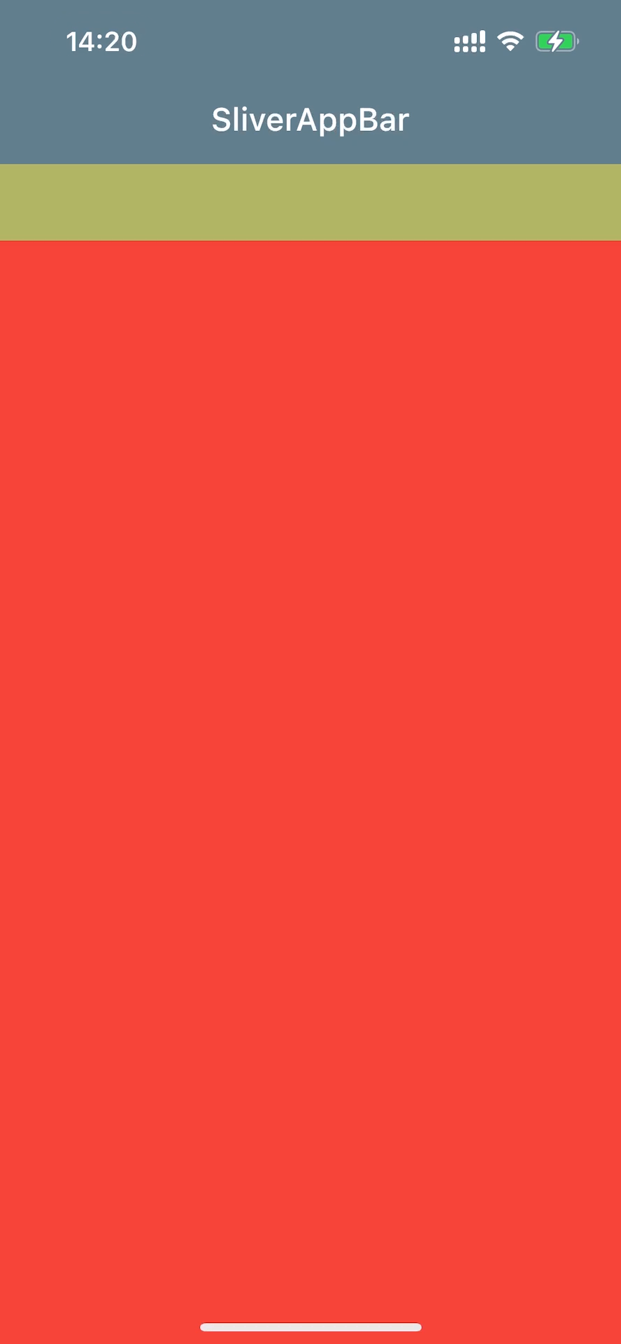
相关代码:
class SliverAppBarFloatPage extends StatefulWidget {
  const SliverAppBarFloatPage({Key? key}) : super(key: key);

  @override
  State<SliverAppBarFloatPage> createState() => _SliverAppBarFloatPageState();
}

class _SliverAppBarFloatPageState extends State<SliverAppBarFloatPage> {
  @override
  Widget build(BuildContext context) {
    var mediaQuery = MediaQuery.of(context);
    return Scaffold(
      backgroundColor: Colors.blueGrey,
      // 创建一个公共的 Scrollable 和 Viewport
      body: CustomScrollView(
        slivers: [
          SliverAppBar(
            backgroundColor: Colors.transparent,
            title: Text("SliverAppBar"),
            pinned: true,
            floating: true,
            bottom: PreferredSize(
              preferredSize: Size.fromHeight(kTextTabBarHeight),
              child: Container(height: kTextTabBarHeight, color: Colors.yellow.withOpacity(0.5),),
            ),
          ),
          SliverList(
            delegate: SliverChildListDelegate([
              Container(
                color: Colors.red,
                height: 1100,
              )
            ]),
          ),
        ],
      ),
    );
  }
}
2、floating 等于 true 还有一个作用,就是当 snap 等于 true 时,在滚动时会触发一个自动完成工具栏滚动/隐藏的动画效果。具体原理有时间再分析。
示例2:
避免下方列表的滚动区间随外部滚动偏移到最上方,使用 NestedScrollView 进行联结
class NestedTabViewPage extends StatelessWidget {
  const NestedTabViewPage({Key? key}) : super(key: key);

  @override
  Widget build(BuildContext context) {
    final tabs = <String>['猜你喜欢', '今日特价', '发现更多'];
    return DefaultTabController(
      length: tabs.length, // This is the number of tabs.
      child: Scaffold(
        body: NestedScrollView(
          headerSliverBuilder: (BuildContext context, bool innerBoxIsScrolled) {
            return <Widget>[
              SliverOverlapAbsorber(
                handle: NestedScrollView.sliverOverlapAbsorberHandleFor(context),
                sliver: SliverAppBar(
                  title: const Text('商城'),
                  forceElevated: innerBoxIsScrolled,
                  floating: true,
                  snap: true,
                  pinned: true,
                  bottom: TabBar(
                    tabs: tabs.map((String name) => Tab(text: name)).toList(),
                  ),
                ),
              )
            ];
          },
          body: TabBarView(
            children: tabs.map((String name) {
              return Builder(
                builder: (BuildContext context) {
                  return CustomScrollView(
                    key: PageStorageKey<String>(name),
                    slivers: <Widget>[
                      SliverOverlapInjector(
                        handle: NestedScrollView.sliverOverlapAbsorberHandleFor(context),
                      ),
                      SliverPadding(
                        padding: const EdgeInsets.all(8.0),
                        sliver: SliverFixedExtentList(
                          itemExtent: 50,
                          delegate: SliverChildBuilderDelegate(
                            (context, index) {
                              return ListTile(title: Text('$index'));
                            },
                            childCount: 25,
                          ),
                        ),
                      ),
                    ],
                  );
                },
              );
            }).toList(),
          ),
        ),
      ),
    );
  }
}
SliverAppBar 效果实现 —— 背景层 FlexibleSpaceBar 滚动动画
特殊属性说明
collapseMode
导航栏正常收缩时背景的动画效果
enum CollapseMode {
  /// 默认效果,视差,收缩时背景缓慢地向上滚动
  parallax,

  /// 直接滚动
  pin,

  /// 背景固定不动
  none,
}
stretchModes
导航栏向下正常滚动(内部滚动)结束后,也会发生外部滚动,如果 SliverAppBar.stretch 等于 true,那么这个外部滚动是整个页面(包括导航栏)一起滚动(类似 于 extendBodyBehindAppBar 增加 body 内部的 sliverPadding)。并且 ScrollViewport 组件的 physics 效果为 BouncingScrollPhysics,这会进一步拉伸页面。此时会触发 FlexibleSpaceBar 容器放大导致的背景图片变化的一个动画效果。
enum StretchMode {
  /// 默认效果,放大图片(如果背景宽度已经铺满了,则不会再放大)
  zoomBackground,

  /// 模糊背景
  blurBackground,

  /// 淡化 title
  fadeTitle,
}
效果:
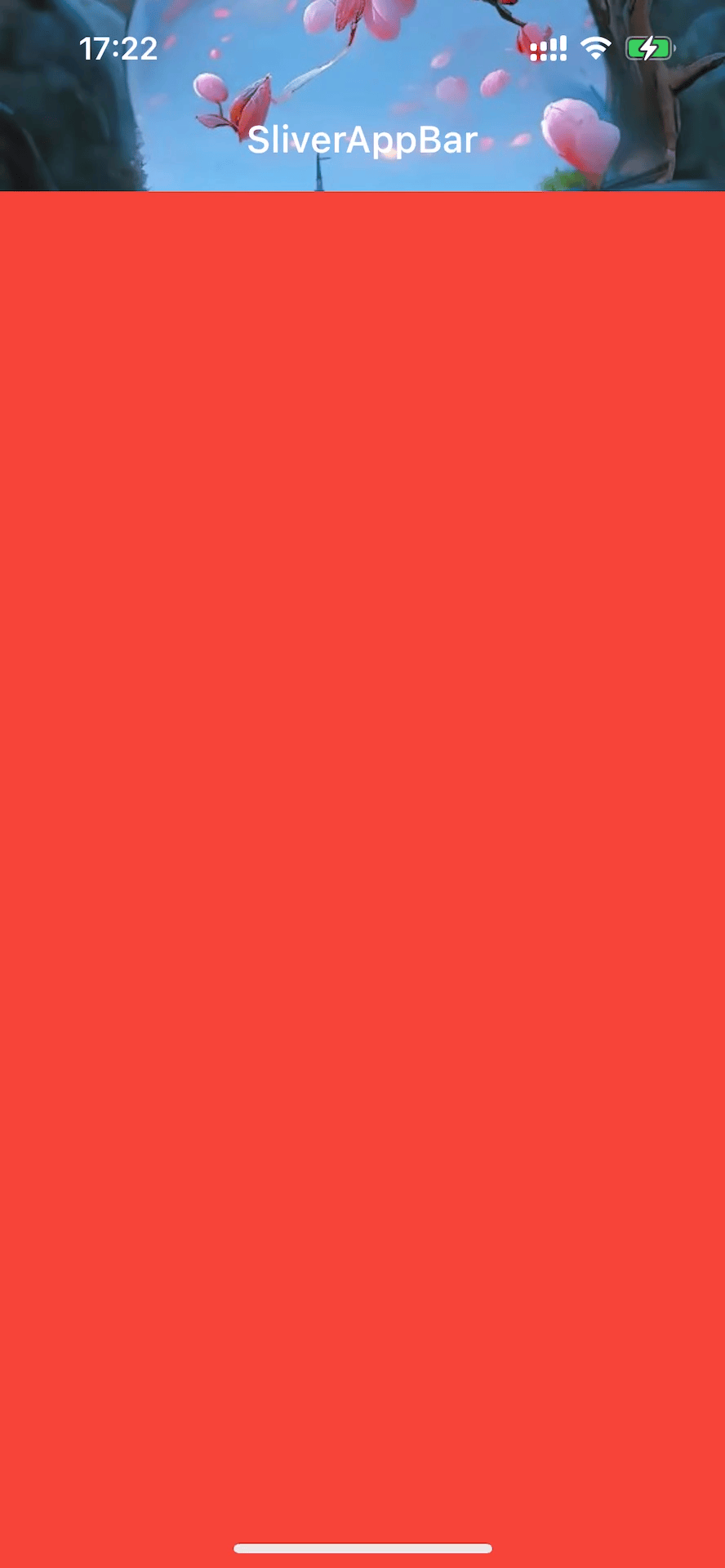
相关代码:
class SliverAppBarStretchPage extends StatefulWidget {
  const SliverAppBarStretchPage({Key? key}) : super(key: key);

  @override
  State<SliverAppBarStretchPage> createState() => _SliverAppBarStretchPageState();
}

class _SliverAppBarStretchPageState extends State<SliverAppBarStretchPage> {
  @override
  Widget build(BuildContext context) {
    return Scaffold(
      backgroundColor: Colors.blueGrey,
      // 创建一个公共的 Scrollable 和 Viewport
      body: CustomScrollView(
        // 弹性效果(在滚动到尽头时仍可继续滚动)
        physics: BouncingScrollPhysics(),
        slivers: [
          SliverAppBar(
            backgroundColor: Colors.transparent,
            title: Text("SliverAppBar"),
            // 让 FlexibleSpaceBar 与外部组件同步滚动(在内部滚动结束后)
            stretch: true,
            flexibleSpace: FlexibleSpaceBar(
                collapseMode: CollapseMode.pin,
                stretchModes: const <StretchMode>[StretchMode.zoomBackground],
                background: Image.network(
                  "https://r11.realme.net/CN/thread/1555770224727732224.jpg",
                  //默认是 fit: BoxFit.contain,在容器宽高比背景图片的宽高都大时
                  //(比如原始图片比较小),不再放大。可以设置为其它效果,让其放大
                  fit: BoxFit.fitWidth,
                )),
          ),
          SliverList(
            delegate: SliverChildListDelegate([
              Container(
                color: Colors.red,
                height: 1100,
              )
            ]),
          ),
        ],
      ),
    );
  }
}
FlexibleSpaceBar 源码分析
flexibleSpace 不为空的 AppBar 是一个 Stack 布局,appBar 本身在上层, flexibleSpace 在底层。同时,SliverAppBar.backgroundColor 位于 Stack 的父组件,实际上是处于最底层。
简单看下 FlexibleSpaceBar 的源码:
class _FlexibleSpaceBarState extends State<FlexibleSpaceBar> {

  //标题是否居中(ios/macos 居中)
  bool _getEffectiveCenterTitle(ThemeData theme) {
    if (widget.centerTitle != null)
      return widget.centerTitle!;
    assert(theme.platform != null);
    switch (theme.platform) {
      case TargetPlatform.android:
      case TargetPlatform.fuchsia:
      case TargetPlatform.linux:
      case TargetPlatform.windows:
        return false;
      case TargetPlatform.iOS:
      case TargetPlatform.macOS:
        return true;
    }
  }

  //标题布局
  Alignment _getTitleAlignment(bool effectiveCenterTitle) {
    if (effectiveCenterTitle)
      //底部居中
      return Alignment.bottomCenter;
    final TextDirection textDirection = Directionality.of(context);
    assert(textDirection != null);
    switch (textDirection) {
      case TextDirection.rtl:
        //底部居右
        return Alignment.bottomRight;
      case TextDirection.ltr:
        //底部居左
        return Alignment.bottomLeft;
    }
  }

  //背景缩放模式
  double _getCollapsePadding(double t, FlexibleSpaceBarSettings settings) {
    switch (widget.collapseMode) {
      case CollapseMode.pin:
        return -(settings.maxExtent - settings.currentExtent);
      case CollapseMode.none:
        return 0.0;
      case CollapseMode.parallax:
        final double deltaExtent = settings.maxExtent - settings.minExtent;
        return -Tween<double>(begin: 0.0, end: deltaExtent / 4.0).transform(t);
    }
  }

  @override
  Widget build(BuildContext context) {
    return LayoutBuilder(
      builder: (BuildContext context, BoxConstraints constraints) {
        final FlexibleSpaceBarSettings settings = context.dependOnInheritedWidgetOfExactType<FlexibleSpaceBarSettings>()!;
        assert(
        settings != null,
        'A FlexibleSpaceBar must be wrapped in the widget returned by FlexibleSpaceBar.createSettings().',
        );

        final List<Widget> children = <Widget>[];

        final double deltaExtent = settings.maxExtent - settings.minExtent;

        // 0.0 -> Expanded
        // 1.0 -> Collapsed to toolbar
        // 向下滚动 t 逐渐变成 0
        final double t = (1.0 - (settings.currentExtent - settings.minExtent) / deltaExtent).clamp(0.0, 1.0);

        // 一、background 背景组件部分
        if (widget.background != null) {
          final double fadeStart = math.max(0.0, 1.0 - kToolbarHeight / deltaExtent);
          const double fadeEnd = 1.0;
          assert(fadeStart <= fadeEnd);
          // If the min and max extent are the same, the app bar cannot collapse
          // and the content should be visible, so opacity = 1.
          //背景透明:在最大高度与最小高度不相等的情况下,随着向下滚动, t 逐渐变为 0,同时 opacity 由 透明转向不透明。
          final double opacity = settings.maxExtent == settings.minExtent
              ? 1.0
              : 1.0 - Interval(fadeStart, fadeEnd).transform(t);
          double height = settings.maxExtent;

          // StretchMode.zoomBackground
          //背景缩放效果:zoomBackground
          if (widget.stretchModes.contains(StretchMode.zoomBackground) &&
              constraints.maxHeight > height) {
            height = constraints.maxHeight;
          }

          //① 添加背景组件
          children.add(Positioned(
            // 背景滚动效果:collapseMode:pin, none, parallax
            top: _getCollapsePadding(t, settings),
            left: 0.0,
            right: 0.0,
            height: height,
            child: Opacity(
              // IOS is relying on this semantics node to correctly traverse
              // through the app bar when it is collapsed.
              alwaysIncludeSemantics: true,
              opacity: opacity,
              child: widget.background,
            ),
          ));

          // StretchMode.blurBackground
          if (widget.stretchModes.contains(StretchMode.blurBackground) &&
              constraints.maxHeight > settings.maxExtent) {
            final double blurAmount = (constraints.maxHeight - settings.maxExtent) / 10;
            //② 添加模糊效果组件
            children.add(Positioned.fill(
              child: BackdropFilter(
                filter: ui.ImageFilter.blur(
                  sigmaX: blurAmount,
                  sigmaY: blurAmount,
                ),
                child: Container(
                  color: Colors.transparent,
                ),
              ),
            ));
          }
        }

        // 二、title 标题组件部分
        if (widget.title != null) {
          final ThemeData theme = Theme.of(context);

          Widget? title;
          switch (theme.platform) {
            case TargetPlatform.iOS:
            case TargetPlatform.macOS:
              title = widget.title;
              break;
            case TargetPlatform.android:
            case TargetPlatform.fuchsia:
            case TargetPlatform.linux:
            case TargetPlatform.windows:
              title = Semantics(
                namesRoute: true,
                child: widget.title,
              );
              break;
          }

          //标题透明过渡效果
          // StretchMode.fadeTitle
          if (widget.stretchModes.contains(StretchMode.fadeTitle) &&
              constraints.maxHeight > settings.maxExtent) {
            final double stretchOpacity = 1 -
                (((constraints.maxHeight - settings.maxExtent) / 100).clamp(0.0, 1.0));
            title = Opacity(
              opacity: stretchOpacity,
              child: title,
            );
          }

          //标题颜色透明度
          final double opacity = settings.toolbarOpacity;
          if (opacity > 0.0) {
            TextStyle titleStyle = theme.primaryTextTheme.headline6!;
            titleStyle = titleStyle.copyWith(
              color: titleStyle.color!.withOpacity(opacity),
            );
            //标题居中
            final bool effectiveCenterTitle = _getEffectiveCenterTitle(theme);
            final EdgeInsetsGeometry padding = widget.titlePadding ??
                EdgeInsetsDirectional.only(
                  start: effectiveCenterTitle ? 0.0 : 72.0,
                  bottom: 16.0,
                );
            //标题缩放
            final double scaleValue = Tween<double>(begin: widget.expandedTitleScale, end: 1.0).transform(t);
            final Matrix4 scaleTransform = Matrix4.identity()
              ..scale(scaleValue, scaleValue, 1.0);
            final Alignment titleAlignment = _getTitleAlignment(effectiveCenterTitle);
            //③ 添加标题容器
            children.add(Container(
              padding: padding,
              child: Transform(
                alignment: titleAlignment,
                transform: scaleTransform,
                child: Align(
                  alignment: titleAlignment,
                  child: DefaultTextStyle(
                    style: titleStyle,
                    child: LayoutBuilder(
                      builder: (BuildContext context, BoxConstraints constraints) {
                        return Container(
                          width: constraints.maxWidth / scaleValue,
                          alignment: titleAlignment,
                          child: title,
                        );
                      },
                    ),
                  ),
                ),
              ),
            ));
          }
        }

        // 返回值也是一个 Stack 布局
        return ClipRect(child: Stack(children: children));
      },
    );
  }
}
增加 overlay 遮罩
有时间再写
233

 浙公网安备 33010602011771号