
从零搭建基于 react 17.x + antd 4.x 的业务组件库
一些废话
在前端的飞速发展下,这十年里,前端从美工切图仔演变成如今的大前端,在互联网时代中占据越来越重要的位置。前端工程化,模块化成为前端提效利器。越来越多公司也开始重视,开始搭建适用于公司内部,或者业务线内部的组件库。这篇文章将遵循 是什么 为什么 怎么做 来一起搭建业务组件库,或者太长不想看直接看代码
npm 包主页
【注意】这里用到的是react react-dom antd都是较新版本,如果你的项目还是老的版本不支持新版本的一些用法可能会出现报错,请酌情考虑升级项目或降级组件库依赖。
UI 组件库有哪些
常见的基于 react 的 antd 组件库,基于 vue 的 element ,这些都是前端在使用 react 或 vue 的时候首选的 UI 组件库,这类 UI 组件库是集成了大部分场景里通用的 UI 组件。
业务组件库是什么?
基于业务场景和设计规范抽出通用模块,来形成业务线的组件库,其实也类似于UI组件库,只不过是多了一层封装和自定义,更适合自己的业务场景。封装一些通用模块。
比如一个图片预览的组件,有单张图片预览和多张图片预览,这种组件逻辑上和业务不是强关联的,但是又是全站通用的,就很适合组装成业务组件,以后一旦遇到这种场景就直接拿来用就行。
为什么要搭建业务组件库?
一般来说,如果某条业务线下有多个前端项目,他们用的技术栈都是一致的,且设计规范一致,甚至有很多通用的组件,那么就需要在每个项目里都写组件,写起来重复,维护起来也麻烦,这个时候就需要抽出一些常见业务场景的通用组件,打包发布到 npm 上,这样每个项目里只需要通过npm包来引用,修改的时候只需要修改组件库内容,大大降低维护成本。
怎么搭建业务组件库?
1. 确定技术栈
看业务线的技术栈是什么,如果是 react+antd 或者是vue+element 或者其他,这些视实际情况而定。本次以 react+antd 为例,手把手一起从零到一搭建业务组件库。
好了技术栈定好了,作为一个优秀的前端配置工程师,接下来就是开启配置表演了😺
首先是 package.json 的配置,除了一些常规配置外,作为组件库,则需要配置打包文件输出地址
{
 "main": "./lib/index.js",
 "module": "./lib/index.js",
}
main 这个字段的值是你程序主入口。如果其他用户需要你的包,当用户调用require()方法时,返回的就是这个模块的导出(exports)
module 配置的是以模块化方式导出,也就是下面 rollup.config.js 文件里 es module 导出,便于 tree-shaking
相当于在一个包内同时发布了两种模块规范的版本
如果它已经支持 pkg.module 字段则会优先使用 ES6 模块规范的版本,这样可以启用 Tree Shaking 机制。
如果它还不识别 pkg.module 字段则会使用我们已经编译成 CommonJS 规范的版本,也不会阻碍打包流程。
2. 配置组件库文档
一个优秀的组件库一定少不了简洁且可读性高文档。
文档又一定要有代码和效果示例才算简单易用。很多根据注释生成文档的工具,这里用的是 react-styleguidist,vue 有 vue-styleguidist
其他还有很多例如 docz storybook 等,看自己怎样使用习惯啦。
react-styleguidist 的使用
首先安装支持文档库的模块,由于组件库是用ts写的所以还需要装react-docgen-typescript
yarn add react-docgen-typescript react-styleguidist --dev
or
npm i react-docgen-typescript react-styleguidist --save-dev
安装完成之后,就是配置了,在项目根目录下新建 styleguide.config.js
const path = require('path');
const packagePath = path.resolve(__dirname, 'package.json');
const packageFile = require(packagePath);

module.exports = {
  title: 'React 业务组件库',
  version: packageFile.version, // 同上 使用 package.json 的 version
  usageMode: 'expand', // 自动打开文档的缩放
  pagePerSection: true, // 是否每页一个组件显示
  styleguideDir: 'dist_docs', // 打包的目录
  components: 'components/**/*.tsx', // 写入对应目录的文档
  exampleMode: 'expand', // 表示示例代码是否展开或者合上文档中代码示例的标签初始化状态,决定是否展开
  webpackConfig: require('./webpack.config'),
  propsParser: require('react-docgen-typescript').withCustomConfig('./tsconfig.json').parse, // 用来支持 tsx
  verbose: true, // 打印详细信息
  compilerConfig: {
    target: { ie: 11 },
    transforms: {
      modules: false,
      // to make async/await work by default (no transformation)
      asyncAwait: false,
    },
  },
  updateDocs(docs, file) {
    if (docs.doclets.version) {
      const version = packageFile.version;
      docs.doclets.version = version;
      docs.tags.version[0].description = version;
    }
    return docs;
  }, // 在使用 @version 时 使用 package.json 的 version
};
上面是配置文件的内容,注意这里有个webpack的配置,webpackConfig: require('./webpack.config'), 主要是因为并没有默认支持ts和less的编译,https://github.com/styleguidist/react-styleguidist/blob/master/styleguide.config.js 这里的配置可以看到只对 jsx 和 css文件进行了加载处理
我们这里如果用到 tsx 和 less ,所以就需要经过处理,webpackConfig: require('./webpack.config'),这个配置就是为了扩展 styleguidist 的 webpack 配置,以及这里要配置antd的按需加载引入,webpack.config.js 文件如下
module.exports = {
  entry: './components/index.js', // 这个是组件的总的入口文件,在这个文件里会把所有组件导出
  module: {
    rules: [
      {
        test: /\.(js|jsx|ts|tsx)?$/,
        loader: require.resolve('babel-loader'),
        query: {
          cacheDirectory: true,
          plugins: [['import', { libraryName: 'antd', style: 'css' }]],
        },
      },
      {
        test: /\.(css|less)?$/,
        use: ['style-loader', 'css-loader', 'less-loader'],
      },
    ],
  },
  resolve: {
    extensions: ['.tsx', '.ts', '.js'],
  },
};
还需要注意下为了支持 tsx 还需要配置 tsconfig.json
npm scripts 里对启动和打包文档的配置
"scripts": {
"doc": "styleguidist server",
"build_doc": "styleguidist build
}
npm run doc 是开启本地服务,会默认开启本地 6060 端口,方便看组件效果,以及注释生成文档,npm run build_doc 是打包文档库,可以把打包后的文档库部署到服务器方便查看。
其他把一些组件需要的一些模块安装完成后,就可以开始 npm run doc 开启本地文档服务开发调试组件了
文档打包部署到 github pages上, 可以戳这里查看示例
文档库持续集成部署-添加Github Actions持续部署到 github pages 上
用的是这个actions
可以到这里找一些其他人写好的 actions
3. 打包
文档打包工具因为是用的是 react-styleguidist,这个工具用的是 webpack 所以针对文档的编译处理就用webpack来实现,具体的文档打包配置集成到styleguidist命令了
至于业务组件库的打包输出则用的是 rollup
选择使用 rollup 是因为配置简单,更小巧,默认自动开启 tree-shaking
rollup的优缺点分别如下
优:
输出结果更扁平
自动移除未引用代码
打包结果依然完全可读
缺:
加载非ESM第三方模块比较复杂
模块最终都被打包到一个函数中,无法实现HMR(热替换)
浏览器环境中,代码拆分功能依赖AMD库
开发应用 webpack 更全更常见
开发框架类库 rollup
这里由于是组件库,优点很有用,缺点可以忽略不计,所以用了rollup
rollup 的打包配置,根目录下新建 rollup.config.js, 包含一些编译文件和打包入口文件以及输出目录
import babel from '@rollup/plugin-babel';
import commonjs from '@rollup/plugin-commonjs';
import json from '@rollup/plugin-json';
import postcss from 'rollup-plugin-postcss';
import { nodeResolve } from '@rollup/plugin-node-resolve';
import { terser } from 'rollup-plugin-terser';
import typescript from '@rollup/plugin-typescript';
import { DEFAULT_EXTENSIONS } from '@babel/core';

const isProd = process.env.NODE_ENV === 'production';

const pkg = require('./package.json');

const dependencies = Object.keys(pkg.peerDependencies);

export default {
  input: './components/index.ts', // 入口文件
  output: [
    {
      format: 'umd',
      name: pkg.name,
      sourcemap: isProd ? false : true,
      dir: 'lib',
      globals: {
        antd: 'antd',
        react: 'react',
        'react-dom': 'react-dom',
      },
    },
  ],
  plugins: [
    typescript({ include: ['components/**'], lib: ['es5', 'es6', 'dom'], target: 'es5' }),
    babel({
      exclude: 'node_modules/**',
      babelHelpers: 'runtime',
      // babel 默认不支持 ts 需要手动添加
      extensions: [...DEFAULT_EXTENSIONS, '.ts', 'tsx'],
    }),
    nodeResolve({
      mainField: ['jsnext:main', 'browser', 'module', 'main'],
      browser: true,
    }),
    // 使得 rollup 支持 commonjs 规范,识别 commonjs 规范的依赖
    commonjs(),
    json(),
    postcss({
      // Minimize CSS, boolean or options for cssnano.
      minimize: isProd,
      // Enable sourceMap.
      sourceMap: !isProd,
      // This plugin will process files ending with these extensions and the extensions supported by custom loaders.
      extensions: ['.less', '.css'],
      use: [['less', { javascriptEnabled: true }]],
    }),
    isProd && terser(), // 压缩js
  ],
  // 指出应将哪些模块视为外部模块,如 Peer dependencies 中的依赖
  external: dependencies,
};
npm scripts 打包命令
"scripts": {
    "build": "rimraf dist && cross-env NODE_ENV=production rollup -c",
    "build:watch": "rimraf dist && rollup -c -w", // 监听文件变化打包
    "build:dev": "rimraf dist && rollup -c"
}
到这里遇到一个按需引入的问题,rollup 打包 js 没啥问题,import { BaseButton } from 'sum-react' 可以按需加载 js,但是到了 css 就不能做到按需加载,必须对css全量引入,在引入这个包的时候要引入所有的css。如果是后续这个库很大,就会造成不少浪费。比如在某个项目中只想用其中某一个组件,但就一定要引入组件库的所有css才行。
组件库的按需加载有两种思路:一种是分成多入口打包,打包成多个组件,然后借助如 babel-plugin-import 这类babel插件
还有一种就是rollup打包,成js, css注入到js
第一种引入的时候直接 import { BaseButton } from 'sum-react' 经过插件转换实际引入路径,从而实现按需引入
可以在 webpack babel中配置,和antd的按需加载保持一致 这种看这里
[
    "import",
  {
    "libraryName": "react_components",
    "style": name=>`${name}/index.css`, // 配置组件库打包后的css路径 注意如果是.babelrc json文件是不能写变量的 所以要改成js文件.babelrcjs 然后export导出json就可以
    "camel2DashComponentName": false // 关闭驼峰转换
  },
  "react_components"
]
第二种无需配置插件,直接使用(建议使用) 这种看这里
import { BaseButton } from 'react_components
4. 提交前检查、生成log等
最后,代码规范少不了,结合 eslint prettier 等做代码规范
lint-staged husky 做 git 提交前检查
commitizen cz-conventional-changelog 做生成log等
这里就不细讲了
5. 根据模板快速生成文件
既然为了工程化,那就要工程化到底,能利用工具快速生成的就绝不手动执行😁
在开发过程中,要新加一个组件的时候需要加一个文件夹,文件夹下面三个文件,还要修改 components 下的默认导出语句,就算是是copy之后再去修改文件名和其他一些命名,这样也要花上一两分钟。
为了节省这个时间,添加一个小型自动化工具 plop 来实现一步到位
首先安装 plop
yarn add plop --dev
or
npm i plop --save-dev
安装完成之后,在根目录下新建 templates 文件夹,下面放三个文件,index.tsx,index.md,index.less 文件里面需要用 {{name}} 替换用到组件名的地方
然后在根目录下新建 plopfile.js 在 components 下的 index.js 首行添加注释 // -- APPEND ITEMS HERE -- 这是为了 plop 匹配到这个位置,然后插入特定语句 详情见下文件
module.exports = (plop) => {
  plop.setGenerator('component', {
    description: '生成组件',
    prompts: [
      {
        type: 'input',
        name: 'name',
        message: '请输入组件名?',
      },
    ],
    actions: [
      {
        type: 'add',
        path: 'components/{{name}}/index.less',
        templateFile: 'templates/index.less',
      },
      {
        type: 'add',
        path: 'components/{{name}}/index.md',
        templateFile: 'templates/index.md',
      },
      {
        type: 'add',
        path: 'components/{{name}}/index.tsx',
        templateFile: 'templates/index.tsx',
      },
      {
        type: 'append',
        path: 'components/index.js',
        pattern: /(\/\/ -- APPEND ITEMS HERE --)/gi,
        template: "export { default as {{name}} } from './{{name}}' ",
      },
    ],
  });
};
好了,到这里一个简单的工具就完成了,添加组件的时候只需要执行命令,就能生成想要的组件了,不需要做其他额外操作,只需要在组件里开始开发了
yarn plop <ComponentName>
or
npx plop <ComponentName>
6. 添加单元测试
用 Enzyme 给组件添加单元测试,示例
import React from 'react';
import Enzyme, { shallow } from 'enzyme';
import Adapter from 'enzyme-adapter-react-16';
import BaseButton from '../components/BaseButton';
import BaseModal from '../components/BaseModal';

Enzyme.configure({ adapter: new Adapter() });
describe('BaseButton', () => {
  const handleClick = jest.fn();
  const buttonwrapper = shallow(<BaseButton onClick={handleClick}>hello</BaseButton>);
  const modalwrapper = Enzyme.shallow(
    <BaseModal>
      <p>Some contents...</p>
    </BaseModal>,
  );
  it('should have rendered BaseButton', () => {
    expect(buttonwrapper).toMatchSnapshot();
  });
  it('should have rendered BaseModal', () => {
    expect(modalwrapper).toMatchSnapshot();
  });
  it('should excute click event', () => {
    buttonwrapper.find('.base-btn').simulate('click');
    expect(handleClick).toBeCalled();
  });
});
运行yarn test进行单测
7. 体验demo
安装npm 包
yarn add sum-react
or
npm install sum-react
组件里使用
import React from 'react';
import { BaseButton, BaseModal } from 'sum-react'

function App() {
  const [visible, setVisible] = React.useState(false);
  const showModal = () => {
    console.log('showmodal');
    setVisible(true);
  };

  const closeModal = () => {
    console.log('closemodal');
    setVisible(false);
  }
  return (
    <div className="App">
      <header className="App-header">
        <img src={logo} className="App-logo" alt="logo" />
        <BaseButton onClick={showModal}>点击我展示弹窗</BaseButton>
        <BaseModal title="Basic Modal" visible={visible} onOk={closeModal} onCancel={closeModal}>
          <p>Some contents...</p>
        </BaseModal>
      </header>
    </div>
  );
}

export default App;
8. 注意点
组件库可以多入口打包,也可全部打包到一个文件,两种打包方式区别
x.d.ts为生成的 ts 声明文件
| 打包方式 | 打包结果 | 优缺点 | sum-react版本 | 代码地址 |
|---|---|---|---|---|
| 单入口打包 | 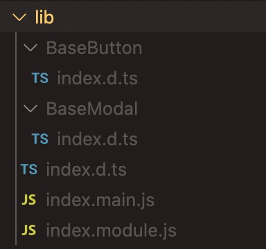 |
优点:打包后的结果是一个 js 文件,css 样式等都注入到 js 了,按需引入无需使用插件。 缺点:只能在组件库里定义主题样式,因为打包后的结果已经是 css 非 less,如果在项目里通过 less 修改主题色会不成功 | 最新版本 | https://github.com/leitingting08/sum-react |
| 多入口打包 | 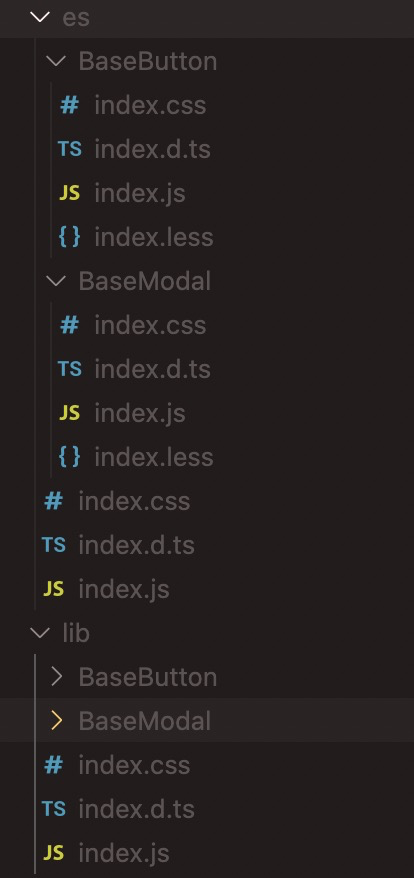 |
优点:可以按需引入的时候使用 less,在项目里通过 less modifyVars 动态修改主题色。 缺点:按需引入需要使用babel-plugin-import插件,组件库里样式需要导入用到的 antd 组件的less,比较繁琐 | 0.4.0 | https://github.com/leitingting08/sum-react/tree/release-0.0.1 (babel-plugin-import的使用方式附readme) |
9. 发布到 npm
最后业务组件库写好了一些组件,就可以发布到 npm 了,执行 npm 的发布流程就好了
如果是发布到公司内部的私有 npm
需要在 package.json 中配置registry
"publishConfig": {
    "registry": "http://xxx"
  },
登录到npm 之后执行 npm publish 就能把自己的包发布到 npm 上,在项目中就可以愉快的通过 npm 安装使用了
至此,一个简单的业务组件库框架就搭建完成了,后续可以根据需求和业务,往库里不断填充组件,后续可给组件添加组件单元测试,完善组件库~
完整代码在 这里
有问题欢迎提出~

 浙公网安备 33010602011771号