

Window Presentation Foundation系列(3)---布局系统简介
2011-06-29 01:38 libiver 阅读(713) 评论(3) 编辑 收藏 举报声明:欢迎任何人和组织转载本blog中文章,但必须标记文章原始链接和作者信息。
本文链接:http://www.cnblogs.com/leezhm/archive/2011/06/29/2092847.html
开拓进取的小乌龟------->cnBlogs 点滴点点滴滴 Blog
布局系统是WPF中非常重要的一部分知识,也是WPF的精华,很多时候决定了软件的成败。好的布局牵涉到程序的性能,复杂度,耦合度等等。好的布局为广大的程序员提供了充分的控制。
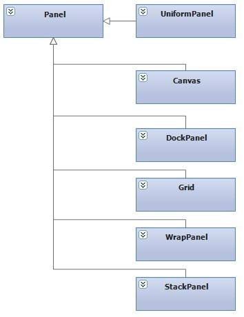
为了布局的方便,WPF为我们提供了如下几种布局面板。
| 面板名称 | 说明 |
|---|---|
| 定义一个区域,在此区域内,您可以使用相对于 Canvas 区域的坐标显式定位子元素。 | |
| 定义一个区域,在此区域中,您可以使子元素互相水平或垂直排列。 | |
| 定义由行和列组成的灵活的网格区域。 | |
| 将子元素排列成一行(可沿水平或垂直方向)。 | |
| 为虚拟化其子数据集合的 Panel 元素提供一个框架。 这是一个抽象类。 | |
| 从左至右按顺序位置定位子元素,在包含框的边缘处将内容断开至下一行。 后续排序按照从上至下或从右至左的顺序进行,具体取决于 Orientation 属性的值。 |
任何一个Panel它都有一些基本的常见公共属性,如Margin,Padding,FlowDirection,ZIndex,RenderTransform和LayoutTransform。他们有不同的功能,决定不同的Panel的作用。
一个Panel的呈现是分测量和排列这两个阶段来进行的,然后再在屏幕上进行绘制。首先需要询问面板需要多大的空间,在这个过程中需要测量每一个子元素并得到它们所需要的空间,然后来汇总这些数据,从而求出面板所需要的空间。但往往并不是测量了之后就可以确定所需大小的,必须在排列阶段才能获知我们究竟需要多大的空间,因为这涉及到把子元素布局在什么位置,并尽可能地嵌入到有效空间中问题。
由上面的描述可知,这两个步骤都需要对子元素进行一系列的计算,所以子元素越多,执行计算的次数也就越多,所消耗的资源也就越多。故我们在进行布局的时候,应该尽可能地避免使用不需要的复杂的布局面板,例如如果能够使用Canvas,UniformPanel来进行布局的,就没必要使用Grid这样的复杂的布局面板。同样如果有可能,在我们使用Panel的过程中应该尽可能避免不必要地调用UpdateLayout方法。
当一个布局发生改变的时候,布局系统都会触发一次新的处理过程,进行重新布局。所以了解那些函数调用,会在什么情况下导致布局系统重新布局,对于优化程序性能很重要,毕竟布局过程是一个递归的过程。
下面对集中常见的布局面板,进行简单的分析。
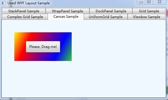
(1) Canvas
Canvs是比较简单的布局容器,它能够让我们完全控制每个元素的精确位置。实际情况是Canvas不做任何布局,它只需要简单地把元素放在所指定的位置就算完成布局,而且它默认不会改变元素的大小来填充可用的布局空间,也就意味着Canvas中的子元素是根据元素的内容来调整尺寸大小(注:如果想修剪内容进行布局,可以将ClipToBounds设置为True)。
| 名称 | 说明 | |
|---|---|---|
 | Bottom | 获取或设置一个值,该值表示某元素的下边缘与其父 Canvas 的下边缘之间的距离。 |
| | Left | 获取或设置一个值,该值表示某元素的左边缘与其父 Canvas 的左边缘之间的距离。 |
| | Right | 获取或设置一个值,该值表示某元素的右边缘与其父 Canvas 的右边缘之间的距离。 |
| | Top | 获取或设置一个值,该值表示某元素的上边缘与其父 Canvas 的上边缘之间的距离。 |
1: <Canvas Background="Transparent" Name="layoutCanvas"
2: MouseMove="OnDragMeMouseMoveEventHandler" >
3:
4: <Rectangle Width="200" Height="100" Canvas.Left="40" Canvas.Top="40">
5: <Rectangle.Fill>
6: <LinearGradientBrush StartPoint="0,0" EndPoint="1,1">
7: <GradientStop Color="Yellow" Offset="0.0" />
8: <GradientStop Color="Red" Offset="0.25" />
9: <GradientStop Color="Blue" Offset="0.75" />
10: <GradientStop Color="LimeGreen" Offset="1.0" />
11: </LinearGradientBrush>
12: </Rectangle.Fill>
13: </Rectangle>
14:
15:
16: <Button Name="DragMe" Content="Please, Drag me!" Height="40" Width="120"
17: Canvas.Left="80" Canvas.Top="70"
18: MouseLeftButtonDown="OnDragMeMouseDownEventHandler"
19: MouseLeftButtonUp="OnDragMeMouseUpEventHandler"/>
20: </Canvas>
运行结果如下所示:
(2) DockPanel
DockPanel适合于进行简单的整体布局,可以用来划分窗体的基本结构。它总是会对每个元素进行排列,默认情况下最后一个子元素负责填充剩余的布局空间。同样它利用附加属性Dock来指定元素的靠边位置(注:如果你不想最后一个元素填充剩余布局空间,可以将属性LastChildFill设置为False)。
简单示例代码如下:
1: <DockPanel Background="SkyBlue" Name="dockPanelLayout">
2: <Button DockPanel.Dock="Left" Content="Left" Width="60" />
3: <Button DockPanel.Dock="Right" Content="Right" Width="60"/>
4: <Button DockPanel.Dock="Top" Content="Top" Height="60"/>
5: <Button DockPanel.Dock="Bottom" Content="Bottom" Height="60"/>
6: <Button Content="Fill" Name="btnChanged" Click="OnClicked" Background="Tomato"/>
7:
8: <x:Code>
9: <![CDATA[
10: void OnClicked(object sender, System.Windows.RoutedEventArgs args)
11: {
12: if(true == dockPanelLayout.LastChildFill)
13: {
14: dockPanelLayout.LastChildFill = false;
15: btnChanged.Content = "unFill";
16: btnChanged.Width = 60;
17: }
18: else
19: {
20: dockPanelLayout.LastChildFill = true;
21: btnChanged.Content = "Fill";
22: btnChanged.Width = Double.NaN; // 这个就相当于在XAML中设置Width="Auto"
23: }
24: }
25: ]]>
26: </x:Code>
27: </DockPanel>
运行结果如下截图:

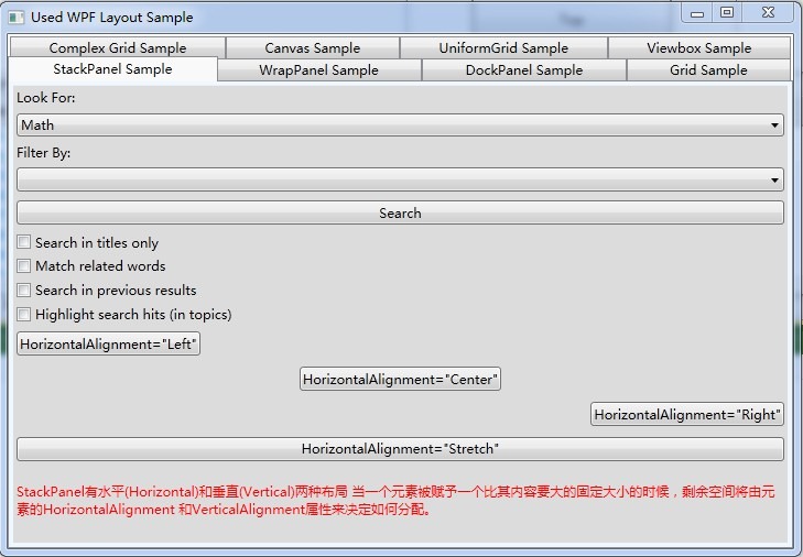
(3) StackPanel
StackPanel也是一个简单的布局面板,它将子元素按一行或者一列进行排列。但是同样它的功能不足以进行整个面板的布局,而是进行一些的模块的布局。默认情况下,它是横排(Horizontal),但是也可以通过设置Orientation为Vertical进行竖排布局。再默认横排情况下,每个子元素跟面板一样宽,反之竖排亦然。当子元素超过了面板空间的时候,它会自动截断多出的内容。
当一个元素被赋予一个比其内容要大的固定大小的时候,剩余空间将由元素的HorizontalAlignment 和VerticalAlignment属性来决定如何分配。
简单的示例代码如下:
1: <StackPanel Background="Gainsboro">
2: <TextBlock Margin="3">Look For:</TextBlock>
3: <ComboBox Margin="3" SelectedIndex="0">
4: <ComboBoxItem>Math</ComboBoxItem>
5: <ComboBoxItem>English</ComboBoxItem>
6: <ComboBoxItem>History</ComboBoxItem>
7: <ComboBoxItem>Physics</ComboBoxItem>
8: </ComboBox>
9: <TextBlock Margin="3">Filter By:</TextBlock>
10: <ComboBox Margin="3"></ComboBox>
11: <Button Margin="3, 5">Search</Button>
12: <CheckBox Margin="3">Search in titles only</CheckBox>
13: <CheckBox Margin="3">Match related words</CheckBox>
14: <CheckBox Margin="3">Search in previous results</CheckBox>
15: <CheckBox Margin="3">Highlight search hits (in topics)</CheckBox>
16:
17: <Button Margin="3, 5" HorizontalAlignment="Left">HorizontalAlignment="Left"</Button>
18: <Button Margin="3, 5" HorizontalAlignment="Center">HorizontalAlignment="Center"</Button>
19: <Button Margin="3, 5" HorizontalAlignment="Right">HorizontalAlignment="Right"</Button>
20: <Button Margin="3, 5" HorizontalAlignment="Stretch">HorizontalAlignment="Stretch"</Button>
21:
22: <TextBlock Margin="3,15" Foreground="Red" TextWrapping="Wrap">
23: StackPanel有水平(Horizontal)和垂直(Vertical)两种布局
24: 当一个元素被赋予一个比其内容要大的固定大小的时候,剩余空间将由元素的HorizontalAlignment
25: 和VerticalAlignment属性来决定如何分配。
26: </TextBlock>
27: </StackPanel>
运行结果截图如下:
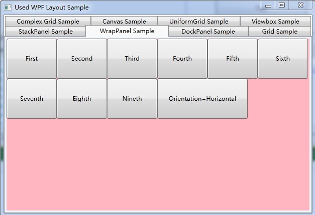
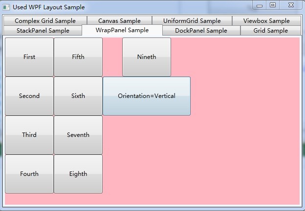
(4) WrapPanel
WrapPanel的功能跟StackPanel基本上没有区别,不同的是,当子元素的空间超过了面板的时候,StackPanel是进行截断,而WrapPanel则是会将元素重启一行,进行排列。同样它也提供了Horizontal和Vertical两种方式供Orientation选择。
简单的实例代码如下:
1: <WrapPanel Background="LightPink" Orientation="Horizontal" Name="wrapPanelLayout">
2: <Button Content="First" Width="100" Height="80"/>
3: <Button Content="Second" Width="100" Height="80"/>
4: <Button Content="Third" Width="100" Height="80"/>
5: <Button Content="Fourth" Width="100" Height="80"/>
6: <Button Content="Fifth" Width="100" Height="80"/>
7: <Button Content="Sixth" Width="100" Height="80"/>
8: <Button Content="Seventh" Width="100" Height="80"/>
9: <Button Content="Eighth" Width="100" Height="80"/>
10: <Button Content="Nineth" Width="100" Height="80"/>
11:
12: <Button Name="btnChanged" Content="Orientation=Horizontal" Width="180" Height="80" Click="OnClicked" />
13: <x:Code>
14: <![CDATA[
15: void OnClicked(object sender, System.Windows.RoutedEventArgs args)
16: {
17: if(Orientation.Vertical == wrapPanelLayout.Orientation)
18: {
19: wrapPanelLayout.Orientation = Orientation.Horizontal;
20: btnChanged.Content = "Orientation=Horizontal";
21: }
22: else
23: {
24: wrapPanelLayout.Orientation = Orientation.Vertical;
25: btnChanged.Content = "Orientation=Vertical";
26: }
27: }
28: ]]>
29: </x:Code>
30: </WrapPanel>
实例运行截图如下:
(5) Grid
Grid是WPF中功能最复杂的布局面板,也是功能最强大的。它由<Grid.ColumnDefinitions>列元素和<Grid.RowDefinitions>行元素来组成,将面板进行有效的切分。通过附加属性<Grid.Column>和<Grid.Row>来确定元素在面板中的位置,默认子元素均放置在第0行第0列。当然还可以对每一个单元格进行定义布局,充分发挥Grid布局的强大功能和精细控制。
简单示例代码如下:
1: <Grid Background="Azure" ShowGridLines="false">
2: <Grid.ColumnDefinitions>
3: <ColumnDefinition Width="Auto" />
4: <ColumnDefinition Width="3*"/>
5: </Grid.ColumnDefinitions>
6:
7: <Grid.RowDefinitions>
8: <RowDefinition Height="40" />
9: <RowDefinition Height="Auto" />
10: <RowDefinition Height="120" />
11: <RowDefinition Height="Auto" />
12: </Grid.RowDefinitions>
13: </Grid>
通过上面的简单示例代码,可以看出来,Grid的单元格的行高和列宽,可以采用自动,固定宽度,按比例(或者百分比)的方式来进行指定。
固定长度:单位是Pixel,当宽度不够的时候,Grid会进行裁剪。
自动长度:单位是Pixel,自动匹配子元素中最长元素的宽度。
比例长度:单位是Star,*前面的数字指定的是相对大小,而不是绝对大小。所以6*=3*,对于第4行。
(注:在WPF中的像素是一个与设备无关的单位,即1inch的96分之一。所以 1 pixel = 1/96 inch,1 cm = 96 / 2.54 pixel,1 pt = 96 / 72 pixel)
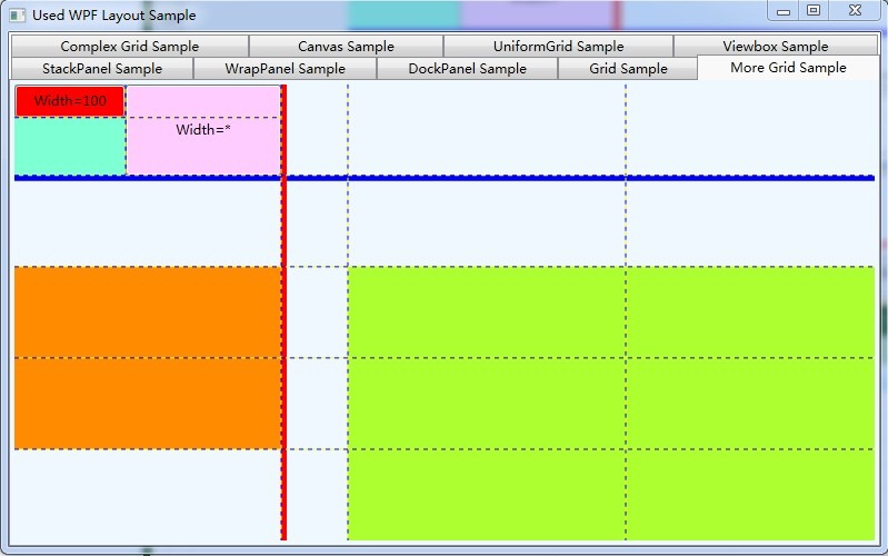
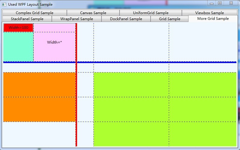
当然,在Grid中使用Grid.ColumnSpan和Grid.RowSpan附加属性可以让相互间隔的行列合并,所以元素也可以跨越多个单元格。而且可以在Grid的每一行嵌套一个Grid。还有更好的方法,通过GridSplitter类,在Grid控件的列或行之间重新分配空间。
具体示例代码如下:
1: <Grid Background="AliceBlue" ShowGridLines="True">
2: <Grid.RowDefinitions>
3: <RowDefinition />
4: <RowDefinition />
5: <RowDefinition />
6: <RowDefinition />
7: <RowDefinition />
8: </Grid.RowDefinitions>
9:
10: <Grid.ColumnDefinitions>
11: <ColumnDefinition Width="240" />
12: <ColumnDefinition Width="60" />
13: <ColumnDefinition Width="250" />
14: <ColumnDefinition Width="250" />
15:
16: </Grid.ColumnDefinitions>
17:
18: <!-- Grid的一行中嵌套另外的一个Grid -->
19: <Grid Grid.Row="0" ShowGridLines="True" Background="Aquamarine">
20:
21: <!-- 新的Grid分为两行 -->
22: <Grid.RowDefinitions>
23: <RowDefinition Height="30" />
24: <RowDefinition Height="*" />
25: </Grid.RowDefinitions>
26:
27: <!-- 新的Grid分为两列 -->
28: <Grid.ColumnDefinitions>
29: <ColumnDefinition Width="100" />
30: <ColumnDefinition Width="*" />
31: </Grid.ColumnDefinitions>
32:
33: <Button Background="#FFFF0000" Grid.Column="0" Content="Width=100" />
34:
35: <!-- 通过Grid.RowSpan来进行跨行布局 -->
36: <Button Background="#FFFFCCFF" Grid.Column="1" Content="Width=*"
37: Grid.Row="0" Grid.RowSpan="2"/>
38: </Grid>
39:
40: <!-- 使用GridSplitter来调整第一行的大小 -->
41: <GridSplitter Grid.Row="1" Grid.ColumnSpan="4"
42: HorizontalAlignment="Stretch" VerticalAlignment="Top"
43: Background="Blue" ShowsPreview="True" ResizeDirection="Auto" Height="5" />
44:
45: <!-- 使用Grid.RowSpan来跨行布局 -->
46: <Rectangle Fill="DarkOrange" Grid.Row="2" Grid.RowSpan="2" />
47:
48: <!-- 使用GridSplitter来调整第一列的大小 -->
49: <GridSplitter Grid.Column="1" Grid.RowSpan="5" HorizontalAlignment="Left" VerticalAlignment="Stretch"
50: Background="Red" ShowsPreview="True" ResizeDirection="Auto" Width="5" />
51:
52: <!-- 使用Grid.RowSpan来跨行布局 -->
53: <Rectangle Fill="GreenYellow" Grid.Row="2" Grid.RowSpan="3" Grid.ColumnSpan="2" Grid.Column="2"/>
54: </Grid>
运行结果截图如下,分别是原始运行图,横向的GridSplitter调整后图和纵向的GridSplitter调整后图:
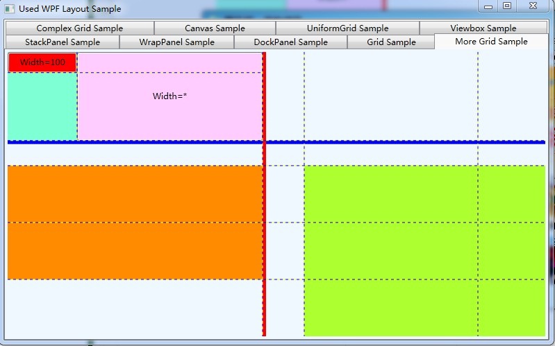
关于Grid的IsSharedSizeScope的用法,在此不具体详细讲解,但是通过它可以让多个Grid元素共享大小信息。具体怎么使用通过下面的实例来展示,示例代码如下:
1: <StackPanel Grid.IsSharedSizeScope="True">
2: <StackPanel.Resources>
3: <Style TargetType="TextBlock">
4: <Setter Property="Margin" Value="4, 4" />
5: </Style>
6: </StackPanel.Resources>
7:
8: <Grid>
9: <Grid.RowDefinitions>
10: <RowDefinition Height="Auto" />
11: </Grid.RowDefinitions>
12:
13: <Grid.ColumnDefinitions>
14: <ColumnDefinition Width="*" />
15: <ColumnDefinition Width="Auto" SharedSizeGroup="Sex"/>
16: <ColumnDefinition Width="Auto" SharedSizeGroup="Age"/>
17: <ColumnDefinition Width="Auto" SharedSizeGroup="Location"/>
18: <ColumnDefinition Width="Auto" />
19: </Grid.ColumnDefinitions>
20:
21: <Border Grid.Column="0" Grid.Row="0" BorderThickness="1" Background="LightCyan" BorderBrush="Cyan">
22: <TextBlock>Name</TextBlock>
23: </Border>
24:
25: <Border Grid.Column="1" Grid.Row="0" BorderThickness="1" Background="LightCyan" BorderBrush="Cyan">
26: <TextBlock>Sex</TextBlock>
27: </Border>
28:
29: <!-- 填充最后两列 -->
30: <Border Grid.Column="2" Grid.Row="0" BorderThickness="1" Background="LightCyan" BorderBrush="Cyan">
31: <TextBlock>Age</TextBlock>
32: </Border>
33:
34: <Border Grid.Column="3" Grid.ColumnSpan="2" Grid.Row="0" BorderThickness="1" Background="LightCyan" BorderBrush="Cyan" />
35: <TextBlock Grid.Column="3">Location</TextBlock>
36:
37: <!-- Cution 绑定到ScrollBar的宽度上去 -->
38: <FrameworkElement Grid.Column="4" Grid.Row="0"
39: Width="{DynamicResource {x:Static SystemParameters.VerticalScrollBarWidthKey}}" />
40:
41: </Grid>
42:
43: <ScrollViewer Background="RosyBrown" CanContentScroll="True" Height="385">
44: <Grid>
45: <Grid.RowDefinitions>
46: <RowDefinition Height="Auto" />
47: <RowDefinition Height="Auto" />
48: <RowDefinition Height="Auto" />
49: <RowDefinition Height="Auto" />
50: <RowDefinition Height="Auto" />
51: <RowDefinition Height="Auto" />
52: <RowDefinition Height="Auto" />
53: <RowDefinition Height="Auto" />
54: <RowDefinition Height="Auto" />
55: </Grid.RowDefinitions>
56:
57: <Grid.ColumnDefinitions>
58: <ColumnDefinition Width="*" />
59: <ColumnDefinition Width="Auto" SharedSizeGroup="Sex" />
60: <ColumnDefinition Width="Auto" SharedSizeGroup="Age" />
61: <ColumnDefinition Width="Auto" SharedSizeGroup="Location" />
62: </Grid.ColumnDefinitions>
63:
64: <TextBlock Grid.Column="0" Grid.Row="0">Lucy</TextBlock>
65: <TextBlock Grid.Column="1" Grid.Row="0">Female</TextBlock>
66: <TextBlock Grid.Column="2" Grid.Row="0">26</TextBlock>
67: <TextBlock Grid.Column="3" Grid.Row="0">United States</TextBlock>
68:
69: <TextBlock Grid.Column="0" Grid.Row="1">Lily</TextBlock>
70: <TextBlock Grid.Column="1" Grid.Row="1">Female</TextBlock>
71: <TextBlock Grid.Column="2" Grid.Row="1">24</TextBlock>
72: <TextBlock Grid.Column="3" Grid.Row="1">German</TextBlock>
73:
74: <TextBlock Grid.Column="0" Grid.Row="2">Tracy</TextBlock>
75: <TextBlock Grid.Column="1" Grid.Row="2">Female</TextBlock>
76: <TextBlock Grid.Column="2" Grid.Row="2">22</TextBlock>
77: <TextBlock Grid.Column="3" Grid.Row="2">England</TextBlock>
78:
79: <TextBlock Grid.Column="0" Grid.Row="3">Smith</TextBlock>
80: <TextBlock Grid.Column="1" Grid.Row="3">Male</TextBlock>
81: <TextBlock Grid.Column="2" Grid.Row="3">28</TextBlock>
82: <TextBlock Grid.Column="3" Grid.Row="3">England</TextBlock>
83:
84: <TextBlock Grid.Column="0" Grid.Row="4">Jame</TextBlock>
85: <TextBlock Grid.Column="1" Grid.Row="4">Male</TextBlock>
86: <TextBlock Grid.Column="2" Grid.Row="4">24</TextBlock>
87: <TextBlock Grid.Column="3" Grid.Row="4">China</TextBlock>
88:
89: <TextBlock Grid.Column="0" Grid.Row="5">Lily</TextBlock>
90: <TextBlock Grid.Column="1" Grid.Row="5">Female</TextBlock>
91: <TextBlock Grid.Column="2" Grid.Row="5">24</TextBlock>
92: <TextBlock Grid.Column="3" Grid.Row="5">German</TextBlock>
93:
94: <!-- 在此省略了一些定义TextBlock的代码 -->
95:
96: </Grid>
97: </ScrollViewer>
98:
99: </StackPanel>
运行截图如下:

(6) UniformPanel
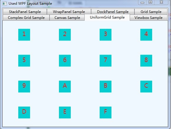
在学习了Grid之后,紧接着的这个UniformGrid 就比较简单了,均匀分别网格可以看作是Grid的简化版本,它确保每个单元格的大小相同,不用在定义行列集合。均匀分布网格的每个单元格只能容纳一个元素,而且会自动根据定义在其内部的元素个数,自动创建行列,并通常保持相同的行列数。简单示例代码如下:
1: <UniformGrid TextBlock.TextAlignment="Center">
2: <Border Height="40" Width="40" Background="DarkTurquoise">
3: <TextBlock Text="1" FontSize="20" Foreground="Red" Margin="3"/>
4: </Border>
5: <Border Height="40" Width="40" Background="DarkTurquoise">
6: <TextBlock Text="2" FontSize="20" Foreground="Red" Margin="3"/>
7: </Border>
8: <Border Height="40" Width="40" Background="DarkTurquoise">
9: <TextBlock Text="3" FontSize="20" Foreground="Red" Margin="3"/>
10: </Border>
11: <Border Height="40" Width="40" Background="DarkTurquoise">
12: <TextBlock Text="4" FontSize="20" Foreground="Red" Margin="3"/>
13: </Border>
14: <Border Height="40" Width="40" Background="DarkTurquoise">
15: <TextBlock Text="5" FontSize="20" Foreground="Red" Margin="3"/>
16: </Border>
17: <Border Height="40" Width="40" Background="DarkTurquoise">
18: <TextBlock Text="6" FontSize="20" Foreground="Red" Margin="3"/>
19: </Border>
20: <Border Height="40" Width="40" Background="DarkTurquoise">
21: <TextBlock Text="7" FontSize="20" Foreground="Red" Margin="3"/>
22: </Border>
23: <Border Height="40" Width="40" Background="DarkTurquoise">
24: <TextBlock Text="8" FontSize="20" Foreground="Red" Margin="3"/>
25: </Border>
26: <Border Height="40" Width="40" Background="DarkTurquoise">
27: <TextBlock Text="9" FontSize="20" Foreground="Red" Margin="3"/>
28: </Border>
29: <Border Height="40" Width="40" Background="DarkTurquoise">
30: <TextBlock Text="A" FontSize="20" Foreground="Red" Margin="3"/>
31: </Border>
32: <Border Height="40" Width="40" Background="DarkTurquoise">
33: <TextBlock Text="B" FontSize="20" Foreground="Red" Margin="3"/>
34: </Border>
35: <Border Height="40" Width="40" Background="DarkTurquoise">
36: <TextBlock Text="C" FontSize="20" Foreground="Red" Margin="3"/>
37: </Border>
38: <Border Height="40" Width="40" Background="DarkTurquoise">
39: <TextBlock Text="D" FontSize="20" Foreground="Red" Margin="3"/>
40: </Border>
41: <Border Height="40" Width="40" Background="DarkTurquoise">
42: <TextBlock Text="E" FontSize="20" Foreground="Red" Margin="3"/>
43: </Border>
44: <Border Height="40" Width="40" Background="DarkTurquoise">
45: <TextBlock Text="F" FontSize="20" Foreground="Red" Margin="3"/>
46: </Border>
47: </UniformGrid>
运行截图如下:
(7)ViewBox
ViewBox通常和其他控件结合起来使用,是WPF中非常有用的控制。定义一个内容容器,该容器可拉伸和缩放单个子元素以填满可用空间。一个 Viewbox 只能具有一个 Child。如果添加一个附加 Child,会导致一个运行时 ArgumentException错误。我们用得最多的首先是Stretch属性,然后是StrctchDirection属性,关于这两个元素,大家可以运行我们的代码,然后改变设置就可以看到效果。可以通过ViewBox来实现全屏显示。由于比较简单,就不给出示例的。
总结:以上基本简单介绍了WPF的布局系统,虽然示例简单,很多具体实现细节都没有详细讲解,但是透过这些,可以充分理解WPF布局的强大功能。
