
vue-5-tabBar创建
目的:在App.vue组件中,加入整个tabbar
思路
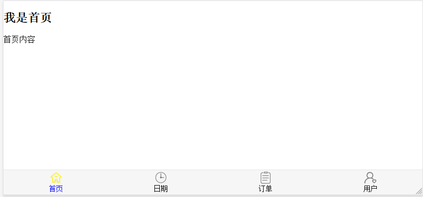
1. 确认完整tabbar的布局,如:
tabbar包含两种组件:tabBar组件,tabBarItem组件
2. 分析:
1. 导入tabBar组件和tabBarItem组件
注意:
tabBar和tabBarItem两个组件中,只写单独一个的样式,布局,及接收标签即可。
如要求多个tabBarItem,则根据需求,在外侧App.vue中添加tabBar和tabBarItem,要使用几个,就在<template></template>调用几次。如此例,使用一个tabBar, 四个tabBarItem (tabBarItem写在tabBar中)
2. App.vue组件中:
<template>
  <div id="app">
    <router-view></router-view>
<!-- 使用组件tabBar组件-->
    <tab-bar>
<!-- 使用tabBarItem组件-->
      <tab-bar-item">
      </tab-bar-item>
      <tab-bar-item>
      </tab-bar-item>
      <tab-bar-item>
      </tab-bar-item>
      <tab-bar-item>
      </tab-bar-item>
    </tab-bar>
  </div>
</template>
<script>
// 导入组件
import TabBar from "./components/tabbar/TabBar";
import TabBarItem from "./components/tabbar/TabBarItem";

export default {
  name: 'App',
  components:{
    TabBar,      // 注册组件
    TabBarItem
  }
}
</script>

<style>
  @import "./assets/css/base.css";


</style>
3. 此时,大体结构已经完成:在App.vue组件中,插入一个tabBar,tabBar中插入四个tabBarItem
4. tabBar组件中:
1. 注意:tabBar中,要接收四个标签,但都是tabBarItem标签,所以此时使用一个<slot></slot>插槽足矣,这就可以传入四个<tab-bar-item"> </tab-bar-item>来替换插槽。
2. 定义好自己的整体样式和使内容水平分布 display: flex 。注意:不要设置tabBarItem的样式,只负责tabBar自己
<template>
  <div id="tab-bar">
    <slot></slot>
  </div>
</template>

<script>
export default {
  name: "TabBar"
}
</script>

<style scoped>
  #tab-bar{
    display: flex;
    background-color: #f6f6f6;

    position: fixed;
    left: 0;
    right: 0;
    bottom: 0;

    box-shadow: 0 -1px 1px rgba(100, 100, 100, .2);
  }

</style>
5. tabBarItem组件中:
1. 其中要插入:点击前图片,点击后图片,文字三种内容。但为了组件更好的移植性,内容不能直接写死在组件中,而是应通过App.vue传入,所以,tabBarItem的<template></template>中,也使用<slot></slot>来接收传入的标签进行替换,与tabBar不同的 是,传入tabBarItem中的内容,既有点击前后图片<img>,也有文字<div>或<text>,就需要三个slot来接收
2.设置tabBarItem自己的样式:图片大小,间距,文字大小,*接受tabBar的水平分布flex:1,等
<template>
  <div class="tab-bar-item">
    <div>
      <slot name="item-icon"></slot>
    </div>
    <div>
      <slot name="item-icon-active"></slot>
    </div>
    <div>
      <slot name="item-text"></slot>
    </div>
  </div>
</template>

<script>
export default {
  name: "TabBarItem",
}
</script>

<style scoped>
  .tab-bar-item{

    flex: 1;
    text-align: center;
    height: 49px;

    margin: auto;
    font-size: 14px;
  }
  .tab-bar-item img{
    width: 24px;
    height: 24px;
    margin-top: 3px;
    margin-bottom: 2px;
    /*去掉img标签的边缘空间*/
    vertical-align: middle;
  }
</style>
6. App.vue中给tabBarItem传递图片和文字,应该如下:
<template>
  <div id="app">
<!--    使用组件-->
    <tab-bar>
      <tab-bar-item>
        <img slot="item-icon" src="../src/assets/img/tabbar/index.png" alt="">
        <img slot="item-icon-active" src="../src/assets/img/tabbar/index2.png" alt="">
        <div slot="item-text">首页</div>
      </tab-bar-item>
      <tab-bar-item>
        <img slot="item-icon" src="../src/assets/img/tabbar/appointment.png" alt="">
        <img slot="item-icon-active" src="../src/assets/img/tabbar/appointment2.png" alt="">
        <div slot="item-text">日期</div>
      </tab-bar-item>
      <tab-bar-item>
        <img slot="item-icon" src="../src/assets/img/tabbar/order.png" alt="">
        <img slot="item-icon-active" src="../src/assets/img/tabbar/order2.png" alt="">
        <div slot="item-text">订单</div>
      </tab-bar-item>
      <tab-bar-item>
        <img slot="item-icon" src="../src/assets/img/tabbar/user.png" alt="">
        <img slot="item-icon-active" src="../src/assets/img/tabbar/user2.png" alt="">
        <div slot="item-text">用户</div>
      </tab-bar-item>
    </tab-bar>
  </div>
</template>
<script>
// 导入组件
import TabBar from "./components/tabbar/TabBar";
import TabBarItem from "./components/tabbar/TabBarItem";

export default {
  name: 'App',
  components:{
    TabBar,      // 注册组件
    TabBarItem
  }
}
</script>

<style>
  @import "./assets/css/base.css";


</style>

 浙公网安备 33010602011771号