JS获取页面宽度高度及Vue页面自适应方案
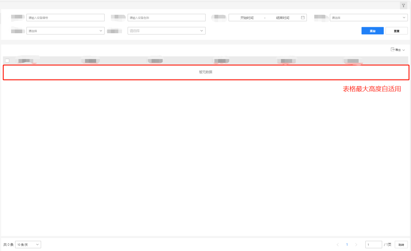
项目需求:顶部为搜索栏栏,主体内容为表格;顶部的搜索栏折叠,表格高度自适应页面剩余的高度,且适配不同分辨率的屏幕。
1、JavaScript获取页面高度
- 网页可见区域宽:document.body.clientWidth
- 网页可见区域高:document.body.clientHeight
- 网页可见区域宽:document.body.offsetWidth(包括边线的宽)
- 网页可见区域高:document.body.offsetHeight(包括边线的宽)
- 网页正文全文宽:document.body.scrollWidth
- 网页正文全文高:document.body.scrollHeight
- 网页被卷去的高:document.body.scrollTop(IE7无效)
- 网页被卷去的左:document.body.scrollLeft(IE7无效)
- 网页被卷去的高:document.documentElement.scrollTop(IE7有效)
- 网页被卷去的左:document.documentElement.scrollLeft(IE7有效)
- 网页正文部分上:window.screenTop
- 网页正文部分左:window.screenLeft
- 屏幕分辨率的高:window.screen.height
- 屏幕分辨率的宽:window.screen.width
- 屏幕可用工作区高度:window.screen.availHeight
- 屏幕可用工作区宽度:window.screen.availWidth
- 相对于窗口左上角的X:window.event.clientX
- 相对于窗口左上角的Y:window.event.clientY
- 相对于整个页面的X:window.event.X 相对于整个页面的Y:window.event.Y
其中,可视区域就是不包括上下左右的工具栏、状态栏(滚动条特殊)。
2、Vue中根据可视区域高度的自适应
项目截图:
实际代码:
export default {
  data () {
    return {
      tableMaxHeight: 100,  // 表格的最大高度
    }
  },
  mounted () {

    window.onresize = () => {
      this.changeTableMaxHeight()
    }
    this.changeTableMaxHeight()
  },

  destroyed () {
    window.onresize = null
  },
  methods: {

    showFilterForm () {
      this.filterActive = !this.filterActive
      this.changeTableMaxHeight()
    },

    changeTableMaxHeight () {
      let height = document.body.offsetHeight // 网页可视区域高度
      if (this.filterActive) {
        this.tableMaxHeight = height - 320
      } else {
        this.tableMaxHeight = height - 170
      }
      console.log(this.tableMaxHeight)
    }
}
上述代码通过window.onresize函数实时监听页面宽度和高度的改变,然后都通过document.body.offsetHeight获取网页可视区域高度,表格的最大高度根据可视区域的高度自动调节

 浙公网安备 33010602011771号