css3小代码
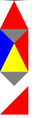
1.三角


<!doctype html>
<html lang="en">
<head>
    <meta charset="UTF-8">
    <meta name="viewport" content="width=device-width,initial-scale=1,maximum-scale=1,minimum-scale=1,user-scalable=no"/>
    <meta name="format-detection" content="telphone=no, email=no"/>
    <meta name="apple-touch-fullscreen" content="yes"/>
    <meta name="apple-mobile-web-app-capable" content="yes"/>
    <meta name="apple-mobile-web-app-status-bar-style" content="black"/>
    <title>sanjiao</title>
    <style type="text/css">
        *{
            margin:0;
            padding:0;
        }
        .sanjiao{
            width: 0;
            height: 0;
            border-left: 50px solid transparent;
            border-right: 50px solid transparent;
            border-bottom: 100px solid red;
        }
        .sanjiao:hover{
            border-left: 50px solid transparent;
            border-right: 50px solid transparent;
            border-top: 100px solid red;
            transition: 5s all;
        }
        .arr_down_a{
            width: 0;
            height: 0;
            border-color:pink;
            display: block;
            border-left: 50px solid blue;
            border-right: 50px solid red;
            border-bottom: 100px solid yellow;
            border-top: 50px solid grey;
        }

        .test_a{
            width: 0;
            height: 0;
            display: block;
            border-left: 50px solid transparent;
            border-right: 50px solid transparent;
            border-bottom: none;
            border-top: 50px solid grey;
        }

        .triangle-bottomright {
            width: 0;
            height: 0;
            border-bottom: 100px solid red;
            border-left: 100px solid transparent;
        }

        .trans-scroll{
            width: 0;
            height: 0;
            display: block;
            margin-top: 60px;
            border-top: 6px solid #969696;
            border-left: 5px solid transparent;
            border-right: 5px solid transparent;
            border-bottom: 1px solid transparent;
        }
        .trans-scroll:hover{
            -moz-transform: rotate(180deg);
            -ms-transform: rotate(180deg);
            -o-transform: rotate(180deg);
            -webkit-transform: rotate(180deg);
            transform: rotate(180deg);
            transition: 500ms all;
        }
    </style>
</head>
<body>
<div class="sanjiao"></div>
<div class='arr_down_a'></div>
<div class='test_a' ></div>
<div class='triangle-bottomright' ></div>
<span class="trans-scroll"></span>
</body>
</html>
2.css兼容符号:
background:#ffc; /* 对firefox有效*/
*background:#ccc; /* 对ie7有效 */
_background:#000; /* 只对ie6有效 */
3.商品hover-animate
<!DOCTYPE html PUBLIC "-//W3C//DTD XHTML 1.0 Transitional//EN" "http://www.w3.org/TR/xhtml1/DTD/xhtml1-transitional.dtd">
<html xmlns="http://www.w3.org/1999/xhtml">
<head>
<meta http-equiv="Content-Type" content="text/html; charset=utf-8" />
<title>hover-animate</title>
<link rel="stylesheet" type="text/css" href="css/common.css"/>
    <style type="text/css">
        a{
            color: blueviolet;
        }
        .div-demo-box{
            padding: 20px;
        }
        .a-box{
            width: 290px;
            height: 250px;
            background-color: pink;
        }
        .a-box>img{
            display: block;
        }
        /*hover-animate 放大*/
        .hover-box{
            display: block;
            overflow: hidden;
        }
        .hover-box:hover .hover-animation {
          -webkit-transform: scale(1.05);
          -moz-transform: scale(1.05);
          -o-transform: scale(1.05);
          -ms-transform: scale(1.05);
          transform: scale(1.05);
          -webkit-transition: transform 1s ease;
          -moz-transition: transform 1s ease;
          -o-transition: transform 1s ease;
          -ms-transition: transform 1s ease;
          transition: transform 1s ease;
      }

      .hover-animation {
          -webkit-transform: scale(1);
          -moz-transform: scale(1);
          -o-transform: scale(1);
          -ms-transform: scale(1);
          transform: scale(1);
          -webkit-transition: transform 1s ease;
          -moz-transition: transform 1s ease;
          -o-transition: transform 1s ease;
          -ms-transition: transform 1s ease;
          transition: transform 1s ease;
      }
      /*hover-animate-shadow*/
      .hover-shadow {
          width: 100%;
          padding-top: 20px;
          padding-bottom: 20px;
          margin-bottom: 6px;
          border-bottom: #e3e2e2 solid 1px;
          box-shadow: 0 0 5px rgba(0, 0, 0, 0.1);
          background-color: pink;
      }
      .hover-shadow:after {
          clear: both;
          content: '';
          display: table;
      }
      /*@media only screen and (min-width: 320) {*/
          .hover-shadow {
            width: 286px;
            padding: 60px 10px 45px;
            margin-right: 10px;
            border-bottom: none;
            box-shadow: none;
            -webkit-transform: translate3d(0, 0, 0);
            -moz-transform: translate3d(0, 0, 0);
            -o-transform: translate3d(0, 0, 0);
            -ms-transform: translate3d(0, 0, 0);
            transform: translate3d(0, 0, 0);
            -webkit-transition: transform 0.3s ease;
            -moz-transition: transform 0.3s ease;
            -o-transition: transform 0.3s ease;
            -ms-transition: transform 0.3s ease;
            transition: transform 0.3s ease;
        }
        .hover-shadow:hover {
            box-shadow: 0 15px 30px rgba(0, 0, 0, 0.1);
            -webkit-transform: translate3d(0, -2px, 0);
            -moz-transform: translate3d(0, -2px, 0);
            -o-transform: translate3d(0, -2px, 0);
            -ms-transform: translate3d(0, -2px, 0);
            transform: translate3d(0, -2px, 0);
            -webkit-transition: transform 0.3s ease;
            -moz-transition: transform 0.3s ease;
            -o-transition: transform 0.3s ease;
            -ms-transition: transform 0.3s ease;
            transition: transform 0.3s ease;
        }

        /*商品题目+简介布局     */
        .brick-img{
            width: 100%;
            padding:0 40px;
            *width: 236px; /*IE7*/
            *margin: 0 auto;
            *padding: 0;
            display: block;
            box-sizing: border-box;
        }
        .brick-title {
          text-align: center;
          color: #141414;
          font-size: 1.6rem;
          margin-top: 12px;
          line-height: 20px;
        /*control text 1 line ...*/
          text-overflow: ellipsis;
          display: -webkit-box;
          -webkit-line-clamp: 1;
          -webkit-box-orient: vertical;
          overflow: hidden;
          text-align: center;
          height: 1.8rem;
      }
      .brick-desc {
          text-align: center;
          color: #a0a0a0;
          font-size: 12px;
          font-size: 0.75rem;
          line-height: 18px;
          margin-top: 4px;
           text-overflow: ellipsis;
          display: -webkit-box;
          -webkit-line-clamp: 2;
          -webkit-box-orient: vertical;
          overflow: hidden;
          text-align: center;
          height: 2.8rem;
      }

    </style>
</head>
<body>
<div class="div-demo-box">
    <h2>hover-animate
</h2>
<a href="javascript:void(0)" class="a-box hover-box">
    <img src="images/cris_ban_01.jpg" alt="" class="hover-animation" />
</a>
<!-- pc商品 -->
<div class="brick-box hover-shadow margin-top20">
  <a href="javascript:void(0)" class="display-block">
    <img src="images/cris_ban_01.jpg" alt="" class="brick-img" />
    <h3 class="brick-title">题目题目</h3>
    <p class="brick-desc">标题标题标题标题标题标题标题标题标题标题标题标题标题标题标题标题标题标题标题标题标题标题标题标题标题标题标题标题标题标题</p>
 </a>
</div>
</div>


</body>
</html>

 浙公网安备 33010602011771号