


css属性操作
css属性
转载学习地址:http://www.cnblogs.com/yuanchenqi/articles/6856399.html
css的四种引入方式
1.行内式
<p style='backgroud-color:red">hellow</p>
2.嵌入式
嵌入式是将CSS样式集中写在网页的<head></head>标签对的<style></style>标签对中。格式如下:
<head>
    <meta charset="UTF-8">
    <title>Title</title>
    <style>
        p{
            background-color: #2b99ff;
        }
    </style>
</head>
3 链接式
将一个.css文件引入到HTML文件中
<link href="mystyle.css" rel="stylesheet" type="text/css"/>
4.导入式:
将一个独立的.css文件引入HTML文件中,导入式使用CSS规则引入外部CSS文件,<style>标记也是写在<head>标记中,使用的语法如下:
<style type="text/css">

          @import"mystyle.css"; 此处要注意.css文件的路径

</style>
文本颜色:color
颜色是通过CSS最经常的指定:
- 十六进制值 - 如: #FF0000
- 一个RGB值 - 如: RGB(255,0,0)
- 颜色的名称 - 如: red
p { color: rebeccapurple; }
水平对齐方式
text-align 属性规定元素中的文本的水平对齐方式。
- left 把文本排列到左边。默认值:由浏览器决定。
- right 把文本排列到右边。
- center 把文本排列到中间。
- justify 实现两端对齐文本效果。


<!DOCTYPE html> <html> <head> <meta charset="utf-8"> <title>css</title> <style> h2 {text-align:center;} p.publish_time {text-align:right;} p.content {text-align:justify;} </style> </head> <body> <h1>CSS text-align 水平居中</h1> <p class="publish_time">2017 年 5 月 17 号</p> <p class="content"> 有个落拓不得志的中年人每隔三两天就到教堂祈祷,而且他的祷告词几乎每次都相同。第一次他到教堂时, 跪在圣坛前,虔诚地低语:“上帝啊,请念在我多年来敬畏您的份上。让我中一次彩票吧!阿门。” 几天后,他又垂头丧气回到教堂,同样跪着祈祷:“上帝啊,为何不让我中彩票?我愿意更谦卑地来 服侍你,求您让我中一次彩票吧!阿门。”又过了几天,他再次出现在教堂,同样重复他的祈祷。如此周而 复始,不间断地祈求着。到了最后一次,他跪着:“我的上帝,为何您不垂听我的祈求?让我中一次彩票吧! 只要一次,让我解决所有困难,我愿终身奉献,专心侍奉您……”就在这时,圣坛上发出一阵宏伟庄严的声 音:“我一直垂听你的祷告。可是最起码?你也该先去买一张彩票吧!”</p> <p><b>注意:</b> 重置浏览器窗口大小查看 "justify" 是如何工作的。</p> </body> </html>
/*


font-size: 10px;

line-height: 200px;   文本行高 通俗的讲,文字高度加上文字上下的空白区域的高度 50%:基于字体大小的百分比

vertical-align:-4px  设置元素内容的垂直对齐方式 ,只对行内元素有效,对块级元素无效


text-decoration:none       text-decoration 属性用来设置或删除文本的装饰。主要是用来删除链接的下划线

font-family: 'Lucida Bright'

font-weight: lighter/bold/border/

font-style: oblique

text-indent: 150px;      首行缩进150px

letter-spacing: 10px;  字母间距

word-spacing: 20px;  单词间距

text-transform: capitalize/uppercase/lowercase ; 文本转换,用于所有字句变成大写或小写字母,或每个单词的首字母大写


*/
背景属性
属性介绍
- background-color
- background-image
- background-repeat
- background-position
边框属性
属性介绍
- border-width
- border-style (required)
- border-color
border-style: solid;

border-color: chartreuse;

border-width: 20px;
简写:
边框-单独设置各边
border-top-style:dotted;
border-right-style:solid;
border-bottom-style:dotted;
border-left-style:none;
列表属性
list-style-type         设置列表项标志的类型。
list-style-image    将图象设置为列表项标志。
list-style-position 设置列表中列表项标志的位置。

list-style          简写属性。用于把所有用于列表的属性设置于一个声明中
ist-style-type属性指定列表项标记的类型:
ul { list-style-type: square; }
使用图像来替换列表项的标记:
ul {
list-style-image: url(''); }dispaly属性
noneblockinline- inline-block
none(隐藏某标签)
p{display:none;}
注意与visibility:hidden的区别:
visibility:hidden可以隐藏某个元素,但隐藏的元素仍需占用与未隐藏之前一样的空间。也就是说,该元素虽然被隐藏了,但仍然会影响布局。
display:none可以隐藏某个元素,且隐藏的元素不会占用任何空间。也就是说,该元素不但被隐藏了,而且该元素原本占用的空间也会从页面布局中消失。
block(内联标签设置为块级标签)
span {display:block;}
注意:一个内联元素设置为display:block是不允许有它内部的嵌套块元素。
inline(块级标签设置为内联标签)
li {display:inline;}
inline-block
display:inline-block可做列表布局,其中的类似于图片间的间隙小bug可以通过如下设置解决:
#outer{

            border: 3px dashed;
            word-spacing: -5px;
        }
display:inline;行内元素,不换行,text-align:center不起作用
display:block;块级元素,换行,能设置宽高
display:inline-block;能设置宽高,不换行,text-align:center起作用
外边距(margine)和内边距(padding)
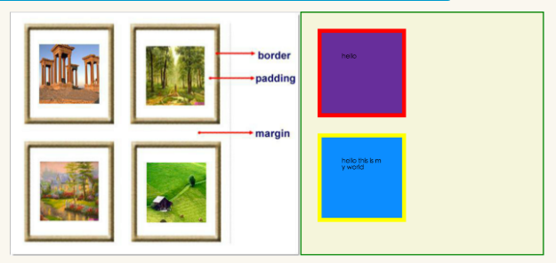
- margin: 用于控制元素与元素之间的距离;margin的最基本用途就是控制元素周围空间的间隔,从视觉角度上达到相互隔开的目的。
- padding: 用于控制内容与边框之间的距离;
- Border(边框): 围绕在内边距和内容外的边框。
- Content(内容): 盒子的内容,显示文本和图像。
margine(外边距)
margin-top:100px;
margin-bottom:100px;
margin-right:50px;
margin-left:50px;
简写属性
margin:10px 20px 20px 10px;

        上边距为10px
        右边距为20px
        下边距为20px
        左边距为10px

margin:10px 20px 10px;

        上边距为10px
        左右边距为20px
        下边距为10px

margin:10px 20px;

        上下边距为10px
        左右边距为20px

margin:25px;

        所有的4个边距都是25px
居中应用:margin: 0 auto;
padding(内边距)
单独使用填充属性可以改变上下左右的填充。缩写填充属性也可以使用,一旦改变一切都改变。
设置同margine;
页码实例:
<!DOCTYPE html>
<html lang="en">
<head>
    <meta charset="UTF-8">
    <title>Title</title>

    <style>
        .outer{
            margin: 0 auto;
            width: 80%;

        }

        .content{
            background-color: darkgrey;
            height: 500px;

        }

        a{
            text-decoration: none;
        }

        .page-area{

            text-align: center;
            padding-top: 30px;
            padding-bottom: 30px;
            background-color: #f0ad4e;

        }

        .page-area ul li{
            display: inline-block;
        }


       .page-area ul li a ,.page-area ul li span{

            display: inline-block;
            color: #369;
            height: 25px;
            width: 25px;
            text-align: center;
            line-height: 25px;

            padding: 8px;
            margin-left: 8px;

            border: 1px solid #e1e1e1;
            border-radius: 15%;

        }

       .page-area ul li .page-next{
           width: 70px;
           border-radius:0
       }


       .page-area ul li span.current_page{
           border: none;
           color: black;
           font-weight:900;
       }

       .page-area ul li a:hover{

           color: #fff;
           background-color: #2459a2;
       }


    </style>
</head>
<body>

<div class="outer">

<div class="content"></div>

<div class="page-area">

             <ul>

                 <li><span class="current_page">1</span></li>
                 <li><a href="#" class="page-a">2</a></li>
                 <li><a href="#" class="page-a">3</a></li>
                 <li><a href="#" class="page-a">4</a></li>
                 <li><a href="#" class="page-a">5</a></li>
                 <li><a href="#" class="page-a">6</a></li>
                 <li><a href="#" class="page-a">7</a></li>
                 <li><a href="#" class="page-a">8</a></li>
                 <li><a href="#" class="page-a">9</a></li>
                 <li><a href="#" class="page-a">10</a></li>
                 <li><a href="#" class="page-a page-next">下一页</a></li>

             </ul>

</div>

</div>


</body>
</html>
float属性
基本浮动规则
先来了解一下block元素和inline元素在文档流中的排列方式。
block元素通常被现实为独立的一块,独占一行,多个block元素会各自新起一行,默认block元素宽度自动填满其父元素宽度。block元素可以设置width、height、margin、padding属性;
inline元素不会独占一行,多个相邻的行内元素会排列在同一行里,直到一行排列不下,才会新换一行,其宽度随元素的内容而变化。inline元素设置width、height属性无效
- 常见的块级元素有 div、form、table、p、pre、h1~h5、dl、ol、ul 等。
- 常见的内联元素有span、a、strong、em、label、input、select、textarea、img、br等
所谓的文档流,指的是元素排版布局过程中,元素会自动从左往右,从上往下的流式排列。
脱离文档流,也就是将元素从普通的布局排版中拿走,其他盒子在定位的时候,会当做脱离文档流的元素不存在而进行定位。
假如某个div元素A是浮动的,如果A元素上一个元素也是浮动的,那么A元素会跟随在上一个元素的后边(如果一行放不下这两个元素,那么A元素会被挤到下一行);如果A元素上一个元素是标准流中的元素,那么A的相对垂直位置不会改变,也就是说A的顶部总是和上一个元素的底部对齐。此外,浮动的框之后的block元素元素会认为这个框不存在,但其中的文本依然会为这个元素让出位置。 浮动的框之后的inline元素,会为这个框空出位置,然后按顺序排列。
示例代码:
<!DOCTYPE html>
<html lang="en">
<head>
    <meta charset="UTF-8">
    <title>Title</title>
    <style>
        *{
            margin: 0;
        }

        .r1{
            width: 300px;
            height: 100px;
            background-color: #7A77C8;
            float: left;
        }
        .r2{
            width: 200px;
            height: 200px;
            background-color: wheat;
            /*float: left;*/

        }
        .r3{
            width: 100px;
            height: 200px;
            background-color: darkgreen;
            float: left;
        }
    </style>
</head>
<body>

<div class="r1"></div>
<div class="r2"></div>
<div class="r3"></div>


</body>
</html>
清除浮动
clear语法:
clear : none | left | right | both
取值:
none : 默认值。允许两边都可以有浮动对象
left : 不允许左边有浮动对象
right : 不允许右边有浮动对象
both : 不允许有浮动对象
但是需要注意的是:clear属性只会对自身起作用,而不会影响其他元素。
<!DOCTYPE html>
<html lang="en">
<head>
    <meta charset="UTF-8">
    <title>Title</title>
    <style>
        *{
            margin: 0;
        }

        .r1{
            width: 300px;
            height: 100px;
            background-color: #7A77C8;
            float: left;
        }
        .r2{
            width: 200px;
            height: 200px;
            background-color: wheat;
            float: left;
            clear: left;

        }
        .r3{
            width: 100px;
            height: 200px;
            background-color: darkgreen;
            float: left;
        }
    </style>
</head>
<body>

<div class="r1"></div>
<div class="r2"></div>
<div class="r3"></div>


</body>
</html>
把握住两点:1、元素是从上到下、从左到右依次加载的。
2、clear: left;对自身起作用,一旦左边有浮动元素,即切换到下一行来保证左边元素不是浮动的,依据这一点解决父级塌陷问题。
position(定位)
1 static
static 默认值,无定位,不能当作绝对定位的参照物,并且设置标签对象的left、top等值是不起作用的的。
2 position: relative/absolute
relative: 相对定位。
相对定位是相对于该元素在文档流中的原始位置,即以自己原始位置为参照物。有趣的是,即使设定了元素的相对定位以及偏移值,元素还占有着原来的位置,即占据文档流空间。对象遵循正常文档流,但将依据top,right,bottom,left等属性在正常文档流中偏移位置。而其层叠通过z-index属性定义。
注意:position:relative的一个主要用法:方便绝对定位元素找到参照物。
absolute: 绝对定位。
定义:设置为绝对定位的元素框从文档流完全删除,并相对于最近的已定位祖先元素定位,如果元素没有已定位的祖先元素,那么它的位置相对于最初的包含块(即body元素)。元素原先在正常文档流中所占的空间会关闭,就好像该元素原来不存在一样。元素定位后生成一个块级框,而不论原来它在正常流中生成何种类型的框。
重点:如果父级设置了position属性,例如position:relative;,那么子元素就会以父级的左上角为原始点进行定位。这样能很好的解决自适应网站的标签偏离问题,即父级为自适应的,那我子元素就设置position:absolute;父元素设置position:relative;,然后Top、Right、Bottom、Left用百分比宽度表示。
另外,对象脱离正常文档流,使用top,right,bottom,left等属性进行绝对定位。而其层叠通过z-index属性定义。
示例代码:
<!DOCTYPE html>
<html lang="en">
<head>
    <meta charset="UTF-8">
    <title>Title</title>
    <style>
        *{
            margin: 0;
        }
        .outet{
            /*position: relative;*/

        }
        .item{
            width: 200px;
            height:200px ;
        }
        .r1{
            background-color: #7A77C8;
        }
        .r2{
            background-color: wheat;
            /*position: relative;*/
            position: absolute;
            top: 200px;
            left: 200px;
        }
        .r3{
            background-color: darkgreen;
        }
    </style>
</head>
<body>

<div class="item r1"></div>
<div class="outet">

    <div class="item r2"></div>
    <div class="item r3"></div>
</div>


</body>
</html>
总结:参照物用相对定位,子元素用绝对定位,并且保证相对定位参照物不会偏移即可。
position:fixed
fixed:对象脱离正常文档流,使用top,right,bottom,left等属性以窗口为参考点进行定位,当出现滚动条时,对象不会随着滚动。而其层叠通过z-index属性 定义。 注意点: 一个元素若设置了 position:absolute | fixed; 则该元素就不能设置float。这 是一个常识性的知识点,因为这是两个不同的流,一个是浮动流,另一个是“定位流”。但是 relative 却可以。因为它原本所占的空间仍然占据文档流。
在理论上,被设置为fixed的元素会被定位于浏览器窗口的一个指定坐标,不论窗口是否滚动,它都会固定在这个位置。
示例代码:
<!DOCTYPE html>
<html lang="en">
<head>
    <meta charset="UTF-8">
    <title>Title</title>
    <style>
        *{
            margin: 0;
        }
        .back{
            background-color: wheat;
            width: 100%;
            height: 1200px;
        }
        span{
            display: inline-block;
            width: 80px;
            height: 50px;
            position: fixed;
            bottom: 20px;
            right: 20px;
            background-color: rebeccapurple;
            color: white;
            text-align: center;
            line-height: 50px;

        }
    </style>
</head>
<body>


<div class="back">
    <span>返回顶部</span>
</div>
</body>
</html>
Caution!
1、默认的高度和宽度问题
(1)父子都是块级元素
<!DOCTYPE html>
<html>
<head>
    <title>fortest</title>
    <style>
        div.parent{
            width: 500px;
            height: 300px;
            background: #ccc;
        }
        div.son{
            width: 100%;
            height: 200px;
            background: green;
        }
    </style>
</head>
<body>
    <div class="parent">
        <div class="son"></div>
    </div>
</body>
</html>
这时,子元素设置为了父元素width的100%,那么子元素的宽度也是500px;
但是如果我们把子元素的width去掉之后,就会发现子元素还是等于父元素的width。也就是说,对于块级元素,子元素的宽度默认为父元素的100%。
当我们给子元素添加padding和margin时,可以发现宽度width是父元素的宽度减去子元素的margin值和padding值。
毫无疑问,如果去掉子元素的height,就会发先子元素的高度为0,故height是不会为100%的,一般我们都是通过添加内容(子元素)将父元素撑起来。
(2)父:块级元素 子:内联元素
如果内联元素是不可替换元素(除img,input以外的一般元素),元素是没有办法设置宽度的,也就谈不上100%的问题了。 即内联元素必须依靠其内部的内容才能撑开。
如果内联元素是可替换元素(img,input,本身可以设置长和宽),不管怎么设置父元素的宽度和高度,而不设置img的宽和高时,img总是表现为其原始的宽和高。
<!DOCTYPE html>
<html>
<head>
    <title>...</title>
    <style>
        div.parent{
            width: 500px;
            height: 300px;
            background: #ccc;
        }
        img{
            height: 100px;
            background: green;
        }
    </style>
</head>
<body>
    <div class="parent">
        <img class="son" src="s1.jpg"></img>
    </div>
</body>
</html>
由此我们可以发现,虽然没有设置宽度,但是表现在浏览器上为160px,它并没有继承父元素的100%得到500px,而是根据既定的高度来等比例缩小宽度。 同样, 如果只设置width,那么height也会等比例改变。 如果我们把img的width设置为100%,就可以发现其宽度这时就和父元素的宽度一致了。而我们一般的做法时,首先确定img的父元素的宽度和高度,然后再将img的宽度和高度设置位100%,这样,图片就能铺满父元素了。
后台管理布局
<!DOCTYPE html>
<html lang="en">
<head>
    <meta charset="UTF-8">
    <title>Title</title>

    <style>

        .pg-header{
           height: 48px;
           width: 100%;
           background-color: #2459a2;
           position: fixed;
           top:0;
           left: 0;
        }
        .left{
            position:absolute;
            left:0;
            top:48px;
            bottom:0;
            width:200px;
            background-color: #ededed;
        }

        .right{
            position:absolute;
            right:0;
            left:200px;
            top:48px;
            bottom:0;
            overflow:auto;

        }
        .content{
            height: 2000px;
            width: 100%;

        }
    </style>
</head>
<body>


<div class="pg-header"></div>
<div>
    <div class="left">

    </div>
    <div class="right">
      <div class="content"></div>
    </div>
</div>

</body>
</html>
css响应式布局
<!DOCTYPE html>
<html lang="en">
<head>
    <meta charset="UTF-8">
    <title>Title</title>
    <style>

        /*======================================初始化=====================*/
            *{
             margin: 0;
             padding: 0;
                  }

            body{
                font-size: 12px;
            }

            a{
              text-decoration: none;
            }

        /*======================================header区域设置=====================*/
        .header{
               height: 44px;
               width: 100%;
               background-color: #2459a2;
               position: fixed;
               top:0;
               left: 0;
        }


        .header_content{
            width: 80%;
            height: 44px;
            background-color: #2459a2;
            margin: 0 auto;
            line-height: 44px;
            position: relative;

        }


/*======header区part1:logo ===========*/


               .logo{

                    float: left;
                    width: 121px;
                    height: 23px;
                    margin-top: 9px;

                }

/*======header区part2:action-menu =====*/

               .action-menu{
                    float: left;
                    margin-left: 30px;
                }

                .action-menu a.tb{
                            color: #c0cddf;
                            padding: 0 10px;
                            text-align: center;
                            margin-left: -3px;
                            display: inline-block;


                        }

                .action-menu a.tb:hover {
                    color: #fff;
                    background-color: lightslategrey;

                }

                 .action-menu a.active, .action-menu a.active:hover {
                                color: #fff;
                                background-color:#204982;;

                            }

/*======header区part3:key-search =====*/

                 .key-search{
                         margin-top: 5px;
                         float: right;
                    }


                 .key-search a.search-icon-box, .search-txt {
                        float: left;
                    }

                .search-txt {

                    color: #333;
                    line-height: 25px;
                    padding: 2px 2px 2px 5px;
                    height: 25px;
                    width: 91px;

                }

                .key-search a.search-icon-box {
                    border: 1px solid #e0e0e0;
                    background-color: #f4f4f4;
                    width: 30px;
                    height: 31px;
                    border-left: 0;
                }


                .key-search a.search-icon-box span.search-icon{
                    background: url("images/icon.png") no-repeat 0 -197px;
                    float: left;
                    height: 12px;
                    width: 11px;
                    margin-left: 10px;
                    margin-top: 9px;
                }

/*======header区part4:action-nav =====*/

                .action-nav {
                       float: right;
                       margin-right: 10px;
                    }

                 .action-nav a {
                        color: white;
                        padding: 14px 18px;

                    }

                .action-nav a:hover{
                    background-color: lightslategrey;
                    color: white;
                }
 /*======================================content区域设置=====================*/

             .content-box {
                    background-color: #ededed;
                    padding-top: 44px;
                    height: 100%;
                }

             .content {
                    width: 960px;
                    margin: 0 auto;
                    height: auto!important;
                    overflow: hidden;
                    min-height: 713px;
                    padding: 6px 28px;
                    background-color: #fff;
                    /*overflow: hidden;取消后看看效果*/
                }

        /*===============================响应式布局=====================*/


         @media(max-width:1050px) {


          .action-menu a.item{

              display: none;
              background-color: gold;
              border: dashed 1px rebeccapurple;

              color: black;


          }

             .action-menu a.active{

                 padding: 0 25px;

             }

             .action-nav{

                 float: left;

                 margin-left: 80px;

             }

             .key-search{
                 float: right;
                 margin-right: 100px;
             }


          .action-menu:hover a.item{
              display: block;


          }


         }


        @media(max-width:810px) {

             .key-search{
                 display: none;
             }

            .action-nav{
                display: none;
            }
        }


    </style>
</head>
<body>


    <!--header结构-->
    <div class="header">

         <div class="header_content">

               <div class="logo">
                   <a href="/"><img src="images/logo.png" alt=""></a>
               </div>

               <div class="action-menu">

                        <a href="#" class="tb active">全部</a>
                        <a href="#" class="tb item">42区</a>
                        <a href="#" class="tb item">段子</a>
                        <a href="#" class="tb item">图片</a>
                        <a href="#" class="tb item">挨踢1024</a>
                        <a href="#" class="tb item">你问我答</a>
               </div>

               <div class="key-search">

                    <form action="/" method="post">
                        <input type="text" class="search-txt">

                        <a href="#" class="search-icon-box" >
                            <span class="search-icon"></span>
                        </a>
                    </form>

               </div>

               <div class="action-nav">

                    <a href="#" class="register-btn">注册</a>
                    <a href="#" class="login-btn">登录</a>
               </div>

         </div>
    </div>


    <!--content结构-->

    <div class="content-box">

        <div class="content">


        </div>

    </div>


</body>
</html>

