文本溢出显示省略号
单行溢出
- 核心代码:
  /* 宽度width需要进行限定 */
  overflow: hidden;
  text-overflow: ellipsis;
  white-space: nowrap;
- 示例:
<!DOCTYPE html>
<html>
<head>
  <style type="text/css">
      .wrap .text {
          width: 100%;
          overflow: hidden;
          text-overflow: ellipsis;
          white-space: nowrap;
      }
  </style>
</head>
<body>
<div class="wrap">
  <div class="text">
      It is said that the true nature of being is veiled. The labor of words, the expression of art, the seemingly ceaseless buzz that is human thought all have in common the need to get at what really is so. The hope to draw close to and possess the truth of being can be a feverish one. In some cases it can even be fatal, if pleasure is one's truth and its attainment more important than life itself. In other lives, though, the search for what is truthful gives life.
  </div>
</div>
</body>
</html>
多行溢出
-
实现原理:
利用浮动特性实现
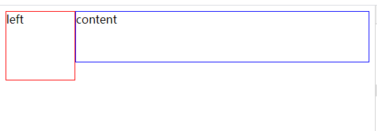
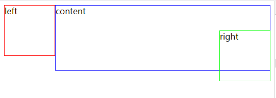
left高度相当于溢出高度,content为内容,right相当于省略号。通过content不同的高度变化来更改right的位置- 代码:
<!DOCTYPE html>
<html lang="en">
<head>
    <style type="text/css">
        * {
            box-sizing: border-box;
        }
        .left {
            float: left;
            width: 100px;
            height: 100px;
            border: 1px solid #f00;
        }
        .right {
            float: right;
            width: 100px;
            height: 100px;
            border: 1px solid #0f0;
        }
        .center {
            float: right;
            width: calc(100% - 100px);
            height: 300px;
            border: 1px solid #00f;
        }

    </style>
</head>
<body>
    <div class="left">left</div>
    <div class="center">content</div>
    <div class="right">right</div>
</body>
</html>
当content高度小于left高度时,right在右边
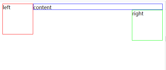
当content高度大于left高度时,right跑到坐标的left下面去了

然后
.right加入定位代码position: relative; left: calc(100% - 100px); top: -50px;此时,当content高度小于left高度时,right在更右边了,不能看见
此时,当content高度大于left高度时,right在右边,可以看见
- 代码:
-
示例:
<!DOCTYPE html>
<html lang="en">
<head>
  <style type="text/css">
      .wrap {
          height: 60px;
          line-height: 20px;
          overflow: hidden;
      }
      .wrap .text {
          float: right;
          width: 100%;
          margin-left: -5px;
      }
      .wrap:before {
          float: left;
          width: 5px;
          height: 60px;
          content: '';
      }
      .wrap:after {
          float: right;
          height: 20px;
          line-height: 20px;
          content: '...';
          width: 3em;
          padding-right: 5px; /*填补空缺的5px*/

          /*未设置定位时:                       设置定位:
            文本未溢出时: 省略号在左边    ->      省略号被定位到更右边的距离了
            文本溢出时: 省略号在右下角    ->      省略号被定位到正确位置
            */
          position: relative;
          top: -20px;
          left: 100%;

          margin-left: -3em; /*弥补left:100%*/
          text-align: right; /*防止文字居中影响*/
          background: linear-gradient(to right, transparent 0%, #FFF 50%, #FFF 100%); /*加上渐变效果,使显示一半的文章看上去正常点*/
      }
  </style>
</head>
<body>
<div class="wrap">
  <div class="text">
      It is said that the true nature of being is veiled. The labor of words, the expression of art, the seemingly ceaseless buzz that is human thought all have in common the need to get at what really is so. The hope to draw close to and possess the truth of being can be a feverish one. In some cases it can even be fatal, if pleasure is one's truth and its attainment more important than life itself. In other lives, though, the search for what is truthful gives life.
  </div>
</div>
</body>
</html>

 浙公网安备 33010602011771号