
CSS三大特性
-
1、层叠性
- 一个标签可以有多个CSS样式
- 浏览器处理冲突的能力,如果一个属性通过两个相同的选择器设置到这个元素上,样式的层叠规则
- 按照样式的声明顺序来层叠,就近原则,样式不冲突,不会层叠
- 前提:选择器必须是同一种
-
2、继承性
- 子标签会继承父标签的某些样式
-
3、优先级
-
权重
- 继承的权重0-------最低
- 行内样式100
- 权重相同,就近原则
- !important命令 无限大
-
css权重公式:贡献值
- 继承、*----0,0,0,0
- 标签选择器----0,0,0,1
- 类、伪类选择器----0,0,1,0
- ID选择器----0,1,0,0
- 行内样式----1,0,0,0
- !important----无穷大
- width,height,max-width,max-height,min-width,max-height----大于无穷大
-
权重不能被继承
-
贡献值不能进位
-
常用单位
- px(像素):最常用
- em:绝对单位,比如说父级的字号16px,我们可以设置成2em
- rem:由整个html的字号决定。当浏览器的字号发生改变,页面的字号会随之改变
- 百分比:相对父元素的比例
字体
  /* 字体大小 */
  font-size: 20px;
  /* 字体样式 */
  font-style: italic;
  /* 字体粗细 */
 font-weight: normal;
  /* 字体修饰 */
  text-decoration: underline;
  /* 字体 */
  font-family: monospace;
  /* 复合属性 */
  font: 30px italic bold;
背景
一般情况下不要既有背景又有背景图片
/* 背景颜色 */
background-color: rgb(25, 55, 77);
width: 200px;
height: 200px;
/* 背景图片 */
background-image: url(地址);
/* 背景图片大小 */
background-size: 200px;
/* 背景图片位置 */
background-position: center;
/* 指定如何重复背景图像 */
background-repeat: no-repeat;
列表属性
			div ul li {
				/* list-style-type 属性设置列表项标记的类型 */
                list-style-type: decimal;
                list-style-position: outside;
                /* list-style-image: url(img/libai.jpeg); */
            }
边框
            .div1 {
                width: 200px;
                height: 200px;
                background-color: yellow;
                border-radius: 50px;
                border-bottom-left-radius: 100px;
                border-style: solid;
                border-color: blue;
                /* border: 1px solid red; */
            }
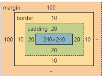
盒子模型
		* {
            /* *号选择器初始化 */
            /* 初始化浏览器默认的内外边距 */
            margin: 0px;
            padding: 0px;
        }

        div {
            width: 300px;
            height: 300px;
            background-color: orange;
            /* 外边距 */
            margin-top: 100px;
            margin-left: 100px;
            border: 10px solid red;
            /* 内边距 */
            padding: 20px;
            /* boder-box:保证盒子的大小是300*300,外边距不包括 */
            box-sizing: border-box;
            /* content-box:保证当前div的尺寸是300*300,不包括内边距和边框线 */
            /* box-sizing: content-box; */
        }
display的inline、block、inline-block的区别
display:block就是将元素显示为块级元素----->独占一行,高度,行高以及顶和底边距都可控制;
display:inline就是将元素显示为行内元素----->和其他元素都在一行上,高,行高及顶和底边距不可改变,宽度就是它的文字或图片的宽度,不可改变----->
display:inline-block 行内块元素----->和其他元素都在一行上,高度,行高以及顶和底边距都可控制
文档流
在网页中将窗体自上而下分成好多行,并在每行从左到右的顺序排列元素,即为文档流(网页默认的布局方式)
定位
- static:文档流,默认的
- absolute:绝对定位------>相对于一个父元素的绝对定位,当设置了绝对定位之后,原来的元素会脱离文档流,在页面上浮起来
- relative:相对定位------>相对于上一个元素的位置
- fixed:固定定位
当设置了定位之后,原来的元素会脱离文档流,在页面上浮起来
- 子绝父相
- 子元素绝对定位
- 父元素相对定位
<!DOCTYPE html>
<html lang="en">
<head>
<meta charset="UTF-8">
<meta http-equiv="X-UA-Compatible" content="IE=edge">
<meta name="viewport" content="width=device-width, initial-scale=1.0">
<title>Document</title>
<style>
* {
/* *号选择器初始化 */
/* 初始化浏览器默认的内外边距 */
margin: 0;
padding: 0;
}
.div1 {
width: 300px;
height: 300px;
background-color: orange;
position: absolute;
left: 150px;
top: 50px;
}
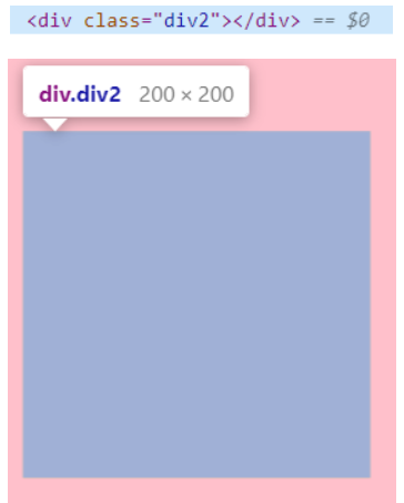
.div2 {
width: 200px;
height: 200px;
background-color: skyblue;
/* 绝对定位 */
position: absolute;
/* 坐标 */
left: 150px;
top: 400px;
}
.container {
width: 600px;
height: 800px;
background-color: pink;
position: relative;
top: 100px;
left: 200px;
}
.nav {
width: 100%;
height: 100px;
background-color: red;
/* 水平居中 */
margin: auto;
position: fixed;
/* z轴的索引 */
z-index: 1;
}
</style>
</head>
<body>
<div class="nav">我是导航栏</div>
<div class="container">
<div class="div1"></div>
<div class="div2"></div>
</div>
</body>
</html>
导航栏
/* 固定定位:固定导航栏的位置 */
position: fixed;
/* z轴的索引:是导航栏一直显示在其他内容之上,不给覆盖 */
z-index: 100;
定位的left和top、right和bottom和margin-left.....的区别?
- 定位的left等是相对于父元素的位置,margin是相对于自己的初始位置,margin是盒子模型的属性
- 在开发中,尽量统一使用
可见性
- display: none---->使用该属性后,HTML元素(对象)仅仅是在视觉上看不见(完全透明),而它所占据的空间位置仍然存在,也即是说它仍具有高度、宽度等属性值
- visibility: hidden---->使用该属性后,HTML元素(对象)的宽度、高度等各种属性值都将“丢失”
溢出策略
<!DOCTYPE html>
<html lang="en">
<head>
<meta charset="UTF-8">
<meta http-equiv="X-UA-Compatible" content="IE=edge">
<meta name="viewport" content="width=device-width, initial-scale=1.0">
<title>Document</title>
<style>
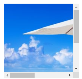
div {
width: 200px;
height: 200px;
/* 溢出策略
scroll:内容会被修剪,但是浏览器会显示滚动条以便查看其余的内容
visible:默认值。内容不会被修剪,会呈现在元素框之外
hidden:内容会被修剪,并且其余内容是不可见的
*/
overflow: scroll;
}
</style>
</head>
<body>
<div>
<img src="./1.jpg" alt="">
</div>
</body>
</html>
浮动
 float: left;向左浮动
 float: right;向右浮动
过渡
transition: property duration timing-function delay;

transition-property //规定设置过渡效果的 CSS 属性的名称。
transition-duration //规定完成过渡效果需要多少秒或毫秒。
transition-timing-function  //规定速度效果的速度曲线。
transition-delay    //定义过渡效果何时开始。
css3兼容性问题
- 针对于火狐浏览器: -moz-transition
- 针对于Safari和Google : -webkit-animation:
- 针对Opera浏览器 :-o-animation: ;
动画
<!DOCTYPE html>
<html lang="en">
    <head>
        <meta charset="UTF-8">
        <meta http-equiv="X-UA-Compatible" content="IE=edge">
        <meta name="viewport" content="width=device-width, initial-scale=1.0">
        <title>Document</title>
        <style>
            .div1 {
                /* 引用自定义动画,延迟时间 */
                animation: myAnim 5s;
            }
            /* 先声明动画,再使用 */
            @keyframes myAnim {
                0% {
                    width: 100px;
                    height: 100px;
                    background-color: orange;
                }
                25%{
                    width: 200px;
                    height: 200px;
                    background-color: blue;
                }
                50% {
                    width: 400px;
                    height: 400px;
                    background-color: red;transform: rotate(45deg);
                }
                75% {
                    width: 200px;
                    height: 200px;
                    background-color: blue;transform: rotateZ(180deg);
                }
                100% {
                    width: 100px;
                    height: 100px;
                    background-color: orange;transform: rotate3d(270deg);
                }
            }
        </style>
    </head>
    <body>
        <div class="div1">123</div>
    </body>
</html>
transition和animation区别
- transition是一个过渡的效果,没有中间状态,需要设置触发事件(如hover等)才能执行;
- animation是一个动画的效果,有多个中间帧,可以在任意一个中间帧设置状态,不需要设置触发事件就能执行。
flex布局
<!DOCTYPE html>
<html lang="en">
    <head>
        <meta charset="UTF-8">
        <meta http-equiv="X-UA-Compatible" content="IE=edge">
        <meta name="viewport" content="width=device-width, initial-scale=1.0">
        <title>Document</title>
        <style>
            .container {
                display: flex;
                /* 排列方向 */
                /* flex-direction: row; */
                /* 如果一条轴线上装不下,换行的方式 */
                /* flex-wrap:wrap-reverse; */
                /* flex-flow: row wrap; */
                /* 设置主轴的排列策略 */
                justify-content: space-evenly;
                /* 交叉轴 */
                align-items:flex-start;
                align-content: center;
                width: 900px;
                height: 900px;
                background-color: pink;
            }
            .flex1 {
                width: 200px;
                height: 200px;
                background-color: green;
                order: 1;
                /* 要将哪个项目放大,默认是0 */
                /* flex-grow: 2; */
                /* 要将哪个项目缩小,默认是0 */
                flex-shrink: 20;
                align-self: flex-end;
            }
            .flex2 {
                width: 200px;
                height: 200px;
                background-color: yellow;
                order: -2;
            }
        </style>
    </head>
    <body>
        <!-- flex布局
            块级元素和行内块级元素
            1.父容器要加上display:flex
        -->
        <div class="container">
            <div class="flex1">123</div>
            <div class="flex2">456</div>
            <div class="flex1">123</div>
            <div class="flex2">456</div>
            <div class="flex1">123</div>
            <div class="flex2">456</div>
        </div>
        <hr>
        <div class="container">
            <div class="flex1">123</div>
            <div class="flex2">456</div>
            <div class="flex1">123</div>
            <div class="flex2">456</div>
            <div class="flex1">123</div>
            <div class="flex2">456</div>
        </div>
    </body>
</html>
练习
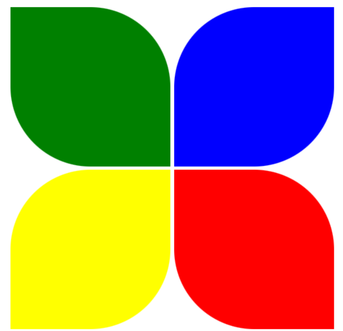
<!DOCTYPE html>
<html lang="en">
    <head>
        <meta charset="UTF-8">
        <meta http-equiv="X-UA-Compatible" content="IE=edge">
        <meta name="viewport" content="width=device-width, initial-scale=1.0">
        <title>Document</title>
        <style>
            div {
                width: 200px;
                height: 200px;
                display: inline-block;
            }
            .div1,.div4{
                border-bottom-left-radius: 50%;
                border-top-right-radius: 50%;
            }
            .div2,.div3{
                border-bottom-right-radius: 50%;
                border-top-left-radius: 50%;
            }
            /* 区块属性:定义一个元素的显示方式 */
            .div1{
                background-color: green;
            }
            .div2 {
                background-color: blue;
            }
            .div3 {
                background-color: yellow;
            }
            .div4 {
                background-color: red;
            }
        </style>
    </head>
    <body>
        <div class="div1"></div>
        <div class="div2"></div><br>
        <div class="div3"></div>
        <div class="div4"></div>
    </body>
</html>
作业
有多张缩小了的图片,实现:当鼠标移动到图片上时,图片自动展开
<!DOCTYPE html>
<html lang="zh-CN">
<head>
    <meta charset="UTF-8">
    <meta http-equiv="X-UA-Compatible" content="IE=edge">
    <meta name="viewport" content="width=device-width, initial-scale=1.0">
    <title>Document</title>
    <style>
        div {
            width: 50px;
            height: 307px;
            overflow: hidden;
            display: inline-block;
        }

        div:hover {
            width: 410px;
            overflow: visible;
        }
    </style>
</head>
<body>
    <div>
        <img src="./1.jpg">
    </div>
    <div>
        <img src="./1.jpg">
    </div>
    <div>
        <img src="./1.jpg">
    </div>
    <div>
        <img src="./1.jpg">
    </div>
</body>
</html>

