小程序篇 -- 制作一个弹窗组件
1、首先我们来创建弹窗的子组件,在components下面创建popup,代码如下:
popup.wxml
<view class="wx-popup" hidden="{{flag}}">
  <view class='popup-container'>
    <view class="wx-popup-title">{{title}}</view>
    <view class="wx-popup-con">{{content}}</view>
    <view class="wx-popup-btn">
      <text class="btn-no" bindtap='_error'>{{btn_no}}</text>
      <text class="btn-ok" bindtap='_success'>{{btn_ok}}</text>
    </view>
  </view>
</view>
popup.wxss
.wx-popup {
  position: absolute;
  left: 0;
  top: 0;
  width: 100%;
  height: 100%;
  background: rgba(0, 0, 0, .5);
}
.popup-container {
  position: absolute;
  left: 50%;
  top: 50%;

  width: 80%;
  max-width: 600rpx;
  border: 2rpx solid #ccc;
  border-radius: 10rpx;
  box-sizing: bordre-box;
  transform: translate(-50%, -50%);
  overflow: hidden;
  background: #fff;
}
.wx-popup-title {
  width: 100%;
  padding: 20rpx;
  text-align: center;
  font-size: 40rpx;
  border-bottom: 2rpx solid red;
}
.wx-popup-con {
  margin: 60rpx 10rpx;
  text-align: center;
}
.wx-popup-btn {
  display: flex;
  justify-content: space-around;
  margin-bottom: 40rpx;
}
.wx-popup-btn text {
  display: flex;
  align-items: center;
  justify-content: center;
  width: 30%;
  height: 88rpx;
  border: 2rpx solid #ccc;
  border-radius: 88rpx;
}
popup.js
Component({
  options: {
    multipleSlots: true // 在组件定义时的选项中启用多slot支持
  },
  /**
   * 组件的属性列表
   */
  properties: {
    title: {            // 属性名
      type: String,     // 类型(必填),目前接受的类型包括:String, Number, Boolean, Object, Array, null(表示任意类型)
      value: '标题'     // 属性初始值(可选),如果未指定则会根据类型选择一个
    },
    // 弹窗内容
    content: {
      type: String,
      value: '内容'
    },
    // 弹窗取消按钮文字
    btn_no: {
      type: String,
      value: '取消'
    },
    // 弹窗确认按钮文字
    btn_ok: {
      type: String,
      value: '确定'
    }
  },

  /**
   * 组件的初始数据
   */
  data: {
    flag: true,
  },

  /**
   * 组件的方法列表
   */
  methods: {
    //隐藏弹框
    hidePopup: function () {
      this.setData({
        flag: !this.data.flag
      })
    },
    //展示弹框
    showPopup () {
      this.setData({
        flag: !this.data.flag
      })
    },
    /*
    * 内部私有方法建议以下划线开头
    * triggerEvent 用于触发事件
    */
    _error () {
      //触发取消回调
      this.triggerEvent("error")
    },
    _success () {
      //触发成功回调
      this.triggerEvent("success");
    }
  }
})
2、在首页引入这个组件,在index.json中配置"usingComponents",代码如下:
{
  "usingComponents": {
    "popup": "/components/popup/popup"
  }
}
index.wxml:
<!--index.wxml-->
<view class="container">
<view class="userinfo">
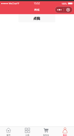
<button bindtap="showPopup"> 点我 </button>
</view>
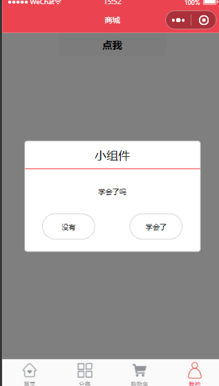
<popup id='popup'
title='小组件'
content='学会了吗'
btn_no='没有'
btn_ok='学会了'
bind:error="_error"
bind:success="_success">
</popup>
</view>
index.js:
Page({
  onReady: function () {
    //获得popup组件
    this.popup = this.selectComponent("#popup");
  },

  showPopup() {
    this.popup.showPopup();
  },

  //取消事件
  _error() {
    console.log('你点击了取消');
    this.popup.hidePopup();
  },
  //确认事件
  _success() {
    console.log('你点击了确定');
    this.popup.hidePopup();
  }
})
运行效果如下:

 浙公网安备 33010602011771号