
ggplot2 注释文本到图所展示的数据上
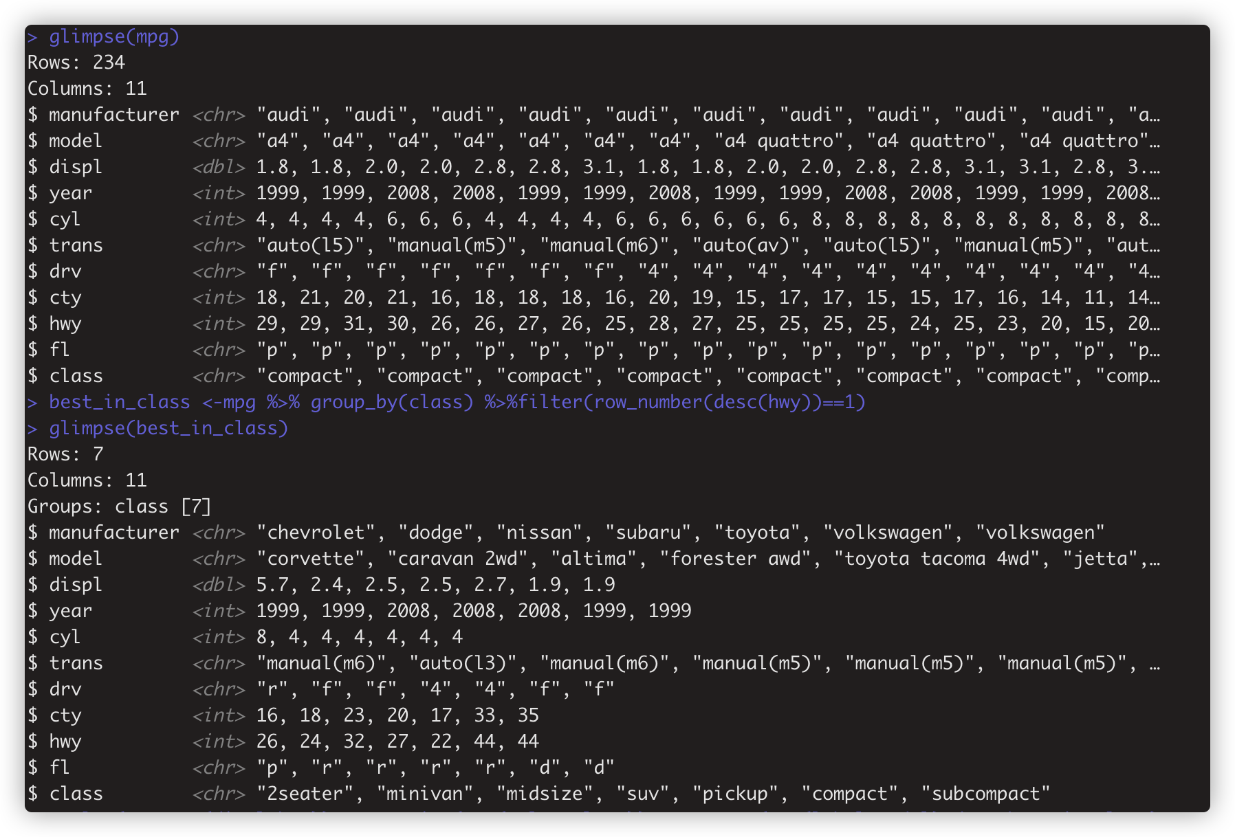
best_in_class <-mpg %>% group_by(class) %>%filter(row_number(desc(hwy))==1) #取每组hwy 最大的那行观测赋值给best_in_class
ggplot(mpg,aes(displ,hwy))+geom_point(aes(color=class))+geom_text(aes(label=model),data=best_in_class)
# 1 先把mpg 的 hwy 对displ作图,按class分颜色散点图
# 2 再依据存有每类的hwy最大值的观测数据,为每个class里边hwy最大的点标注上它的model
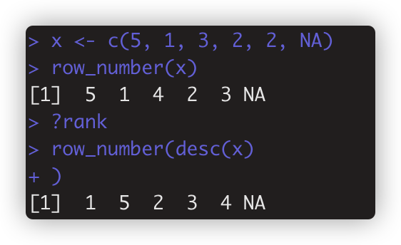
注: row_number() 等同于rank, row_number(desc(hwy)) 返回值是按从大到小顺序排列时,当前元素所在的第几。如
> x <- c(5, 1, 3, 2, 2, NA)
> row_number(x)
> row_number(desc(x) )
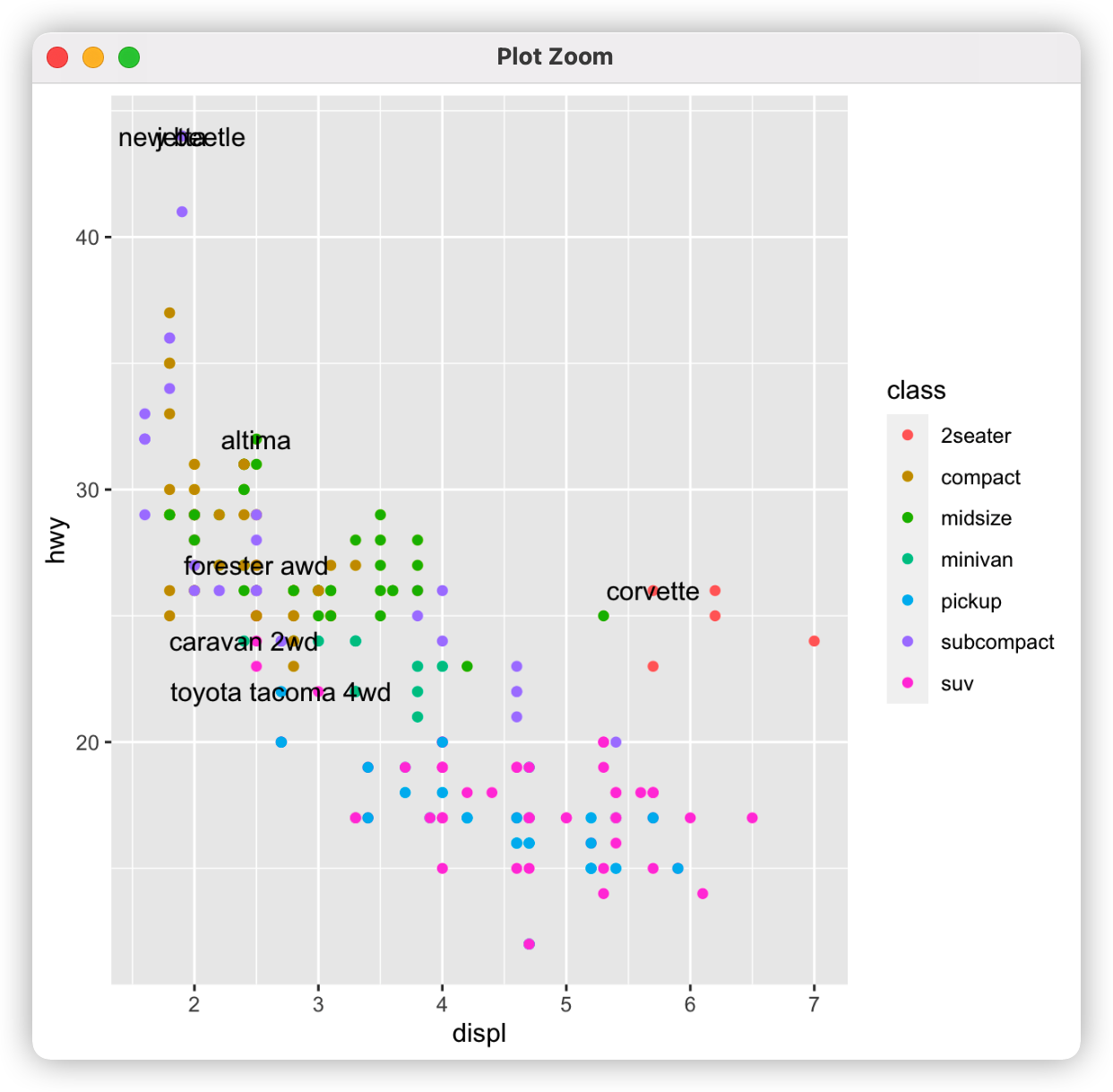
上图 标签彼此重叠,标签和数据点混在一起。因此改用geom_label()函数,为文本设置方框,设置nudge_y参数让标签位于对应数据点的正上方
ggplot(mpg,aes(displ,hwy))+geom_point(aes(color=class))+geom_label(aes(label=model),data=best_in_class,nudge_y = 2,alpha=0.5)

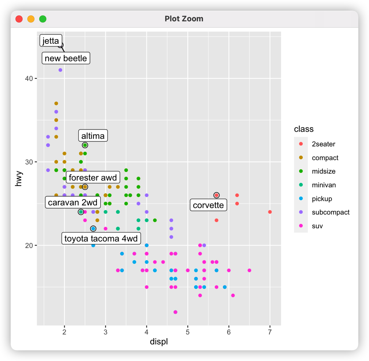
但右上角有重叠的字符框,因为数据点位置几乎重叠,用ggrepel包的geom_label_repel自动调节标签位置,以避免重叠
ggplot(mpg,aes(displ,hwy))+geom_point(aes(color=class))+geom_point(size=3,shape=1,data=best_in_class)+ggrepel::geom_label_repel(aes(label=model),data=best_in_class) #这里还自动用较大的空心圆来强调添加了标签的数据点
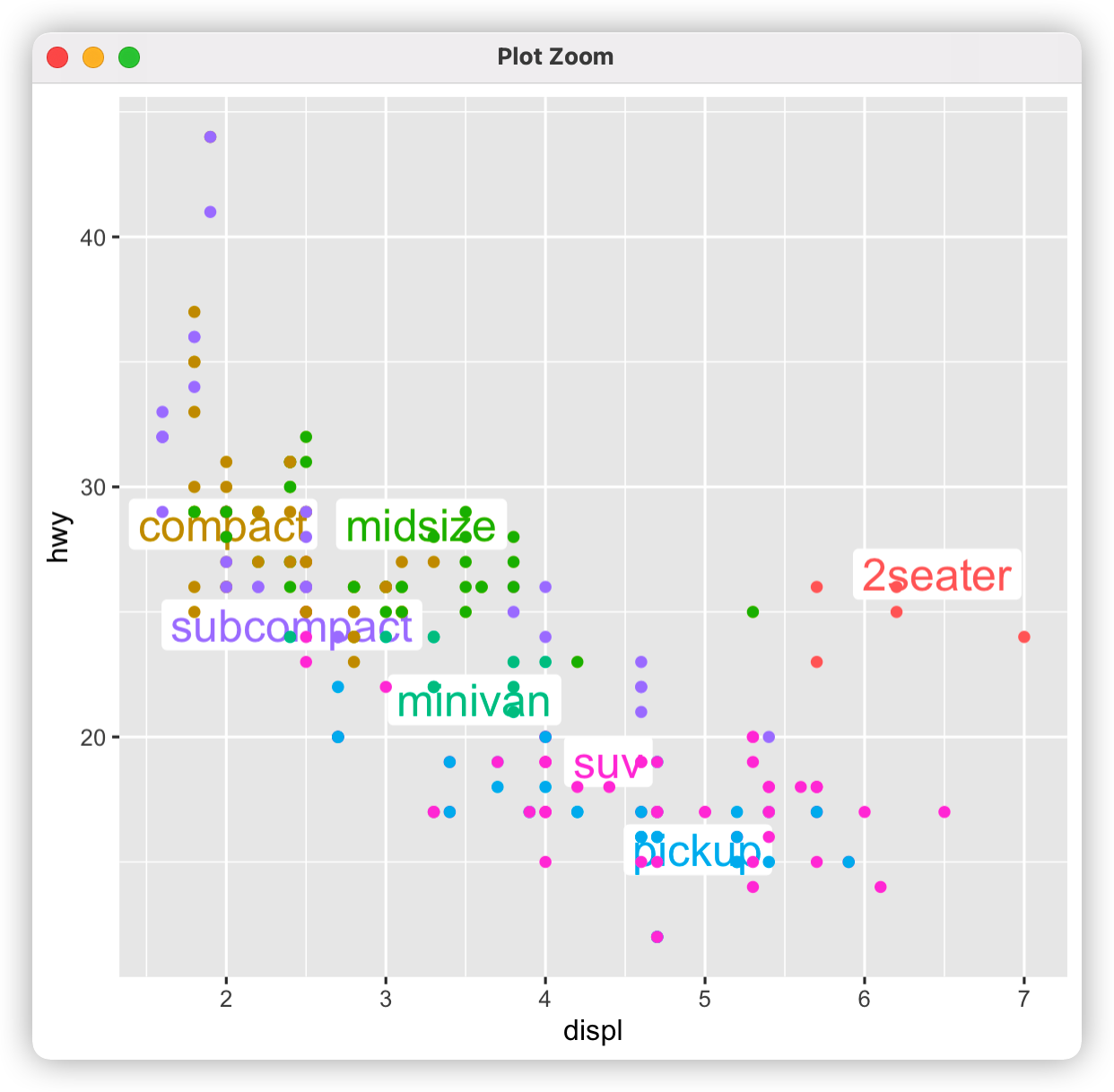
class_avg<-mpg %>% group_by(class) %>%summarize(displ=median(displ),hwy=median(hwy))
ggplot(mpg,aes(displ,hwy,color=class))+ggrepel::geom_label_repel(aes(label=class),data=class_avg,size=6,label.size=0,segment.color=NA)+geom_point()+theme(legend.position = "none") # 讲class 作为lable 标注在图上,theme(legend.position = "none") 删掉图例legend
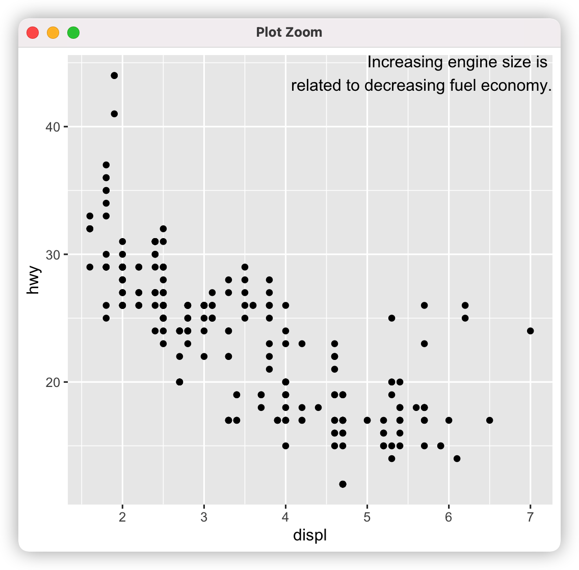
label<-tibble(displ=Inf,hwy=Inf,label=paste("Increasing engine size is \nrelated to", + "decreasing fuel economy.")) #设置Inf,不从数据集映射位置
ggplot(mpg,aes(displ,hwy))+geom_point()+geom_text(aes(label=label),data=label,vjust="top",hjust="right") #通过vjust,hjust 设置唯一的标签的位置
备注:
geom_text() 函数,通过设置label,向图形中添加文本标签。
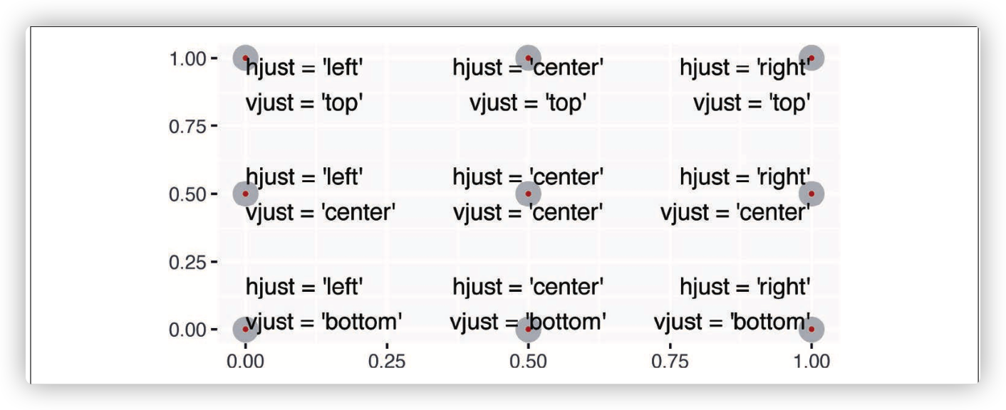
hjust 与vjust组合:
此外:
geom_rect() 在选择的数据点周围绘制矩形,矩形边界由 xmin,xmax,ymin,ymax确定
geom_segment() 搭配arrow参数画箭头,指向需关注的数据点。使用x和y定义开始位置,xend和yend定义结束位置。
本文来自博客园,作者:BioinformaticsMaster,转载请注明原文链接:https://www.cnblogs.com/koujiaodahan/p/15940669.html
posted on 2022-02-26 22:09 BioinformaticsMaster 阅读(299) 评论(0) 编辑 收藏 举报