本文分六步介绍创建自定义控件的步骤。
原文来自:http://www.wpftutorial.net/CustomVsUserControl.html
How to Create a WPF Custom Control
This article gives you a step by step walktrough how to create a custom control in WPF. If you don't know the differences between a user control and a custom control, I recommend to read the article Custom Control vs. User Control first.
1. Define Requirements(定义需求)
Creating a custom control is quite simple in WPF. But the challenge is to do it the right way. So before you start creating a control try to answer the following questions:
- What problem should my control solve?
- Who will use this control? In which context and environment?
- Can I extend or compose existing controls? Have a look at Existing Controls?
- Should it be possible to style or template my control?
- What design-time support should it have? In Expression Blend and Visual Studio?
- Is it used in a single project, or part of a reusable library?
2. Create Project Structures(创建工程结构)

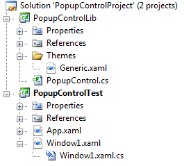
Create a new solution in VisualStudio and start with a WPF Custom Control Library and give it the name PopupControlLib. This is the place where our custom control comes in. Next we create an WPF Application and call it PopupControlTest. This is place where we test our control in a simple application.
- Create a new solution and start with a WPF Custom Control Library. Call it "PopupControlLib".
- Add a second project of type WPF Application to the solution and call it "PopupControlTest".
- Add a reference to the custom control library by using the "Add Reference" context menu entry on the "PopupControlTest" project item in the solution explorer.
- Rename the
CustomControl1toPopupControl.
3. Choose the right base class(选择正确的基类)
Choosing the right base class is crucial and can save a lot of time! Compare the features of your control with existing controls and start with one that matches close. The following list should give you a good overview from the most leightweight to more heavyweight base types:
- UIElement - The most lightweight base class to start from. It has support for LIFE - Layout, Input, Focus and Events.
- FrameworkElement - Derives from UIElement and adds support for styling, tooltips and context menus. It is first base class that takes part in the logical tree and so it supports data binding and resource lookup.
- Control - is the most common base class for controls (its name speaks for itself). It supports templates and adds some basic properties as
Foreground,BackgroundorFontSize. - ContentControl - is a control that has an additional
Contentproperty. This is often used for simple containers. - HeaderedContentControl - is a control that has an
Contentand aHeaderproperty. This is used for controls with a header like Expander, TabControl, GroupBox,... - ItemsControl - a control that has an additional
Itemscollection. This is a good choice for controls that display a dynamic list of items without selection. - Selector - an ItemsControl whose items can be indexed and selected. This is used for ListBox, ComboBox, ListView, TabControl...
- RangeBase - is the base class for controls that display a value range like Sliders or ProgressBars. It adds an
Value,MinimumandMaximumproperty.
4. Override the Default Style(重写缺省样式)
Controls in WPF separate behavior and appearance. The behavior is defined in code. The template is defined in XAML. The default template is by convention wrapped into a style that has an implicit key. That is is not a string - as usually - but a Type object of our control.
And that is excactly what we are doing in the static constructor. We are overriding the default value of the DefaultStyleKey property and set it to the Type object of our control.
static PopupControl()
{
    DefaultStyleKeyProperty.OverrideMetadata(typeof(PopupControl),
        new FrameworkPropertyMetadata(typeof(PopupControl)));
}
5. Create a default Style(创建默认样式)
The style must be located by convention in a folder called "Themes" that must be located in the root of the control library project. In these folder we can provide different templates for each Windows theme. The name of these ResourceDictionaries must match the name of the windows theme. If we do not provide any theme-specific styles, we need to provide the fallback style located in the "Generic.xaml" file.
As we set the default value of the DefaultStylekey property to the Type object of our control, we must give our default style the same key to be found. This is done by leaving the x:Key attribute out. In this case WPF uses the type object from the TargetType property as key.
<ResourceDictionary
    xmlns="http://schemas.microsoft.com/winfx/2006/xaml/presentation"
    xmlns:x="http://schemas.microsoft.com/winfx/2006/xaml">

    <Style TargetType="{x:Type local:PopupControl}">
        <Setter Property="Template">
            <Setter.Value>
                <ControlTemplate TargetType="{x:Type local:PopupControl}">
                    ...
                </ControlTemplate>
            </Setter.Value>
        </Setter>
    </Style>

</ResourceDictionary>
5. Add DependencyProperties(添加依赖属性)
#region DependencyProperty Content

/// <summary>
/// Registers a dependency property as backing store for the Content property
/// </summary>
public static readonly DependencyProperty ContentProperty =
    DependencyProperty.Register("Content", typeof(object), typeof(PopupControl),
    new FrameworkPropertyMetadata(null,
          FrameworkPropertyMetadataOptions.AffectsRender |
          FrameworkPropertyMetadataOptions.AffectsParentMeasure));

/// <summary>
/// Gets or sets the Content.
/// </summary>
/// <value>The Content.</value>
public object Content
{
    get { return (object)GetValue(ContentProperty); }
    set { SetValue(ContentProperty, value); }
}

#endregion
6. Map XML Namespace(映射Xml命名空间)
Content follows...


