
插槽
官方地址:https://cn.vuejs.org/v2/guide/components-slots.html#ad
官方解释:Vue 实现了一套内容分发的 API,这套 API 的设计灵感源自 Web Components 规范草案,将 <slot> 元素作为承载分发内容的出口。
插槽能干什么?
1.匿名插槽
我们现在想自己制作一个button标签
我们新建了一个子组件mbutton.vue
 1 <template>
 2     <div>
 3         <div class="mbutton">
 4         <slot>
 5         <!--插槽,承载内容的出口-->
 6         </slot>
 7         </div>
 8     </div>
 9 </template>
10
11 <script>
12     export default {
13
14     }
15 </script>
16
17 <style  scoped>
18 .mbutton{
19     display: inline-block;
20     padding: 5px 10px;
21     background: blue;
22     color: white;
23     border-radius: 5px;
24 }
25 </style>
在父组件中调用这个mbutton
 1 <template>
 2   <div>
 3     <mbutton>
 4     确定
 5     </mbutton>
 6   </div>
 7 </template>
 8
 9 <script>
10 import mbutton from "./components/mbutton.vue"
11   export default {
12     components:{
13       mbutton
14     }
15   }
16 </script>
17
18 <style scoped>
19
20 </style>
页面中会渲染对应的文本

机理就是子组件内部的slot就是用来存放父组件的内容部分,slot就是一个内容入口,子组件将父组件的内部文本通过slot进行结合
slot最后会被替代,变成下面的代码
1 <div>
2     <div class="mbutton">
3         确定
4     </div>
5 </div>
确定的文字是slot最后展示的内容,展示的是父组件的内容部分,这个内容可以是文本也可以是元素,甚至是组件
如果slot中有内容,这个内容是后备内容
1 <div class="m-button">
2     <!--插槽,承载内容的出口-->
3     <slot>
4         确定
5     </slot>
6 </div>
父组件的调用
1 <mbutton></mbutton>
我们为什么要使用slot,有什么好处
答:slot可以帮助我们拓展很多功能,比如我们模仿ui框架制作按钮
mbutton.vue
 1 <template>
 2     <div>
 3         <div class="mbutton" :class="{[type]:true,[size]:true}">
 4         <slot>
 5         <!--插槽,承载内容的出口-->
 6         确定
 7         </slot>
 8         </div>
 9     </div>
10 </template>
11
12 <script>
13     export default {
14         props:{
15             type:{
16                 type:String,
17                 default:"default"
18             },
19             size:{
20                 type:String,
21                 default:"default"
22             }
23         }
24     }
25 </script>
26
27 <style  scoped>
28 .mbutton{
29     display: inline-block;
30     padding: 5px 10px;
31     background: blue;
32     color: white;
33     border-radius: 5px;
34     margin: 5px;
35 }
36 .primary{
37     background: red;
38 }
39 .error{
40     background: green;
41 }
42 .large{
43     padding: 12px 18px;
44     font-size: 18px;
45 }
46 .samll{
47     padding: 5px 8px;
48     background: skyblue;
49 }
50 </style>
App.vue
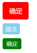
1 <template>
2   <div>
3     <mbutton type="primary" size="large"></mbutton>
4     <mbutton type="samll" >提交</mbutton>
5     <mbutton type="error" ></mbutton>
6   </div>
7 </template>
2.具名插槽
我们现在制作一个dialog弹出效果
App.vue
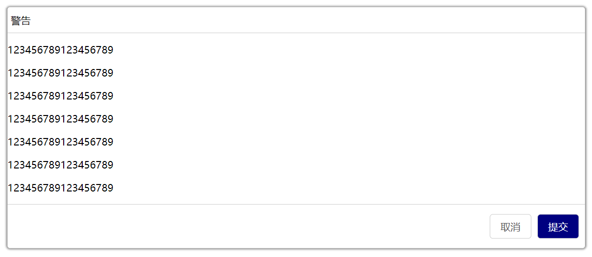
 1 <template>
 2   <div>
 3     <Dialog>
 4      <div slot="header">
 5       警告
 6       </div>
 7     <p>123456789123456789</p>
 8     <p>123456789123456789</p>
 9     <p>123456789123456789</p>
10     <p>123456789123456789</p>
11     <p>123456789123456789</p>
12     <p>123456789123456789</p>
13     <p>123456789123456789</p>
14     <div slot="footer">
15     <mbutton>取消</mbutton>
16     <mbutton type="primary">提交</mbutton>
17     </div>
18     </Dialog>
19   </div>
20 </template>
21
22 <script>
23 import Dialog from "./components/Dialog.vue"
24 import mbutton from "./components/mbutton.vue"
25   export default {
26     components:{
27       Dialog,
28       mbutton
29     }
30
31   }
32 </script>
33
34 <style  scoped>
35
36 </style>
mbutton.vue
 1 <template>
 2     <div class="warp">
 3         <div class="mbutton" :class="{[type]:true, [size]:true}">
 4         <slot></slot>
 5         </div>
 6     </div>
 7 </template>
 8
 9 <script>
10     export default {
11         props:{
12             type:{
13                 type:String,
14                 default:"default"
15             },
16             size:{
17                 type:String,
18                 default:"default"
19             }
20         }
21
22     }
23 </script>
24
25 <style  scoped>
26 .mbutton{
27     display: inline-block;
28     padding: 8px 16px ;
29     background: skyblue;
30     color: #fff;
31     border-radius: 5px;
32     margin: 5px;
33 }
34 .default{
35     border: 1px solid #ccc;
36     background: #fff;
37     color: #555;
38 }
39 .primary{
40     background: navy;
41   color: #fff;
42 }
43 .large{
44     padding: 12px 18px;
45     font-size: 18px;
46 }
47
48 .error{
49     background: red;
50 }
51 .small{
52     padding: 5px 8px;
53 }
54 .warp{
55     display: inline-block;
56 }
57
58 </style>
Dialog.vue
 1 <template>
 2     <div>
 3         <dib class="box">
 4         <header>
 5         <slot name="header">提示</slot>
 6         </header>
 7         <main>
 8        <slot></slot>
 9         </main>
10         <footer>
11        <slot name="footer"></slot>
12         </footer>
13         </dib>
14     </div>
15 </template>
16
17 <script>
18     export default {
19
20     }
21 </script>
22
23 <style  scoped>
24 .box{
25     width: 60%;
26 background: #fff;
27 box-shadow: 0px 0px 3px 2px rgba(0, 0, 0,0.4);
28 position: fixed;
29 top: 50%;
30 left: 50%;
31 transform: translate(-50%,-50%);
32 border-radius: 4px;
33 }
34 header{
35     padding: 10px 5px ;
36     border-bottom: 1px solid #ccc;
37 }
38 footer{
39     padding: 10px 5px;
40     border-top: 1px solid #ccc;
41     text-align: right;
42 }
43 </style>
在Dialog.vue 组件中发现<slot></slot> 元素有name属性,这个属性就是配置插槽的名称,称为具名插槽
作用是如果一个模板中需要用到多个slot,此时如果使用这个模板的地方如果配置不明确,都以匿名插槽进行渲染,所以,如果我们需要在合理的,地方渲染,使用具名插槽
slot='header'指的是具名插槽<slot name='header'>的渲染位置
橙色文字部分是匿名插槽的渲染位置
slot="footer"指的是具名插槽<slot name='footer'>的渲染位置
3.作用域插槽
什么是作用域插槽,其实就是在父组件中修改子组件的插槽的后备内容
组件Dialog.vue的内容
Dialog.vue
 1 <template>
 2     <div>
 3         <div class="box">
 4         <header>
 5         <slot name="header">提示</slot>
 6         </header>
 7         <main>
 8        <slot :list="list">
 9        <div v-for="(item,index) in list" :key=index>
10        {{item.name}}
11        </div>
12        </slot>
13         </main>
14         </div>
15     </div>
16 </template>
17
18 <script>
19     export default {
20 props:{
21     list:{
22         type:Array,
23         default:()=>{
24             return []
25         }
26     }
27 }
28     }
29 </script>
30
31 <style  scoped>
32 .box{
33     width: 60%;
34 background: #fff;
35 box-shadow: 0px 0px 3px 2px rgba(0, 0, 0,0.4);
36 position: fixed;
37 top: 50%;
38 left: 50%;
39 transform: translate(-50%,-50%);
40 border-radius: 4px;
41 }
42 main{
43 margin: 5px;
44 }
45 header{
46     padding: 10px 5px ;
47     border-bottom: 1px solid #ccc;
48 }
49 footer{
50     padding: 10px 5px;
51     border-top: 1px solid #ccc;
52     text-align: right;
53 }
54 </style>
list是通过props接收的数组内容list是通过props接收的数组内容
App.vue
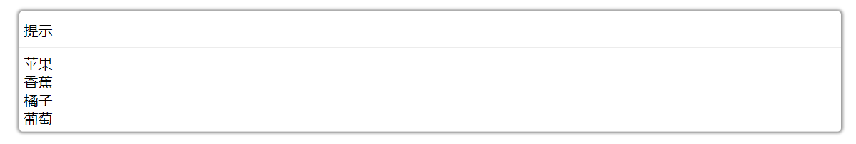
 1 <template>
 2   <div>
 3     <Dialog :list="arr" >
 4
 5     </Dialog>
 6   </div>
 7 </template>
 8
 9 <script>
10 import Dialog from "./components/Dialog.vue"
11
12   export default {
13     components:{
14       Dialog,
15
16     },data(){
17       return{
18         arr:[
19           { name: "苹果 ",price: 5,num: 10},
20           {name: "香蕉 ",price: 6,num: 114},
21           {name: "橘子 ",price: 5,num: 55},
22           {name: "葡萄 ",price: 5,num: 142}
23         ]
24       }}
25     }
26
27
28 </script>
29
30 <style  scoped>
31
32 </style>
data中的数据为父组件传进来的props内容
此时页面的渲染为
接下来我们要通过作用域插槽去修改传到Dialog.vue的内容
此时我们要在父组件中通过子组件传出的:list内容进行修改
父组件的调用
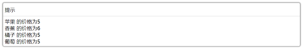
1 <template>
2   <div>
3     <Dialog :list="arr" v-slot="list">
4       <div v-for="(item,index) in list.list" :key="index">
5       {{item.name}}的价格为{{item.price}}
6       </div>
7     </Dialog>
8   </div>
9 </template>
通过v-slot指令进行渲染和修改Dialog组件插槽后备内容
上面的代码修改的是匿名插槽的内容,如果有多个插槽都需要修改,就得template进行辅助,然后具名修改
Dialog.vue组件的插槽
 1 <template>
 2     <div>
 3         <div class="box">
 4         <header>
 5         <slot name="header">提示</slot>
 6         </header>
 7         <main>
 8        <slot :list="list">
 9        <div v-for="(item,index) in list" :key="index">
10        {{item.name}}
11        </div>
12        </slot>
13        <slot name="price" :price="list">
14        <div v-for="(item,index) in list" :key="index+10">
15        价格{{item.price}}
16        </div>
17        </slot>
18         </main>
19         </div>
20     </div>
21 </template>
22
23 <script>
24     export default {
25 props:{
26     list:{
27         type:Array,
28         default:()=>{
29             return []
30         }
31     }
32 }
33     }
34 </script>
35
36 <style  scoped>
37 .box{
38     width: 60%;
39 background: #fff;
40 box-shadow: 0px 0px 3px 2px rgba(0, 0, 0,0.4);
41 position: fixed;
42 top: 50%;
43 left: 50%;
44 transform: translate(-50%,-50%);
45 border-radius: 4px;
46 }
47 main{
48 margin: 5px;
49 }
50 header{
51     padding: 10px 5px ;
52     border-bottom: 1px solid #ccc;
53 }
54 footer{
55     padding: 10px 5px;
56     border-top: 1px solid #ccc;
57     text-align: right;
58 }
59 </style>
通过动态属性传出对应的作用域内容
App.vue
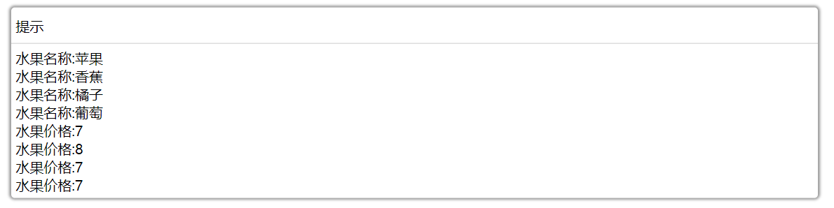
 1 <template>
 2   <div>
 3     <Dialog :list="arr">
 4       <template v-slot:default="list">
 5         <div v-for="(item,index) in list.list" :key="index">
 6         水果名称:{{item.name}}
 7         </div>
 8       </template>
 9        <template v-slot:price="price">
10         <div v-for="(item,index) in price.price" :key="index+10">    //index+10是为了防治key值重复导致报错
11         水果价格:{{item.price+2}}    //所有水果价格加2
12         </div>
13       </template>
14     </Dialog>
15   </div>
16 </template>
17
18 <script>
19 import Dialog from "./components/Dialog.vue"
20
21   export default {
22     components:{
23       Dialog,
24
25     },data(){
26       return{
27         arr:[
28           { name: "苹果 ",price: 5,num: 10},
29           {name: "香蕉 ",price: 6,num: 114},
30           {name: "橘子 ",price: 5,num: 55},
31           {name: "葡萄 ",price: 5,num: 142}
32         ]
33       }}
34     }
35
36
37 </script>
38
39 <style  scoped>
40
41 </style>
父组件通过template分别进行接收
注意:default代表的是匿名插槽的名称
插槽也有自己的语法糖就是#
 1 <template>
 2   <div>
 3     <Dialog :list="arr">
 4       <template #default="list">
 5         <div v-for="(item,index) in list.list" :key="index">
 6         水果名称:{{item.name}}
 7         </div>
 8       </template>
 9        <template #price="price">
10         <div v-for="(item,index) in price.price" :key="index+10">
11         水果价格:{{item.price+2}}
12         </div>
13       </template>
14     </Dialog>
15   </div>
16 </template>
和v-bind或者v-on一样v-slot也有自己的语法糖就是#
v-bind语法糖为“:”
v-on语法糖为“@”
v-slot语法糖为“#”
