


CSS & JS Effect – Section Design Waves
介绍
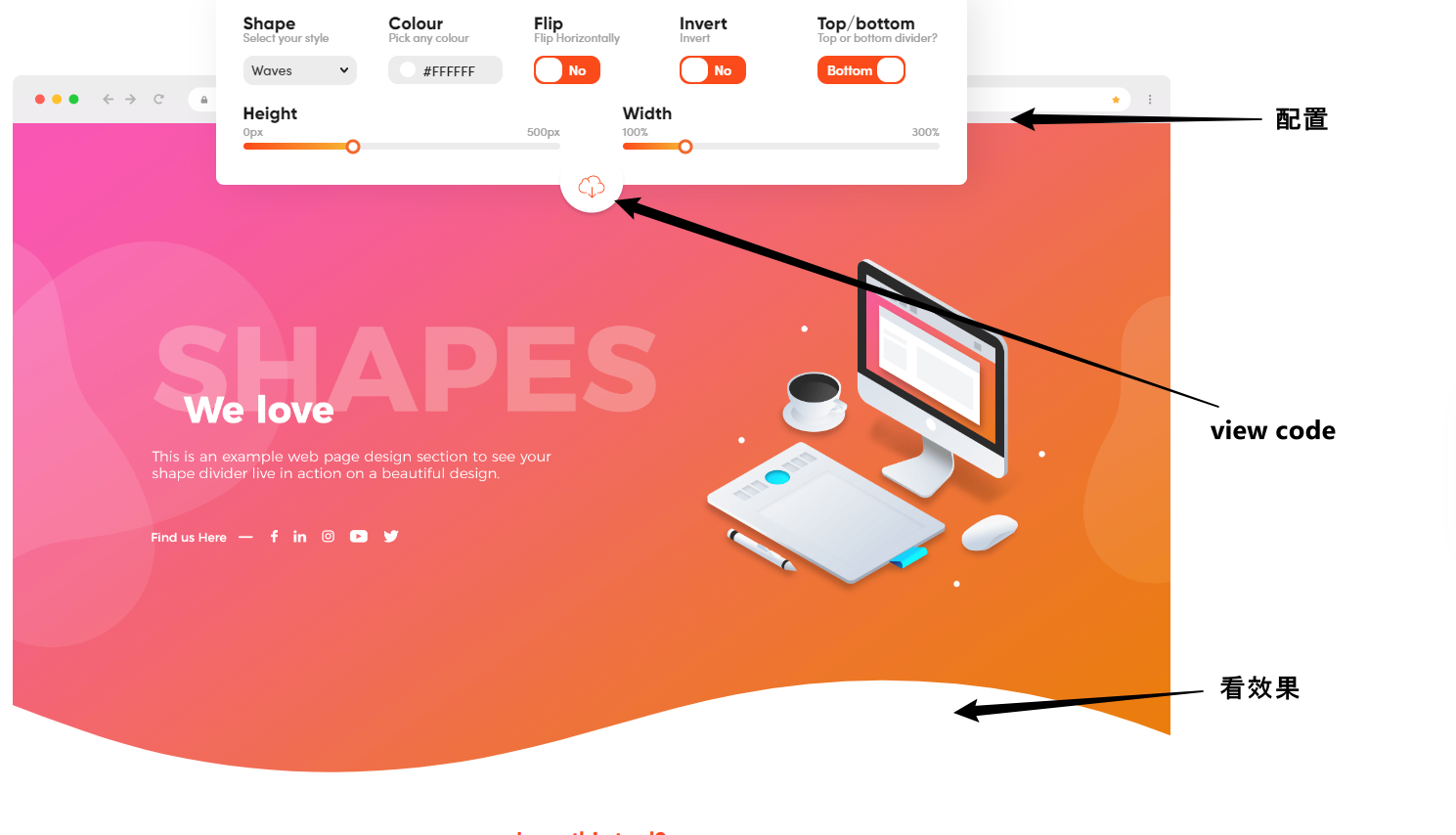
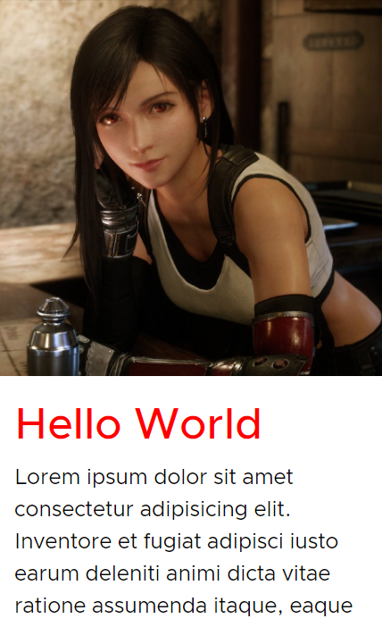
Section Waves 长这样


左边是没有 waves, 右边是加了 waves. 它的作用就是点缀. 让画面有一点 "Design" 的感觉.
参考
YouTube – CSS Wavy Background Tutorial | Section Dividers | FREE
原理
它并不是靠 CSS 做出来的. 它是 SVG. CSS 只负责一些简单的定位, 控制 width 之类的而已.
有许多线上网站可以直接做出这类的 SVG.
softr – Create Beautiful SVG Shapes (可以做一些菱形变种)
Step by Step
进入 shapedivider.app 网站
点击 view code, 把 HTML 和 CSS 拷贝下来
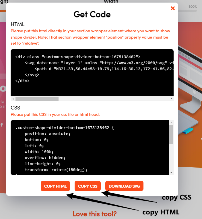
放进 HTML 和 CSS 中就可以了.
HTML
放到 section 的结尾处
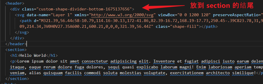


  <body>
    <header>
      <div class="custom-shape-divider-bottom-1675137656">
        <svg data-name="Layer 1" xmlns="http://www.w3.org/2000/svg" viewBox="0 0 1200 120" preserveAspectRatio="none">
          <path d="M321.39,56.44c58-10.79,114.16-30.13,172-41.86,82.39-16.72,168.19-17.73,250.45-.39C823.78,31,906.67,72,985.66,92.83c70.05,18.48,146.53,26.09,214.34,3V0H0V27.35A600.21,600.21,0,0,0,321.39,56.44Z" class="shape-fill"></path>
        </svg>
      </div>
    </header>
    <section>
      <h1>Hello World</h1>
      <p>Lorem ipsum dolor sit amet consectetur adipisicing elit. Inventore et fugiat adipisci iusto earum deleniti animi dicta vitae ratione assumenda itaque, eaque rerum dolore fuga dolores, sequi quasi explicabo laborum magni! Enim laboriosam aperiam tempore consectetur officiis corporis est, veniam, alias quisquam facilis commodi soluta molestias voluptate, exercitationem architecto similique!</p>
    </section>
  </body>
CSS
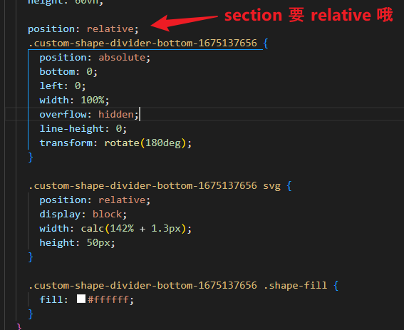
body {
  header {
    background-image: url('../images/tifa1.jpg');
    background-size: cover;
    background-position: center;
    height: 60vh;

    position: relative;
    .custom-shape-divider-bottom-1675137656 {
      position: absolute;
      bottom: 0;
      left: 0;
      width: 100%;
      overflow: hidden;
      line-height: 0;
      transform: rotate(180deg);
    }

    .custom-shape-divider-bottom-1675137656 svg {
      position: relative;
      display: block;
      width: calc(142% + 1.3px);
      height: 50px;
    }

    .custom-shape-divider-bottom-1675137656 .shape-fill {
      fill: #ffffff;
    }
  }
  section {
    padding-block: 3rem 5rem;
    padding-inline: 1rem;
    min-height: 50vh;

    h1 {
      font-size: 3rem;
      color: red;
      font-weight: 500;
    }
    p {
      margin-top: 1rem;
      font-size: 1.5rem;
      line-height: 1.5;
    }
    position: relative;
    z-index: 0;
  }
}
搞定.
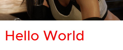
简单的 Section Design (without SVG)
如果不想搞 waves 也可以用一些简单的 design. CSS 就可以做出来了
比如

好不好看是其次, 我们来看看它如何实现. (学点 CSS 呗)
HTML
<body>
  <header></header>
  <section>
    <h1>Hello World</h1>
    <p>Lorem ipsum dolor sit amet consectetur adipisicing elit. Inventore et fugiat adipisci iusto earum deleniti animi dicta vitae ratione assumenda itaque, eaque rerum dolore fuga dolores, sequi quasi explicabo laborum magni! Enim laboriosam aperiam tempore consectetur officiis corporis est, veniam, alias quisquam facilis commodi soluta molestias voluptate, exercitationem architecto similique!</p>
  </section>
</body>
一个 header 图, 一个 section 字. 简单明了.
CSS
body {
  header {
    background-image: url('../images/tifa1.jpg');
    background-size: cover;
    background-position: center;
    height: 60vh;
  }
  section {
    padding-block: 2rem 5rem;
    padding-inline: 1rem;
    min-height: 50vh;
    h1 {
      font-size: 3rem;
      color: red;
      font-weight: 500;
    }
    p {
      margin-top: 1rem;
      font-size: 1.5rem;
      line-height: 1.5;
    }
  }
}
给它一些美化
效果
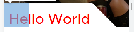
技巧一: 重叠
首先是让 Hello World 上去, 盖到背景, 如下

这种重叠通常是靠 margin negative 实现的.
section {
  margin-top: -80px;
}
效果

由于 section 没有背景色, 所以依然看得见 header 的图片. 只是 Hello World 重叠上去了.
我们不可以直接给 section 背景白色. 因为一旦给了白色, 那么它就全白了
section {
  margin-top: -80px;
  background-color: white;
}
效果
那怎么办呢?
技巧二 : overlay background
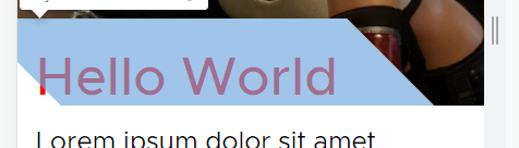
两个蓝色区块是 overlay, 背景色是 white. 是它们覆盖了 header 的背景图.
第二个区块利用了 transform skew 做出了斜线. 第一个区块则负责弥补第二个区块 skew 后左下角的缺口.
CSS
section {
  position: relative;
  z-index: 0;
  &::before {
    content: '';
    position: absolute;
    width: 20%;
    height: 80px;
    background-color: white;
    top: 0;
    left: 0;
    z-index: -1;
  }

  &::after {
    content: '';
    position: absolute;
    width: 80%;
    height: 80px;
    background-color: white;
    top: 0;
    left: 0;
    z-index: -1;
    transform: skew(45deg);
  }
}
这样就搞定了.
极端做法 clip any thing
还有一种做法只用 clip 就可以搞出任何形状了.
参考: Creative Section Breaks Using CSS Clip-Path
首先利用 Figma Pen 勾画出要 clip 的形状 (什么形状都画的出来了...)
然后 conver to relative clip path, 让它可以 responsive
最后用 svg + css 来完成
<svg class="svg">
  <clipPath id="my-clip-path" clipPathUnits="objectBoundingBox"><path d="data..."></path></clipPath>
</svg>
<div class="clipped"></div>
css
.svg {
  position: absolute;
  width: 0;
  height: 0;
}
.clipped {
  -webkit-clip-path: url(#my-clip-path);
  clip-path: url(#my-clip-path);
}
我觉得工程有点大。
