

CSS – :has parent selector, @container container query, transform replacement, subgrid (2022 期待新功能)
前言
CSS 一直有一些老问题没有被解决. 2022 视乎看见了曙光.
参考
4 Exciting New CSS Features in 2022
:has()
参考:
YouTube – How to use CSS :has and :not - Future CSS!
顾名思义就是拥有的意思
p:has(.child)   // p 有子孙 .child
p:has(> .child) // p 有孩子 .child
p:has(+ .child) // p 的 next 是 .child
配合 :not(:has(.child)) 表示没有的意思.
支持度挺好的
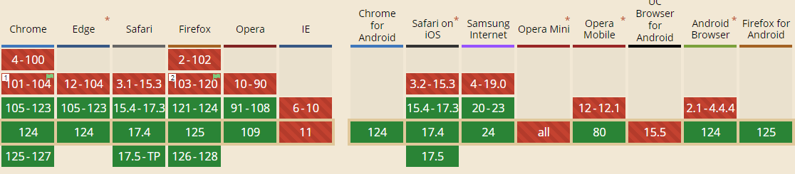
@container (container query)
参考:
YouTube – How to inspect CSS container queries | DevTools Tips
media query 只能对应 viewport, 这个局限太大了.
container query 的出现就是让 media query 可以对应任何一个 element
例子说明, 有 2 个 div

CSS Style
.container {
  width: 150px;
  aspect-ratio: 1 / 1;
  border: 1px solid blue;
  display: grid;
  place-items: center;

  .box {
    width: 100px;
    aspect-ratio: 1 / 1;
    border: 1px solid red;
  }
}
需求, 当 container width > 100px 时, .box 要有 background-color: red
@container
.container {
  container-type: inline-size;
  container-name: my-container;

  @container my-container (inline-size > 100px) {
    .box {
      background-color: red;
    }
  }
}
它有几个语法
container-type 声明, 这个 selector element 是一个 container. value: inline-size 表示我们关注 width 而已, 因为通常都是 depend on width 的啦
container-name 是声明这个 container 的名字. 这样就不会弄错了.
@container 就是 @media 啦. 紧跟着 container name, 然后圆括弧内就是判断条件. 它的语法比 @media 的 min-width 好太多了, 直接支持 symbol > >= < <=
p.s. inline-size = width, 这个 width 依据 box-sizing 而定, 比如 border-box 的话, padding 不算 width 哦.
支持度还不错,只是 IOS 需要 16.0 才能用,也就是 iPhone 8 或以上 (2017年9月发布的)
No More Transform
参考: YouTube – CSS Transform Is Dead! Use This Instead
从前 rotate, scale, translateX, translateY 都必须定义在 transform 属性内. 这个超级不优化.
往后可以一个一个定义了.
.box {
  scale: 2;
  translate: 50px 50px;
  rotate: 100deg;

  transform: translate(50px, 50px) rotate(100deg) scale(2); // 相等于
}
支持度不明
Subgrid
TODO...

