


HTML & CSS – Styling Table
前言
Table (表格) 历史悠久, 它有许多独特的默认样式, 它也是最早的布局方案方案哦 (现在依然有用 table 来做布局的, 比如 email template).
这篇来介绍一下基本的 table styling.
参考
Youtube – Styling HTML tables with CSS - Web Design/UX Tutorial
Youtube – HTML Tables Tutorial with CSS Styling - Crash Course
Youtube – How To Create Responsive Table In HTML & CSS || How To Make Responsive Table Using HTML & CSS (RWD Table)
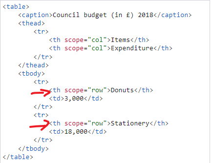
Table HTML 结构
<table>
  <caption>
    Table Title
  </caption>
  <thead>
    <tr>
      <th>First Name</th>
    </tr>
  </thead>
  <tbody>
    <tr>
      <td>Heng Keat</td>
    </tr>
  </tbody>
  <tfoot>
    <tr>
      <td>Footer value</td>
    </tr>
  </tfoot>
</table>
table 就不用说了
caption 是 table 的 title, 很少会用到, 除非在乎 semantic HTML
thead, tbody, tfoot 是 table 内容的结构, 类似于 header, main, footer, 不要小看它哦, 在 printing 的时候 thead, tfoot 会在每一页都出现哦 (很重要的功能)
tr 是 table row
th 是 table header, 用来放 column label (注: 上面 thead 是 table head)
td 是 table data, 也叫 table cell, 用来放 data
上面这个是最常见的结构, 但不是唯一, 还有像下面这样的
这种双 label 也是 ok 的, 效果:
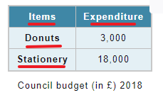
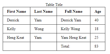
Default Style


<table>
  <thead>
    <tr>
      <th>First Name</th>
      <th>Last Name</td>
      <th>Full Name</th>
      <th>Age</th>
    </tr>
  </thead>
  <tbody>
    <tr>
      <td>Derrick</td>
      <td>Yam</td>
      <td>Derrick Yam</td>
      <td>40</td>
    </tr>
    <tr>
      <td>Kelly</td>
      <td>Wong</td>
      <td>Kelly Wong</td>
      <td>18</td>
    </tr>
    <tr>
      <td>Heng Keat</td>
      <td>Yam</td>
      <td>Yam Heng Keat</td>
      <td>25</td>
    </tr>
  </tbody>
  <tfoot>
    <tr>
      <td></td>
      <td></td>
      <td>Total:</td>
      <td>83</td>
    </tr>
  </tfoot>
</table>
效果
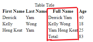
特点:
1. header 有 bold, text-align: center
2. 每个 column (红框) 的 width 是 max-content
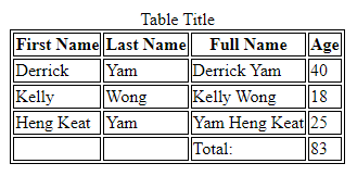
3. 间距, 如果我们为 thead 和 tbody 添加背景色就可以看见 default 的间距
中间白色的线就是间距, 它可不是 border 哦
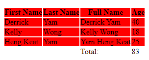
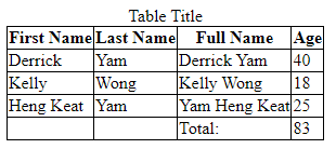
加上 border
table {
  border: 1px solid black;
  tr,
  th,
  td {
    border: 1px solid black;
  }
}
注: thead, tbody, tfoot 是没有 border 的
加了 border 也可以看出 default 的间距
常用美化手法
默认太丑了, 通常会做一些小调整
1. border-collapse
table {
  border-collapse: collapse;
}
它的效果就是把 default 的间距吃掉, 同时类似 margin collapse, 会把 2 个 border 合并成 1 个
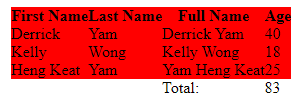
注意: 这个手法不支持 sticky
如果我们加入 sticky, 它的 border 会消失
HTML 加一个 wrapper 做 scroll container
<div class="table-wrapper">
  <table>
      ...same as before
  </table>
</div>
CSS
.table-wrapper {
  overflow-x: auto;
  width: 400px;

  table {
    border-collapse: collapse;
    border: 1px solid black;
    tr,
    th,
    td {
      border: 1px solid black;
    }

    th,
    td {
      padding: 1rem;
      white-space: nowrap;
    }

    :is(th, td):nth-child(1) {
      position: sticky;
      left: 0;
      background-color: white;
    }
  }
}
效果

相关 Issue 参考: Stack Overflow – Border style do not work with sticky position element
解决方法就是不要用 border-collapse, 改用 border-spacing 来去掉间距. 然后画 border 时候自己控制 nth-child 不要让 border 重叠.
table {
  border-spacing: 0;
  th,
  td {
    border: 1px solid black;
  }
  :is(th, td):nth-child(n + 2) {
    border-left: unset;
  }
  td {
    border-top: unset;
  }
}
把重叠的部分 unset 掉就可以了
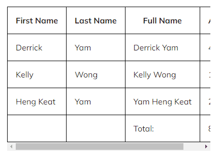
2. padding
空间是最重要的了
table {
  th,
  td {
    padding: 0.5rem 1rem;
  }
}
效果
到这里就算及格了, 剩余的就是美化而已.
3. caption
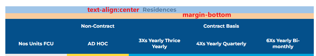
默认就是 text-align: center 了. 通过 margin-bottom 做个间距就很棒了.
4. table width, layout, horizontal scroll
table width 默认是 hug content 的, 当 container 小的时候 table 会尝试 word wrap 和 shrink td 直到无法 wrap 后它会整个缩小.
table 不具备 scrollable, 如果想要 scroll 就需要加一个 div container 然后 overflow: auto, 这样 table word wrap 和 shrink td 后就不会缩小了,如果不希望它 shrink td 那 td 要用 min-width, 或者 hug content。
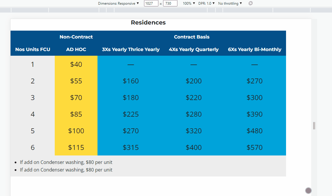
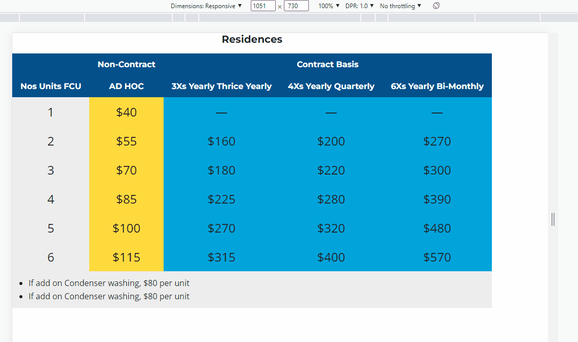
table-layout: auto 是让它自动计算 col 的 width, fixed 则是每一个 col 都一致
table 只有在非 hug content 情况下才有效哦.
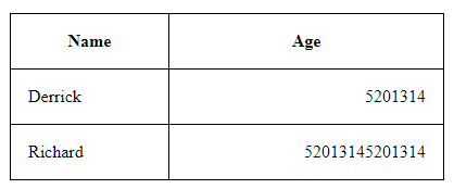
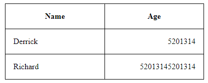
图 1 是 auto, age 的内容比较长, 所以当 table 有多余 width 的时候它被分配的也比较多, 图 2 是 fixed, 两个 col 的 width 始终一致.
参考: W3Schools – CSS table-layout Property
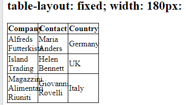
当 container width 不够时, fixed 会变成下面这样, 所以通常只有在空间足够的情况下才会考虑 fixed.
4. 其它
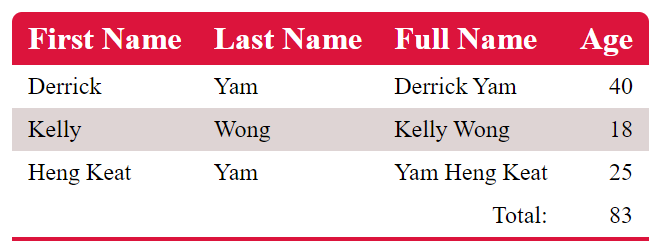
CSS Style
注意它的 border-radius 是怎么弄的.
table {
  border-radius: 10px 10px 0 0; // 要把 caption 拿掉才行哦, 不然 caption 在 top 看不到 radius 了
  overflow: hidden;
  border-collapse: collapse;

  tfoot {
    border-bottom: 4px solid crimson; // 必须给在 tfoot 因为有 collapse, table border-bottom 和 tfoot 会合并
  }

  th,
  td {
    padding: 0.5rem 1rem;
  }

  th {
    text-align: left;
    font-size: 2rem;
  }
  td {
    font-size: 1.5rem;
  }

  tbody tr:nth-last-of-type(even) {
    background-color: hsl(0, 13%, 85%);
  }

  thead {
    background-color: crimson;
    color: white;
  }
}
其它招数
align & valign attribute
上面的 Age column 是靠右边的, 但是 CSS 却没有声明, 这是因为它是用 HTML Attribute 声明的
当然你要用 CSS 也是可以, 那就是 text-align.
<tfoot>
  <tr>
    <td></td>
    <td></td>
    <td align="right">Total:</td>
    <td align="right">83</td>
  </tr>
</tfoot>
valign 就是 vertical align, 目前例子中看不出来, 我们修改一下例子
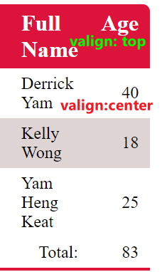
把 Full Name column 所有的 th, td 设置成 width: 50px, 字 wrap 以后高度就增加了. 这时会发现 Age column 的值是居中的.
通过 attribute valign 或 CSS vertical-align: top 就可以让字体靠上了.
col-span & row-span
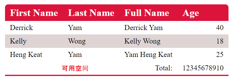
假设 total 很长, 这会导致 Age column 也很长, 但偏偏 tfoot 右边有许多可用空间, 这时就可以充分利用这些空间了.
<tfoot>
  <tr>
    <td></td>
    <td align="right">Total:</td>
    <td colspan="2" align="right">1234567891012345678910</td>
  </tr>
</tfoot>
让 tr 内只有 3 个 td, 最后一个 td 使用 2 个格子, 效果
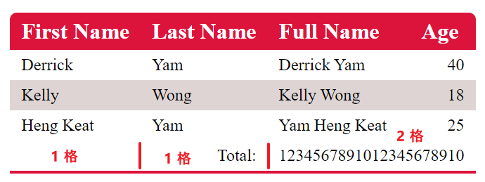
colspan: 2 意思是用 2 个 column
rowspan 就是用 2 个 row (反过来而已)
这个 span 的概念和 grid 是一样的, grid 就是抄袭 table 的. table 才是鼻祖.
有玩过 Excel 的 merge cells 也可以体会到它是同一个概念.
Responsive Table
来个简单的例子就好
RWD 效果
它的做法并没有很直观
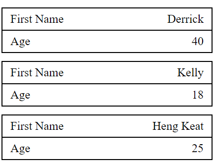
1. 把 thead hide 起来.
2. 让 tr, td 变成 display block, 这时候会长这样
现在每 2 个 row 代表原先的 1 个 row,
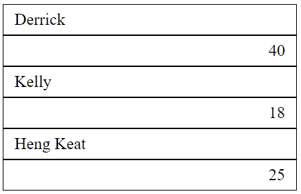
3. 重新画 border 就比较明显了, 在 row 加上 margin-bottom
这样就看出来原本的 row 了
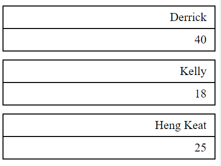
4. 通过 td::before 插入 label, 然后绝对定位
最终 CSS Style
@media (max-width: 500px) {
  .container {
    width: 100%;

    table {
      border: 0;
      width: 100%;

      thead {
        display: none;
      }

      tr,
      td {
        display: block;
        text-align: right;
        border: 1px solid black;
      }

      tr {
        margin-bottom: 1rem;
      }

      td {
        padding-left: 50%;
        position: relative;
        &::before {
          content: attr(data-label);
          position: absolute;
          left: 0;
          padding-left: 1rem;
          width: 50%;
          text-align: left;
        }
      }
    }
  }
}
HTML
<table>
  <thead>
    <tr>
      <th>First Name</th>
      <th align="right">Age</th>
    </tr>
  </thead>
  <tbody>
    <tr>
      <td data-label="First Name">Derrick</td>
      <td data-label="Age" align="right">40</td>
    </tr>
    <tr>
      <td data-label="First Name">Kelly</td>
      <td data-label="Age" align="right">18</td>
    </tr>
    <tr>
      <td data-label="First Name">Heng Keat</td>
      <td data-label="Age" align="right">25</td>
    </tr>
  </tbody>
</table>
注意看 data-label 是如何被使用到 content 的.
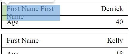
看了许多教程都是用同样的手法, 但这个手法很 limitation 的, 一旦 label 字数长就完蛋了. 它没有办法像真的 row 那样撑大 height.
比如这样:
目前还没有遇到, 以后在看看有没有问题呗.
