

CSS – Float
前言
Float 是上古时代的东西, 它的效果已经基本被 Flex, Grid 取代了. 但是还是可以了解它一下. 就当学习历史呗.
参考
Youtube – HTML & CSS for Beginners Part 18: How Floats and Clears work
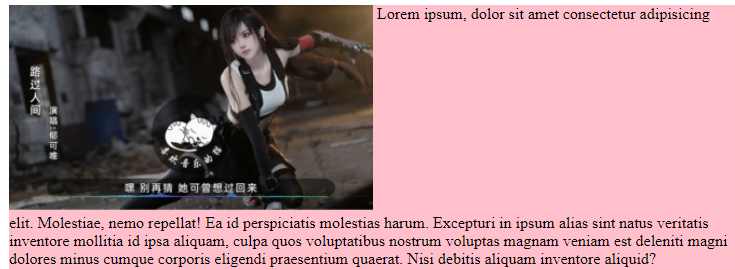
图片和文字 horizontal 排版 (Flex)
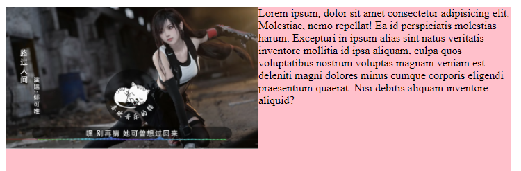
想把图片和文字并排像上图这样.
HTML
<body>
  <div class="container">
    <img src="./images/tifa2.PNG" />
    <p>
      Lorem ipsum, dolor sit amet consectetur adipisicing elit. Molestiae,
      nemo repellat! Ea id perspiciatis molestias harum. Excepturi in ipsum
      alias sint natus veritatis inventore mollitia id ipsa aliquam, culpa
      quos voluptatibus nostrum voluptas magnam veniam est deleniti magni
      dolores minus cumque corporis eligendi praesentium quaerat. Nisi debitis
      aliquam inventore aliquid?
    </p>
  </div>
</body>
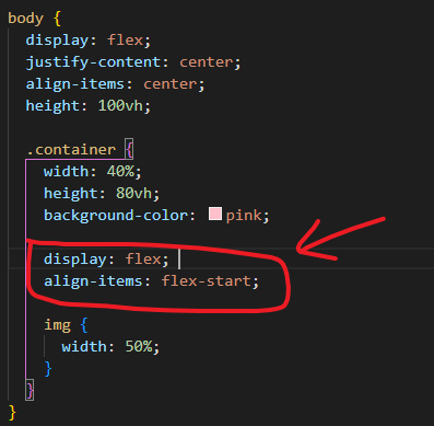
CSS Style


body {
  display: flex;
  justify-content: center;
  align-items: center;
  height: 100vh;

  .container {
    width: 40%;
    height: 80vh;
    background-color: pink;

    display: flex;
    align-items: flex-start;

    img {
      width: 50%;
    }
  }
}
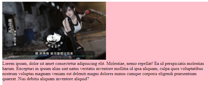
如今使用 Flex 就可以了. 但是在 Flex 还没有诞生之前. 这是很难做到的.
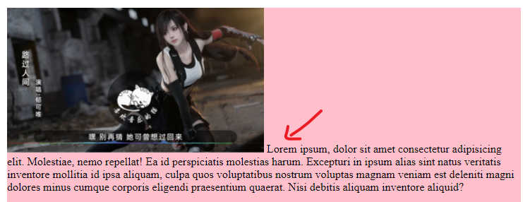
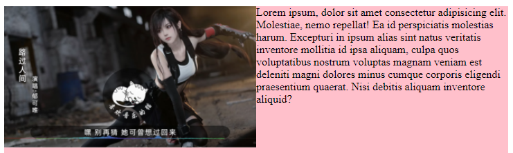
图片和文字 horizontal 排版 (Before Flex)
把 Flex 拿掉, 效果是这样的
合理, 因为 img 是 inline, <p> 是 block.
那把 paragraph 换成 inline 的 span 呢?
虽然是并排了, 但是只有第一行. 即使把 span 设置成 vertical-align: start 也做不到想要的效果
Float come to play
这就是 Float 诞生的原因. 只要在 img 加上 float 就可以了
img {
  float: left;
}
效果
float: right 还会把 img 和 paragraph reverse 哦
How float work?
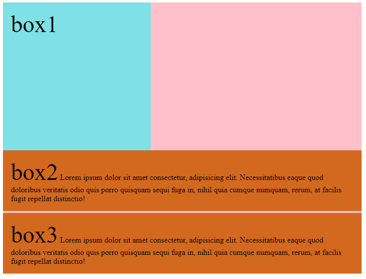
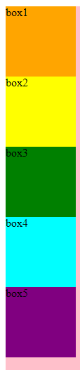
有 3 个 box, 把 box1 设置成 float:left 以后会变这样:
box1 会被抽离出 layout. 有点像 position:absolute, 于是 box2, 3 会跑到上面去了. 形成重叠.
但它很特别的一点是, box2,3 的字却不会重叠进去 box1. 而是在 box1 旁边, 这就形成了上面的 img 和 <p> 并排的效果了.
Float use in layout
Float 最初是用来做 img <p> 并排效果的, 但后来又被用于各种排版上.
上面讲的例子都是只有第一个 element 设置了 float. 当多个 element 设置 float 的时候, 它的效果会很像 Flex. 这也是它可以拿来做排版的原因.
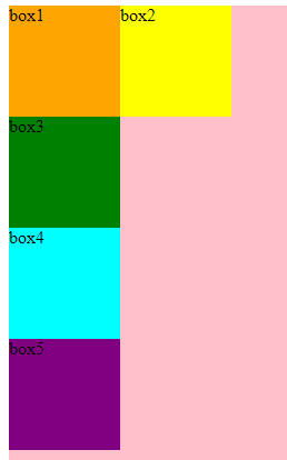
全部 float: left
5 个 box vertical 排列. 想让它们变成 horizontal 排列可以使用 float.
下面这是 5 个 box float: left 的效果
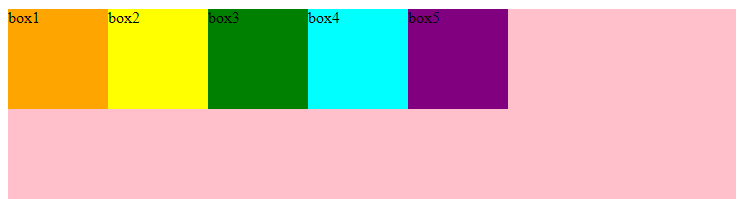
当 2 个或以上元素 float 的时候, 它们会 horizontal 排列 (即使这个元素是 display: block, 它类似 Flex 的效果)
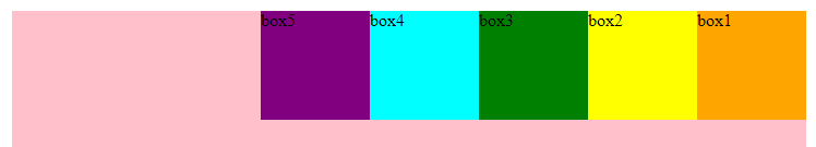
float: right 还可以做到 reverse 哦
当 container 的 width 不够时, 它还会有 wrap 的效果 (RWD)
部分 float: left
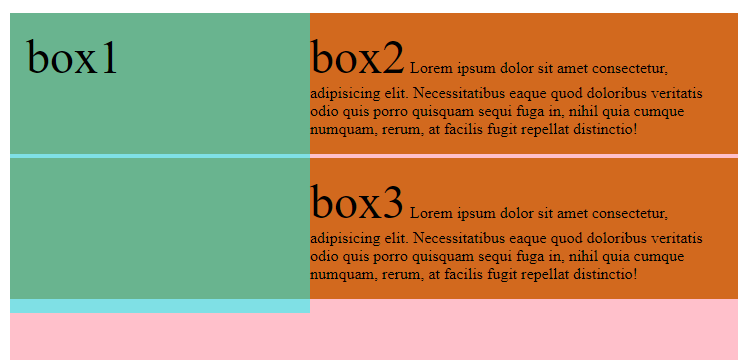
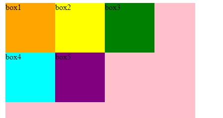
当只有 2 个 float: left, 效果是这样的:
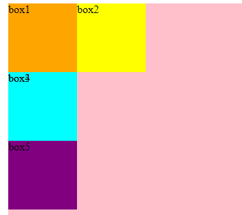
依据上面提到的原理, box1, 2 会脱离 layout 漂浮起来.
box3 会和 box1 重叠, 而里面的 text 则不会.
我们看到 box3 的字体和 box4 重叠是因为 box3 的 width 没有比 box1 + box2 的 width 大, 所以它没有办法出现在 box2 的右边.
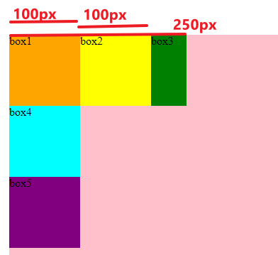
当把 box3 的 width 设置成 250px 以后的效果:
clear come to play
一般上用 float 来做排版, 不会希望被 text 影响.
比如上面的例子, box1, 2 要 horizontal, 3,4,5 不要.
正确的做法是
box1, 2 float: left,
box3, clear: both (both 表示 clear left and right 的意思)
一旦元素有 clear 属性, 那它就无视前一个 float 元素了,
总结
1. Float 能做到部分 Flex 的效果, 至于有没有 Float 可以做到但是 Flex 做不到的呢? 我没有去研究 (可能只有图片文字哪个效果 flex 做不到而已)
2. Float 会让元素飘起来这个需要注意哦. 它会影响到子孙元素的 position 对标 offset parent.
3. 开发中已经很少用到 Float 了, 但如果是为了兼容旧的游览器 (比如 email template) 就有可能会需要用到, 甚至用 table 做排版.

