


CSS & JS Effect – Image Overlay
介绍
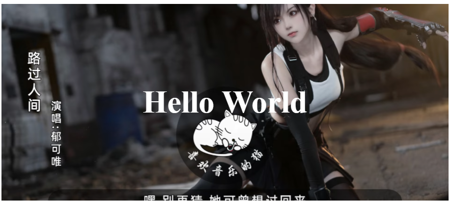
一张背景图, 一行写字, 一层黑影 (Image Overlay), 如果没有做黑影, 字的颜色容易和图片撞, contrast 就会很烂.

HTML 结构
<div class="container">
  <h1>Hello World</h1>
</div>
很简单, 因为图片用 background-image 完成, 黑影用 ::after content: '' 完成. 所以不需要什么 element.
CSS style
.container {
  height: 400px; /* 给个高度 */

  /* 插入背景图片 */
  background-image: url("./images/tifa2.PNG");
  background-size: cover;
  background-position: center;

  /* 给 h1 一些 style */
  h1 {
    color: white;
    font-size: 4rem;
  }

  /* 让 h1 居中 */
  display: flex;
  justify-content: center;
  align-items: center;
}
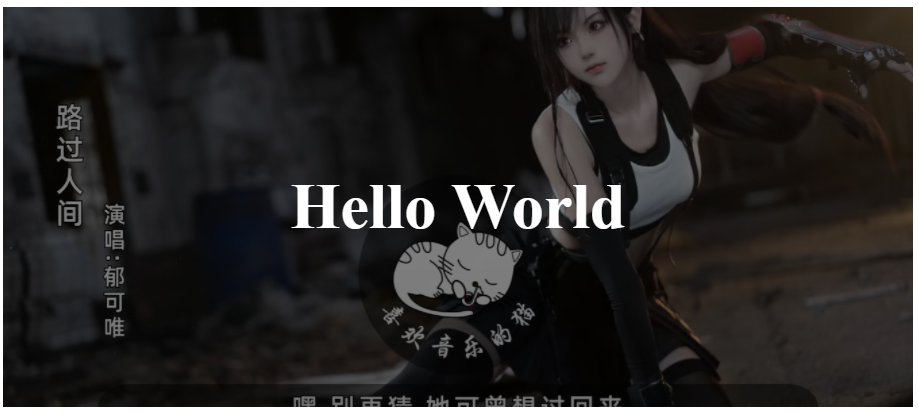
效果
CSS style for image overlay
.container {
  position: relative; /* 让 overlay 定位 */
  z-index: 0; /* 阻止 overlay 的 z-index -1 去到更高层 */
  &::after {
    /* 黑色空 div, 填满整个 container */
    content: "";
    width: 100%;
    height: 100%;
    background-color: rgba($color: black, $alpha: 0.5);

    /* 和 container 重叠 */
    position: absolute;
    top: 0;
    left: 0;

    z-index: -1; /* 必须小于 container 内其它元素 */
  }
}
通过 ::after 做出 overlay 然后定位让它和 container 重贴, 再加上 z-index 确保 container 原先内容没有被挡住.
Tips: top, left, width, height
top: 0;
left: 0;
width: 100%;
height: 100%;
可以写成 top, left, bottom, right (但要小心坑)
top: 0;
left: 0;
bottom: 0;
right: 0;
也相等于 shorthand inset: 0
inset: 0;
冷知识: 但这招对 iframe 无效哦, iframe 只接受 width, height 100%, left rigth:0 无法等价于 width 100% 效果, 原理没去查.
效果
当遇上 rounded corners
如果 container 有圆角.
border-radius: 2rem;
效果
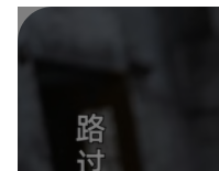
overlay 超出圆角了. 解决方法是在 container 加上 overflow: hidden
Final CSS Style
.container {
  height: 400px; /* 给个高度 */

  /* 插入背景图片 */
  background-image: url("./images/tifa2.PNG");
  background-size: cover;
  background-position: center;

  /* 给 h1 一些 style */
  h1 {
    color: white;
    font-size: 4rem;
  }

  /* 让 h1 居中 */
  display: flex;
  justify-content: center;
  align-items: center;

  border-radius: 2rem;
  overflow: hidden; /* 防止 overlay 超出圆角*/

  position: relative; /* 让 overlay 定位 */
  z-index: 0; /* 阻止 overlay 的 z-index -1 去到更高层 */
  &::after {
    /* 黑色空 div, 填满整个 container */
    content: "";
    width: 100%;
    height: 100%;
    background-color: rgba($color: black, $alpha: 0.5);

    /* 和 container 重叠 */
    position: absolute;
    top: 0;
    left: 0;

    z-index: -1; /* 必须小于 container 内其它元素 */
  }
}
效果
搭配 Gradients
上面的 overlay 用的是 background-color, 这会让整张图都黑. 有时候我们字可能只是出现在左边.

这种情况就可以用 background-image: linear-gradient 替代
background-image: linear-gradient(to right, rgb(255 0 0 / 0.5), rgb(255 255 0 / 1));
Tips: background-image 支持 multiple, 所以我们甚至可以完全不用搞 ::after 定位那一套. 直接 background-image: gradient, url(...) 就可以了.
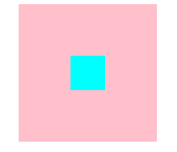
Overlay 居中
顺便教一个居中技巧.
<div class="container">
  <div class="box"></div>
</div>
CSS Style
.container {
  width: 500px;
  height: 500px;
  background-color: pink;
  position: relative;

  .box {
    position: absolute;
    inset: 0;
    width: 100px;
    height: 100px;
    background-color: cyan;
    margin: auto;
  }
}
只要 box 有 dimension, 配上 inset 0 和 margin auto, box 就居中了
它和 top, left, transform 的效果是一样的
.box {
  top: 50%;
  left: 50%;
  transform: translate(-50%, -50%);
}
效果
第 2 种做法
参考: webflow 的一个模板
HTML 结构
<div class="container">
  <h1>Hello World</h1>
  <div class="overlay">
    <img src="./images/tifa2.PNG" />
  </div>
</div>
它不是用 container background-image 来做背景图, 而是用 <img>.
语义上来讲, 如果是要被 SEO 收入的, 那么用 <img> 是对的, 但如果它更倾向于背景图, 那么应该用 background-image.
img 和 background-image 还有个区别是 img 可以被 drag, 也可以被 save as, 而 background-image 是不可以的 (可以用 pointer-event:none 来阻止这项功能).

CSS Style
.container {
  height: 100vh;
  display: flex; /* 居中 h1 */
  align-items: center;
  justify-content: center;
  h1 {
    color: white;
    font-size: 4rem;
  }

  position: relative;
  .overlay {
    background-color: black; /* 黑影是这样做出来的 */

    img {
      opacity: 0.7; /* 黑影是这样做出来的 */
      width: 100%;
      height: 100%;
      object-fit: cover;
    }

    position: absolute;
    inset: 0;
    z-index: -1;
  }
}
有两个点值得关注.
第一它实现黑影的方式是给 overlay background-color 黑色. 然后让 img opacity 0.7.
和第一个方案往图片盖一层黑影是颠倒的实现手法.
第二是它的 z-index
第一方案中, z-index: -1 让黑影下沉, 但是在 container 需要 z-index:0, 阻止 z-index 冒泡, 不然黑影就比 container 还底层而无法盖到 container 的 background-image 了.
第二方案中, container 不需要 z-index:0 去阻止 overlay 冒泡. 原因是 container 不负责 background-image. 所以即便 overlay 更底层也无所谓. 反正 container 是空心的.
它的层次是 h1 > container (空心) > overlay, 此时 mouse hover 接触的是 container 而不是 overlay.
但如果让 container 有一个 background-color, overlay 就被挡住了.

假设让 container z-index:0 阻止冒泡, 那么 <img> 就会在上层, h1 > overlay > container, 此时 mouse hover 接触的是 overlay 而不是 container.
也就是说, <img> 会被 drag 和 save as. 这时就需要用 pointer-event: none 来阻止了.
整体来看, 我不觉得方案二会比方案一好. 感觉它比较混乱. 没有那么直观.
