【面试题】不使用canvas, 绘制出一个 三角形,以及 等边三角形
面试遇到的,面试题
面试时只回答出,rotate+hidden的方式
自己想出了两种,rotate+hidden和linear-gradient
border和clip-path的方式借鉴自网络,
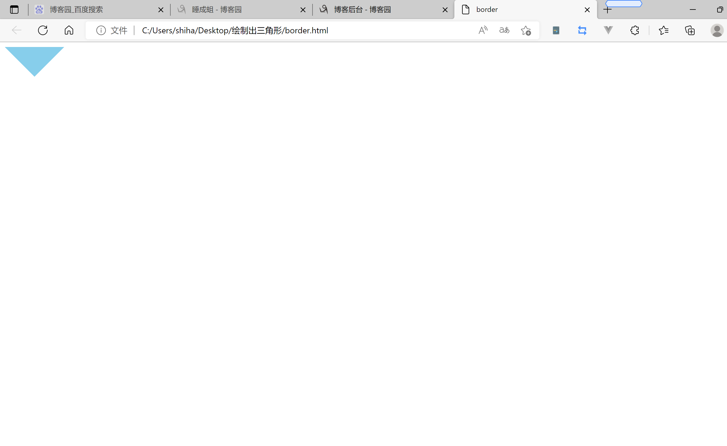
border
点击查看代码
<!DOCTYPE html>
<html lang="en">
<head>
    <meta charset="UTF-8">
    <meta http-equiv="X-UA-Compatible" content="IE=edge">
    <meta name="viewport" content="width=device-width, initial-scale=1.0">
    <title>Document</title>
    <style>
        .triangle {
            width: 0;
            height: 0;
            border-top: 50px solid skyblue;
            border-right: 50px solid transparent;
            border-left: 50px solid transparent;
        }
    </style>
</head>
<body>
    <div class="triangle">

    </div>
</body>
</html>
linear-gradient
点击查看代码
<!DOCTYPE html>
<html lang="en">
<head>
    <meta charset="UTF-8">
    <meta http-equiv="X-UA-Compatible" content="IE=edge">
    <meta name="viewport" content="width=device-width, initial-scale=1.0">
    <title>Document</title>
    <style>
        .triangle {
            width: 100px;
            height: 100px;
            background: linear-gradient( 45deg,skyblue 0% ,skyblue 50% , transparent 50% , transparent 100%);
        }
    </style>
</head>
<body>
    <div class="triangle">

    </div>
</body>
</html>
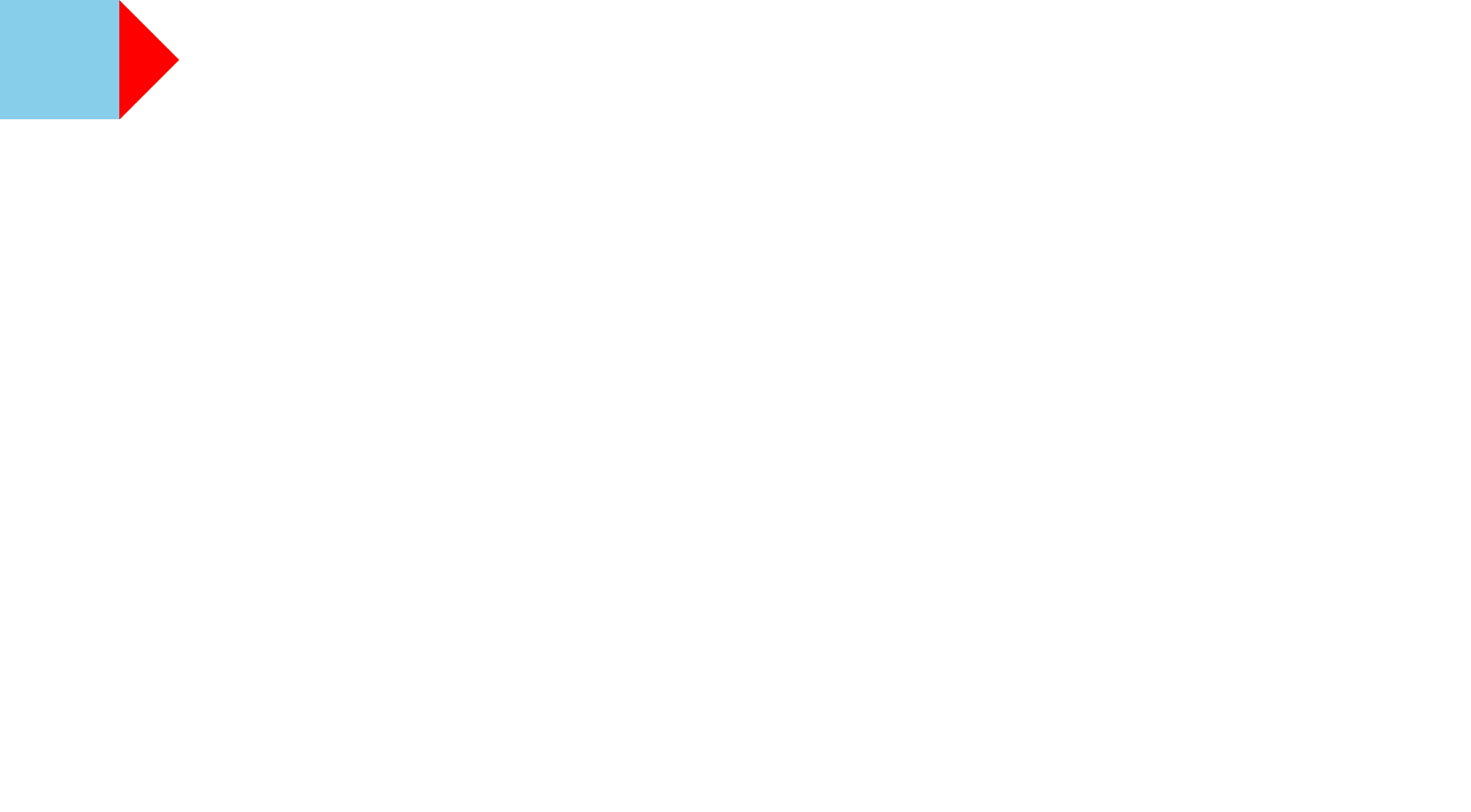
rotate+hidden
点击查看代码
<!DOCTYPE html>
<html lang="en">
<head>
    <meta charset="UTF-8">
    <meta http-equiv="X-UA-Compatible" content="IE=edge">
    <meta name="viewport" content="width=device-width, initial-scale=1.0">
    <title>Document</title>
    <style>
        *{
            margin: 0;
            padding: 0;
        }
        body{
            letter-spacing: -1em;
        }
        .container {
            display: inline-block;
            width: 100px;
            height: 100px;
            overflow: hidden;
        }
        .triangle {
            background-color: red;
            transform-origin: 0 0;
            transform: rotateZ(45deg) scale(0.71); /* (3+4)/5 */
            width: 100px;
            height: 100px;
            /* border: skyblue solid 4px; */
        }
        .leftDiv{
            display: inline-block;
            width: 100px;
            height: 100px;
            background-color: skyblue;
        }
    </style>
</head>
<body>
    <div class="leftDiv">

    </div>
    <div class="container">
        <div class="triangle">

        </div>
    </div>

</body>
</html>
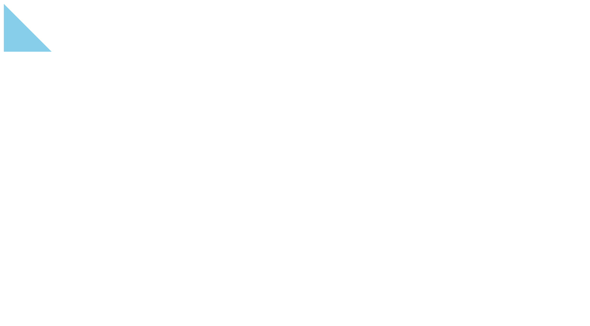
等边三角clip-path (也可以是非等边的)

点击查看代码
<!DOCTYPE html>
<html lang="en">
<head>
    <meta charset="UTF-8">
    <meta http-equiv="X-UA-Compatible" content="IE=edge">
    <meta name="viewport" content="width=device-width, initial-scale=1.0">
    <title>等边三角Clip-path</title>
    <style>
        .triangle {
            width: 80px;
            height: 100px;
            background-color: skyblue;
            clip-path: polygon(0 0,100% 50%,0 100%);
        }
    </style>
</head>
<body>
    <div class="triangle">

    </div>
</body>
</html>
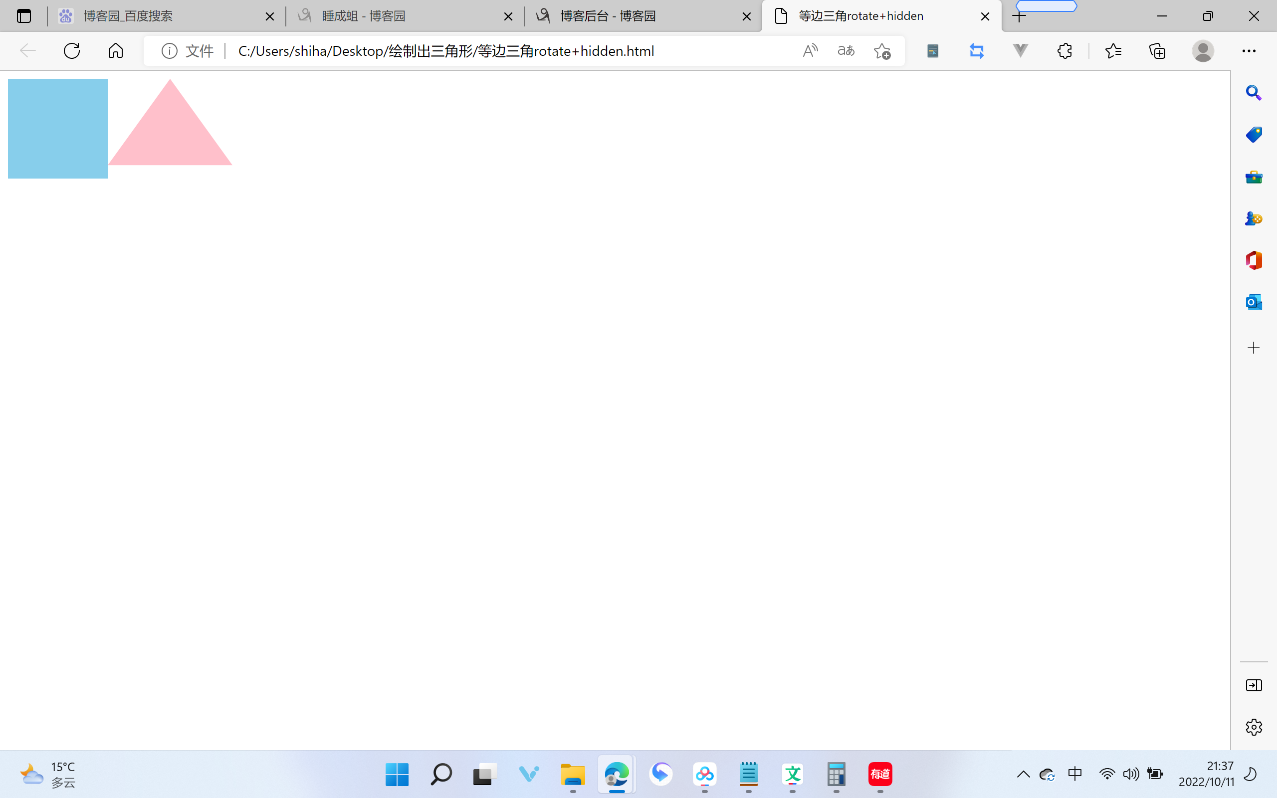
等边三角rotate+hidden
点击查看代码
<!DOCTYPE html>
<html lang="en">
<head>
    <meta charset="UTF-8">
    <meta http-equiv="X-UA-Compatible" content="IE=edge">
    <meta name="viewport" content="width=device-width, initial-scale=1.0">
    <title>等边三角rotate+hidden</title>
    <style>
        body {
            letter-spacing: -1em;
        }
        .leftDiv {
            display: inline-block;
            width: 100px;
            height: 100px;
            background-color: skyblue;
        }
        .container {
            display: inline-block;
            overflow: hidden;
            width: 100px;
            transform-origin: 0 0;
            background-color: pink;
            transform: scale(1.25,1);
        }
        .triangle {
            letter-spacing: -1em;
            width: 100px;
            height: 100px;
            background-color: blue;
            background-color: white;
            transform-origin: 100% 0;
            transform: translate(-50%,0)  rotateZ(30deg) scale(1);

        }
        .triangle::before {
            display: block;
            content: ' ';
            width: 100px;
            height: 100px;
            background-color: red;
            background-color: white;
            transform-origin: 100% 0;
            transform:  rotateZ(-150deg) scale(1);

        }
        .triangle::after {
            display: block;
            content: ' ';
            width: 100px;
            height: 100px;
            background-color: green;
            background-color: white;
            transform-origin: 100% 0;
            transform:  rotateZ(-120deg) scale(1);

        }
    </style>
</head>
<body>
    <div class="leftDiv">

    </div>
    <div class="container">
        <div class="triangle">

        </div>
    </div>
</body>
</html>
保持好奇,保持学习,做时间的朋友