
XP-Style Button
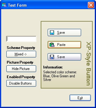
Introduction
XP-Style Button provides the look and feel of a button with any of of the three built-in color schemes of Windows XP and will also work with earlier versions of Windows, or using a color scheme if you use Windows XP. You simply don't have to worry about how the button will look like on different versions of Windows - it will always look the same.
Features
- Resizing of the button doesn't work on appearance.
- Button supports
ImageandTextproperty, which are optional. - Possibility to add a button to a form and set properties at the design and at the run time.
- Tab order, navigating by buttons with keys <Tab>, <Up>, <Down>, <Left>, <Right>. If button has an input focus, <Return> and <Space> work as a left-button mouse click.
- Access keys - possibility to trigger the click event of control by pressing the ALT key in combination with predefined key.
- Accept button (button which is clicked when the user presses ENTER key if no other button or any other control that captures the ENTER key has focus) or Cancel button (button clicked when the user presses the ESC key) on the form.
- Tool tip allows to set a hint with one line of code.
- With
DefaultSchemeproperty set tofalse, the button always has the Windows XP color scheme that you chose, no matter what version of Windows or current Windows XP visual style. - On one form you may have buttons with different color schemes :)
Public properties
Scheme |
Allows you to choose one of the three Windows XP color schemes, for applications running under earlier versions of Windows and Windows XP. Setting DefaultScheme property to false allows you to show buttons with any of the three visual styles--Blue, Olive Green and Silver -- on one form. The default color scheme is Blue. |
DefaultScheme |
If true, uses the default Windows XP color scheme (applies for Windows XP only, ignored for earlier versions of Windows). |
DialogResult |
Gets or sets a value that is returned to the parent form when the button is clicked, if the parent form is displayed through the ShowDialog method. |
Image |
Gets or sets the button's bitmap image. |
Text |
Gets or sets the button's text. |
TextColor |
Gets or sets a color of text. |
Hint |
Gets or sets the ToolTip string. When setting the ToolTip string, removes string currently associated with the control. |
Visual Design
-
Setting the control region
Everybody who used Windows XP has very probably noticed that buttons have rounded corners. The graphic shape of the button looks like this:

So, we'll create such a region (the interior of a graphics shape) for our button.
int X = this.Width;
    int Y = this.Height;
    Point[] points = {    new Point(1, 0),
    new Point(X-1, 0),
    new Point(X-1, 1),
    new Point(X, 1),
    new Point(X, Y-1),
    new Point(X-1, Y-1),
    new Point(X-1, Y),
    new Point(1, Y),
    new Point(1, Y-1),
    new Point(0, Y-1),
    new Point(0, 1),
    new Point(1, 1)}
    GraphicsPath path = new GraphicsPath();
    path.AddLines(points);
    this.Region = new Region(path);
As you have probably guessed, the
regionis critical for drawing irregularly shaped controls. -
Tracking the mouse movement
To accomplish a button's visual interaction on mouse movement, we'll override the
OnMouseEnter,OnMouseLeave,OnMouseDown,OnMouseUpmethods in order to paint the button differently, depending on button state.Bounds of control:
private Rectangle bounds;
    this.bounds = new Rectangle(0, 0, this.Width, this.Height);
Possible states:
public enum States
    {
    Normal,
    MouseOver,
    Pushed
    }
so,
 Collapse
protected override void OnMouseEnter
    (System.Windows.Forms.MouseEventArgs e)
    {
    state = States.MouseOver;
    this.Invalidate(bounds);
    base.OnMouseEnter(e);
    }
    protected override void OnMouseLeave(System.EventArgs e)
    {
    state = States.Normal;
    this.Invalidate(bounds);
    base.OnMouseLeave(e);
    }
    protected override void OnMouseDown
    (System.Windows.Forms.MouseEventArgs e)
    {
    // do nothing if pressed not the left button of mouse
        if ((e.Button & MouseButtons.Left) != MouseButtons.Left) return;
    if (bounds.Contains(e.X, e.Y))
    {
    state = States.Pushed;
    // button receives an imput focus
            this.Focus(;
    }
    else state = States.Normal;
    this.Invalidate(bounds);
    base.OnMouseDown(e);
    }
    protected override void OnMouseUp
    (System.Windows.Forms.MouseEventArgs e)
    {
    if ((e.Button & MouseButtons.Left) == MouseButtons.Left)
    state = States.Normal;
    this.Invalidate(bounds);
    base.OnMouseUp(e);
    }
-
Default button
What we are missing now is to trace and paint button in normal state, but when it is a default button (blue rectangle inside the borders, for Blue and Silver color schemes and green rectangle inside the borders, for Olive Green color scheme). We'll declare a
booleanvariableisDefault, to know whenever the button is default.NotifyDefaultmethod is called by a parent form to make a control the default button:public void NotifyDefault(bool value) { this.isDefault = value; this.Invalidate(); }
Now, when we paint the button's
Normalstate, we should check if it's active or not and perform painting depending onisDefault. -
Filling button with a LinearGradientBrush
When it seems we've traced all possible button states, we can start to paint the control. Buttons in Windows XP are filled with linear gradient color. GDI+ offers two kinds of gradient brushes:
LinearGradientBrushandPathGradientBrush. We need the first one. When creating aLinearGradientBrushwe should:- point to its location (3, 3)
- size (
this.Width-6,this.Height-5) of a rectangular region for the gradient (notice, that you don't have to paint the whole gradient region) - the starting color for the gradient
- the ending color for the gradient
- the angle (in degrees, clockwise from the x-axis) that defines the orientation of gradient (we need vertical gradient, so we use 90.0f)
silverBrush07 = new LinearGradientBrush(new Rectangle(3, 3, X-6, Y-7),
    Color.FromArgb(253, 253, 253),
    Color.FromArgb(201, 200, 220), 90.0f);
But the Silver color scheme is different from the Blue and Olive Green: buttons have more "volume". To accomplish this effect, we'll adjust the way a color varies from one edge of a gradient to the other, setting the
Blendproperty ofLinearGradientBrushobject.// color is much more intensive in the bottom part of the button // first 32 % of height we'll fill with // intencity 0.8 % from starting color: float[] relativeIntensities = {0.0f, 0.008f, 1.0f}; float[] relativePositions = {0.0f, 0.32f, 1.0f}; // create a Blend object and assign it to silverBrush07 Blend blend = new Blend(); blend.Factors = relativeIntensities; blend.Positions = relativePositions; silverBrush07.Blend = blend; // fill the nessecary shape: e.Graphics.FillRectangle(silverBrush07, 3, 4, this.Width-6, this.Height-8); silverBrush07.Dispose();
After drawing border lines and corners the result is:

Adding button to a Form
When the component is ready, we can add it to a form (don't forget to include PinkieControls namespace. The process is very simple, the most important is to not forget to set the Scheme property.
Collapseusing System.Resources;
using System.Reflection;
using PinkieControls;
private PinkieControls.ButtonXP buttonXP3;
static ResourceManager rm;
public Form1()
{
rm = new ResourceManager("TestApp.Images",
Assembly.GetCallingAssembly());
InitializeComponent();
// If to add lines below in InitializeComponent()
// we'll see the button at the design time
// (doing so, don't forget to set _Image
// and Image properties in null
this.buttonXP3 = new PinkieControls.ButtonXP();
this.buttonXP3._Image = GetImage("_Save");
this.buttonXP3.Image = GetImage("Save2");
this.buttonXP3.Text = @"Save";
this.buttonXP3.Location = new
System.Drawing.Point(152, 144);
this.buttonXP3.Name = "buttonXP3";
this.buttonXP3.Scheme =
PinkieControls.ButtonXP.Schemes.Silver;
this.buttonXP3.Size = new System.Drawing.Size(112, 26);
this.buttonXP3.TabIndex = 3;
this.buttonXP3.Click += new
System.EventHandler(this.buttonXP3Click);
this.Controls.Add(this.buttonXP3);
}
private void buttonXP3Click(object sender, System.EventArgs e)
{
MessageBox.Show("Hello, World :)")
}
Setting default color scheme for Windows XP
If we'd like a button painted in current Windows XP color scheme, it's enough only to set the boolean property DefaultScheme, to true (by default it's false). For example,
myButton.Scheme = PinkieControls.ButtonXP.Schemes.Silver;
myButton.DefaultScheme = true;
In this case, earlier versions of Windows will have silver color for the button. For Windows XP (with themes on) the button will have current color scheme.
Creating access keys
User can trigger the click event of control by pressing the ALT key in combination with predefined access key. Normally we add an ampersand (&) before the letter we intend to make an access key. ProcessMnemonic method is called to give a control the opportunity to process a mnemonic character:
protected override bool ProcessMnemonic(char charCode)
{
// determine if the given character matches
    // a mnemonic in the control's text
    if (Control.IsMnemonic(charCode, base.Text))
{
this.PerformClick();
return true;
}
return base.ProcessMnemonic(charCode);
}
Now, if we'll set the Text property to a string that includes an ampersand before the letter, that is going to be a shortcut:
buttonExit.Text = "E&xit";
We can run the command associated with the buttonExit by pressing ALT + X. It will close the form.
How to delete effect of slow painting while form is loading.
Derive your form from PinkieControls.FormEx. The form contains timer which is used to load the form with the fade effect. Interval of timer is set by default in so little value that our eyes don't notice that form fades in, while loading. You can change FadeTime property.
Thanks all for the comments and critique. New suggestions and ideas are welcome. Enjoy ;o)
History
- 28.05.2003:
- Fixed bug with
DefaultSchemeproperty - Access key added
- Fixed bug with
- 04.06.2003
- Access key implementation by Wes Haggard (AKA puzzlehacker)
- Implemented
IButtonControlinterface by Wes Haggard (AKA puzzlehacker) - Painting for the focused button (the focus rectangle around the button) by Wes Haggard (AKA puzzlehacker)
- Pens and brushes are wrapped in separate class
- Source code and demo project downloads updated
- 08.08.2003:
- Deleted effect of slow painting of button while loading form at first time (white rectangle on the place of button).
- Changed the name of namespace from
WiB.Pinkie.ControlstoPinkieControls. - Added
TextColorandHintproperties. - All implementation of button control is pulled out in a separate
ButtonBaseclass which allows easily to reuse the code and implement your own stylish button. - Created round button.