

SBButton
Introduction
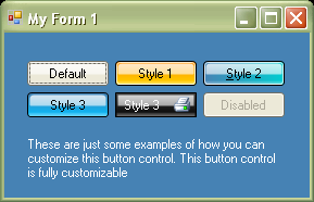
SBButton control is a button control from a set of controls (Sysbytes Controls) I'm developing to use with an application I'm writing. This button control can be customized in almost anyway the user prefers. You can have different styles for different states of this control, e.g.: DefaultStyle, MouseOverStyle, MouseDownStyle, and DisabledStyle.
How it works
This control is inherited from the Control class and the IButtonControl interface, and uses the OnPaint event to draw the control using GDI+. This control uses some properties which are different from the Button control provided with .NET. Here are the properties:
DefaultStyleMouseOverStyleMouseDownStyleDisabledStyleRoundedCornersShowFocusCueImageImageAlignmentFocusCueColor
The properties DefaultStyle, MouseOverStyle, MouseDownStyle and DisabledStyle are derived from a class named SBButtonAppearance, and all these properties have some common sub-properties. They are:
BackColor1BackColor2HighLightColorGlowColorInnerBorderColorOuterBorderColorTextColorFillModeFontHighLightOpacity1HighLightOpacity2GlowOpacityInnerBorderOpacity
Source code
The source code for the SBButtonAppearanceClass follows:
 Collapse
[Serializable()]
[TypeConverter(typeof(ExpandableObjectConverter))]
public class SBButtonAppearance
{
public event EventHandler<EventArgs> SBButtonAppearanceChanged;
private Color _backColor1 = SystemColors.ButtonFace;
public Color BackColor1
{
get { return _backColor1; }
set
{
_backColor1 = value;
AppearanceChanged();
}
}
private Color _backColor2 = SystemColors.ButtonFace;
public Color BackColor2
{
get { return _backColor2; }
set
{
_backColor2 = value;
AppearanceChanged();
}
}
private Color _outerBorderColor = SystemColors.ControlDarkDark;
public Color OuterBorderColor
{
get { return _outerBorderColor; }
set
{
_outerBorderColor = value;
AppearanceChanged();
}
}
private Color _innerBorderColor = SystemColors.ControlLightLight;
public Color InnerBorderColor
{
get { return _innerBorderColor; }
set
{
_innerBorderColor = value;
AppearanceChanged();
}
}
private Color _glowColor = SystemColors.ControlLightLight;
public Color GlowColor
{
get { return _glowColor; }
set
{
_glowColor = value;
AppearanceChanged();
}
}
private Color _highLightColor = SystemColors.ControlLightLight;
public Color HighLightColor
{
get { return _highLightColor; }
set
{
_highLightColor = value;
AppearanceChanged();
}
}
private Color _textColor = SystemColors.ControlText;
public Color TextColor
{
get { return _textColor; }
set
{
_textColor = value;
AppearanceChanged();
}
}
private Font _font = SystemFonts.DefaultFont;
public Font Font
{
get { return _font; }
set
{
_font = value;
AppearanceChanged();
}
}
private LinearGradientMode _fillMode = LinearGradientMode.Horizontal;
public LinearGradientMode FillMode
{
get { return _fillMode; }
set
{
_fillMode = value;
AppearanceChanged();
}
}
private int _innerBorderOpacity = 200;
public int InnerBorderOpacity
{
get { return _innerBorderOpacity; }
set
{
if (value > 255) value = 255;
if (value < 0) value = 0;
_innerBorderOpacity = value;
AppearanceChanged();
}
}
private int _highLightOpacity1 = 200;
public int HightLightOpacity1
{
get { return _highLightOpacity1; }
set
{
if (value > 255) value = 255;
if (value < 0) value = 0;
_highLightOpacity1 = value;
AppearanceChanged();
}
}
private int _highLightOpacity2 = 150;
public int HightLightOpacity2
{
get { return _highLightOpacity2; }
set
{
if (value > 255) value = 255;
if (value < 0) value = 0;
_highLightOpacity2 = value;
AppearanceChanged();
}
}
private int _glowOpacity = 120;
public int GlowOpacity
{
get { return _glowOpacity; }
set
{
if (value > 255) value = 255;
if (value < 0) value = 0;
_glowOpacity = value;
AppearanceChanged();
}
}
public override string ToString()
{
return null;
}
private void AppearanceChanged()
{
EventHandler<EventArgs> temp = SBButtonAppearanceChanged;
if (temp != null)
temp(this, new EventArgs());
}
}
The code for drawing the button:
Collapse protected override void OnPaint(PaintEventArgs e)
{
e.Graphics.SmoothingMode = SmoothingMode.HighQuality;
e.Graphics.TextRenderingHint =
System.Drawing.Text.TextRenderingHint.SystemDefault;
if(!isMouseIn && !isMouseDown && this.Enabled)
this.DrawDefault(e);
if (isMouseIn && !isMouseDown && this.Enabled)
this.DrawMouseOver(e);
if (isMouseIn && isMouseDown && this.Enabled)
this.DrawMouseDown(e);
if (!isMouseIn && isMouseDown && this.Enabled)
this.DrawMouseDown(e);
if (!this.Enabled)
this.DrawDisabled(e);
if (this.Focused && this.ShowFocusCue && this.Enabled)
ControlPaint.DrawBorder(e.Graphics, new Rectangle(
2, 2, this.Width - 4, this.Height - 4), this.FocusCueColor,
ButtonBorderStyle.Dashed);
}
private void DrawDefault(PaintEventArgs e)
{
LinearGradientBrush brBackground = new LinearGradientBrush(
this.ClientRectangle, this.DefaultStyle.BackColor1,
this.DefaultStyle.BackColor2, this.DefaultStyle.FillMode);
LinearGradientBrush brHighlight = new LinearGradientBrush(new Rectangle(
2, 2, this.Width - 5, this.Height / 2),
Color.FromArgb(this.DefaultStyle.HightLightOpacity1,
this.DefaultStyle.HighLightColor),
Color.FromArgb(this.DefaultStyle.HightLightOpacity2,
this.DefaultStyle.HighLightColor), LinearGradientMode.Vertical);
LinearGradientBrush brGlow = new LinearGradientBrush(new Rectangle(
0, this.Height - this.Height / 4 - 1, this.Width - 1, this.Height / 4),
Color.Transparent, Color.FromArgb(this.DefaultStyle.GlowOpacity,
this.DefaultStyle.GlowColor), LinearGradientMode.Vertical);
Pen pnOuterBorder = new Pen(this.DefaultStyle.OuterBorderColor, 1);
Pen pnInnerBorder = new Pen(Color.FromArgb(DefaultStyle.InnerBorderOpacity,
this.DefaultStyle.InnerBorderColor));
GraphicsPath gpBackground = Common.RoundedRect(new Rectangle(
0, 0, this.Width - 1, this.Height - 1), 3);
GraphicsPath gpGlow = Common.RoundedRect(new Rectangle(
1, this.Height - this.Height / 4, this.Width - 3, this.Height / 4), 1,1,3,3);
GraphicsPath gpHighlight = Common.RoundedRect(new Rectangle(
2, 2, this.Width - 5, this.Height / 2 - 1), 3, 3, 1, 1);
GraphicsPath gpOuterBorder = Common.RoundedRect(new Rectangle(
0, 0, this.Width - 1, this.Height - 1), 3);
GraphicsPath gpInnerBorder = Common.RoundedRect(new Rectangle(
1, 1, this.Width - 3, this.Height - 3), 3);
Rectangle rectBackground = new Rectangle(0, 0, this.Width - 1, this.Height - 1);
Rectangle rectGlow = new Rectangle(1, this.Height - this.Height / 4,
this.Width - 3, this.Height / 4);
Rectangle rectHighlight = new Rectangle(2, 2, this.Width - 5, this.Height / 2 - 1);
Rectangle rectOuterBorder = new Rectangle(0, 0, this.Width - 1, this.Height - 1);
Rectangle rectInnerBorder = new Rectangle(1, 1, this.Width - 3, this.Height - 3);
Size textSize = TextRenderer.MeasureText(this.Text, this.DefaultStyle.Font);
Point textPos = new Point(this.Width / 2 - textSize.Width / 2,
this.Height / 2 - textSize.Height / 2);
Point imagePos = new Point();
switch (this.ImageAlignment)
{
case Alignment.Right:
if (this.Image != null)
{
textPos = new Point(5, this.Height / 2 - textSize.Height / 2);
imagePos = new Point(this.Width - this.Image.Width - 5,
this.Height / 2 - this.Image.Size.Height / 2);
}
break;
case Alignment.Left:
if (this.Image != null)
{
textPos = new Point(this.Width - textSize.Width - 5,
this.Height / 2 - textSize.Height / 2);
imagePos = new Point(5, this.Height / 2 - this.Image.Size.Height / 2);
}
break;
}
if (this.RoundedCorners)
{
e.Graphics.FillPath(brBackground, gpBackground);
e.Graphics.FillPath(brGlow, gpGlow);
e.Graphics.FillPath(brHighlight, gpHighlight);
e.Graphics.DrawPath(pnOuterBorder, gpOuterBorder);
e.Graphics.DrawPath(pnInnerBorder, gpInnerBorder);
}
else
{
e.Graphics.FillRectangle(brBackground, rectBackground);
e.Graphics.FillRectangle(brGlow, rectGlow);
e.Graphics.FillRectangle(brHighlight, rectHighlight);
e.Graphics.DrawRectangle(pnOuterBorder, rectOuterBorder);
e.Graphics.DrawRectangle(pnInnerBorder, rectInnerBorder);
}
if (this.Image != null)
e.Graphics.DrawImage(this.Image, imagePos.X, imagePos.Y,
this.Image.Width, this.Image.Height);
TextRenderer.DrawText(e.Graphics, this.Text, this.DefaultStyle.Font,
textPos, this.DefaultStyle.TextColor);
}
The methods DrawMouseOver, DrawMouseDown, and DrawDisabled are the same as the DrawDefault except for the colors and opacity values they use. You may have noticed that this method calls a function Common.RoundedRect. This function will return a rectangle with rounded corners as GraphicsPath.
Here is the code for this function:
Collapse public static System.Drawing.Drawing2D.GraphicsPath RoundedRect(
System.Drawing.Rectangle baseRect, int topLeftRadius,
int topRightRadius, int bottomLeftRadius, int bottomRightRadius)
{
int topLeftDiameter = topLeftRadius * 2;
int topRightDiameter = topRightRadius * 2;
int bottomLeftDiameter = bottomLeftRadius * 2;
int bottomRightDiameter = bottomRightRadius * 2;
System.Drawing.Drawing2D.GraphicsPath gp =
new System.Drawing.Drawing2D.GraphicsPath();
System.Drawing.Rectangle rectTopLeft = new System.Drawing.Rectangle(
baseRect.Left, baseRect.Top, topLeftDiameter, topLeftDiameter);
System.Drawing.Rectangle rectTopRight = new System.Drawing.Rectangle(
baseRect.Right - topRightDiameter, baseRect.Top, topRightDiameter,
topRightDiameter);
System.Drawing.Rectangle rectBottomLeft = new System.Drawing.Rectangle(
baseRect.Left, baseRect.Bottom - bottomLeftDiameter, bottomLeftDiameter,
bottomLeftDiameter);
System.Drawing.Rectangle rectBottomRight = new System.Drawing.Rectangle(
baseRect.Right - bottomRightDiameter, baseRect.Bottom - bottomRightDiameter,
bottomRightDiameter, bottomRightDiameter);
gp.AddArc(rectTopLeft, 180, 90);
gp.AddArc(rectTopRight, 270, 90);
gp.AddArc(rectBottomRight, 0, 90);
gp.AddArc(rectBottomLeft, 90, 90);
gp.CloseFigure();
return gp;
}
public static System.Drawing.Drawing2D.GraphicsPath RoundedRect(
System.Drawing.Rectangle baseRect, int cornerRadius)
{
int diameter = cornerRadius * 2;
System.Drawing.Drawing2D.GraphicsPath gp =
new System.Drawing.Drawing2D.GraphicsPath();
System.Drawing.Rectangle rectTopLeft = new System.Drawing.Rectangle(
baseRect.Left, baseRect.Top, diameter, diameter);
System.Drawing.Rectangle rectTopRight = new System.Drawing.Rectangle(
baseRect.Right - diameter, baseRect.Top, diameter, diameter);
System.Drawing.Rectangle rectBottomLeft = new System.Drawing.Rectangle(
baseRect.Left, baseRect.Bottom - diameter, diameter, diameter);
System.Drawing.Rectangle rectBottomRight = new System.Drawing.Rectangle(
baseRect.Right - diameter, baseRect.Bottom - diameter, diameter, diameter);
gp.AddArc(rectTopLeft, 180, 90);
gp.AddArc(rectTopRight, 270, 90);
gp.AddArc(rectBottomRight, 0, 90);
gp.AddArc(rectBottomLeft, 90, 90);
gp.CloseFigure();
return gp;
}
Points of interest
This control supports an image, and it can only be aligned to either right or left. If there is no image, the text will always be aligned to the center of the control. You can modify these behaviours very easily by editing the methods DrawDefault, DrawMouseOver, DrawMouseDown, and DrawDisabled.
