
电信客户流失预测
电信客户流失预测
项目数据
https://www.kaggle.com/blastchar/telco-customer-churn
项目概况
电信行业的客户可以从各种服务提供商中进行选择,并从一个服务提供商切换到另一个服务提供商。在这个竞争激烈的市场上,电信业务的年流失率为15-25%。
个性化的客户保留是困难的,因为大多数公司都有大量的客户,不能为每个客户投入太多时间。成本太高,超过了额外收入。然而,如果一家公司能够预测哪些客户可能提前离开,那么它可以将客户保留工作的重点放在这些“高风险”客户身上。最终目标是扩大其覆盖范围并获得更多的客户忠诚度。在这个市场上取得成功的核心在于客户本身。
客户流失是一个关键指标,因为留住现有客户的成本要比获得新客户的成本低得多。
为了减少客户流失,电信公司需要预测哪些客户面临高流失风险。
为了发现潜在客户流失的早期迹象,首先必须对客户及其在多个渠道之间的互动进行全面的了解。
因此,通过解决客户流失问题,这些企业不仅可以保持其市场地位,还可以发展壮大。他们网络中的客户越多,发起成本越低,利润越大。因此,公司成功的关键重点是减少客户流失和实施有效的保留战略。
技术工具
本项目以以Python语言为基础,使用conda发行的python3.8.5版本。使用vscode上的jupyter插件进行操作。在数据挖掘过程中,使用pandas进行数据整理和统计分析,使用matplotlib和seaborn进行数据可视化,使用scikit-learn、sgboost和catboost进行建模预测。
目的
1.客户流失率和继续使用主动服务的客户的百分比是多少?
2.是否存在基于性别的客户流失模式?
3.构建用户画像分析,了解客户人群特点。
4.最赚钱的服务类型是什么?
5.根据数据样本中的参数综合分析客户特征。
6.给产品或运营提出建议。
7.分析案例中的流失状况,并拟合模型,预测客户的流失状况。
1、项目环境配置
导入相关的包
import matplotlib.pyplot as plt
import numpy as np
import pandas as pd
import missingno as msno
import seaborn as sns

import plotly.express as px
import plotly.graph_objects as go
from plotly.subplots import make_subplots

from sklearn.ensemble import AdaBoostClassifier, ExtraTreesClassifier  # ada分类器 、 极度随机数分类算法
from sklearn.ensemble import GradientBoostingClassifier # 集成学习梯度提升决策树
from sklearn.ensemble import RandomForestClassifier  # 随机森林
from sklearn.linear_model import LogisticRegression  # 逻辑回归
from sklearn.metrics import confusion_matrix, accuracy_score, classification_report # 评估函数
from sklearn.model_selection import train_test_split  # 数据集划分函数
from sklearn.naive_bayes import GaussianNB  # 朴素贝叶斯
from sklearn.neighbors import KNeighborsClassifier  # KNN算法
from sklearn.preprocessing import LabelEncoder  # 编码转换
from sklearn.preprocessing import StandardScaler # 数据标准化函数
from sklearn.svm import SVC  # 支持向量机
from sklearn.tree import DecisionTreeClassifier  # 决策树分类器
from sklearn.discriminant_analysis import LinearDiscriminantAnalysis  # 线性判别分析
from xgboost import XGBClassifier  # XGB分类器
from sklearn import metrics # 量度函数
from sklearn.metrics import roc_curve # 召回曲线
消除部分warning
import warnings
warnings.filterwarnings('ignore')
plt显示中文和正负号
plt.rcParams['font.sans-serif'] = ['SimHei']
plt.rcParams['axes.unicode_minus'] = False
2、数据获取及分析
读取数据文件
df = pd.read_csv('./data/WA_Fn-UseC_-Telco-Customer-Churn.csv')
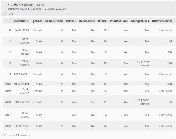
查看前5条数据和后5条数据
df.head(5).append(df.tail(5))
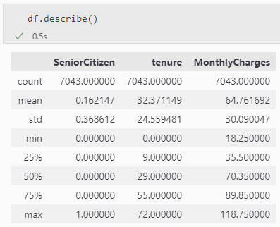
df.describe()
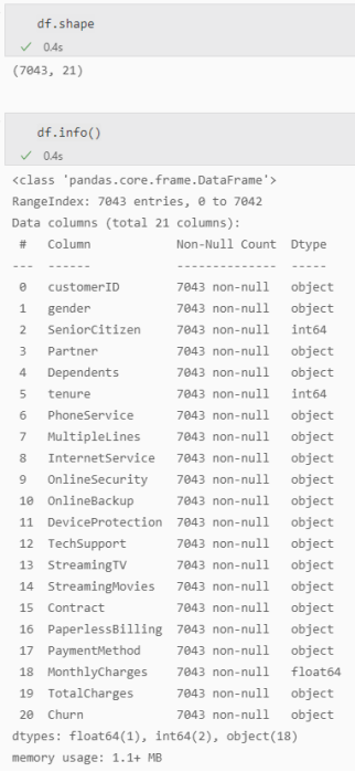
df.shape
df.info()
3、特征工程
数据预处理
缺失值可视化
msno.matrix(df);
使用此矩阵,我们可以非常快速地找到数据的缺失模式。
从上面的可视化中,我们可以观察到它没有突出的数据,并且没有缺失的数据。
TotalCharges表示总费用,这里为对象类型,需要转换为float类型
注意astype如果遇到空值,转换成数值型就会报错
df['TotalCharges'].replace(' ', np.nan, inplace=True)
df['TotalCharges'] = df['TotalCharges'].astype(np.float64)
df.info()
再次检查缺失值
pd.isnull(df["TotalCharges"]).sum()
查看缺失值
df[np.isnan(df['TotalCharges'])]
直接删除这11个缺失值
df.dropna(inplace=True)
再次检查缺失值
pd.isnull(df["TotalCharges"]).sum()
去除重复值
df.drop_duplicates()
df.shape
数据特征转换
对Churn列中的的Yes和No分别用1和0替换,必须是原地替换
df['Churn'].replace(to_replace='Yes', value=1, inplace=True)
df['Churn'].replace(to_replace='No', value=0, inplace=True)
df['Churn'].head()
特征选择
数据可视化
| 参数 | 解释 |
|---|---|
| labels | 饼图外侧显示的说明文字 |
| explode | 离开中心距离 |
| startangle | 起始绘制角度,默认图是从x轴正方向逆时针画起,如设定=90则从y轴正方向画起 |
| shadow | 是否阴影 |
| labeldistance label | 绘制位置,相对于半径的比例, 如<1则绘制在饼图内侧 |
| autopct | 控制饼图内百分比设置,可以使用format字符串或者format function |
| '%1.2f' | 小数点前后位数(没有用空格补齐) |
| pctdistance | 类似于labeldistance,指定autopct的位置刻度 |
| radius | 饼图半径 |
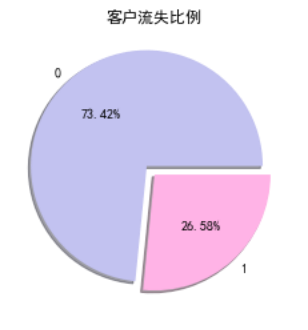
| #客户流失饼状图 | |
| plt.pie(df["Churn"].value_counts(), labels=df["Churn"].value_counts().index, explode=(0.1, 0), autopct='%1.2f%%', shadow=True, colors = ['#c2c2f0','#ffb3e6', '#66b3ff']) | |
| plt.title("客户流失比例") | |
| plt.show() |
其他饼状图
object_col = df.select_dtypes(include=[np.object]).columns.drop('customerID')
fig, axes = plt.subplots(nrows=3, ncols=5, figsize=(60, 100))
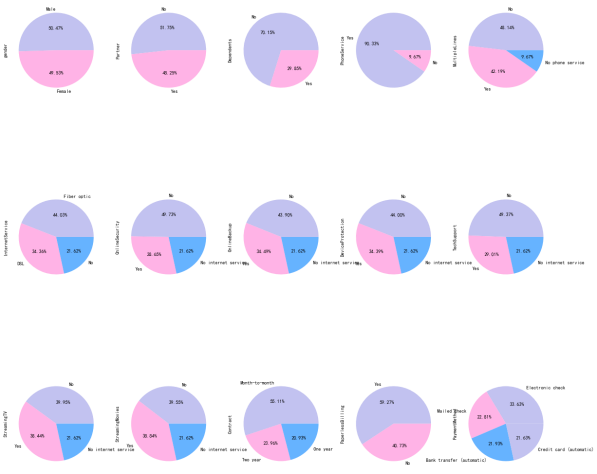
i = 1
for index in object_col:
plt.subplot(3, 5, i)
ax = df[index].value_counts().plot.pie(figsize=(20, 20),autopct='%1.2f%%', colors = ['#c2c2f0','#ffb3e6', '#66b3ff'])
i = i + 1
plt.show()
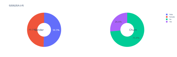
分析性别与流失的关系
g_labels = ['Male', 'Female']
c_labels = ['No', 'Yes']
fig = make_subplots(rows=1, cols=2, specs=[[{'type':'domain'}, {'type':'domain'}]])
fig.add_trace(go.Pie(labels=g_labels, values=df['gender'].value_counts(), name="Gender"),
              1, 1)
fig.add_trace(go.Pie(labels=c_labels, values=df['Churn'].value_counts(), name="Churn"),
              1, 2)

fig.update_traces(hole=.4, hoverinfo="label+percent+name", textfont_size=16)

fig.update_layout(
    title_text="性别和流失分布",
    annotations=[dict(text='Gender', x=0.16, y=0.5, font_size=20, showarrow=False),
                 dict(text='Churn', x=0.84, y=0.5, font_size=20, showarrow=False)])
fig.show()
plt.figure(figsize=(6, 6))
labels =["Churn: Yes","Churn:No"]
values = [1869,5163]
labels_gender = ["F","M","F","M"]
sizes_gender = [939,930 , 2544,2619]
colors = ['#ff6666', '#66b3ff']
colors_gender = ['#c2c2f0','#ffb3e6', '#c2c2f0','#ffb3e6']
explode = (0.3,0.3)
explode_gender = (0.1,0.1,0.1,0.1)
textprops = {"fontsize":15}
plt.pie(values, labels=labels,autopct='%1.1f%%',pctdistance=1.08, labeldistance=0.8,colors=colors, startangle=90,frame=True, explode=explode,radius=10, textprops =textprops, counterclock = True, )
plt.pie(sizes_gender,labels=labels_gender,colors=colors_gender,startangle=90, explode=explode_gender,radius=7, textprops =textprops, counterclock = True, )
centre_circle = plt.Circle((0,0),5,color='black', fc='white',linewidth=0)
fig = plt.gcf()
fig.gca().add_artist(centre_circle)

plt.title('性别的流失分布: Male(M), Female(F)', fontsize=15, y=1.1)

plt.axis('equal')
plt.tight_layout()
plt.show()
fig = go.Figure()

fig.add_trace(go.Bar(
  x = [['Churn:No', 'Churn:No', 'Churn:Yes', 'Churn:Yes'],
       ["Female", "Male", "Female", "Male"]],
  y = [965, 992, 219, 240],
  name = 'DSL',
))

fig.add_trace(go.Bar(
  x = [['Churn:No', 'Churn:No', 'Churn:Yes', 'Churn:Yes'],
       ["Female", "Male", "Female", "Male"]],
  y = [889, 910, 664, 633],
  name = 'Fiber optic',
))

fig.add_trace(go.Bar(
  x = [['Churn:No', 'Churn:No', 'Churn:Yes', 'Churn:Yes'],
       ["Female", "Male", "Female", "Male"]],
  y = [690, 717, 56, 57],
  name = 'No Internet',
))

fig.update_layout(title_text="<b>性别与网络服务的流失关系</b>")

fig.show()
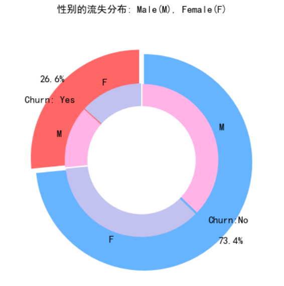
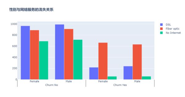
性别与流失基本无关
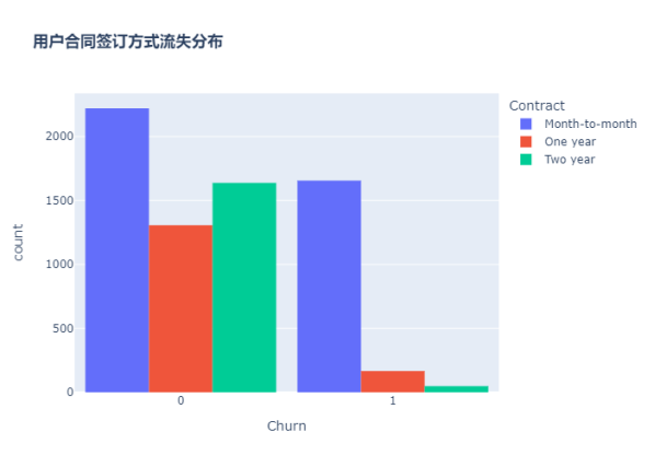
分析用户合同签订方式与流失的关系
fig = px.histogram(df, x="Churn", color="Contract", barmode="group", title="<b>用户合同签订方式流失分布<b>")
fig.update_layout(width=700, height=500, bargap=0.1)
fig.show()
流失的客户中,约75%为按月签订合同的客户,约13%为按年签订合同的客户,约33%为按两年签订合同的客户
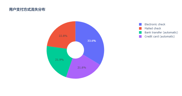
分析用户支付方式与流失的关系
labels = df['PaymentMethod'].unique()
values = df['PaymentMethod'].value_counts()
fig = go.Figure(data=[go.Pie(labels=labels, values=values, hole=.3)])
fig.update_layout(title_text="<b>用户支付方式流失分布</b>")
fig.show()
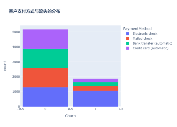
fig = px.histogram(df, x="Churn", color="PaymentMethod", title="<b>客户支付方式与流失的分布</b>")
fig.update_layout(width=700, height=500, bargap=0.1)
fig.show()
ax = sns.catplot(y="Churn", x="MonthlyCharges", row="PaymentMethod", kind="box", data=df, height=1.5, aspect=4, orient='h', palette="pastel")
由图上可以看出,付款方式对客户流失率影响为:电子支票 > 邮件支票 > 银行转账(自动) > 信用卡支付(自动)。
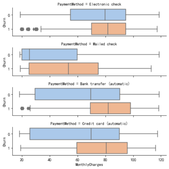
无纸化账单的客户最有可能流失。
信用卡支付对留住现有客户更有效。
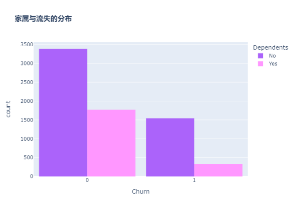
分析客户是否有家属与流失的关系
color_map = {"Yes": "#FF97FF", "No": "#AB63FA"}
fig = px.histogram(df, x="Churn", color="Dependents", barmode="group", title="<b>家属与流失的分布</b>", color_discrete_map=color_map)
fig.update_layout(width=700, height=500, bargap=0.1)
fig.show()
没有家属的客户更容易流失
分析用户配偶与流失的关系
color_map = {"Yes": '#FFA15A', "No": '#00CC96'}
fig = px.histogram(df, x="Churn", color="Partner", barmode="group", title="<b>配偶与流失的分布</b>", color_discrete_map=color_map)
fig.update_layout(width=700, height=500, bargap=0.1)
fig.show()
graphic = sns.FacetGrid(df, row='Partner', col="Dependents", hue="Churn", height=3.5, palette="pastel")
graphic.map(plt.scatter, "tenure", "MonthlyCharges", alpha=0.6)
graphic.add_legend();
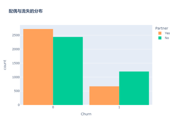
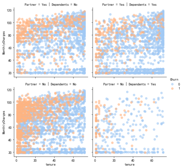
没有配偶的客户更容易流失
分析客户年龄与流失的关系
color_map = {"Yes": '#00CC96', "No": '#B6E880'}
fig = px.histogram(df, x="Churn", color="SeniorCitizen", title="<b>年龄与流失的分布</b>", color_discrete_map=color_map)
fig.update_layout(width=700, height=500, bargap=0.1)
fig.show()
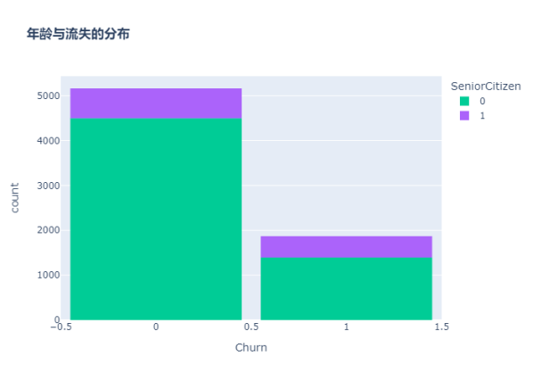
可以看出,老年人的比例非常低。
大多数老年人都在流失。
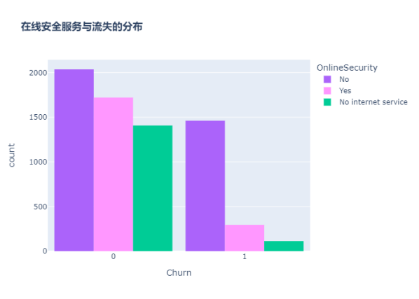
分析用户在线安全服务与流失的关系
color_map = {"Yes": "#FF97FF", "No": "#AB63FA"}
fig = px.histogram(df, x="Churn", color="OnlineSecurity", barmode="group", title="<b>在线安全服务与流失的分布</b>", color_discrete_map=color_map)
fig.update_layout(width=700, height=500, bargap=0.1)
fig.show()
大多数客户在无在线安全服务的情况下流失
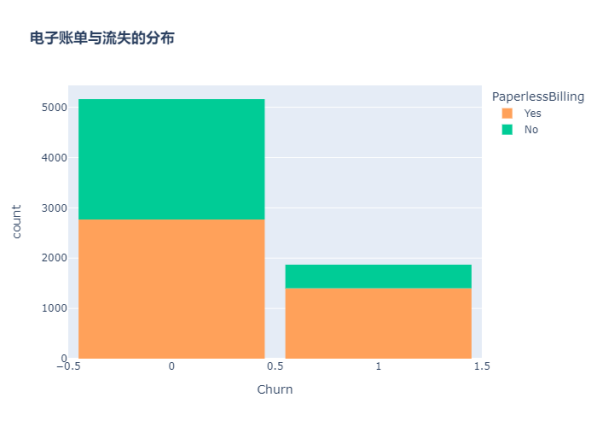
分析客户电子账单与流失的关系
color_map = {"Yes": '#FFA15A', "No": '#00CC96'}
fig = px.histogram(df, x="Churn", color="PaperlessBilling",  title="<b>电子账单与流失的分布</b>", color_discrete_map=color_map)
fig.update_layout(width=700, height=500, bargap=0.1)
fig.show()
分析客户技术支持与流失的关系
fig = px.histogram(df, x="Churn", color="TechSupport",barmode="group",  title="<b>技术支持与流失的关系</b>")
fig.update_layout(width=700, height=500, bargap=0.1)
fig.show()
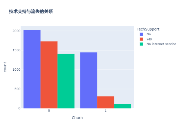
没有技术支持的客户最有可能迁移到其他服务提供商。
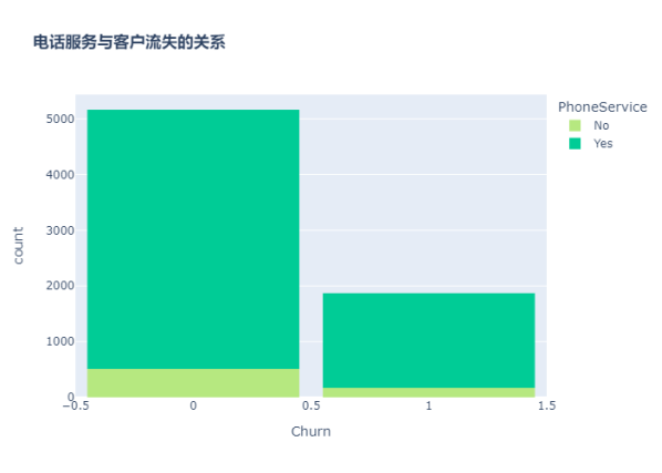
分析客户电话服务与流失的关系
color_map = {"Yes": '#00CC96', "No": '#B6E880'}
fig = px.histogram(df, x="Churn", color="PhoneService", title="<b>电话服务与客户流失的关系</b>", color_discrete_map=color_map)
fig.update_layout(width=700, height=500, bargap=0.1)
fig.show()
很少一部分客户没有电话服务,其中三分之一的客户更可能流失。
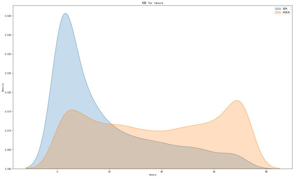
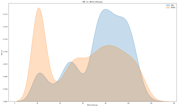
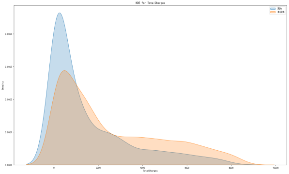
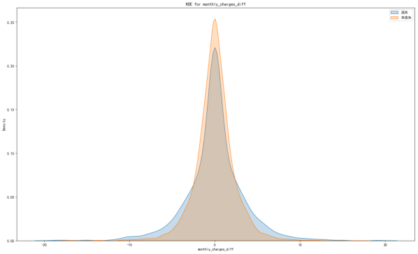
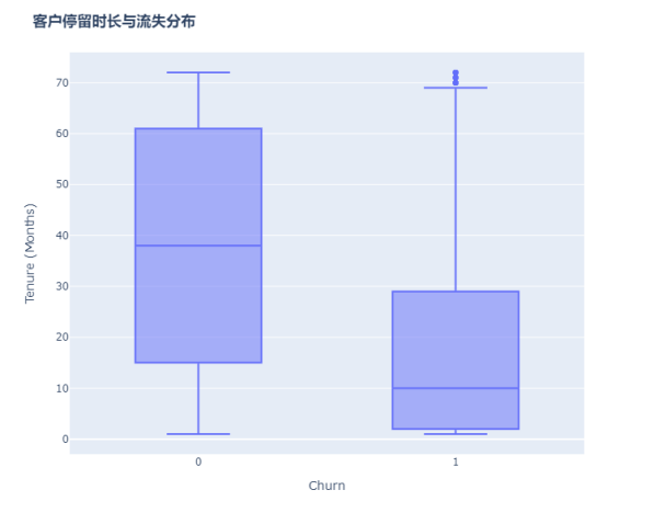
分析客户停留时长与流失的关系
绘制核密度图
自定义绘制核密度图的函数
def kdeplot(col):
plt.figure(figsize=(20, 12), dpi=100)
plt.title('KDE for {}'.format(col))
ax1 = sns.kdeplot(df[df['Churn'] == 1][col], shade=True)
ax2 = sns.kdeplot(df[df['Churn'] == 0][col], shade=True)
plt.legend(['流失', '未流失'])
plt.show()
kdeplot('tenure')
kdeplot('MonthlyCharges')
kdeplot('TotalCharges')
df['total_charges_to_tenure_ratio'] = df['TotalCharges'] / df['tenure']
df['monthly_charges_diff'] = df['MonthlyCharges'] - df['total_charges_to_tenure_ratio']
kdeplot('monthly_charges_diff')
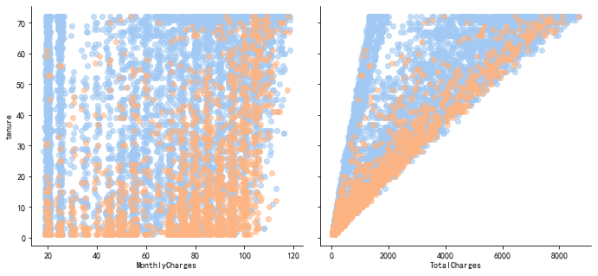
graphic = sns.PairGrid(df, y_vars=["tenure"], x_vars=["MonthlyCharges", "TotalCharges"], height=4.5, hue="Churn", aspect=1.1, palette="pastel")
ax = graphic.map(plt.scatter, alpha=0.6)
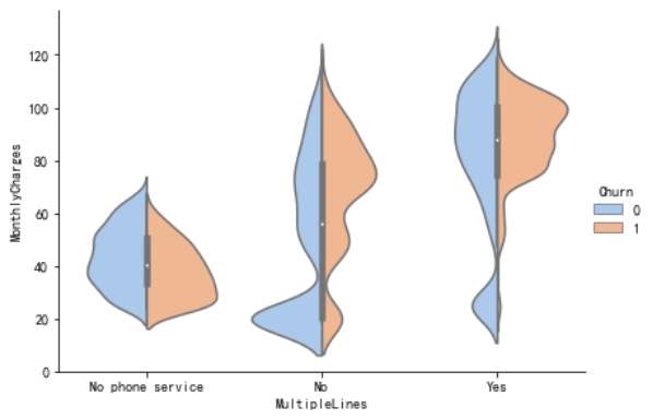
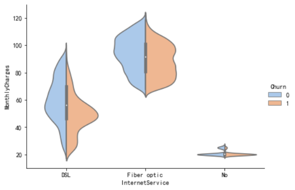
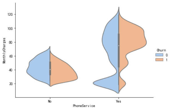
用“小提琴图”看PhoneService、MultipleLines、InternetService与MonthlyCharges的情况
ax = sns.catplot(x="MultipleLines", y="MonthlyCharges", hue="Churn", kind="violin", split=True, palette="pastel", data=df, height=4.2, aspect=1.4)
ax = sns.catplot(x="InternetService", y="MonthlyCharges", hue="Churn", kind="violin", split=True, palette="pastel", data=df, height=4.2, aspect=1.4)
ax = sns.catplot(x="PhoneService", y="MonthlyCharges", hue="Churn", kind="violin", split=True, palette="pastel", data=df, height=4.2, aspect=1.4)
fig = px.box(df, x='Churn', y = 'tenure')

fig.update_yaxes(title_text='Tenure (Months)', row=1, col=1)

fig.update_xaxes(title_text='Churn', row=1, col=1)

fig.update_layout(autosize=True, width=750, height=600,
    title_font=dict(size=25, family='Courier'),
    title='<b>客户停留时长与流失分布</b>',
)

fig.show()
新客户更容易流失
使用热地图显示相关系数
| 热力系数图参数 | 解释 |
|---|---|
| heatmap | 使用热地图展示系数矩阵情况 |
| linewidths | 热力图矩阵之间的间隔大小 |
| annot | 设定是否显示每个色块的系数值 |
构造相关性矩阵
charges = df.iloc[:, 1:20]
corr = charges.apply(lambda x: pd.factorize(x)[0])
corr = corr.corr()
plt.figure(figsize=(20, 16))
ax = sns.heatmap(corr, xticklabels=corr.columns, yticklabels=corr.columns, linewidths=0.2, annot=True)
plt.title("变量间的相关性")

结论:
从上图可以看出,互联网服务、网络安全服务、在线备份业务、设备保护业务、技术支持服务、网络电视和网络电影之间存在较强的相关性。
多线业务和电话服务之间也有很强的相关性,并且都呈强正相关关系。
one-hot编码
df_dummies = pd.get_dummies(df.iloc[:, 1:21])
df_dummies.head()
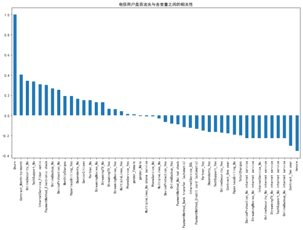
电信用户是否流失与各变量之间的相关性
plt.figure(figsize=(15, 8))
df_dummies.corr()['Churn'].sort_values(ascending=False).plot(kind='bar')
plt.title("电信用户是否流失与各变量之间的相关性")
由图上可以看出,变量gender 和 PhoneService 处于图形中间,其值接近于 0 ,这两个变量对电信客户流失预测影响非常小,可以直接舍弃。
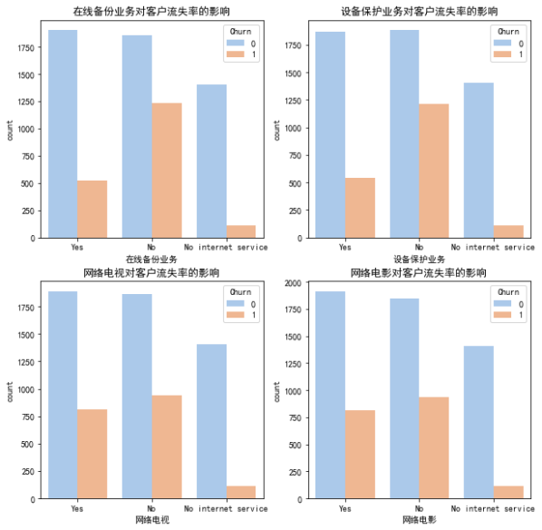
分析用户在线备份业务、设备保护业务、网络电视、网络电影与流失的关系
在线备份业务、设备保护业务、网络电视、网络电影和无互联网服务对客户流失率的影响
covariables = ["OnlineBackup", "DeviceProtection", "StreamingTV", "StreamingMovies"]
covariables_dict = [ "在线备份业务", "设备保护业务", "网络电视", "网络电影"]
fig, axes = plt.subplots(nrows=2, ncols=2, figsize=(10, 10))
for i, item in enumerate(covariables):
    plt.subplot(2, 2, (i + 1))
    ax = sns.countplot(x=item, hue="Churn", data=df, palette="pastel", order=["Yes", "No", "No internet service"])
    plt.xlabel(covariables_dict[i])
    plt.title(covariables_dict[i] + "对客户流失率的影响")
    i = i + 1
plt.show()
-
由上图可以看出,在网络安全服务、在线备份业务、设备保护业务、技术支持服务、网络电视和网络电影六个变量中,没有互联网服务的客户流失率值是相同的,都是相对较低。
-
这可能是因为以上六个因素只有在客户使用互联网服务时才会影响客户的决策,这六个因素不会对不使用互联网服务的客户决定是否流失产生推论效应。
结论
1.用户流失与性别gender无关。
2.老年人流失比率比较大,原因可能在于老年人对电信套餐认识不深,普及度较低,容易流失老年人客户。
3.没有伴侣以及没有家属的用户流失率大。伴侣及家庭成员的存在可以显著影响电信用户的留存或流失。
4.用户流失基本与手机服务指标“电话服务”和“多线”无关。可能是因为这是电信企业的核心业务,用户流失与此无关。
5.网络服务指标中,采用光纤服务的用户更容易流失。可能是因为光纤服务的性价比不高。
6.其他订阅服务指标中,前四项服务(“在线安全”、“在线备份”、“设备保护”和“技术支持”)对客户流失呈正相关,没有订阅该服务的用户较容易流失,后两项(“流媒体电视”和“流媒体电影”)对客户流失没有明显关系。
7.电子支付更容易流失客户。可能是因为办理业务方便,抑或是操作频率高,使客户厌倦。
8.采用无纸化账单的客户更容易流失。可能是因为让客户的钱流动没有感觉。
9.合同签约期越长用户越不容易流失。2年合同若在中途毁约,对客户有一定损失,这在一定程度上减少了客户的流失。
10.新客户更容易流失。可以采取一定的折扣方案挽留新用户,提高新用户的留存率。
11.月费率越高越容易流失客户,若不在高费率的基础上提供更优质的服务,容易导致用户流失。月费为60元左右可以使得流失率较低且留存率较高,此后流失率大幅增加。80元左右时,客户的流失率达到顶峰。
12.总费用少的用户反而容易流失。因此费用保持在60元左右最好。
建议
用户方面:针对老年用户、无亲属、无伴侣用户的特征推出定制服务如老年朋友套餐、温暖套餐等。鼓励用户加强关联,推出各种亲子套餐、情侣套餐等,满足客户的多样化需求。针对新注册用户,推送半年优惠如赠送消费券,以度过用户流失高峰期。
服务方面:针对光纤用户可以推出光纤和通讯组合套餐,对于连续开通半年以上的用户给与优惠减免。开通网络电视、电影的用户容易流失,需要研究这些用户的流失原因,是服务体验如观影流畅度清晰度等不好还是资源如片源等过少,再针对性的解决问题。针对在线安全、在线备份、设备保护、技术支持等增值服务,应重点对用户进行推广介绍,如首月/半年免费体验,使客户习惯并受益于这些服务
交易倾向方面:针对单月合同用户,建议推出年合同付费折扣活动,将月合同用户转化为年合同用户,提高用户存留时长,以减少用户流失。 针对采用电子支票支付用户,建议定向推送其它支付方式的优惠券,引导用户改变支付方式。对于开通电子账单的客户,可以在电子账单上增加等级积分等显示,等级升高可以免费享受增值服务,积分可以兑换某些日用商品。
根据预测模型,构建一个高流失率的用户列表。通过用户调研推出一个最小可行化产品功能,并邀请种子用户进行试用。
选择特征
删除customerID、gender、phone service
df_var = df.iloc[:, 2:20]
df_var.drop("PhoneService", axis=1, inplace=True)
提取ID
df_id = df['customerID']
特征编码
离散特征的编码分为两种情况:
1、离散特征的取值之间没有大小的意义,使用one-hot编码。
2、离散特征的取值有大小的意义,就使用数值的映射。
scaler = StandardScaler(copy=False)
scaler.fit_transform(df_var[['tenure', 'MonthlyCharges', 'TotalCharges']])
df_var[['tenure', 'MonthlyCharges', 'TotalCharges']] = scaler.transform(df_var[['tenure', 'MonthlyCharges', 'TotalCharges']])
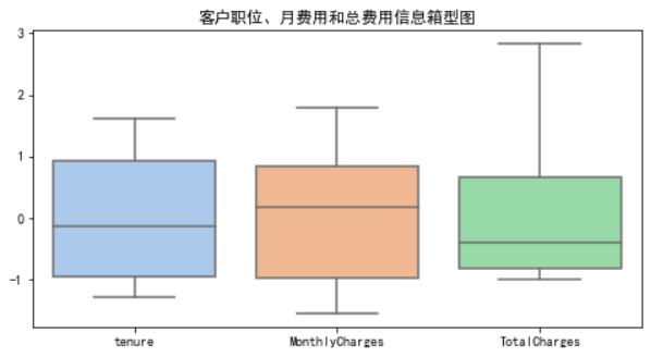
画箱型图,查看异常值
plt.figure(figsize=(8, 4))
numbox = sns.boxplot(data=df_var[['tenure', 'MonthlyCharges', 'TotalCharges']], palette="pastel")
plt.title("客户职位、月费用和总费用信息箱型图")
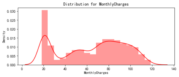
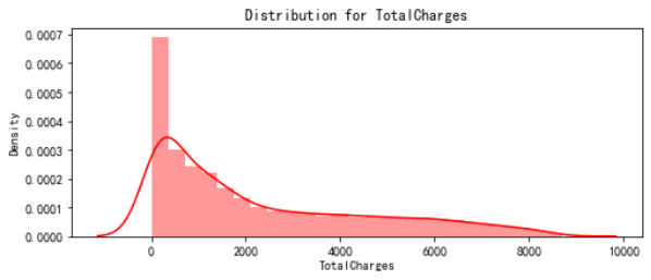
绘制分布图
def distplot(feature, frame, color='r'):
plt.figure(figsize=(8,3))
plt.title("Distribution for {}".format(feature))
ax = sns.distplot(frame[feature], color= color)
num_cols = ["tenure", 'MonthlyCharges', 'TotalCharges']
for feat in num_cols: distplot(feat, df)
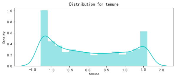
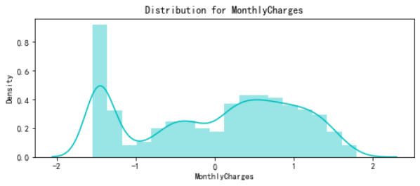
由于数字特征分布在不同的值范围内,因此我将使用标准标量将它们缩小到相同的范围。
df_std = pd.DataFrame(StandardScaler().fit_transform(df[num_cols].astype('float64')), columns=num_cols)
for feat in ['tenure', 'MonthlyCharges', 'TotalCharges']: distplot(feat, df_std, color='c')
特征转换
六个变量中存在No internet service,即无互联网服务对客户流失率影响很小,这些客户不使用任何互联网产品,可以使用 No 替代 No internet service
查看对象类型字段中存在的值
def uni(columnlabel):
    print(columnlabel, "--", df_var[columnlabel].unique())  # unique函数去除其中重复的元素,返回唯一值
df_object = df_var.select_dtypes(['object'])
for i in range(0, len(df_object.columns)):
    uni(df_object.columns[i])
df_var.replace(to_replace='No internet service', value='No', inplace=True)
df_var.replace(to_replace='No phone service', value='No', inplace=True)
for i in range(0, len(df_object.columns)):
    uni(df_object.columns[i])
def labelencode(columnlabel):
    df_var[columnlabel] = LabelEncoder().fit_transform(df_var[columnlabel])

for i in range(0, len(df_object.columns)):
    labelencode(df_object.columns[i])

for i in range(0, len(df_object.columns)):
    uni(df_object.columns[i])
4、模型设计、选择
| 参数 | 功能 |
|---|---|
| test_size/train_size | 设置train/test中train和test所占的比例 |
| random_state | 将样本随机打乱 |
X = df_var
y = df["Churn"].values
X_train, X_test, y_train, y_test = train_test_split(X, y, test_size=0.30, random_state=17)

KNN
knn_model = KNeighborsClassifier(n_neighbors = 11)
knn_model.fit(X_train,y_train)
predicted_y = knn_model.predict(X_test)
accuracy_knn = knn_model.score(X_test,y_test)
print("KNN accuracy:",accuracy_knn)
print(classification_report(y_test, predicted_y, digits=5))
SVC
svc_model = SVC(random_state = 1)
svc_model.fit(X_train,y_train)
predict_y = svc_model.predict(X_test)
accuracy_svc = svc_model.score(X_test,y_test)
print("SVM accuracy is :",accuracy_svc)
Random Forest
model_rf = RandomForestClassifier(n_estimators=500 , oob_score = True, n_jobs = -1,
                                  random_state =50, max_features = "auto",
                                  max_leaf_nodes = 30)
model_rf.fit(X_train, y_train)

prediction_test = model_rf.predict(X_test)
print (metrics.accuracy_score(y_test, prediction_test))
print(classification_report(y_test, prediction_test, digits=5))
plt.figure(figsize=(4,3))
sns.heatmap(confusion_matrix(y_test, prediction_test),
                annot=True,fmt = "d",linecolor="k",linewidths=3)

plt.title(" RANDOM FOREST CONFUSION MATRIX",fontsize=14)
plt.show()
y_rfpred_prob = model_rf.predict_proba(X_test)[:,1]
fpr_rf, tpr_rf, thresholds = roc_curve(y_test, y_rfpred_prob)
plt.plot([0, 1], [0, 1], 'k--' )
plt.plot(fpr_rf, tpr_rf, label='Random Forest',color = "r")
plt.xlabel('False Positive Rate')
plt.ylabel('True Positive Rate')
plt.title('Random Forest ROC Curve',fontsize=16)
plt.show();
Logistic Regression
lr_model = LogisticRegression()
lr_model.fit(X_train,y_train)
accuracy_lr = lr_model.score(X_test,y_test)
print("Logistic Regression accuracy is :",accuracy_lr)
lr_pred= lr_model.predict(X_test)
print(classification_report(y_test,lr_pred, digits=5))
plt.figure(figsize=(4,3))
sns.heatmap(confusion_matrix(y_test, lr_pred),
                annot=True,fmt = "d",linecolor="k",linewidths=3)

plt.title("LOGISTIC REGRESSION CONFUSION MATRIX",fontsize=14)
plt.show()
y_pred_prob = lr_model.predict_proba(X_test)[:,1]
fpr, tpr, thresholds = roc_curve(y_test, y_pred_prob)
plt.plot([0, 1], [0, 1], 'k--' )
plt.plot(fpr, tpr, label='Logistic Regression',color = "r")
plt.xlabel('False Positive Rate')
plt.ylabel('True Positive Rate')
plt.title('Logistic Regression ROC Curve',fontsize=16)
plt.show();
Decision Tree
dt_model = DecisionTreeClassifier()
dt_model.fit(X_train,y_train)
predictdt_y = dt_model.predict(X_test)
accuracy_dt = dt_model.score(X_test,y_test)
print("Decision Tree accuracy is :",accuracy_dt)
print(classification_report(y_test, predictdt_y, digits=5))
AdaBoost Classifier
a_model = AdaBoostClassifier()
a_model.fit(X_train,y_train)
a_preds = a_model.predict(X_test)
print("AdaBoost Classifier accuracy")
metrics.accuracy_score(y_test, a_preds)
print(classification_report(y_test, a_preds, digits=5))
plt.figure(figsize=(4,3))
sns.heatmap(confusion_matrix(y_test, a_preds), annot=True,fmt = "d",linecolor="k",linewidths=3)
plt.title("AdaBoost Classifier Confusion Matrix",fontsize=14)
plt.show()
Gradient Boosting Classifier
gb = GradientBoostingClassifier()
gb.fit(X_train, y_train)
gb_pred = gb.predict(X_test)
print("Gradient Boosting Classifier", accuracy_score(y_test, gb_pred))
print(classification_report(y_test, gb_pred, digits=5))
plt.figure(figsize=(4,3))
sns.heatmap(confusion_matrix(y_test, gb_pred), annot=True,fmt = "d",linecolor="k",linewidths=3)
plt.title("Gradient Boosting Classifier Confusion Matrix",fontsize=14)
plt.show()
Voting Classifier
from sklearn.ensemble import VotingClassifier
clf1 = GradientBoostingClassifier()
clf2 = LogisticRegression()
clf3 = AdaBoostClassifier()
eclf1 = VotingClassifier(estimators=[('gbc', clf1), ('lr', clf2), ('abc', clf3)], voting='soft')
eclf1.fit(X_train, y_train)
predictions = eclf1.predict(X_test)
print("Final Accuracy Score ")
print(accuracy_score(y_test, predictions))
plt.figure(figsize=(4,3))
sns.heatmap(confusion_matrix(y_test, predictions),annot=True,fmt = "d",linecolor="k",linewidths=3)

plt.title("CONFUSION MATRIX",fontsize=14)
plt.show()
print(classification_report(y_test, predictions, digits=5))
Naive Bayes
gnb = GaussianNB()
gnb.fit(X_train, y_train)
predictions = gnb.predict(X_test)
accuracy_gnb = gnb.score(X_test,y_test)
print("Naive Bayes accuracy is :",predictions)
print(classification_report(y_test, predictions, digits=5))
XGB
xgb = XGBClassifier()
xgb.fit(X_train, y_train)
predictions = xgb.predict(X_test)
accuracy_xgb = xgb.score(X_test,y_test)
print("XGB accuracy is :",predictions)
print(classification_report(y_test, predictions, digits=5))
Extra Trees
et = ExtraTreesClassifier()
et.fit(X_train, y_train)
predictions = et.predict(X_test)
accuracy_et = et.score(X_test,y_test)
print("Extra Trees accuracy is :",predictions)
print(classification_report(y_test, predictions, digits=5))
Linear Discriminant Analysis
lda = LinearDiscriminantAnalysis()
lda.fit(X_train, y_train)
predictions = lda.predict(X_test)
accuracy_lda = lda.score(X_test,y_test)
print("Linear Discriminant Analysis accuracy is :",predictions)
print(classification_report(y_test, predictions, digits=5))
Quadratic Discriminant Analysis
qda = LinearDiscriminantAnalysis()
qda.fit(X_train, y_train)
predictions = qda.predict(X_test)
accuracy_qda = qda.score(X_test,y_test)
print("Quadratic Discriminant Analysis accuracy is :",predictions)
print(classification_report(y_test, predictions, digits=5))
5、模型评估
| 参数 | 解释 | 公式 |
|---|---|---|
| 召回率(recall) | 原本为对的当中,预测为对的比例(值越大越好,1为理想状态) | R=TP/(TP+FN) |
| 精确率、精度(precision) | 预测为对的当中,原本为对的比例(值越大越好,1为理想状态) | P=TP/(TP+FP) |
| F1分数(F1-Score) | 综合了Precision与Recall的产出的结果(值越大越好,1为理想状态) | F1=2×(P×R)/(P+R) |
| AUC(Area Under Curve) | ROC曲线下的面积。ROC曲线一般位于y=x上方,AUC越大,分类效果越好 |
由上可知,Voting Classifier的F1分数最高为0.81090,召回率最高,所以最终选择投票分类器。
混淆矩阵中一共1549个未流失用户,561个流失用户。其中该模型正确预测1400个未流失用户和324个流失客户。属于可接受范围内。
本文原先是用word写的,链接附在这里,有需要可以下载
https://files-cdn.cnblogs.com/files/blogs/728660/%E7%94%B5%E4%BF%A1%E5%AE%A2%E6%88%B7%E6%B5%81%E5%A4%B1%E9%A2%84%E6%B5%8B.7z

 浙公网安备 33010602011771号