scikit-learn生成随机数据集
%matplotlib inline
from sklearn import datasets
import matplotlib.pyplot as plt
import numpy as np
scikit-learn生成随机数据集
scikit-learn 包含了一系列的用来创建指定规模和复杂度的人工数据的样本生成器。
聚类和分类的生成器
单标签
-
make_blobs和make_classification都可以创建多个类别的数据集。但make_blobs主要是用来创建聚类的数据集,对每个聚类的中心,标准差都有很好的控制。make_classification通过冗杂,无效的特征等方法引入噪声,主要来创建分类的数据集。 -
make_gaussian_quantities把单个高斯簇划分为被同心超球面分割为两等份的类。make_hastie_10_2创建了一个10维2分类的问题。 -
make_circles和make_moons创建对有些算法具有一定挑战性的二维二分类数据集。 -
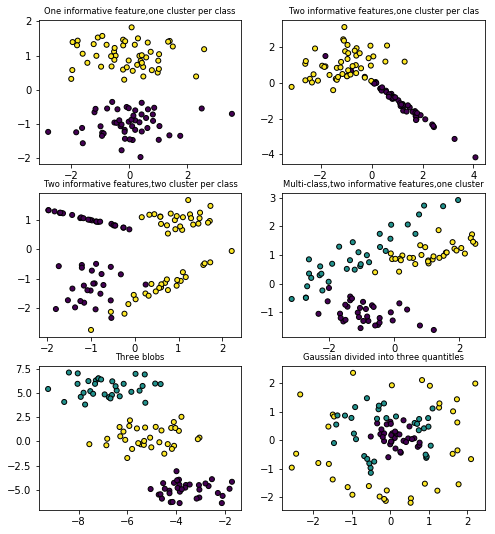
make_blobs 和 make_classification
plt.figure(figsize=(8,8))
plt.subplots_adjust(bottom=0.05,top=0.9)
plt.subplot(321)
plt.title('One informative feature,one cluster per class',fontsize='small')
x1,y1=datasets.make_classification(n_samples=100,n_features=2,n_redundant=0,n_informative=1,n_clusters_per_class=1)
plt.scatter(x1[:,0],x1[:,1],marker='o',c=y1,s=25,edgecolor='k')

plt.subplot(322)
plt.title('Two informative features,one cluster per clas',fontsize='small')
x1,y1=datasets.make_classification(n_samples=100,n_features=2,n_redundant=0,n_informative=2,n_clusters_per_class=1)
plt.scatter(x1[:,0],x1[:,1],marker='o',c=y1,s=25,edgecolor='k')

plt.subplot(323)
plt.title('Two informative features,two cluster per class',fontsize='small')
x1,y1=datasets.make_classification(n_samples=100,n_features=2,n_redundant=0,n_informative=2,n_clusters_per_class=2)
plt.scatter(x1[:,0],x1[:,1],marker='o',c=y1,s=25,edgecolor='k')

plt.subplot(324)
plt.title('Multi-class,two informative features,one cluster',fontsize='small')
x1,y1=datasets.make_classification(n_samples=100,n_features=2,n_redundant=0,n_informative=2,n_clusters_per_class=1,
                                   n_classes=3)# multicass here,n_classes is 3
plt.scatter(x1[:,0],x1[:,1],marker='o',c=y1,s=25,edgecolor='k')

plt.subplot(325)
plt.title('Three blobs',fontsize='small')
x1,y1=datasets.make_blobs(n_samples=100,n_features=2,centers=3)
plt.scatter(x1[:,0],x1[:,1],marker='o',c=y1,s=25,edgecolor='k')

plt.subplot(326)
plt.title('Gaussian divided into three quantitles',fontsize='small')
x1,y1=datasets.make_gaussian_quantiles(n_samples=100,n_features=2,n_classes=3)
plt.scatter(x1[:,0],x1[:,1],marker='o',c=y1,s=25,edgecolor='k')
<matplotlib.collections.PathCollection at 0x1f824fa37b8>
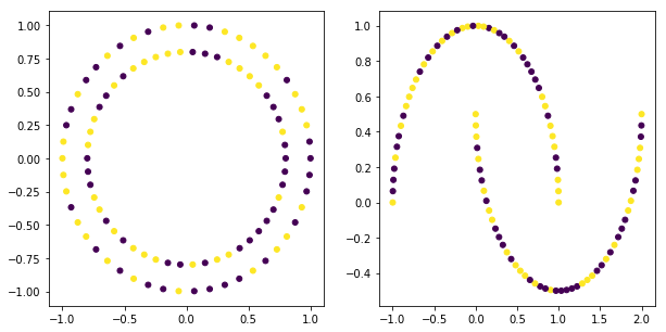
- make_circles 和 make_moons
plt.figure(figsize=(10,5))

plt.subplot(121)
x1,y1=datasets.make_circles(n_samples=100)
plt.scatter(x1[:,0],x1[:,1],c=y,s=25)

plt.subplot(122)
x1,y1=datasets.make_moons(n_samples=100)
plt.scatter(x1[:,0],x1[:,1],c=y,s=25)
<matplotlib.collections.PathCollection at 0x1f825549630>
多标签
多标签分类与多种类分类不一样,多标签分类中一个样本可以属于多个分类类别,而多种类分类中的一个样本智能属于一个分类类别。
sklearn中make_multilabel_classification用于生成多标签分类数据集。
被标记的点是按下面的规则绘制:比如属于第1类,不属于第2,3类,则标红颜色;全部属于3个类别,则标棕色等。
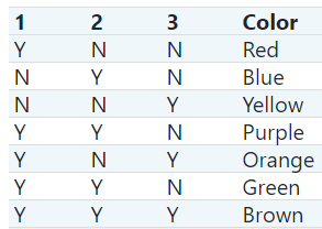
COLORS = np.array(['!',
                   '#FF3333',  # red
                   '#0198E1',  # blue
                   '#BF5FFF',  # purple
                   '#FCD116',  # yellow
                   '#FF7216',  # orange
                   '#4DBD33',  # green
                   '#87421F'   # brown
                   ])
COLORS.take(1)
'#FF3333'
x=np.arange(12).reshape((3,4))
x
array([[ 0,  1,  2,  3],
       [ 4,  5,  6,  7],
       [ 8,  9, 10, 11]])
RANDOM_STATE=np.random.randint(2**10)
x,y,p_c,pW_c=datasets.make_multilabel_classification(n_samples=150,n_features=2,
                                                     n_classes=3,n_labels=1,
                                                     length=50,allow_unlabeled=False,
                                                     return_distributions=True,
                                                     random_state=RANDOM_STATE)
x.shape
(150, 2)
y.shape
(150, 3)
y[0]
array([1, 0, 0])
y[100]
array([0, 0, 1])
x[0]
array([ 8., 35.])
x[1]
array([18., 41.])
y[0]
array([1, 0, 0])
y[1]
array([1, 0, 1])
y.shape
(150, 3)
(y*[1,2,4]).sum(axis=1)
array([1, 5, 1, 1, 1, 1, 1, 1, 1, 1, 4, 7, 3, 3, 1, 3, 7, 5, 1, 4, 3, 3,
       5, 1, 1, 1, 3, 6, 3, 5, 1, 1, 1, 6, 2, 3, 1, 1, 1, 1, 7, 1, 3, 6,
       1, 3, 1, 3, 1, 5, 1, 5, 2, 1, 5, 5, 2, 1, 3, 1, 4, 4, 1, 1, 5, 4,
       1, 7, 4, 1, 2, 4, 2, 1, 4, 2, 1, 1, 1, 1, 5, 7, 3, 6, 5, 5, 1, 1,
       1, 1, 3, 4, 3, 3, 2, 4, 3, 7, 5, 1, 4, 1, 7, 6, 3, 5, 2, 5, 1, 7,
       1, 1, 4, 6, 1, 7, 2, 3, 1, 1, 5, 1, 7, 1, 2, 1, 2, 5, 1, 1, 4, 7,
       3, 1, 1, 1, 5, 1, 5, 1, 3, 7, 1, 6, 5, 5, 4, 4, 7, 1])
plt.scatter(x[:,0],x[:,1],color=COLORS.take((y*[1,2,4]).sum(axis=1)),marker='.')
<matplotlib.collections.PathCollection at 0x1f825628e80>
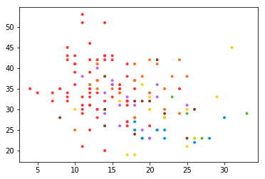
独热编码与映射阵,[1,2,4,8,16...]的乘积,能清楚的将标记规则与独热编码对应起来,比如产生的结果是3,则一定是[1,1,0],产生的结果是4,一定是[0,0,1],产生的结果是6,一定是[0,1,1]。其证明也非常简单,假设有N类,则标签的个数是2N-1,映射阵是[1,2,4,8,16,...2N],现在考虑最后一个标签,即符合所有类,即映射阵的和,即等比数列,显然与标签的个数相一致。
返回的p_c是每个类被绘制的概率
p_c
array([0.60031363, 0.19681806, 0.20286832])
p_w_c:是对于每个类下的每个特征的概率
pW_c
array([[0.26471562, 0.46622308, 0.43420831],
       [0.73528438, 0.53377692, 0.56579169]])
plt.scatter(x[:,0],x[:,1],color=COLORS.take((y*[1,2,4]).sum(axis=1)),marker='.')
plt.scatter(pW_c[0]*50,pW_c[1]*50,marker='*',linewidth=.5,edgecolor='black',color=COLORS.take([1,2,4]),
           s=20+1500*p_c**2)
<matplotlib.collections.PathCollection at 0x1f8257627b8>
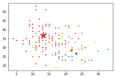
pW_c[0]是第一个特征对于3个类别的概率,pW_c[1]是第二个特征对于3个类别的概率,所以颜色对于三个类别分别取[1,2,4],大小与每个类别的概率相关
回归的生成器
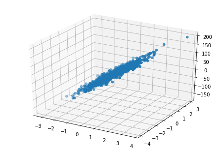
- make_regression
x,y,coe=datasets.make_regression(n_samples=1000,n_features=2,n_informative=2,noise=10,coef=True)
x.shape
(1000, 2)
y.shape
(1000,)
from mpl_toolkits.mplot3d import Axes3D
fig=plt.figure()
ax=Axes3D(fig)
ax.scatter(x[:,0],x[:,1],y)
<mpl_toolkits.mplot3d.art3d.Path3DCollection at 0x1f8256c3dd8>

 浙公网安备 33010602011771号