CSS进阶之模拟Bootstrap网格布局
目前暂时实现效果,容后面整理心得,先贴上源代码。
源码
<!DOCTYPE html>
<html>

<head>
    <title>demo bootstrap</title>
    <link rel="stylesheet" type="text/css" href="dist/css/bootstrap.css">
    <!-- <script type="text/javascript" src="dist/js/bootstrap.js"></script> -->
    <style type="text/css">
    .my-container {
        padding-right: 15px;
        padding-left: 15px;
        margin-right: auto;
        margin-left: auto;
    }

    @media (min-width: 768px) {
        .my-container {
            width: 750px;
        }
    }

    @media (min-width: 992px) {
        .my-container {
            width: 970px;
        }
    }

    @media (min-width: 1200px) {
        .my-container {
            width: 1170px;
        }
    }

    /*用于清除网格浮动造成的影响*/
    .my-row:before,
    .my-row:after {
        display: table;
        content: " ";
    }

    .my-row:after {
        clear: both;
    }

    .my-row {
        margin-right: -15px;
        margin-left: -15px;
    }

    .my-col-lg-4,
    .my-col-md-6,
    .my-xs-12 {
        position: relative;
        min-height: 1px;
        padding-right: 15px;
        padding-left: 15px;
        /*----*/
        float: left;
    }


    @media (min-width:768px) {
        .my-xs-12 {
            width: 100%;
        }
        .my-col-xs-12:after {
            display: block;
            content: 'after my-col-xs-12 min-width: 768px';
            color: red
        }
        .my-col-xs-12:before {
            display: block;
            content: 'before my-col-xs-12 min-width: 768px';
            color: red
        }
    }

    @media (min-width: 992px) {
        .my-col-md-6 {
            width: 50%;
        }
        .my-col-md-6:after {
            display: block;
            content: 'after col-md-6 min-width: 992px';
            color: red
        }
        .my-col-md-6:before {
            display: block;
            content: 'before col-md-6 min-width: 992px';
            color: red
        }
    }

    @media (min-width: 1200px) {
        .my-col-lg-4 {
            width: 33.3333333%;
        }
        .my-col-lg-4:after {
            display: block;
            content: 'after col-lg-4 min-width: 1200px';
            color: yellow
        }
        .my-col-lg-4:before {
            display: block;
            content: 'before col-lg-4 min-width: 1200px';
            color: yellow
        }
    }
    </style>
</head>

<body style="background-color: #eee">
    <div class="container" style="background-color: #aaa;padding: 15px;">
        <div class="row" style="background-color: #bbb;padding: 15px;">
            <div class="col-lg-4 col-md-6" style="height: 300px;background-color: #000"></div>
            <div class="col-lg-4 col-md-6" style="height: 300px;background-color: #fff"></div>
            <div class="col-lg-4 col-md-6" style="height: 300px;background-color: #000"></div>
        </div>
    </div>
    <div class="my-container" style="background-color: #aaa;padding: 15px;">
        <div class="my-row" style="background-color: #bbb;padding: 15px;">
            <div class="my-col-lg-4 my-col-md-6 my-xs-12" style="height: 300px;background-color: #000">X</div>
            <div class="my-col-lg-4 my-col-md-6 my-xs-12" style="height: 300px;background-color: #fff"></div>
            <div class="my-col-lg-4 my-col-md-6 my-xs-12" style="height: 300px;background-color: #000"></div>
        </div>
    </div>
</body>

</html>
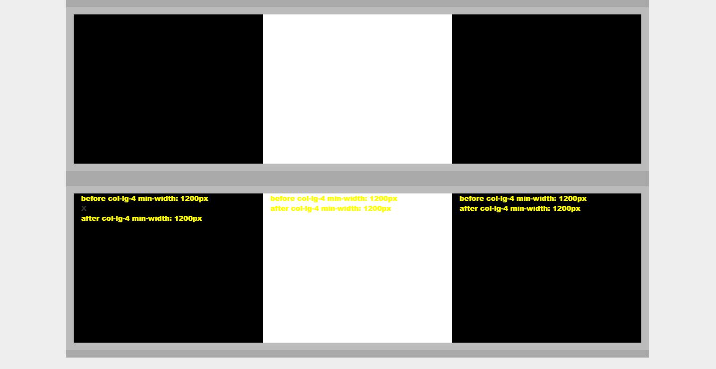
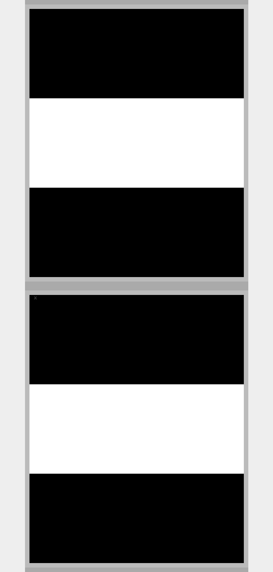
效果图:
width>1200px:
width:1200-992px:

width:0-768px:
笔记
@media (min-width: 768px){ //>=768的设备 }
@media (min-width: 992px){ //>=992的设备 }
@media (min-width: 1200px){ //>=1200的设备 }
@media (max-width: 1199px){ //<=1199的设备 }
@media (max-width: 991px){ //<=991的设备 }
@media (max-width: 767px){ //<=768的设备 }
参考文献

本文作者:
千千寰宇
本文链接: https://www.cnblogs.com/johnnyzen
关于博文:评论和私信会在第一时间回复,或直接私信我。
版权声明:本博客所有文章除特别声明外,均采用 BY-NC-SA 许可协议。转载请注明出处!
日常交流:大数据与软件开发-QQ交流群: 774386015 【入群二维码】参见左下角。您的支持、鼓励是博主技术写作的重要动力!
本文链接: https://www.cnblogs.com/johnnyzen
关于博文:评论和私信会在第一时间回复,或直接私信我。
版权声明:本博客所有文章除特别声明外,均采用 BY-NC-SA 许可协议。转载请注明出处!
日常交流:大数据与软件开发-QQ交流群: 774386015 【入群二维码】参见左下角。您的支持、鼓励是博主技术写作的重要动力!

 浙公网安备 33010602011771号