Python办公自动化-excel
第一节、Python Excel库对比
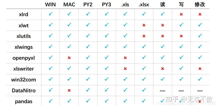
我们先来看一下python中能操作Excel的库对比(一共九个库):
第二节、openpyxl操作Excel
在openpyxl中,主要用到三个概念:Workbooks,Sheets,Cells。
- Workbook就是一个excel工作表;
- Sheet是工作表中的一张表页;
- Cell就是简单的一个格。
openpyxl就是围绕着这三个概念进行的,不管读写都是“三板斧”:打开Workbook,定位Sheet,操作Cell
官方文档:https://link.zhihu.com/?target=https%3A//openpyxl.readthedocs.io/en/stable/
官方示例:
from openpyxl import Workbook
wb = Workbook()

# grab the active worksheet
ws = wb.active

# Data can be assigned directly to cells
ws['A1'] = 42

# Rows can also be appended
ws.append([1, 2, 3])

# Python types will automatically be converted
import datetime
ws['A2'] = datetime.datetime.now()

# Save the file
wb.save("sample.xlsx")
2.1、openpyxl 基本操作
1、安装
pip install openpyxl
2、打开文件
新建
from  openpyxl import  Workbook
# 实例化
wb = Workbook()
# 激活 worksheet
ws = wb.active
打开已有
from openpyxl  import load_workbook

wb = load_workbook('文件名称.xlsx')
3、写入数据
# 方式一:数据可以直接分配到单元格中(可以输入公式)
ws['A1'] = 42
# 方式二:可以附加行,从第一列开始附加(从最下方空白处,最左开始)(可以输入多行)
ws.append([1, 2, 3])
# 方式三:Python 类型会被自动转换
ws['A3'] = datetime.datetime.now().strftime("%Y-%m-%d")
4、创建表(sheet)
# 方式一:插入到最后(default)
ws1 = wb.create_sheet("Mysheet")
# 方式二:插入到最开始的位置
ws2 = wb.create_sheet("Mysheet", 0)
5、选择表(sheet)
# sheet 名称可以作为 key 进行索引
>>> ws3 = wb["New Title"]
>>> ws4 = wb.get_sheet_by_name("New Title")
>>> ws is ws3 is ws4
True
6、查看表名(sheet)
# 显示所有表名
>>> print(wb.sheetnames)
['Sheet2', 'New Title',  'Sheet1']
# 遍历所有表
>>> for sheet in  wb:
...     print(sheet.title)
7、访问单元格(cell)
单个单元格访问
# 方法一
>>> c = ws['A4']
# 方法二:row 行;column 列
>>> d = ws.cell(row=4, column=2, value=10)
# 方法三:只要访问就创建
>>> for i in  range(1,101):
...         for j in range(1,101):
...            ws.cell(row=i, column=j)
多个单元格访问
# 通过切片
>>> cell_range = ws['A1':'C2']
# 通过行(列)
>>> colC = ws['C']
>>> col_range = ws['C:D']
>>> row10 = ws[10]
>>> row_range = ws[5:10]
# 通过指定范围(行 → 行)
>>> for row in  ws.iter_rows(min_row=1, max_col=3, max_row=2):
...    for cell in  row:
...        print(cell)
<Cell Sheet1.A1>
<Cell Sheet1.B1>
<Cell Sheet1.C1>
<Cell Sheet1.A2>
<Cell Sheet1.B2>
<Cell Sheet1.C2>
# 通过指定范围(列 → 列)
>>> for row in  ws.iter_rows(min_row=1, max_col=3, max_row=2):
...    for cell in  row:
...        print(cell)
<Cell Sheet1.A1>
<Cell Sheet1.B1>
<Cell Sheet1.C1>
<Cell Sheet1.A2>
<Cell Sheet1.B2>
<Cell Sheet1.C2>
# 遍历所有 方法一
>>> ws = wb.active
>>> ws['C9'] = 'hello world'
>>> tuple(ws.rows)
((<Cell Sheet.A1>, <Cell Sheet.B1>, <Cell Sheet.C1>),
(<Cell Sheet.A2>, <Cell Sheet.B2>, <Cell Sheet.C2>),
...
(<Cell Sheet.A8>, <Cell Sheet.B8>, <Cell Sheet.C8>),
(<Cell Sheet.A9>, <Cell Sheet.B9>, <Cell Sheet.C9>))
# 遍历所有 方法二
>>> tuple(ws.columns)
((<Cell Sheet.A1>,
<Cell Sheet.A2>,
<Cell Sheet.A3>,
...
<Cell Sheet.B7>,
<Cell Sheet.B8>,
<Cell Sheet.B9>),
(<Cell Sheet.C1>,
...
<Cell Sheet.C8>,
<Cell Sheet.C9>))
8、保存数据
wb.save('文件名称.xlsx')
改变sheet标签按钮颜色
9、其它
改变sheet标签按钮颜色
ws.sheet_properties.tabColor = "1072BA" # 色值为RGB16进制值
获取最大行,最大列
# 获得最大列和最大行
print(sheet.max_row)
print(sheet.max_column)
获取每一行每一列
- sheet.rows为生成器, 里面是每一行的数据,每一行又由一个tuple包裹。
- sheet.columns类似,不过里面是每个tuple是每一列的单元格。
# 因为按行,所以返回A1, B1, C1这样的顺序
for row in sheet.rows:
    for cell in row:
        print(cell.value)

# A1, A2, A3这样的顺序
for column in sheet.columns:
    for cell in column:
        print(cell.value)
根据数字得到字母,根据字母得到数字
from openpyxl.utils import get_column_letter, column_index_from_string

# 根据列的数字返回字母
print(get_column_letter(2))  # B
# 根据字母返回列的数字
print(column_index_from_string('D'))  # 4
删除工作表
# 方式一
wb.remove(sheet)
# 方式二
del wb[sheet]
矩阵置换
rows = [
    ['Number', 'data1', 'data2'],
    [2, 40, 30],
    [3, 40, 25],
    [4, 50, 30],
    [5, 30, 10],
    [6, 25, 5],
    [7, 50, 10]]

list(zip(*rows))

# out
[('Number', 2, 3, 4, 5, 6, 7),
 ('data1', 40, 40, 50, 30, 25, 50),
 ('data2', 30, 25, 30, 10, 5, 10)]

# 注意 方法会舍弃缺少数据的列(行)
rows = [
    ['Number', 'data1', 'data2'],
    [2, 40      ],    # 这里少一个数据
    [3, 40, 25],
    [4, 50, 30],
    [5, 30, 10],
    [6, 25, 5],
    [7, 50, 10],
]
# out
[('Number', 2, 3, 4, 5, 6, 7), ('data1', 40, 40, 50, 30, 25, 50)]
10、设置单元格风格
(1)需要导入的类
from openpyxl.styles import Font, colors, Alignment
(2)字体
下面的代码指定了等线24号,加粗斜体,字体颜色红色。直接使用cell的font属性,将Font对象赋值给它。
bold_itatic_24_font = Font(name='等线', size=24, italic=True, color=colors.RED, bold=True)

sheet['A1'].font = bold_itatic_24_font
(3)对齐方式
也是直接使用cell的属性aligment,这里指定垂直居中和水平居中。除了center,还可以使用right、left等等参数
# 设置B1中的数据垂直居中和水平居中
sheet['B1'].alignment = Alignment(horizontal='center', vertical='center')
(4)设置行高和列宽
# 第2行行高
sheet.row_dimensions[2].height = 40
# C列列宽
sheet.column_dimensions['C'].width = 30
(5)合并和拆分单元格
所谓合并单元格,即以合并区域的左上角的那个单元格为基准,覆盖其他单元格使之称为一个大的单元格。
相反,拆分单元格后将这个大单元格的值返回到原来的左上角位置。
# 合并单元格, 往左上角写入数据即可
sheet.merge_cells('B1:G1') # 合并一行中的几个单元格
sheet.merge_cells('A1:C3') # 合并一个矩形区域中的单元格
- 合并后只可以往左上角写入数据,也就是区间中:左边的坐标。
- 如果这些要合并的单元格都有数据,只会保留左上角的数据,其他则丢弃。换句话说若合并前不是在左上角写入数据,合并后单元格中不会有数据。
- 以下是拆分单元格的代码。拆分后,值回到A1位置
sheet.unmerge_cells('A1:C3')
11、示例代码
import datetime
from random import choice
from time import time
from openpyxl import load_workbook
from openpyxl.utils import get_column_letter

# 设置文件 mingc
addr = "openpyxl.xlsx"
# 打开文件
wb = load_workbook(addr)
# 创建一张新表
ws = wb.create_sheet()
# 第一行输入
ws.append(['TIME', 'TITLE', 'A-Z'])

# 输入内容(500行数据)
for i in range(500):
    TIME = datetime.datetime.now().strftime("%H:%M:%S")
    TITLE = str(time())
    A_Z = get_column_letter(choice(range(1, 50)))
    ws.append([TIME, TITLE, A_Z])

# 获取最大行
row_max = ws.max_row
# 获取最大列
con_max = ws.max_column
# 把上面写入内容打印在控制台
for j in ws.rows:    # we.rows 获取每一行数据
    for n in j:
        print(n.value, end="\t")   # n.value 获取单元格的值
    print()
# 保存,save(必须要写文件名(绝对地址)默认 py 同级目录下,只支持 xlsx 格式)
wb.save(addr)
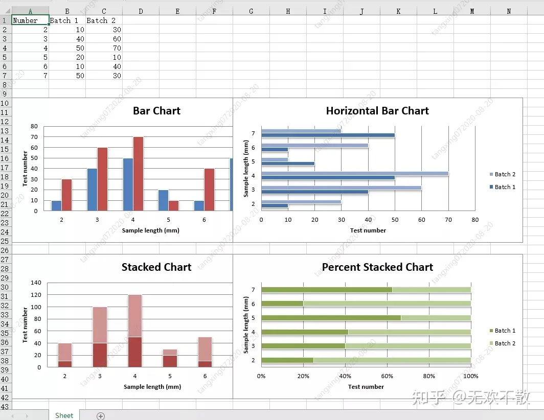
2.2、openpyxl生成2D图表
示例代码:
from openpyxl import Workbook
from openpyxl.chart import BarChart, Series, Reference

wb = Workbook(write_only=True)
ws = wb.create_sheet()

rows = [
    ('Number', 'Batch 1', 'Batch 2'),
    (2, 10, 30),
    (3, 40, 60),
    (4, 50, 70),
    (5, 20, 10),
    (6, 10, 40),
    (7, 50, 30),
]

for row in rows:
    ws.append(row)

chart1 = BarChart()
chart1.type = "col"
chart1.style = 10
chart1.title = "Bar Chart"
chart1.y_axis.title = 'Test number'
chart1.x_axis.title = 'Sample length (mm)'

data = Reference(ws, min_col=2, min_row=1, max_row=7, max_col=3)
cats = Reference(ws, min_col=1, min_row=2, max_row=7)
chart1.add_data(data, titles_from_data=True)
chart1.set_categories(cats)
chart1.shape = 4
ws.add_chart(chart1, "A10")

from copy import deepcopy

chart2 = deepcopy(chart1)
chart2.style = 11
chart2.type = "bar"
chart2.title = "Horizontal Bar Chart"
ws.add_chart(chart2, "G10")

chart3 = deepcopy(chart1)
chart3.type = "col"
chart3.style = 12
chart3.grouping = "stacked"
chart3.overlap = 100
chart3.title = 'Stacked Chart'
ws.add_chart(chart3, "A27")

chart4 = deepcopy(chart1)
chart4.type = "bar"
chart4.style = 13
chart4.grouping = "percentStacked"
chart4.overlap = 100
chart4.title = 'Percent Stacked Chart'
ws.add_chart(chart4, "G27")

wb.save("bar.xlsx")
效果如下:
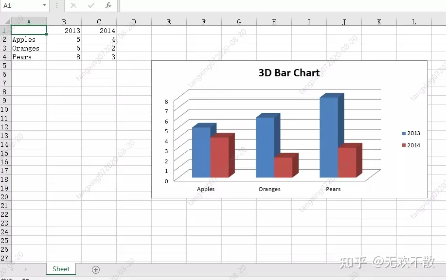
2.3、openpyxl生成3D图表
示例代码:
from openpyxl import Workbook
from openpyxl.chart import (
    Reference,
    Series,
    BarChart3D,
)

wb = Workbook()
ws = wb.active

rows = [
    (None, 2013, 2014),
    ("Apples", 5, 4),
    ("Oranges", 6, 2),
    ("Pears", 8, 3)
]

for row in rows:
    ws.append(row)

data = Reference(ws, min_col=2, min_row=1, max_col=3, max_row=4)
titles = Reference(ws, min_col=1, min_row=2, max_row=4)
chart = BarChart3D()
chart.title = "3D Bar Chart"
chart.add_data(data=data, titles_from_data=True)
chart.set_categories(titles)

ws.add_chart(chart, "E5")
wb.save("bar3d.xlsx")
效果如下:
第三节、xlswriter操作Excel
3.2、xlswriter基本操作
1.安装 xlswriter 模块
pip install XlsxWriter
2.创建excel文件
# 创建文件
workbook = xlsxwriter.Workbook("new_excel.xlsx")
3.创建sheet
# 创建sheet
worksheet = workbook.add_worksheet("first_sheet")
4.写入数据(1)写入文本
# 法一:
worksheet.write('A1', 'write something')
# 法二:
worksheet.write(1, 0, 'hello world')
(2)写入数字
# 写入数字
worksheet.write(0, 1, 32)
worksheet.write(1, 1, 32.3)
(3)写入函数
worksheet.write(2, 1, '=sum(B1:B2)')
(4)写入图片
# 插入图片
worksheet.insert_image(0, 5, 'test.png')
worksheet.insert_image(0, 5, 'test.png', {'url': 'http://httpbin.org/'})
(5)写入日期
# 写入日期
d = workbook.add_format({'num_format': 'yyyy-mm-dd'})
worksheet.write(0, 2, datetime.datetime.strptime('2017-09-13', '%Y-%m-%d'), d)
(6)设置行、列属性
# 设置行属性,行高设置为40
worksheet.set_row(0, 40)

# 设置列属性,把A到B列宽设置为20
worksheet.set_column('A:B', 20)
5.自定义格式常用格式:
- 字体颜色:color
- 字体加粗:bold
- 字体大小:font_site
- 日期格式:num_format
- 超链接:url
- 下划线设置:underline
- 单元格颜色:bg_color
- 边框:border
- 对齐方式:align
# 自定义格式
f = workbook.add_format({'border': 1, 'font_size': 13, 'bold': True, 'align': 'center','bg_color': 'cccccc'})
worksheet.write('A3', "python excel", f)
worksheet.set_row(0, 40, f)
worksheet.set_column('A:E', 20, f)
6.批量往单元格写入数据
# 批量往单元格写入数据
worksheet.write_column('A15', [1, 2, 3, 4, 5])  # 列写入,从A15开始
worksheet.write_row('A12', [6, 7, 8, 9])        # 行写入,从A12开始
7.合并单元格写入
# 合并单元格写入
worksheet.merge_range(7,5, 11, 8, 'merge_range')
8.关闭文件
workbook.close()
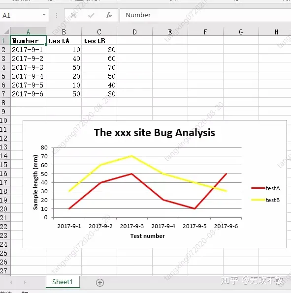
3.2 xlswriter 生成折线图
示例代码:
# -*- coding:utf-8 -*-
import xlsxwriter
# 创建一个excel
workbook = xlsxwriter.Workbook("chart_line.xlsx")
# 创建一个sheet
worksheet = workbook.add_worksheet()
# worksheet = workbook.add_worksheet("bug_analysis")
# 自定义样式,加粗
bold = workbook.add_format({'bold': 1})
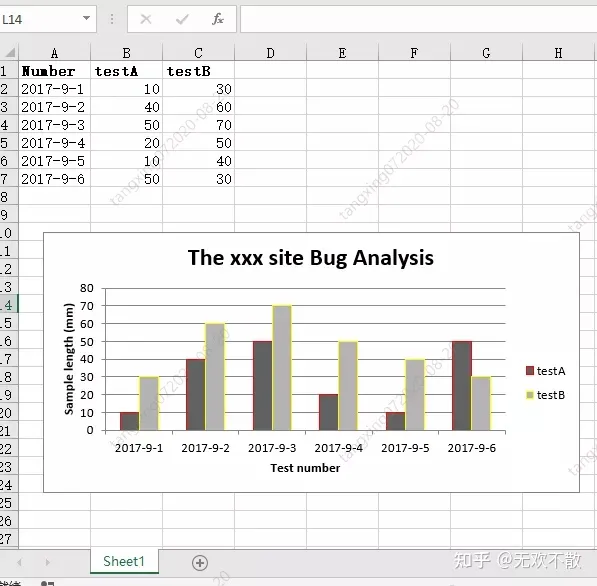
# --------1、准备数据并写入excel---------------
# 向excel中写入数据,建立图标时要用到
headings = ['Number', 'testA', 'testB']
data = [
['2017-9-1', '2017-9-2', '2017-9-3', '2017-9-4', '2017-9-5', '2017-9-6'],
[10, 40, 50, 20, 10, 50],
[30, 60, 70, 50, 40, 30],
]
# 写入表头
worksheet.write_row('A1', headings, bold)
# 写入数据
worksheet.write_column('A2', data[0])
worksheet.write_column('B2', data[1])
worksheet.write_column('C2', data[2])
# --------2、生成图表并插入到excel---------------
# 创建一个柱状图(line chart)
chart_col = workbook.add_chart({'type': 'line'})
# 配置第一个系列数据
chart_col.add_series({
# 这里的sheet1是默认的值,因为我们在新建sheet时没有指定sheet名
# 如果我们新建sheet时设置了sheet名,这里就要设置成相应的值
'name': '=Sheet1!$B$1',
'categories': '=Sheet1!$A$2:$A$7',
'values': '=Sheet1!$B$2:$B$7',
'line': {'color': 'red'},
})
# 配置第二个系列数据
chart_col.add_series({
'name': '=Sheet1!$C$1',
'categories': '=Sheet1!$A$2:$A$7',
'values': '=Sheet1!$C$2:$C$7',
'line': {'color': 'yellow'},
})
# 配置第二个系列数据(用了另一种语法)
# chart_col.add_series({
# 'name': ['Sheet1', 0, 2],
# 'categories': ['Sheet1', 1, 0, 6, 0],
# 'values': ['Sheet1', 1, 2, 6, 2],
# 'line': {'color': 'yellow'},
# })
# 设置图表的title 和 x,y轴信息
chart_col.set_title({'name': 'The xxx site Bug Analysis'})
chart_col.set_x_axis({'name': 'Test number'})
chart_col.set_y_axis({'name': 'Sample length (mm)'})
# 设置图表的风格
chart_col.set_style(1)
# 把图表插入到worksheet并设置偏移
worksheet.insert_chart('A10', chart_col, {'x_offset': 25, 'y_offset': 10})
workbook.close()
效果如下:
3.3、xlswriter 生成柱状图
示例代码:
# -*- coding:utf-8 -*-

import xlsxwriter

# 创建一个excel
workbook = xlsxwriter.Workbook("chart_column.xlsx")
# 创建一个sheet
worksheet = workbook.add_worksheet()
# worksheet = workbook.add_worksheet("bug_analysis")

# 自定义样式,加粗
bold = workbook.add_format({'bold': 1})

# --------1、准备数据并写入excel---------------
# 向excel中写入数据,建立图标时要用到
headings = ['Number', 'testA', 'testB']
data = [
    ['2017-9-1', '2017-9-2', '2017-9-3', '2017-9-4', '2017-9-5', '2017-9-6'],
    [10, 40, 50, 20, 10, 50],
    [30, 60, 70, 50, 40, 30],
]

# 写入表头
worksheet.write_row('A1', headings, bold)

# 写入数据
worksheet.write_column('A2', data[0])
worksheet.write_column('B2', data[1])
worksheet.write_column('C2', data[2])

# --------2、生成图表并插入到excel---------------
# 创建一个柱状图(column chart)
chart_col = workbook.add_chart({'type': 'column'})

# 配置第一个系列数据
chart_col.add_series({
    # 这里的sheet1是默认的值,因为我们在新建sheet时没有指定sheet名
    # 如果我们新建sheet时设置了sheet名,这里就要设置成相应的值
    'name': '=Sheet1!$B$1',
    'categories': '=Sheet1!$A$2:$A$7',
    'values':   '=Sheet1!$B$2:$B$7',
    'line': {'color': 'red'},
})

# 配置第二个系列数据(用了另一种语法)
chart_col.add_series({
    'name': '=Sheet1!$C$1',
    'categories':  '=Sheet1!$A$2:$A$7',
    'values':   '=Sheet1!$C$2:$C$7',
    'line': {'color': 'yellow'},
})

# 配置第二个系列数据(用了另一种语法)
# chart_col.add_series({
#     'name': ['Sheet1', 0, 2],
#     'categories': ['Sheet1', 1, 0, 6, 0],
#     'values': ['Sheet1', 1, 2, 6, 2],
#     'line': {'color': 'yellow'},
# })

# 设置图表的title 和 x,y轴信息
chart_col.set_title({'name': 'The xxx site Bug Analysis'})
chart_col.set_x_axis({'name': 'Test number'})
chart_col.set_y_axis({'name':  'Sample length (mm)'})

# 设置图表的风格
chart_col.set_style(1)

# 把图表插入到worksheet以及偏移
worksheet.insert_chart('A10', chart_col, {'x_offset': 25, 'y_offset': 10})

workbook.close()
效果如下:
3.4、xlswriter 生成饼图
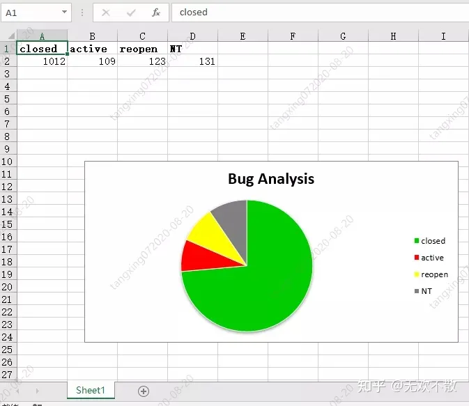
示例代码:
# -*- coding:utf-8 -*-

import xlsxwriter

# 创建一个excel
workbook = xlsxwriter.Workbook("chart_pie.xlsx")
# 创建一个sheet
worksheet = workbook.add_worksheet()

# 自定义样式,加粗
bold = workbook.add_format({'bold': 1})

# --------1、准备数据并写入excel---------------
# 向excel中写入数据,建立图标时要用到
data = [
    ['closed', 'active', 'reopen', 'NT'],
    [1012, 109, 123, 131],
]

# 写入数据
worksheet.write_row('A1', data[0], bold)
worksheet.write_row('A2', data[1])

# --------2、生成图表并插入到excel---------------
# 创建一个柱状图(pie chart)
chart_col = workbook.add_chart({'type': 'pie'})

# 配置第一个系列数据
chart_col.add_series({
    'name': 'Bug Analysis',
    'categories': '=Sheet1!$A$1:$D$1',
    'values': '=Sheet1!$A$2:$D$2',
    'points': [
        {'fill': {'color': '#00CD00'}},
        {'fill': {'color': 'red'}},
        {'fill': {'color': 'yellow'}},
        {'fill': {'color': 'gray'}},
    ],

})

# 设置图表的title 和 x,y轴信息
chart_col.set_title({'name': 'Bug Analysis'})

# 设置图表的风格
chart_col.set_style(10)

# 把图表插入到worksheet以及偏移
worksheet.insert_chart('B10', chart_col, {'x_offset': 25, 'y_offset': 10})
workbook.close()
效果如下:
3.5、实战训练
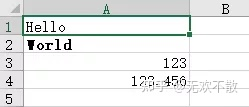
xlswriter新建并写入Excel程序示例:
# 3.6.2 xlswriter新建并写入Excel
def fun3_6_2():
    # 创建Exce并添加sheet
    workbook = xlsxwriter.Workbook('demo.xlsx')
    worksheet = workbook.add_worksheet()

    # 设置列宽
    worksheet.set_column('A:A', 20)

    # 设置格式
    bold = workbook.add_format({'bold': True})

    # 添加文字内容
    worksheet.write('A1', 'Hello')

    # 按格式添加内容
    worksheet.write('A2', 'World', bold)

    # 写一些数字
    worksheet.write(2, 0, 123)
    worksheet.write(3, 0, 123.456)

    # 添加图片
    worksheet.insert_image('B5', 'demo.png')

    workbook.close()
效果如下:

 浙公网安备 33010602011771号