
常用css属性
1.伸缩导航菜单
a{display:block;height:30px;text-align:center; line-height:30px; width:120px; background-color:#ccc;}
a:hover{ color:#fff;background-color:#F60;height:40px; line-height:40px;  margin-top:-10px;}
2.padding与margin,如果没有设置父元素宽高,俩者之间可以通过背景颜色分辨出是margin还是padding
margin-top: 44px;margin-left:50px;background: red;
padding-top: 44px;padding-left:50px;background: red;
3.制作一条下滑小线(i元素空白)
.line i{display: inline-block;width: 40px;border-bottom: 1px solid #fff;}
4.制作一条横线(-)
.line i{display: inline-block;width: 40px;border-bottom: 1px solid #fff;vertical-align: middle;}
5.制造一条定位在右侧间隔线高度128px厚度在1px的线
.wrapper li .line{position:absolute;right:0;top:5px;width:0px;height:128px;border-right:1px dashed #cacaca;}
6.做一个领线
.index-menu .menu-tips{position:absolute;left:50%;top:0;margin-left: -78px;width: 156px;height:75px;border: 1px solid blue;text-align: center;line-height:65px;color:#FFF;background: #f34949;}
.index-menu .menu-tips:after{position: absolute;content: "a";left:0;bottom:0;width:0;height: 0;border-left:78px solid transparent;border-right: 78px solid transparent;border-bottom: 20px solid #fff;}
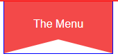
精简版尖角不能修改
.index-menu .menu-tips:after{position: absolute;content: "";left:0;bottom:0;border-left:78px solid transparent;border-right: 78px solid transparent;border-bottom: 20px solid #ccc;}
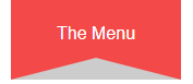
border-bottom是尖角的距离,边框类型以及边框填充颜色
left:0;bottom:0;是绝对定位元素,最左边并且最底部显示
border-left和border-right的78px是相对于父级元素宽度156px的尖角居中。
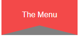
.index-menu .menu-tips:after{position: absolute;content: "";left:0;bottom:0;width:46px;border-left:55px solid transparent;border-right: 55px solid transparent;border-bottom: 20px solid grey;}
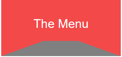
尖角变平角居中是因为宽度width:46px;等于(156px-46px)/2=55px;
7.制作一个好看的目录标题
style="display: inline-block;min-width:30%;background: #DEECF4; border-radius: 6px; box-shadow: 0 0 0 1px #5F5A4B, 1px 1px 6px 1px rgba(10, 10, 0, 0.5); color: #3b3939; font-size: 15px; line-height: 24px; font-weight:bold;margin: 12px 0 !important; padding: 5px 5px 5px 10px; font-family: '微软雅黑';"

7.2制作一个好看的目录标题——2
style="min-width: 30%; background: #5f5a4b; box-shadow: 0 0 0 1px #5f5a4b, 1px 1px 6px 1px rgba(10,10,0,.5); color: #ffffff; ;padding: 5px 0px 5px 8px; text-shadow: 2px 2px 3px #222222; margin: 15px 0 !important; height: 25px; font-weight: normal !important; font-family: '微软雅黑'; border-radius: 7px; border: 1px solid black;"
制作的标题就是此标题样式
7.3制作一个好看的语法标题——3
style="font-family: monospace;color: #00f;font-size:12px;line-height: 1.5;display:block;padding: 0.5em;background:#f0f0f0;overflow:auto;"

7.4.制作一个好看的目录标题——4
style="color:#000;font-weight: normal;display: inline-block;padding-left: 5px;padding-right: 5px;font-size: 16px;background: #FDDEDC;border-radius: 5px;margin: auto 3px;font-family: '微软雅黑';"
7.5.制作一个代码背景
style="margin: 15px 0; font: 100 12px/18px monaco, andale mono, courier new;padding: 10px 12px; border: #ccc 1px solid; border-left-width: 5px; background-color: #fefefe; box-shadow: 0 0 4px #eee; word-break: break-all; word-wrap: break-word; color: #170;"

7.6制作一个文字标题
<code style="padding: 2px 4px; border: none; font-size: 13px; white-space: pre-wrap; vertical-align: middle; color: #c7254e;">row,column</code>
7.7制作文字特效
style="box-sizing: border-box; outline: 0px; margin: 0px; padding: 2px 4px; font-family: 'Source Code Pro', 'DejaVu Sans Mono', 'Ubuntu Mono', 'Anonymous Pro', 'Droid Sans Mono', Menlo, Monaco, Consolas, Inconsolata, Courier, monospace, 'PingFang SC', 'Microsoft YaHei', sans-serif; line-height: 22px; color: #c7254e; border-radius: 2px; overflow-wrap: break-word; font-variant-ligatures: common-ligatures;"
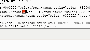
8.给编辑博文可选表情选项——右击红块增加
<strong>🅰块级元素:</strong>
9.移动端开发自适应


<meta name="viewport" content="width=device-width, initial-scale=1, minimum-scale=1, maximum-scale=1, user-scalable=no">
10.制作文字俩旁边的居中线
<!DOCTYPE html>
<html lang="en">
<head>
    <meta charset="UTF-8">
    <title>Document</title>
    <style>
    *{margin:0;padding: 0;}
    .checkout-title {
        position: relative;
        margin-bottom: 41px;
        text-align: center;
    }
  .checkout-title span {
        position: relative;
        padding: 0 1em;
        background-color: #fff;
        font-family: "moderat", sans-serif;
        font-weight: bold;
        font-size: 20px;
        color: #605F5F;
        z-index: 1;
    }
    .checkout-title:before{
        position: absolute;
        content: '';
        border-bottom: 1px solid green;
        width: 100%;
        top:50%;
        left: 0;
        z-index: 0;
    }
/*  居中线制作方法2
    .checkout-title:before {
        position: absolute; /*相对定位取决于checkout-title的position:relative
        top: 50%;
        left: 0;
        content: "";
        width: 100%;
        height: 1px;
        background: #ccc;
        z-index: 0;
    }
    */
    </style>
</head>
<body>
        <div class="checkout-title">
             <span>购物车</span>
        </div>
</body>
</html>
10.2通过简单标签制作文字或图片的居中线
/*小程序*/
/*view标签与图片同级*/
.horizon {
      width: 660rpx;
      height: 1px;
      background-color: #e5e5e5;
      vertical-align: middle;
      position: relative;
      top: 46rpx;      /*值是图片文字的一半*/
      margin: 0 auto;
      z-index: -99;
}

/*div标签与图片同级*/
  .horizon{
      width: 660px;
      height: 1px;
      background-color: red;
      position: absolute;
      top: 25px;
      z-index: -99;
    }
11.制作图片俩旁边的居中线
<style type="text/css">

.tool {
  margin-top: 20rpx;
}

.circle-img {
  float: right;
  margin-right: 40rpx;
  vertical-align: middle;
}

.circle-img Image {
  width: 90rpx;
  height: 90rpx;
}

.share-img {
  margin-left: 30rpx;
}

.horizon {
  width: 660rpx;
  height: 1px;
  background-color: #e5e5e5;
  vertical-align: middle;
  position: relative;
  top: 46rpx;
  margin: 0 auto;
  z-index: -99;
}
</style>
<div class="tool">
    <div class="circle-img">
            <img class="share-img" src="/index/images/icon/collection.png"></img>
            <img class="share-img" src="/index/images/icon/share.png"></img>
    </div>
    <div class="horizon"></div>
</div>
12.登陆窗口页面居中
<!DOCTYPE html>
<html>
<head>
    <meta charset="utf-8">
    <title>登陆</title>
    <style type="text/css">
        html{
            width: 100%;
            height: 100%;
        }
        body{
            width: 100%;
            height: 100%;
            display: flex;
            justify-content: center;
            align-items: center;
        }

        #login{
            display: flex;
            flex-direction: column;
            justify-content: center;
            align-items: center;
            width: 300px;
            height: 300px;
            border: 1px black solid;
        }
    </style>
</head>
<body>
    <div id="login">
        <h1>登陆</h1>
        <input type="text"><br>
        <input type="password"><br>
        <button>确定</button>
    </div>
</body>
</html>
<!DOCTYPE html>
<html>
<head>
<meta charset="utf-8">
<title>登陆窗口2</title>
    <style>
        html{height:100%;width:100%;}
        body{
            height:100%;
            width:100%;
            position:relative;
        }
        .container{
            height:350px;
            width:350px;
            border:1px solid black;
            position:absolute;
            top:50%;
            left:50%;
            margin-top:-175px;
            margin-left:-175px;
        }
        .center{
            display:flex;
            justify-content:center;
            align-items:center;
            flex-direction:column;
        }

    </style>
</head>
<body>


<script>

</script>
<div class="container">
        <div class="center">
        <h1>登陆</h1>
        <input type="text"/><br>
        <input type="password" /><br>
        <button>确认</button>
        <div>

</div>


</body>
</html>
静则思,思则变,变则通,通则达
