
css实现有趣的效果
一、实现一个对话框
步骤:
(1)三角形的实现
初始效果显示:
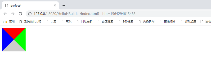
初始效果的源代码:
<!DOCTYPE html>
<html lang="en">

    <head>
        <meta charset="utf-8" />

        <meta http-equiv="X-UA-Compatible" content="ie=edge" />
        <title> perfect*</title>
        <style>
            .tr{
                width:0;
                height:0;
                border: 50px solid;
                border-color: #f00 #0f0 #ccc #00f;

            }
        </style>
    </head>
    <body>
        <div class="tr"></div>
    </body>
</html>
<meta http-equiv="X-UA-Compatible" content="edge" />
Edge 模式通知 Windows Internet Explorer 以最高级别的可用模式显示内容,这实际上破坏了“锁定”模式。即如果你有IE9的话说明你有IE789,那么就调用高版本的那个也就是IE9。
X-UA-Compatible是针对IE8新加的一个设置,对于IE8之外的浏览器是不识别的,这个区别与content="IE=7"在无论页面是否包含<!DOCTYPE>指令,都像是使用了 Windows Internet Explorer 7的标准模式。而content="IE=EmulateIE7"模式遵循<!DOCTYPE>指令。对于多数网站来说,它是首选的兼容性模式。
border-color:<color>{1,4}

默认值:看每个独立属性

相关属性:[ border-top-color ] || [ border-right-color ] || [ border-bottom-color ] || [ border-left-color ]
说明:
- 如果提供全部四个参数值,将按上、右、下、左的顺序作用于四边。
- 如果只提供一个,将用于全部的四边。
- 如果提供两个,第一个用于上、下,第二个用于左、右。
- 如果提供三个,第一个用于上,第二个用于左、右,第三个用于下。
- 如果border-width等于0或border-style设置为none,本属性将被忽略。
- 对应的脚本特性为borderColor。
最终实现的效果:
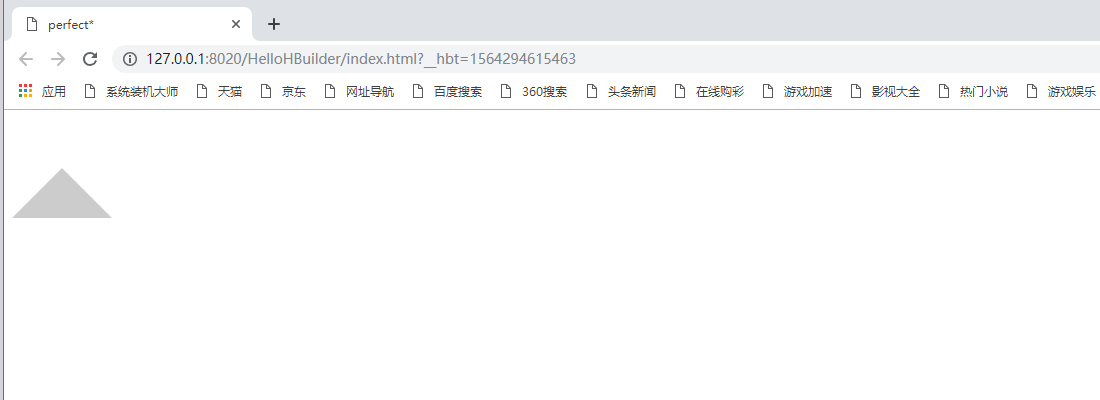
将上述源代码中的border-color改为:
border-color: transparent transparent #ccc transparent;//上、右、下、左
transparent为默认值,边框颜色为透明的
现在使用三角形进行来进行制作对话框:
对话框最终效果:
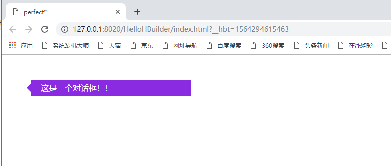
对话框最终的代码:
<!DOCTYPE html>
<html lang="en">

    <head>
        <meta charset="utf-8" />

        <meta http-equiv="X-UA-Compatible" content="ie=edge" />
        <title> perfect*</title>
        <style>
            /*.tr{
                width:0;
                height:0;
                border: 50px solid;
                border-color: transparent transparent #ccc transparent;

            }*/

            .ts{
                position: relative;
                margin-top: 50px;
                margin-left: 50px;
                padding-left:20px ;
                width: 300px;
                line-height: 2;
                background:blueviolet;
                color: #fff;
            }
            .ts::before{

                content:'';
                position: absolute;
                border: 8px solid;
                border-color: transparent blueviolet transparent transparent;
                left: -16px;
                top: 8px;
            }
        </style>
    </head>
    <body>
        <div class="ts">这是一个对话框!!</div>
    </body>
</html>
:before 选择器在被选元素的内容前面插入内容。
二、画一个平行四边形
其最终的效果:
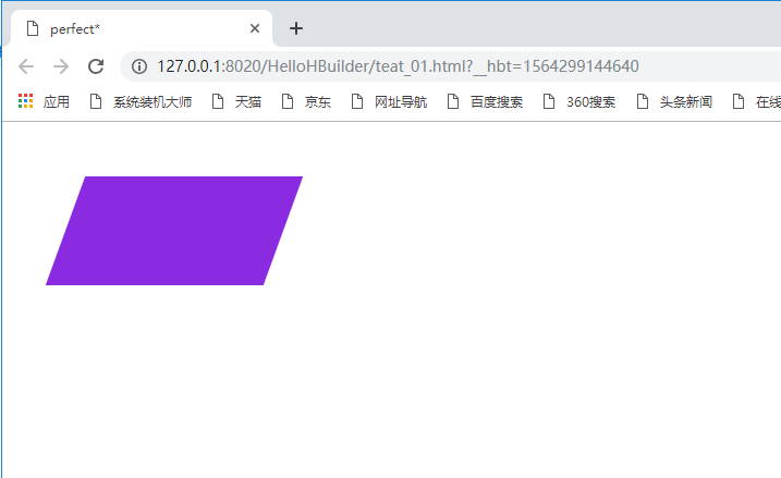
利用skew特性,第一个参数为x轴倾斜的角度,第二个参数为y轴倾斜的角度。
<!DOCTYPE html>
<html>
    <head>
        <meta charset="UTF-8">
        <title>perfect*</title>
        <style>
            .par{
                margin-top:50px ;
                margin-left: 50px;
                width: 200px;
                height: 100px;
                background: blueviolet;
                transform: skew(-20deg,0);
            }
        </style>
    </head>
    <body>
        <div class="par"></div>
    </body>
</html>
三、用一个div画一个五角星
最终实现的效果:
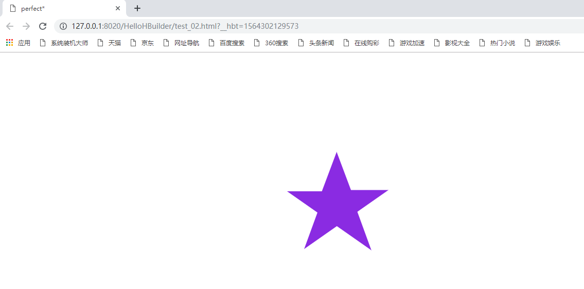
实现该效果的源代码:
<!DOCTYPE html>
<html>
    <head>
        <meta charset="UTF-8">
        <!--<meta name="viewport" content="width=device-width,initial-scale=1.0" />-->
        <meta http-equiv="X-UA-Compatible" content="ie=edge" />
        <title>perfect*</title>
        <style>
            #str{
                position: relative;
                margin: 200px auto;
                width: 0;
                height: 0;
                border-style: solid;
                border-color: transparent transparent blueviolet transparent;
                border-width: 70px 100px;
                transform: rotate(35deg);
            }
            #str::before{

                position: absolute;
                content:'';
                width: 0;
                height: 0;
                top: -128px;
                left: -95px;
                border-style:solid;
                border-color: transparent  transparent blueviolet transparent;
                border-width: 80px 30px;
                transform: rotate(-35deg);
            }
            #str::after{

                position: absolute;
                content: '';
                width: 0;
                height: 0;
                top: -45px;
                left: -140px;

                border-style:solid ;
                border-color: transparent  transparent blueviolet transparent;
                border-width: 70px 100px;
                transform: rotate(-70deg);
            }
        </style>
    </head>
    <body>
        <div id="str"></div>
    </body>
</html>
四、用一个div实现💗
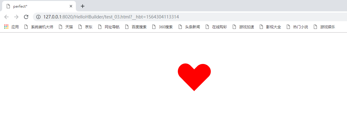
实现该效果的源代码:
<!DOCTYPE html>
<html>
    <head>
        <meta http-equiv="X-UA-Compatible" content="ie=edge" />
        <meta charset="UTF-8">
        <title>perfect*</title>
        <style>
            .heart{
                width: 100px;
                height: 90px;
                position: relative;
                margin: 100px auto;


            }
            .heart::before{
                content: '';
                position: absolute;
                width: 50px;
                height: 90px;
                background: red;
                border-radius: 50px 45px 0 0;

                /*设置旋转中心*/
                transform-origin:0 100% ;
                transform: rotate(-45deg);
            }
            .heart::after{

                content: '';
                position: absolute;
                width: 50px;
                height: 90px;
                top: -35px;
                left: -35px;
                background: red;
                border-radius:50px 45px 0 0 ;
                /*设置旋转中心*/
                transform-origin:0 100% ;
                transform: rotate(45deg);
            }
        </style>
    </head>
    <body>
        <div class="heart"></div>
    </body>
</html>
五、使用一个div实现一个八卦图
最终实现的效果:
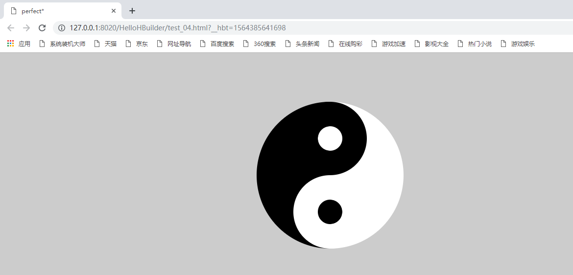
实现该效果的代码:
<!DOCTYPE html>
<html>
    <head>
        <meta charset="UTF-8">
        <title>perfect*</title>
        <style>
            body{
                background-color: #ccc;
            }
            .yuang{
                position: relative;
                width: 300px;
                height: 300px;
                margin: 100px auto;
                border-radius: 50%;
                background-color: #000;

                /*从0-50%用背景色。50%开始到100%用#fff*/
                background-image: linear-gradient(to right,transparent 50%,#fff 50%);/*图像的线性渐变*/
            }
            .yuang::before{

                content:'';
                position: absolute;
                left: 75px;
                width: 0;
                height: 0;
                padding: 25px;
                border-radius: 50%;
                border: 50px solid #000;
                background: #fff;
                background-clip:padding-box;/*背景被裁剪到内边距框*/


            }
            .yuang::after{
                content:'';
                position:absolute;
                top:150px;
                left:75px;
                width:0;
                height:0;
                padding:25px;
                border-radius:50%;
                border:50px solid #fff;
                background: #000;
                background-clip:padding-box;


            }
        </style>
    </head>
    <body>
        <div class="yuang"></div>
    </body>
</html>
linear-gradient是属于CSS3中Gradient中的两个属性一个,这两个属性分别为linear-gradient(线性渐变)和radial-gradient(径性渐变),其中linear-gradient线性渐变呈现线性变化,大家一看名称就可以知道这相当于是直线变化,比如充左上角到右下角的变化,或者从上到下,而radial-gradient径性渐变呈现径性变化,圆圈渐变效果,从图像的中间向四周进行变化。
接下来就使用这两个属性值,做出下面的效果:
六、超级棒棒糖
实现的最终效果:
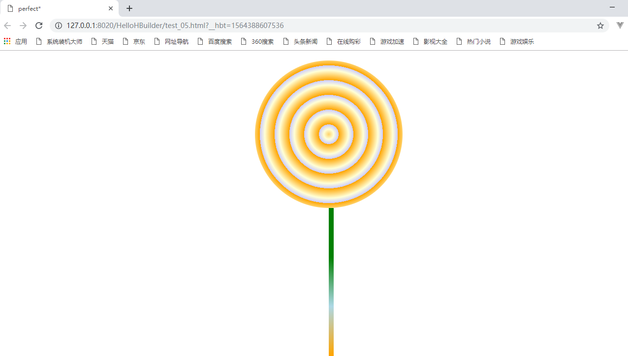
实现该效果的代码:
<!DOCTYPE html>
<html>
    <head>
        <meta charset="UTF-8">
        <title>perfect*</title>
        <style>

            .line{
                width: 300px;
                height: 300px;
                margin: 20px auto;
                border-radius: 50%;

                /*重复径向渐变*/

                background-image:repeating-radial-gradient(orange 20px,#ffcc 40px,#ccff 50px);
                position: relative;
            }
            .line::after
          {
        content: '';
        position: absolute;
        top: 100%;
        left: 50%;
        width: 10px;
        height: 500px;
        border-radius: 0 0 10px 10px;
        /*线性渐变*/
        background-image: linear-gradient(to top ,red 20%,orange 40%,lightblue 60%, green 80%);
            }

        </style>
    </head>
    <body>
        <div class="line"></div>
    </body>
</html>
七、跳动的字节
最终实现的效果图:
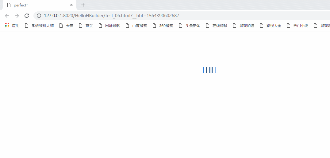
从效果图中看出是不是有点loading的感觉,实现该效果用animation-delay即可控制五个元素的错落感
实现该效果的代码:
<!DOCTYPE html>
<html>
    <head>
        <meta charset="UTF-8">
        <title>perfect*</title>
        <style>
            .spin{
                margin:100px auto;
                width:50px;
                height: 50px;
                text-align: center;
                font-size: 10px;

            }
            .spin>div{

                display: inline-block;
                background-color: rgb(43,128,226);
                height: 100%;
                width: 5px;
                margin-right: 1px;
                animation: bytedance 1s infinite;
            }
            .spin>div:nth-child(2){

                background-color:rgb(49,84,124);
                animation-delay:-0.8s;

            }
            .spin>div:nth-child(3){

                background-color:rgb(88,128,173);
                animation-delay:-0.8s;

            }
            .spin>div:nth-child(4){

                background-color:rgb(88,128,173);
                animation-delay:-0.7s;

            }
            .spin>div:nth-child(5){

                background-color:rgb(142,187,240);
                animation-delay:-0.6s;

            }
            @keyframes bytedance{
                0%,40%,100%{
                    transform: scaleY(0.4);
                }
                20%{
                    transform: scaleY(1);
                }
            }
        </style>
    </head>
    <body>
        <div class="spin">
        <div></div>
        <div></div>
        <div></div>
        <div></div>
        <div></div>

        </div>
    </body>
</html>
animation-delay 属性定义动画何时开始。
animation-delay 值以秒或毫秒计。
提示:允许负值,-2s 使动画马上开始,但跳过 2 秒进入动画。
通过 @keyframes 规则,能够创建动画。
创建动画的原理是,将一套 CSS 样式逐渐变化为另一套样式。
在动画过程中,您能够多次改变这套 CSS 样式。
以百分比来规定改变发生的时间,或者通过关键词 "from" 和 "to",等价于 0% 和 100%。
0% 是动画的开始时间,100% 动画的结束时间。
为了获得最佳的浏览器支持,您应该始终定义 0% 和 100% 选择器。
注释:请使用动画属性来控制动画的外观,同时将动画与选择器绑定。
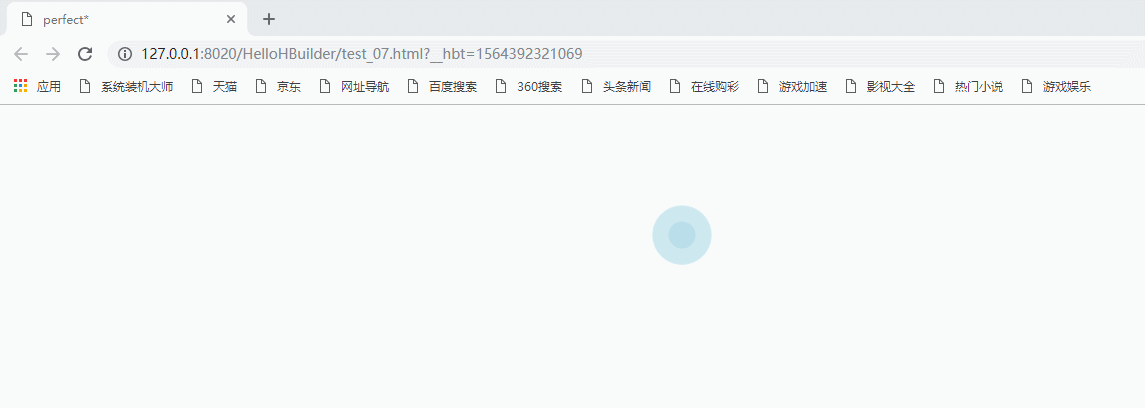
八、涟漪缓动效果
实现的最终效果:
实现该效果的代码:
<!DOCTYPE html>
<html>
    <head>
        <meta charset="UTF-8">
        <title>perfect*</title>
        <style>
            .spin{

                width:60px;
                height: 60px;
                position: relative;

                margin: 100px auto;

            }
            .spin>div{

                 width: 100%;
              height: 100%;
             opacity: 0.6;/*设置透明度*/
             border-radius: 50%;
             background-color: lightblue;
             position: absolute;
           top: 0;
           left: 0;
           animation: loading 1.4s infinite ease-in;
            }
            .spin>div:nth-child(2){


                animation-delay:-0.7s;

            }

            @keyframes loading{
                0%,100%{
                    transform: scale(0.0);
                }
                20%{
                    transform: scale(1.0);
                }
            }
        </style>
    </head>
    <body>
        <div class="spin">
        <div></div>
        <div></div>


        </div>
    </body>
</html>
看到上面有趣的效果是不是喜欢上css了呀!!
博文参考于:https://zhuanlan.zhihu.com/p/75450511

 浙公网安备 33010602011771号