页面布局 Wrap 组件
一、Flutter RaisedButton 定义一个按钮
Flutter 中通过 RaisedButton 定义一个按钮。RaisedButton 里面有很多的参数,这一讲我们只是简单的进行使用。
return RaisedButton(
        child: Text('女装'),
        textColor: Theme.of(context).accentColor,
        onPressed: (){ },
);
Flutter 2.x 以后新增了一些按钮组件 可以使用 ElevatedButton 替代 RaisedButton,也可以继续使用 RaisedButton
class MyButton extends StatelessWidget {
  final String text;

  const MyButton(this.text, {Key? key}) : super(key: key);

  @override
  Widget build(BuildContext context) {
    return ElevatedButton(child: Text(this.text), onPressed: () {});
  }
}
二、Wrap 组件
Wrap 可以实现流布局,单行的 Wrap 跟 Row 表现几乎一致,单列的 Wrap 则跟 Row 表现几乎一致。但 Row 与 Column 都是单行单列的,Wrap 则突破了这个限制,mainAxis 上空间不足时,则向 crossAxis 上去扩展显示。
列,如果是水平方向布局的话,run 可以理解
为新的一行
runSpacing run 的间距
| 属性 | 说明 |
| direction | 主轴的方向,默认水平 |
| alignment | 主轴的对其方式 |
| spacing | 主轴方向上的间距 |
| textDirection | 文本方向 |
| verticalDirection |
定义了 children 摆放顺序,默认是 down,见 Flex 相关属性介绍。
|
| runAlignment | run 的对齐方式。run 可以理解为新的行或者 |
|
runSpacing
|
run 的间距 |
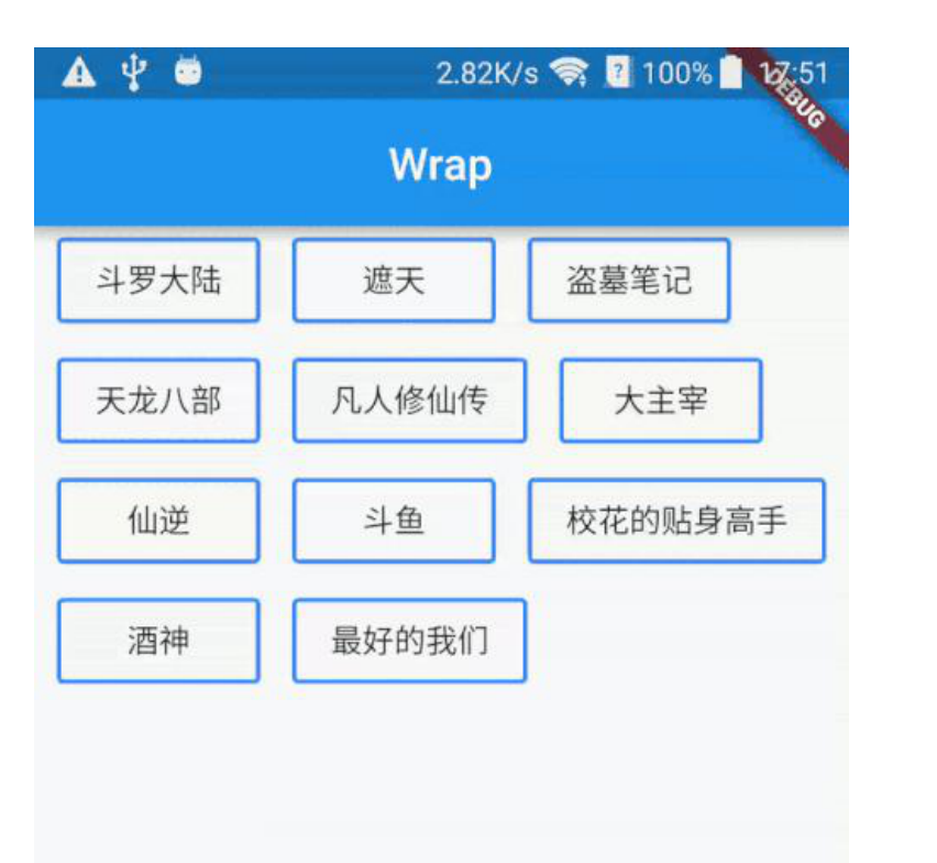
import 'package:flutter/material.dart';

void main() => runApp(MyApp());

class MyApp extends StatelessWidget {
  @override
  Widget build(BuildContext context) {
    return MaterialApp(
        home: Scaffold(
      appBar: AppBar(title: Text('FlutterDemo')),
      body: LayoutDemo(),
    ));
  }
}

class LayoutDemo extends StatelessWidget {
  @override
  Widget build(BuildContext context) {
    return Wrap(
      spacing: 10,
      runSpacing: 10,
      alignment: WrapAlignment.spaceEvenly,
      children: <Widget>[
        MyButton("第 1 集"),
        MyButton("第 2 集"),
        MyButton("第 3 集"),
        MyButton("第 4 集"),
        MyButton("第 5 集"),
        MyButton("第 6 集第 6 集"),
        MyButton("第 7 集"),
        MyButton("第 8 集第 6 集"),
        MyButton("第 9 集"),
        MyButton("第 10 集"),
        MyButton("第 11 集"),
      ],
    );
  }
}

class MyButton extends StatelessWidget {
  final String text;

  const MyButton(this.text, {Key key}) : super(key: key);

  @override
  Widget build(BuildContext context) {
    return RaisedButton(
      child: Text(this.text),
      textColor: Theme.of(context).accentColor,
      onPressed: () {},
    );
  }
}
posted on 2021-11-07 20:08 JieFangZhe 阅读(79) 评论(0) 编辑 收藏 举报