


Introduction
If you've visited the Flickr photo-sharing website, then you may have noticed their paging interface which displays a range of page numbers with your current page in the middle. It then omits page numbers, displaying an ellipsis instead, followed by the last page number. This ASP.NET 1.1 control provides a similar paging interface, but with the added feature of making the ellipses clickable and displaying a layer allowing you to type in the exact page you want to navigate to.
Overview
- Provides a unique easy-to-use paging U.I. for your existing databound web controls - place it above and/or below your
DataGridorRepeateretc. - C# custom control. Compiles with .NET 1.1 or 2.0. To compile the control with .NET 2.0 just remove (or comment out) the compiler constant at the top:
#define CLR_v1. - Works with IE 6 & Firefox. Opera doesn't quite render boxes as expected, but it still works (and small boxes are fine).
- Submits Postback when page number is clicked. Supports placing multiple
SmartPagercontrols on a page. - This control only provides the UI for the actual paging facility. You still need to implement the code to display the appropriate data in your databound controls (which for the
DataGridis simply a matter of enabling paging and specifying the page size). - Online demo available: click here ^.
Advantages
- The user can jump to any page using the go-to-page layer (displayed when the ellipses are clicked).
- Set the tooltip text for each page number (for example, the first value from your sorted column for each page - makes it a lot easier to quickly find which page number you should click on).
- Properties to customise control rendering (colours, borders, font-size etc.)
- Ideal for paging large
DataSets (e.g. > 100 pages). - Good Usability - larger clickable areas for page numbers (i.e. you don't have to click exactly on the digits).
- Current page is always in the middle of the displayed range of page numbers, which is more intuitive than the
DataGrid's inbuilt paging mechanism. - Implements
IClonableinterface, so you can easily display a second identicalSmartPagercontrol (e.g. one above and one underneath your databound control).
Limitations
- Does not render/behave correctly for XHTML DOCTYPE. Either no DOCTYPE or HTML 4 DOCTYPE is fine.
- No properties to customise the look of the go-to-page layer (you would need to modify the
SmartPager.jsfile, and would affect allSmartPagers calling that script file). - Not 100% Opera compatible (page-number boxes don't render correctly, so
PageNumberBoxPaddingproperty should be set to 1 or 2 for Opera).
Using the control
- Add the
SmartPagercontrol to the Toolbox, or add theSmartPagerassembly to your project's assembly references. Alternatively you can copy theSmartPager.csfile (from the source download) to your project (N.B. if you are compiling with .NET 2.0 or later, you should comment out thedefine-line near the top ofSmartPager.cs).
- Only if you are using the .NET 1.1 DLL or if you copied the C# code file to your project, you should copy the
SmartPager.jsfile to your project. If you keep Javascript files in a separate folder to your ASPX files, be sure to set the control'sScriptPathproperty. This step is not necessary if you are using the .NET 2.0 version of this control because the JavaScript file is embedded in the DLL.
- In the Visual Studio.NET designer, drop the control on your page from the Toolbox. Or, in HTML mode, register and add the control as follows:
<%@ Register TagPrefix=avg Namespace=Avg.Controls Assembly=SmartPager %>
<form runat=server>
   <avg:SmartPager ID=PgrOrders runat=server OnPageChanged=PgrOrders_PageChanged />
</form>
- Code an event handler to respond to the
PageChangedevent to update your databound control's page index and re-populate it. For example:protected void PgrOrders_PageChanged(object sender, System.EventArgs e) { GrdOrders.CurrentPageIndex = PgrOrders.CurrentPage - 1; PopulateGrid(); }
- Add code to set the
PageCountproperty. E.g. for aDataGridwith paging enabled, add this line after yourDataBind()call:PgrOrders.PageCount = GrdOrders.PageCount;
- If you are using Visual Studio.NET 2005 or Visual Web Developer 2005 Express Edition, either remove the
DOCTYPEHTML tag or change it from XHTML 1.0 to HTML 4.0:The XHTML<!DOCTYPE HTML PUBLIC "-//W3C//DTD HTML 4.0 Transitional//EN" >
DOCTYPEaffects the rendering in IE 6, and causes an issue with the go-to-page layer in Firefox. The HTML 4.0DOCTYPEis the default in VS.NET 2003, in which case it should be correct.
- Finally, if you are using the
DataGrid's built-in pager, you can disable it.<asp:DataGrid ... PagerStyle-Visible=False>
Go-to-page layer
When clicking either of the ellipses, the go-to-page layer is displayed, allowing the user to specify the page number to navigate to. The textbox is automatically given the focus, and apart from numeric keys, the following keys may be used:
- Enter - navigates to the entered page, unless the page number is out of the range, in which case the textbox becomes red.
- Escape - hides the layer.
- Up arrow & Down arrow - increases/decreases the page number in the textbox (and updates the label if tooltips are specified).
Postback
Clicking the page numbers submits a postback. This was necessary to support multiple SmartPager controls on the same page and maintain the state of all webcontrols. However, you can modify the SmartPagerPostBack JavaScript function to perform another action rather than posting the form (which will change the behaviour of all SmartPager controls referencing that JS file.
SmartPager class
Summary
Flickr-style pager control with a go-to-page feature.
public class SmartPager : Control, ICloneable, IPostBackDataHandlerPublic Properties
|
|
ClientPageChanged |
Gets or sets the name of the JavaScript function to handle the page-change (overriding the default Postback behavior)
| |
|
|
CurrentPage |
Gets or sets the current page number
| |
|
|
DisabledNextPrevStyle |
Gets or sets the style for non-clickable Next & Previous links
| |
|
|
Display |
Gets or sets the number of page numbers to display in the list
| |
|
|
EllipsisText |
Gets or sets the text to indicate page numbers that are omitted
| |
|
|
EnableGoToPage |
Gets or sets a value indicating whether clicking the ellipses should display the Go-to-page layer
| |
|
|
FontSize |
Gets or sets the font size for page links
| |
|
|
GoButtonText |
Gets or sets the text for the GO button on the Go-to-page layer
| |
|
|
MainTableStyle |
Gets or sets the style attribute for the main table
| |
|
|
NavigateNextText |
Gets or sets the text for the 'Next' link
| |
|
|
NavigatePreviousText |
Gets or sets the text for the 'Previous' link
| |
|
|
OutputFirstAndLastLinks |
Gets or sets a value indicating whether to output the first and last page links
| |
|
|
OutputNextPrevLinks |
Gets or sets a value indicating whether to output the Next & Previous links
| |
|
|
PageCount |
Gets or sets the number of pages available in the data source
| |
|
|
PageLabelText |
Gets or sets the text for the textbox-label on the Go-to-page layer
| |
|
|
PageLinkBackColor |
Gets or sets the background color for page links
| |
|
|
PageLinkForeColor |
Gets or sets the color for page links
| |
|
|
PageLinkHoverBackColor |
Gets or sets the hover background color for page links
| |
|
|
PageLinkHoverForeColor |
Gets or sets the hover color for page links
| |
|
|
PageLinkSelectedBackColor |
Gets or sets the background color for selected page links
| |
|
|
PageLinkSelectedForeColor |
Gets or sets the color for selected page links
| |
|
|
PageNumberBoxBorderColor |
Gets or sets the border color of page number boxes
| |
|
|
PageNumberBoxBorderWidth |
Gets or sets the border width in pixels of page number boxes
| |
|
|
PageNumberBoxPadding |
Gets or sets the amount of padding in pixels of page number boxes
| |
|
|
ScriptPath |
Gets or sets the location of
|
Public Methods
|
|
SetTooltips |
Specify the tooltips for the page numbers
| |
|
|
Clone |
Clones the urrent instance of the control
|
Public Events
|
|
PageChanged |
Occurs when the user navigates to a page on this control
|
Notes
Your custom JavaScript function (if ClientPageChanged is set) will be passed two parameters: (1) the control's ClientID, (2) the selected page number.
The DisabledNextPrevStyle allows you to specify how the browser should display the next or previous link when they are disabled using CSS. For example on page 1 there is no previous page, so the Previous link cannot be clicked. You can change the colour etc., however, the default behaviour is to just hide the link.
You can also remove the Next & Previous links altogether by setting OutputNextPrevLinks to false.
If SmartPager.js file is not located in the same directory as your .aspx file, you should specify the path containing the script file. For example:
pager.ScriptPath = "/scripts/";If you wish to display all page numbers (i.e. no pages omitted and replaced with ellipsis), set the Display property to -1.
Examples
1. No Previous & Next links, specify colours, thick border, large padding, larger font:
<avg:SmartPager runat=server Display=9 PageCount=25 OutputNextPrevLinks=False
   PageLinkBackColor=Yellow PageLinkHoverBackColor=Silver PageLinkSelectedBackColor=Silver
   PageNumberBoxPadding=7 PageNumberBoxBorderColor=#c00 PageNumberBoxBorderWidth=2 FontSize=14px />
2. No ellipses, no first & last page numbers, small PageNumberBoxPadding value (recommended for Opera browser, which doesn't render larger boxes as expected).
<avg:SmartPager runat=server PageNumberBoxPadding=2 OutputFirstAndLastLinks=False
   EllipsisText="" Display=10 PageCount=15 PageLinkHoverBackColor=Yellow />
3. Set tooltips / page labels. This allows you to provide a hint of which records can be found on each page. For example if your DataGrid is displaying customer orders, newest first, you could set the tooltip for each page number to indicate the first Order Number on that page. This also works for the go-to-page layer which displays the label as the user specifies a page number (up and down keys also supported).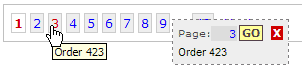
pagerMain.SetTooltips(new string[] { "Order 600", "Order 512", "Order 423", "Order 356",
   "Order 298", "Order 245", "Order 202", "Order 159", "Order 112", "Order 67", "Order 32" });
Code
The following code creates the array representing the central range of page numbers, and determines which page numbers will be displayed in that range. The current page should be in the middle and numbers either side of that. However, near the first and last pages, you can't display the current page in the middle, and the numbers have to be shifted and filled up again.
 Collapse
links = new int[Display];

// current page in the middle of our range
int middle = (int)Math.Ceiling(Display / 2.0) - 1;
links[middle] = currentPage;

// pages preceding current page
for (int i = middle - 1; i >= 0; i--)
   links[i] = links[i + 1] - 1;

// pages following current page
for (int i = middle + 1; i < links.Length; i++)
   links[i] = links[i - 1] + 1;


// Get rid of page numbers exceeding PageCount ("shift" page numbers to the right)
while (links[links.Length - 1] > PageCount)
{
   for (int i = 0; i < links.Length; i++)
      links[i]--;
}

// Get rid of 0 or negative pages ("shift" page numbers to the left)
while (links[0] <= 0)
{
   for (int i = 0; i < links.Length; i++)
      links[i]++;
}

// assign -1 to pages over PageCount
for (int i = links.Length - 1; i >= 0; i--)
{
   if (links[i] > PageCount)
      links[i] = -1;
   else
      break;
}
Then it's just a matter of outputting the HTML/CSS/JavaScript for those pages, which is trivial.
However developing the JavaScript was a bit of an exercise - especially trying to support multiple browsers. Here is the JavaScript event handler for KeyDown event handler of the go-to-page textbox:
Collapsefunction pagerTbKd(e)
{
var tb = document.getElementById('pgrLayer').getElementsByTagName("INPUT")[0]
var pagerPageCount = eval(SmartPagerID + "$pagerPageCount")
tb.style.backgroundColor = ""
tb.style.color = ""
if (e.keyCode == 27) // escape key: hide layer
{
tb.blur()
document.getElementById('pgrLayer').style.visibility='hidden'
}
else if (e.keyCode == 13) // Enter key
{
goToPage()
if (window.event) // IE
e.returnValue = false
else
e.preventDefault()
}
else if (e.keyCode == 38) // up key
{
var current = (isNaN(parseInt(tb.value))) ? 0 : parseInt(tb.value)
if (current < 1)
tb.value = 1
else if (current < pagerPageCount)
tb.value = current + 1
else
tb.value = pagerPageCount
updateLabel(parseInt(tb.value))
}
else if (e.keyCode == 40) // down key
{
var current = (isNaN(parseInt(tb.value))) ? 2 : parseInt(tb.value)
if (current 1)
tb.value = current - 1
else if (current pagerPageCount)
tb.value = pagerPageCount
else
tb.value = 1
updateLabel(parseInt(tb.value))
}
else
setTimeout("updateLabel()", 50)
}Points of interest
The WebResource method for accessing files included in the assembly as embedded resources does not work if you copy the C# source file to your standard web project. Because the aspnet process dynamically compiles the website you can't specify the compile action for Javascript files in your standard web project. And putting the file in Global_Resources or Local_Resources doesn't solve this. However there is a simple way to check if the assembly contains the resource, and reference the Javascript file accordingly (i.e. embedded or external):
bool foundRsrc = false;
foreach (string rsrcName in this.GetType().Assembly.GetManifestResourceNames())
{
   if (rsrcName.EndsWith(".SmartPager.js"))
   {
      foundRsrc = true;
      break;
   }
}
string scriptUrl = (foundRsrc)
   ? Page.ClientScript.GetWebResourceUrl(this.GetType(), "Avg.Controls.SmartPager.js")
   : scriptPath + "SmartPager.js";
Page.ClientScript.RegisterClientScriptInclude("SmartPager_js", scriptUrl);
Future plans
I may implement the following features at some stage:
- Overcome XHTML 1.0
DOCTYPEbrowser rendering restrictions/behavior. - Use localized resource files for text labels
- Properties to alter the look of the go-to-page layer.
- Provide an alternate layout for the go-to-page layer that displays a list of page numbers in a scrollable DIV, instead of typing in the page number.
Updates
30 December 2006- Added a property to specify a JavaScript function to handle the page-changed event (
ClientPageChanged).
- Implemented .NET 2.0 WebResource for the client-script file.
- Added a .NET 2.0 assembly download.
- Updated the instructions for using the .NET 2.0 version of the DLL.
- Added properties:
GoButtonText,PageLabelTextto allow for localization of the Go-to-page popup layer.
Conclusion
Although a search or filter function is also worthwhile, a good pager can make your application much easier to use. This pager takes up less space than standard pagers, has a better UI, and provides an easy way to get to any page. If you find this control useful, you may like to rate it and/or leave feedback below.
License
This article has no explicit license attached to it but may contain usage terms in the article text or the download files themselves. If in doubt please contact the author via the discussion board below.
A list of licenses authors might use can be found here
About the Author
Ashley van Gerven |
Ash is a .NET developer (C#) with a background designing & developing e-commerce content management solutions. His current role includes development on a Windows application interfacing with a VOIP platform, integration and maintenance of various systems. His personal projects include the ScrollingGrid web control - a novel cross-browser freeze-header 2-way scrolling Datagrid. His other interests include travel, cinema, Squash, photography, Muay Thai.
|
 Australia