713 CSS浮动float:浮动的规则,清除浮动,clear
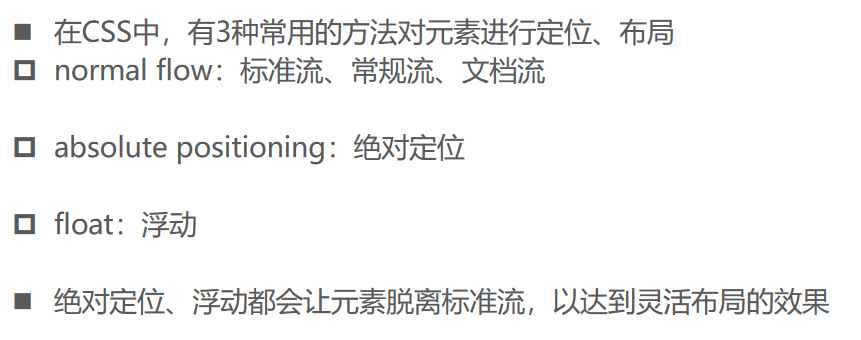
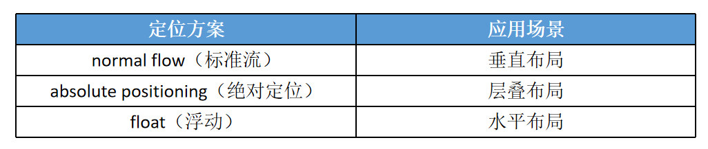
定位方案(Position Schemes)
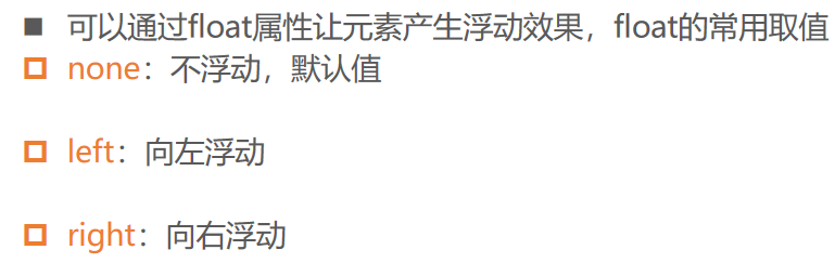
CSS属性 - float
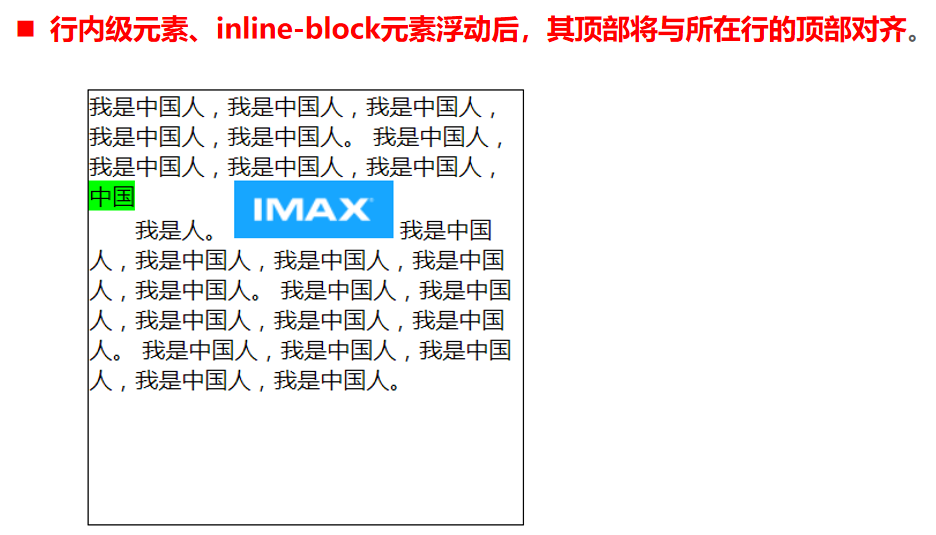
浮动的特点
浮动的特点:
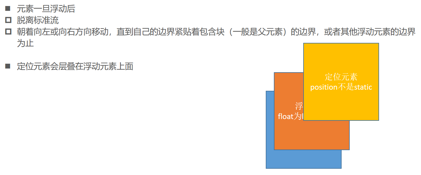
1、浮动的元素脱标。如果一个元素浮动了,那么,(1)将能够【无缝】并排了;(2)并且能够设置宽高了,无论它原来是个div还是个span,浮动即脱离标准流,inline、block是在标准流里用的。2、浮动的元素互相贴靠。左浮动就会贴左边,右浮动贴右边,贴上一个兄弟元素的边。
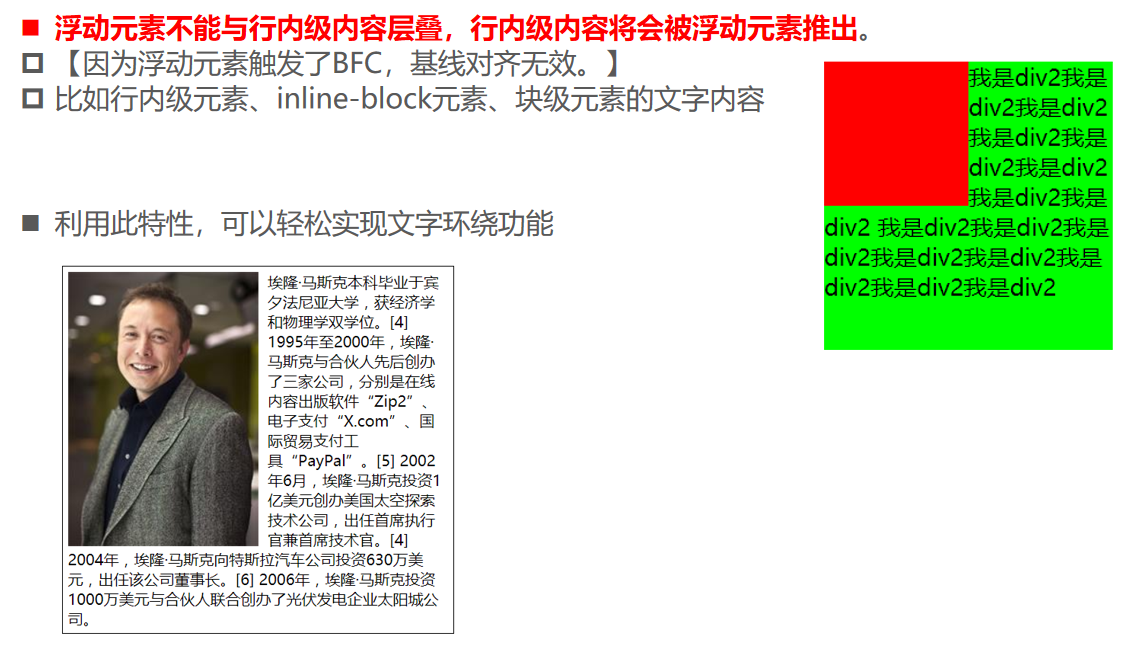
3、浮动的元素有“字围”效果。
4、收缩。不区分行内元素和块级元素了:原来的行内元素现在可以设置宽度、高度;原来的块级元素,如果不写width,现在会自动缩减为内容宽度。
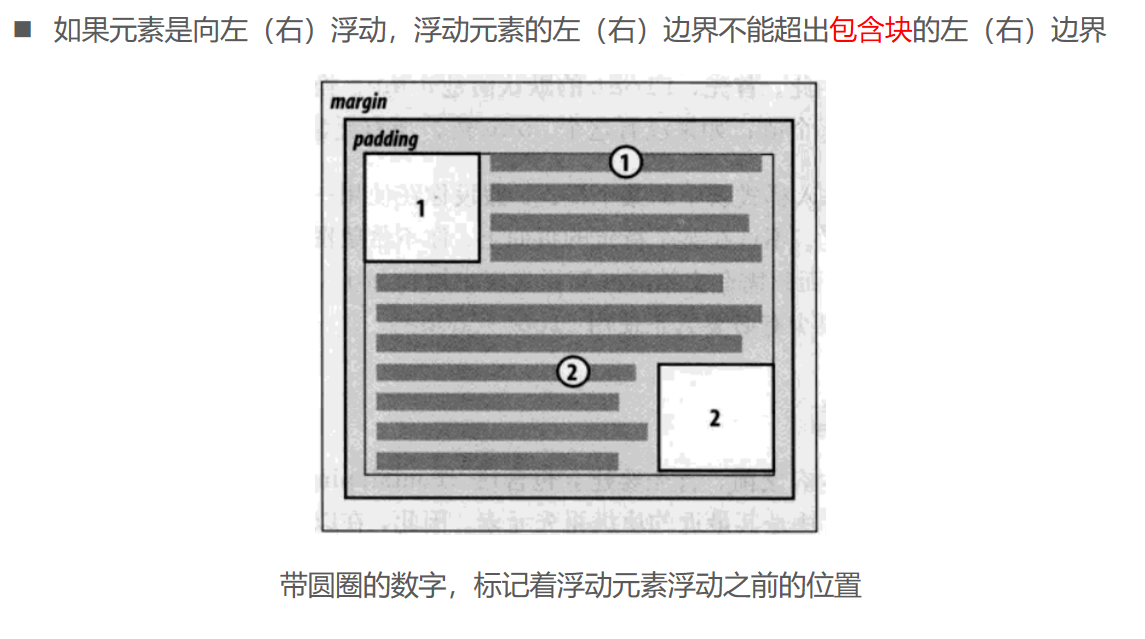
浮动的规则一
01_浮动_理解规则一.html
<!DOCTYPE html>
<html lang="en">
  <head>
    <meta charset="UTF-8" />
    <meta name="viewport" content="width=device-width, initial-scale=1.0" />
    <meta http-equiv="X-UA-Compatible" content="ie=edge" />
    <title>Document</title>

    <style>
      .box {
        height: 200px;
        background-color: #f88;
      }

      .inner {
        display: inline-block;
        width: 100px;
        height: 100px;
        background-color: orange;
        /* word-break: break-all; */
      }

      strong {
        float: left;
        background-color: #0f0;
      }

      a {
        /* float: left; */
        background-color: #00f;
        color: #fff;
      }
    </style>
  </head>
  <body>
    <div class="box">
      <!-- 【可以把文字理解成行内元素。】 -->
      div元素的文字
      <!-- 【如果没给inner添加文本内容,那么除了strong,其他文字会基线对齐,否则顶线对齐。】 -->
      <div class="inner">哈哈哈哈哈哈哈哈哈哈哈哈哈哈哈哈哈</div>
      <!-- <div class="inner">哈哈哈哈哈哈哈哈哈哈哈哈哈哈哈哈哈</div> -->
      <span>span元素</span>
      <strong>strong元素</strong>
      <a href="#">a元素</a>
    </div>
  </body>
</html>
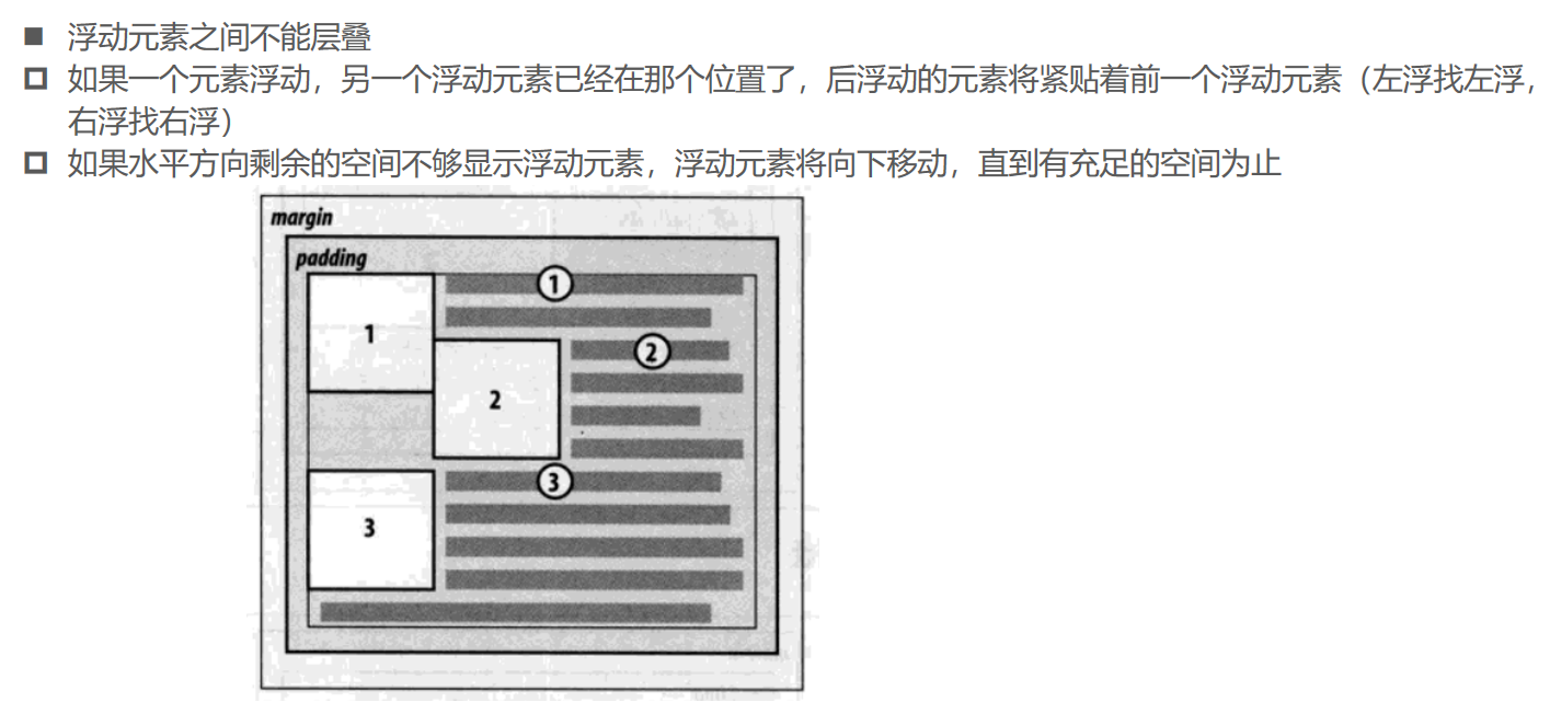
浮动的规则二
02_浮动_理解规则二.html
<!DOCTYPE html>
<html lang="en">
  <head>
    <meta charset="UTF-8" />
    <meta name="viewport" content="width=device-width, initial-scale=1.0" />
    <meta http-equiv="X-UA-Compatible" content="ie=edge" />
    <title>Document</title>

    <style>
      div {
        background-color: #f66;
        width: 300px;
        border: 1px solid #333;
      }

      div img {
        /* 【文字和图片的基线对齐。图片浮动后,触发BFC,意味着图片的基线对齐跟外面的元素无关。】 */
        float: left;
        margin: 8px;
      }
    </style>
  </head>
  <body>
    <div>
      大家都知道, 华为遭到了谷歌GMS的断供,
      <img src="../img/test_01.webp" alt="" />
      华为新款手机在国外是无法使用谷歌服务的,那么华为海外市场份额必定受到影响,
      但是华为突然宣布,华为手机今年全球出货量仍然能够保持在2.3亿台左右,早在10月份华为就宣布了2亿台小目标达成,提前了64天,今年最终成绩将会是2.3亿台,全球第二出货量应该是稳了,苹果今年的“浴霸”并没有很好的效果,2亿台或许都达不成。
    </div>
  </body>
</html>
浮动的规则三
03_浮动_理解规则三.html
<!DOCTYPE html>
<html lang="en">
  <head>
    <meta charset="UTF-8" />
    <meta name="viewport" content="width=device-width, initial-scale=1.0" />
    <meta http-equiv="X-UA-Compatible" content="ie=edge" />
    <title>Document</title>

    <style>
      .box {
        width: 300px;
        background-color: #f66;
      }

      .box .img1 {
        float: left;
      }

      .box .img2 {
        float: left;
      }

      .inner {
        /* 浮动元素/定位元素/display三者的关系 */
        float: left;

        width: 50px;
        height: 50px;
        background-color: orange;
      }
    </style>
  </head>
  <body>
    <div class="box">
      大家都知道,
      <img class="img1" src="../img/wall.png" alt="" />
      华为遭到了谷歌GMS的断供,
      华为新款手机在国外是无法使用谷歌服务的,那么华为海外市场份额必定受到影响,但是华为突然宣布,
      <img class="img2" src="../img/wall.png" alt="" />
      华为手机今年全球出货量仍然能够保持在2.3亿台左右,早在10月份华为就宣布了2亿台小目标达成,
      <div class="inner"></div>
      提前了64天,今年最终成绩将会是2.3亿台,全球第二出货量应该是稳了,苹果今年的“浴霸”并没有很好的效果,2亿台或许都达不成。
    </div>
  </body>
</html>
04_浮动_理解前面的规则.html
<!DOCTYPE html>
<html lang="en">
  <head>
    <meta charset="UTF-8" />
    <meta name="viewport" content="width=device-width, initial-scale=1.0" />
    <meta http-equiv="X-UA-Compatible" content="ie=edge" />
    <title>Document</title>

    <style>
      .box {
        /* height: 300px; */
        background-color: #f66;
      }

      .inner1 {
        float: left;

        width: 100px;
        height: 100px;
        background-color: orange;
      }

      .inner2 {
        float: left;
        /* display: inline-block; */

        width: 150px;
        height: 150px;
        background-color: purple;
      }
    </style>
  </head>
  <body>
    <!--
        1>三者之间的关系:
            position:absolute/fixed和float:left/right和display之间的关系
        2>现象解释:
            1.inner2进行左浮动/右浮动的时候, 只会在当前自己行中浮动
            2.inner1进行左浮动时, inner2在没有浮动时, inner2会如何排布
            3.inner1进行左浮动时, inner2在没有浮动时, 但是里面有文本, 文本会如何排布
            4.inner1进行左浮动时, inner2设置为inline-block, inner2会在第一行, 并且被推出去
            5.inner1进行左浮动时, inner2也进行左浮动, 那么innner1和inner2以此在第一行排布
            6.inner1和inner2都进行浮动, 但是父元素没有设置高度, 那么父元素的高度会消失(高度的坍塌)
     -->

    <div class="box">
      <div class="inner1"></div>
      <div class="inner2">我是inner2的文本</div>
    </div>
  </body>
</html>
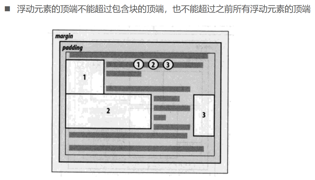
浮动的规则四
浮动的规则五
浮动的规则六
05_浮动_理解规则四.html
<!DOCTYPE html>
<html lang="en">
  <head>
    <meta charset="UTF-8" />
    <meta name="viewport" content="width=device-width, initial-scale=1.0" />
    <meta http-equiv="X-UA-Compatible" content="ie=edge" />
    <title>Document</title>
    <style>
      .box {
        width: 300px;
        height: 300px;
        background-color: #f66;
      }

      .inner {
        width: 100px;
        height: 100px;
        background: orange;
        float: right;
      }
    </style>
  </head>
  <body>
    <div class="box">
      <div class="inner"></div>
    </div>
  </body>
</html>
06_浮动_理解规则五.html
<!DOCTYPE html>
<html lang="en">
  <head>
    <meta charset="UTF-8" />
    <meta name="viewport" content="width=device-width, initial-scale=1.0" />
    <meta http-equiv="X-UA-Compatible" content="ie=edge" />
    <title>Document</title>
    <style>
      .box {
        width: 300px;
        height: 500px;
        background-color: #f66;
      }

      .inner1 {
        float: left;

        width: 100px;
        height: 100px;
        background: orange;
      }

      .inner2 {
        float: left;

        width: 150px;
        height: 150px;
        background: purple;
      }

      .inner3 {
        float: left;

        width: 200px;
        height: 200px;
        background-color: yellowgreen;
      }
    </style>
  </head>
  <body>
    <div class="box">
      <div class="inner1"></div>
      <div class="inner2"></div>
      <div class="inner3"></div>
    </div>
  </body>
</html>
07_浮动_理解规则六.html
<!DOCTYPE html>
<html lang="en">
  <head>
    <meta charset="UTF-8" />
    <meta name="viewport" content="width=device-width, initial-scale=1.0" />
    <meta http-equiv="X-UA-Compatible" content="ie=edge" />
    <title>Document</title>

    <style>
      .box {
        width: 300px;
        height: 500px;
        background-color: #f66;
      }

      .inner1 {
        float: left;

        width: 200px;
        height: 100px;
        background: orange;
      }

      .inner2 {
        float: left;

        width: 150px;
        height: 150px;
        background: purple;
      }

      .inner3 {
        float: right;

        width: 50px;
        height: 200px;
        background-color: yellowgreen;
      }
    </style>
  </head>
  <body>
    <div class="box">
      <div class="inner1"></div>
      <div class="inner2"></div>
      <div class="inner3"></div>
    </div>
  </body>
</html>
08_inline-block水平布局的缺陷.html
<!DOCTYPE html>
<html lang="en">
  <head>
    <meta charset="UTF-8" />
    <meta name="viewport" content="width=device-width, initial-scale=1.0" />
    <meta http-equiv="X-UA-Compatible" content="ie=edge" />
    <title>Document</title>
    <style>
      body {
        font-size: 50px;
      }

      .box {
        /* 【1、元素之间的间距很难控制。 2、vertical-align导致元素之间布局受到影响。】 */
        display: inline-block;
        width: 100px;
        height: 100px;
      }

      .box1 {
        background-color: #f66;
        float: left;
        margin-right: 10px;
      }

      .box2 {
        background-color: #0f0;
        float: left;
      }
    </style>
  </head>
  <body>
    <div class="box box1"></div>
    <div class="box box2">fdafadfa</div>
  </body>
</html>
09_京东_布局案例01.html
<!DOCTYPE html>
<html lang="en">
  <head>
    <meta charset="UTF-8" />
    <meta name="viewport" content="width=device-width, initial-scale=1.0" />
    <meta http-equiv="X-UA-Compatible" content="ie=edge" />
    <title>Document</title>

    <style>
      .container {
        width: 990px;
        height: 500px;
        background-color: #f66;

        margin: 0 auto;
      }

      .section {
        float: left;
        width: 490px;
        height: 300px;
      }

      .section1 {
        background-color: #0f0;
        margin-right: 10px;
      }

      .section2 {
        background-color: #00f;
      }
    </style>
  </head>
  <body>
    <div class="container">
      <div class="section section1"></div>
      <div class="section section2"></div>
    </div>
  </body>
</html>
10_京东_布局案例02.html
<!DOCTYPE html>
<html lang="en">
  <head>
    <meta charset="UTF-8" />
    <meta name="viewport" content="width=device-width, initial-scale=1.0" />
    <meta http-equiv="X-UA-Compatible" content="ie=edge" />
    <title>Document</title>

    <style>
      /* 前提: border-width和padding-width为0 */
      /* width of block = content-width + margin-left + margin-right + padding+border */
      /* 990 = content-width + 0 + -10px */
      /* content-width = 990 + 10 -> 1000 */
      .container {
        width: 990px;
        height: 500px;
        background-color: #f66;

        margin: 0 auto;
      }

      /* 0 + 0 + 0 + width + 0 + 0 + -10 = 990 */
      /* width: 990+10 = 1000 */

      .wrap {
        margin-right: -10px;
      }

      .section {
        float: left;

        margin-top: 10px;
        width: 190px;
        height: 100px;
        background-color: #0f0;

        margin-right: 10px;
      }

      /* div .section:nth-child(5n) {
            margin-right: 0;
        } */

      /* .section5, .section10 {
            margin-right: 0;
        } */

      /* .section1, .section2, .section3, .section4, .section5 {
            margin-right: 10px;
        } */
    </style>
  </head>
  <body>
    <div class="container">
      <!-- 【套一个外层元素,设置它的margin-right为负值,这样它的宽度就和包含块一样了。】 -->
      <div class="wrap">
        <div class="section section1"></div>
        <div class="section section2"></div>
        <div class="section section3"></div>
        <div class="section section4"></div>
        <div class="section section5"></div>
        <div class="section section6"></div>
        <div class="section section7"></div>
        <div class="section section8"></div>
        <div class="section section9"></div>
        <div class="section section10"></div>
        <div class="section section6"></div>
        <div class="section section7"></div>
        <div class="section section8"></div>
        <div class="section section9"></div>
        <div class="section section15"></div>
      </div>
    </div>
  </body>
</html>
11_块级元素的宽度计算.html
<!DOCTYPE html>
<html lang="en">
  <head>
    <meta charset="UTF-8" />
    <meta name="viewport" content="width=device-width, initial-scale=1.0" />
    <meta http-equiv="X-UA-Compatible" content="ie=edge" />
    <title>Document</title>
    <style>
      /* 'margin-left' + 'border-left-width' + 'padding-left' + 'width' + 'padding-right' + 'border-right-width' + 'margin-right' = width of containing block */

      /* border: 0
        padding: 0 */
      /* width of block = content-width + margin-left + margin-right + padding+border */
      /* 990 = content-width + 0 + -10px */
      .box {
        width: 1000px;
        height: 100px;
        border-left: 20px yellowgreen solid;
        border-right: 20px yellowgreen solid;
        padding-left: 50px;
        background-color: #f66;
      }
    </style>
  </head>
  <body>
    <div class="box">xxxx</div>
  </body>
</html>
12_京东_布局案例03.html
<!DOCTYPE html>
<html lang="en">
  <head>
    <meta charset="UTF-8" />
    <meta name="viewport" content="width=device-width, initial-scale=1.0" />
    <meta http-equiv="X-UA-Compatible" content="ie=edge" />
    <title>Document</title>

    <style>
      .container {
        width: 990px;
        /* height: 306px; */
        height: auto;
        background-color: #f66;
        margin: 0 auto;
      }

      .wrap {
        margin-right: -10px;
      }

      .item {
        float: left;
        margin-right: 10px;
        width: 240px;
        background-color: orange;
      }

      .itema {
        height: 306px;
      }

      .itemb {
        height: 148px;
      }

      .item-last {
        margin-top: 10px;
      }
    </style>
  </head>
  <body>
    <div class="container">
      <div class="wrap">
        <div class="item itema"></div>
        <div class="item itema"></div>

        <div class="item itemb"></div>
        <div class="item itemb"></div>
        <div class="item itemb item-last"></div>
        <div class="item itemb item-last"></div>
      </div>
    </div>

    <p>其他内容</p>
    <p>其他内容</p>
    <p>其他内容</p>
    <p>其他内容</p>
    <p>其他内容</p>
    <p>其他内容</p>
    <p>其他内容</p>
    <p>其他内容</p>
  </body>
</html>
13_考拉_考拉案例01.html
<!DOCTYPE html>
<html lang="en">
  <head>
    <meta charset="UTF-8" />
    <meta name="viewport" content="width=device-width, initial-scale=1.0" />
    <meta http-equiv="X-UA-Compatible" content="`" />
    <title>Document</title>

    <style>
      /* CSS reset */
      h2 {
        margin: 0;
        padding: 0;
      }

      a {
        text-decoration: none;
        color: #666;
      }

      .f-left {
        float: left;
      }

      .f-right {
        float: right;
      }

      /* 样式相关 */
      .header {
        width: 1100px;
        margin: 0 auto;
        /* background-color: #0f0; */
        height: 49px;
      }

      .header-left {
        /* float: left; */
        font-size: 14px;
      }

      .header-left h2,
      .header-left span,
      .header-left a {
        float: left;
        margin-right: 20px;
      }

      .header-left h2 {
        font-size: 22px;
      }

      .header-left .search {
        margin-top: 9px;
      }

      .header-left .search a:hover {
        text-decoration: underline;
      }

      .header-left .search .hot {
        color: #ff080f;
      }

      .header-right {
        /* float: right; */
        margin-top: 9px;
        font-size: 14px;
      }

      .header-right a:hover {
        text-decoration: underline;
      }
    </style>
  </head>
  <body>
    <div class="header">
      <div class="header-left f-left">
        <h2>美妆专区</h2>
        <div class="search f-left">
          <span>热搜词:</span>
          <a href="#">面膜</a>
          <a class="hot" href="#">口红</a>
          <a href="#">眼霜</a>
          <a class="hot" href="#">精华</a>
          <a href="#">卸妆</a>
        </div>
      </div>
      <div class="header-right f-right">
        <a href="#">更多好货 ></a>
      </div>
    </div>
  </body>
</html>
14_考拉_考拉案例02.html
<!DOCTYPE html>
<html lang="en">
  <head>
    <meta charset="UTF-8" />
    <meta name="viewport" content="width=device-width, initial-scale=1.0" />
    <meta http-equiv="X-UA-Compatible" content="ie=edge" />
    <title>Document</title>

    <style>
      /* css reset */
      ul {
        list-style: none;
        padding: 0;
        margin: 0;
      }

      /* 样式 */
      .brand {
        width: 1100px;
        height: 180px;
        margin: 0 auto;
        background-color: #6cc;
      }

      .brand ul {
        margin-right: -10px;
      }

      .brand ul li {
        float: left;
        width: 219px;
        height: 167px;
        background-color: yellowgreen;
        margin-right: -1px;
        border: 1px solid #eaeaea;
      }

      span {
        background-color: #f66;
        float: left;

        margin-right: -20px;
      }

      strong {
        background-color: #0f0;
        float: left;
      }
    </style>
  </head>
  <body>
    <div class="brand">
      <ul>
        <li></li>
        <li></li>
        <li></li>
        <li></li>
        <li></li>
      </ul>
    </div>

    <span>span元素</span>
    <strong>strong元素</strong>
  </body>
</html>
15_浮动_考拉案例03.html
<!DOCTYPE html>
<html lang="en">
  <head>
    <meta charset="UTF-8" />
    <meta name="viewport" content="width=device-width, initial-scale=1.0" />
    <meta http-equiv="X-UA-Compatible" content="ie=edge" />
    <title>Document</title>
    <style>
      ul {
        list-style: none;
        margin: 0;
        padding: 0;
      }

      /* 布局样式 */
      .today {
        width: 1100px;
        margin: 0 auto;
      }

      .today ul {
        margin-right: -3px;
      }

      .today ul li {
        float: left;
        width: 420px;
        height: 190px;
        background-color: #f66;

        border: 1px solid #333;
        margin-right: -1px;
        margin-bottom: -1px;
      }

      .today ul .last {
        float: right;
        width: 260px;
        height: 381px;
        background-color: #0f0;
      }
    </style>
  </head>
  <body>
    <div class="today">
      <ul>
        <li class="last"><a href="#"></a></li>
        <li></li>
        <li></li>
        <li></li>
        <li></li>
      </ul>
    </div>
    <br /><br /><br /><br />
    <br /><br /><br /><br />
    <br /><br /><br /><br />
    <br /><br /><br /><br />
    <br /><br /><br /><br />
    <br /><br /><br /><br />
    <br /><br /><br /><br />
    <br /><br /><br /><br />
    <br /><br /><br /><br />
    <br /><br /><br /><br />
    <br /><br /><br /><br />
    <br /><br /><br /><br />
    <br /><br /><br /><br />
    <br /><br /><br /><br />
  </body>
</html>
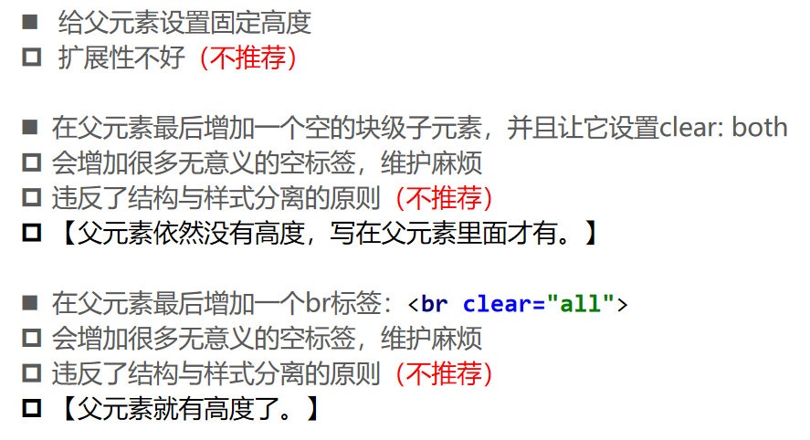
浮动存在的问题

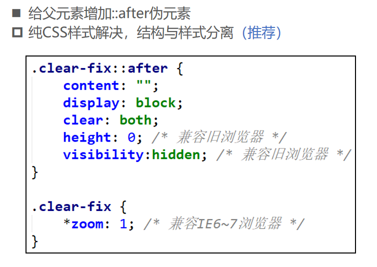
清浮动的常见方法
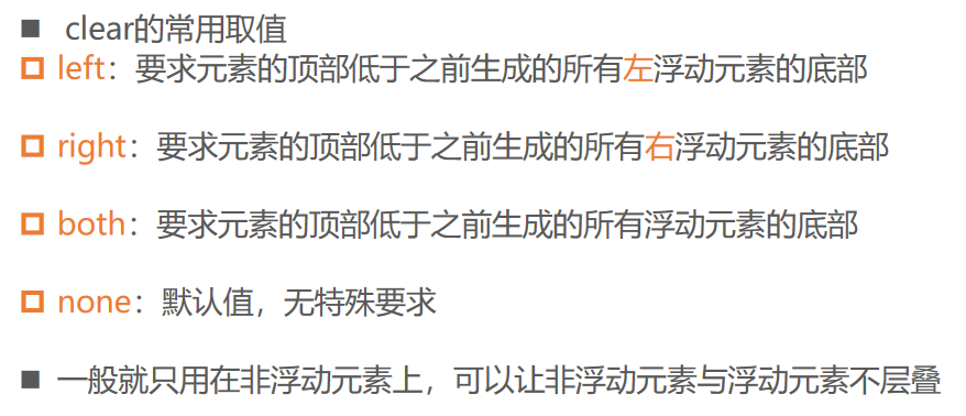
CSS属性 - clear
定位方案对比
16_京东_布局案例-清除浮动.html
<!DOCTYPE html>
<html lang="en">
  <head>
    <meta charset="UTF-8" />
    <meta name="viewport" content="width=device-width, initial-scale=1.0" />
    <meta http-equiv="X-UA-Compatible" content="ie=edge" />
    <title>Document</title>

    <style>
      .container {
        width: 990px;
        background-color: #f66;
        margin: 0 auto;
      }

      .wrap {
        margin-right: -10px;
      }

      .item {
        float: left;

        margin-right: 10px;
        width: 240px;
        background-color: orange;
      }

      .itema {
        height: 306px;
      }

      .itemb {
        height: 148px;
      }

      .item-last {
        margin-top: 10px;
      }

      /* .container::after {
            content: "";
            clear: both;
            display: block;
        }


        .content::after {
            content: "";
            clear: both;
            display: block;
        }

        .brand::after {
            content: "";
            clear: both;
            display: block;
        } */

      .clear-fix::after {
        content: '';
        display: block;
        clear: both;
        height: 0; /* 【有的旧浏览器的伪元素的高度不为0.】 */
        visibility: hidden; /* 【有的即使高度为0,也可以看见。】 */
      }

      .clear-fix {
        /* 兼容IE6和7 */
        *zoom: 1;
      }
    </style>
  </head>
  <body>
    <div class="container clear-fix">
      <div class="wrap">
        <div class="item itema"></div>
        <div class="item itema"></div>

        <div class="item itemb"></div>
        <div class="item itemb"></div>
        <div class="item itemb item-last"></div>
        <div class="item itemb item-last"></div>
      </div>
      <!-- <div class="clear-fix"></div> -->
    </div>

    <div class="brand clear-fix"></div>

    <!-- <div class="clear-fix"></div> -->

    <p>其他内容</p>
    <p>其他内容</p>
    <p>其他内容</p>
    <p>其他内容</p>
    <p>其他内容</p>
    <p>其他内容</p>
    <p>其他内容</p>
    <p>其他内容</p>
  </body>
</html>

