356 flexible.js仿苏宁
rem 适配方案2
手机淘宝团队出的简洁高效 移动端适配库
我们再也不需要在写不同屏幕的媒体查询,因为里面js做了处理
它的原理是把当前设备划分为10等份,但是不同设备下,比例还是一致的。
我们要做的,就是确定好我们当前设备的html 文字大小就可以了
比如当前设计稿是 750px, 那么我们只需要把 html 文字大小设置为 75px(750px / 10) 就可以
里面页面元素rem值: 页面元素的px 值 / 75
剩余的,让flexible.js来去算
github地址:https://github.com/amfe/lib-flexible
总结:
因为flexible是默认将屏幕分为10等分,但是当屏幕大于750的时候希望不要再去重置html字体了,所以要自己通过媒体查询设置一下,并且要把权重提到最高。
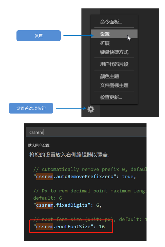
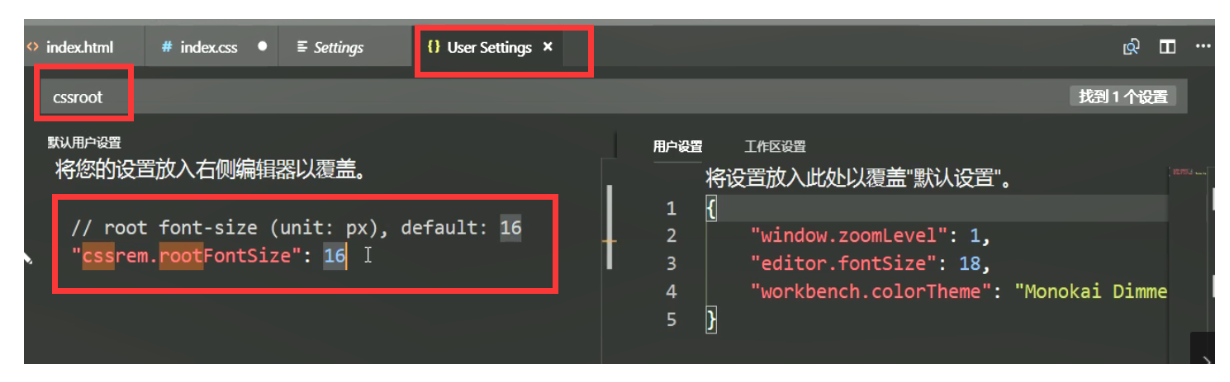
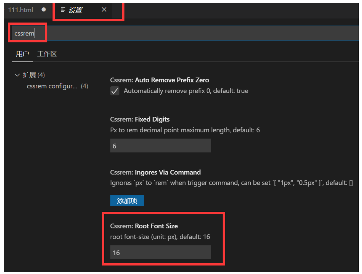
VSCode px 转换rem 插件: cssrem 。
因为cssrem中css自动转化为rem是参照默认插件的16转换的,所以需要自己配置
html
<!DOCTYPE html>
<html lang="en">

<head>
    <meta charset="UTF-8">
    <meta name="viewport" content="width=device-width, user-scalable=no,initial-scale=1.0, maximum-scale=1.0, minimum-scale=1.0">

    <meta http-equiv="X-UA-Compatible" content="ie=edge">
    <link rel="stylesheet" href="css/normalize.css">
    <link rel="stylesheet" href="css/index.css">
    <!-- 引入我们的flexible.js 文件 -->
    <script src="js/flexible.js"></script>
    <title>Document</title>
</head>

<body>
    <div class="search-content">
        <a href="#" class="classify"></a>
        <div class="search">
            <form action="">
                <input type="search" value="rem适配方案2很开心哦">
            </form>
        </div>
        <a href="#" class="login">登录</a>
    </div>
</body>

</html>
css
body {
    min-width: 320px;
    max-width: 750px;
    /* flexible 给我们划分了 10 等份 */
    width: 10rem;
    margin: 0 auto;
    line-height: 1.5;
    font-family: Arial, Helvetica;
    background: #f2f2f2;
}

a {
    text-decoration: none;
    font-size: .333333rem;
}


/* 这个插件默认的html文字大小 cssroot  16px */


/*
img {
    width: 5.125rem;
    height: 4rem;
    width: 1rem;
    width: 1.093333rem;
    height: 1rem;
} */


/* 如果我们的屏幕超过了 750px  那么我们就按照 750设计稿来走 不会让我们页面超过750px */

@media screen and (min-width: 750px) {
    html {
        font-size: 75px!important;
    }
}


/* search-content */

.search-content {
    display: flex;
    position: fixed;
    top: 0;
    left: 50%;
    transform: translateX(-50%);
    width: 10rem;
    height: 1.173333rem;
    background-color: #FFC001;
}

.classify {
    width: .586667rem;
    height: .933333rem;
    margin: .146667rem .333333rem .133333rem;
    background: url(../images/classify.png) no-repeat;
    background-size: .586667rem .933333rem;
}

.search {
    flex: 1;
}

.search input {
    outline: none;
    border: 0;
    width: 100%;
    height: .88rem;
    font-size: .333333rem;
    background-color: #FFF2CC;
    margin-top: .133333rem;
    border-radius: .44rem;
    color: #757575;
    padding-left: .733333rem;
}

.login {
    width: 1rem;
    height: .933333rem;
    margin: .133333rem;
    color: #fff;
    text-align: center;
    line-height: .933333rem;
    font-size: .333333rem;
}

