0020 圆角边框(CSS3):border-radius

- 语法:
border-radius:length;
-
其中每一个值可以为 数值或百分比的形式。
-
技巧: 让一个正方形 变成圆圈
border-radius: 50%;


- 以上效果图矩形的圆角, 就不要用 百分比了,因为百分比会是表示高度和宽度的一半。
- 而我们这里矩形就只用 用 高度的一半就好了。精确单位。
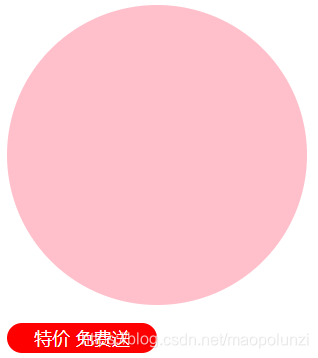
demo
<!DOCTYPE html>
<html lang="en">
<head>
	<meta charset="UTF-8">
	<title>Document</title>
	<style>
		div {
			width: 200px;
			height: 200px;
			background-color: pink;

			/*border-radius: 100px;*/
			border-radius: 50%;
		}
		p {
			width: 100px;
			height: 20px;
			background-color: red;
			font-size: 12px;
			color: #fff;
			text-align: center;
			line-height: 20px;
			border-radius: 10px;
		}
	</style>
</head>
<body>
	<div> </div>
	<p> 特价 免费送 </p>
</body>
</html>
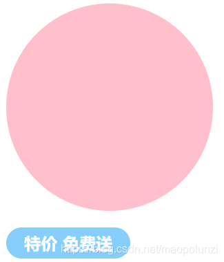
我的demo
<!DOCTYPE html>
<html lang="en">
<head>
	<meta charset="UTF-8">
	<title>Document</title>
	<style>
		div {
			width: 200px;
			height: 200px;
			background-color: pink;
			border-radius: 50%;
		}

		p {
			width: 120px;
			height: 30px;
			/* line-height: 30px; */  /* 不生效,会被下面的font: 900 16px "arial" 覆盖掉, */
			text-align: center;
			background-color: lightskyblue;
			/* 要么写成 font: 900 16px/30px "arial",要么在下面加一行 line-height: 30px; */
			font: 900 16px "arial";
			line-height: 30px;
			border-radius: 15px;
			color: white;
		}
	</style>
</head>
<body>
	<div> </div>
	<p> 特价 免费送 </p>
</body>
</html>