


解决Web开发HTML页面中footer保持在页面底部问题
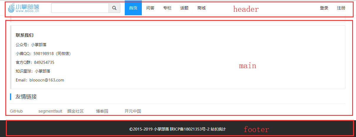
如图所示如何实现footer在内容不足或者浏览器窗口变大变小的时候一直保持在底部呢?请看如下两种解决方案。
第一种方案:
footer高度固定+绝对定位 (兼容性比较好完美兼容IE8+)
思路:footer的父层的最小高度是100%,footer设置成相对于父层位置绝对(absolute)置底(bottom:0),父层内要预留(padding-bottom)footer的高度。
HTML
<div class="wrapper">
    <div class="header">头部</div>
    <div class="main">内容</div>
    <div class="footer">底部</div>
</div>
CSS
*{
    margin: 0;
    padding: 0;
}
html,body{
    height: 100%;
}
.wrapper{
    /*保证footer是相对于container位置绝对定位*/
    position:relative;
    width:100%;
    min-height:100%;
    /*设置padding-bottom值大于等于footer的height值,以保证main的内容能够全部显示出来而不被footer遮盖;*/
    padding-bottom: 100px;
    box-sizing: border-box;
}
.header{
    width: 100%;
    height: 200px;
    background: #999;
}
.main{
    width: 100%;
    height: 200px;
    background: orange;
}
.footer{
    width: 100%;
    height:100px;   /* footer的高度一定要是固定值*/
    position:absolute;
    bottom:0px;
    left:0px;
    background: #333;
}
如果在main区域设置了浮动啥的你会发现footer固定在页面可视区的底部,且覆盖在内容上,这时候只要在footer的父元素样式上增加(overflow : hidden;)即可;
第二种方案:
采用 flexbox布局模型
思路:我们将 body 的 display 属性设置为 flex, 然后将方向属性设置为列, (默认是行,也就是横向布局);同时,将html 和 body 元素的高度设置为100%,使其充满整个屏幕。
HTML
<div class="wrapper">
    <div class="header">头部</div>
    <div class="main">内容</div>
    <div class="footer">底部</div>
</div>
CSS
我们需要调整各个区域占用的页面空间,我们将通过flex 属性来达到这一目的,该属性实际包含了三个属性,分别是:
(1)flex-grow:元素在同一容器中对可分配空间的分配比率,及扩展比率;
(2)flex-shrink:如果空间不足,元素的收缩比率;
(3)flex-basis:元素的伸缩基准值;
*{
    margin: 0;
    padding: 0;
}
html,body{
    height: 100%;
}
.wrapper{
    display: flex;
    flex-direction: column;
    height: 100%;
}
.header{
    background: #999;
    flex: 0 0 auto;
}
.main{
    background: orange;
    flex: 1 0 auto;
}
.footer{
    background: #333;
    flex: 0 0 auto;
}
如果你在很年轻的时候,就遭受到了失败,一定要把它当作老天送你的礼物。如果等到四十岁再失败,你会经受不起的。为什么年纪越大,走路越小心,因为越来越经不起跌倒了。

