

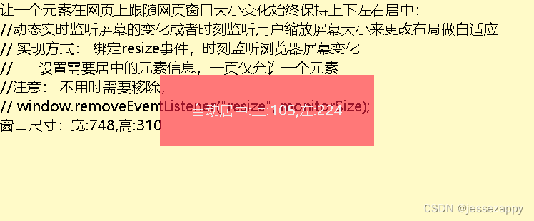
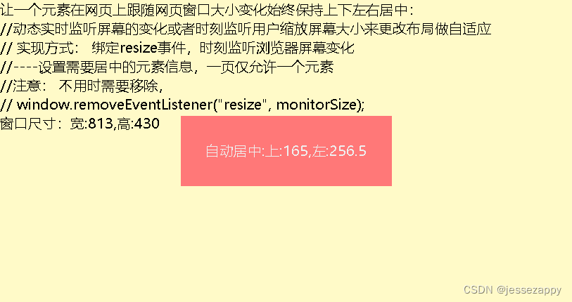
让一个元素在网页上跟随网页窗口大小变化始终保持上下左右居中
废话少说,直接上代码,懂的都懂:
<!DOCTYPE html>
<html style="font-size: 100px;">
<head>
	<meta http-equiv="Content-Type" content="text/html;charset=UTF-8">
	<style type="text/css">
		*{margin: 0; padding: 0;}
		html,body{
			width:100%;
			height:100%;
			overflow: hidden;
			font-size: 0.2rem;
			background-color:rgba(255, 250, 200, 1);
		}
	</style>
<script>
	//动态实时监听屏幕的变化或者时刻监听用户缩放屏幕大小来更改布局做自适应
	// 实现方式: 绑定resize事件,时刻监听浏览器屏幕变化
	//----设置需要居中的元素信息,一页仅允许一个元素
	var cdom,xw,xh;
	var cid='CentS';
	function monitorSize () {
		var w = window.innerWidth||document.documentElement.clientWidth||document.body.clientWidth;
		var h = window.innerHeight||document.documentElement.clientHeight||document.body.clientHeight;
		let cy=((h - xh) / 2);
		let cx=((w - xw) / 2);
		cdom.style.top =cy+"px";
		cdom.style.left =cx+"px";
		document.getElementById('WH1').innerText='宽:'+w+',高:'+h;
		document.getElementById('WH2').innerText='上:'+cy+',左:'+cx;
	}
	window.onload = () => {
		cdom=document.getElementById(cid);
		xw=cdom.clientWidth;
		xh=cdom.clientHeight;
		monitorSize();
		console.log('页面已加载完成!' + xw+','+xh);
		window.addEventListener('resize', () => {monitorSize()});
	}
</script>
</head>
<body>
	让一个元素在网页上跟随网页窗口大小变化始终保持上下左右居中:<br/>
	//动态实时监听屏幕的变化或者时刻监听用户缩放屏幕大小来更改布局做自适应<br/>
	// 实现方式: 绑定resize事件,时刻监听浏览器屏幕变化<br/>
	//----设置需要居中的元素信息,一页仅允许一个元素	<br/>
	//注意: 不用时需要移除,<br/>
	// window.removeEventListener("resize", monitorSize);<br/>
	窗口尺寸:<span id="WH1"></span>
	<div id="CentS" style="background-color:rgba(255, 33, 66, 0.6);color:#efefef;width:3rem;height:1rem;position: absolute;top:3rem;left: 4rem;text-align: center;line-height: 1rem;">自动居中:<span id="WH2">

	</span>
	</div>
</body>
</html>


【推荐】国内首个AI IDE,深度理解中文开发场景,立即下载体验Trae
【推荐】编程新体验,更懂你的AI,立即体验豆包MarsCode编程助手
【推荐】抖音旗下AI助手豆包,你的智能百科全书,全免费不限次数
【推荐】轻量又高性能的 SSH 工具 IShell:AI 加持,快人一步
· 阿里最新开源QwQ-32B,效果媲美deepseek-r1满血版,部署成本又又又降低了!
· 开源Multi-agent AI智能体框架aevatar.ai,欢迎大家贡献代码
· Manus重磅发布:全球首款通用AI代理技术深度解析与实战指南
· 被坑几百块钱后,我竟然真的恢复了删除的微信聊天记录!
· AI技术革命,工作效率10个最佳AI工具