
[bg] Fusion of two video streams
Ref: https://redstapler.co/realtime-video-processing-javascript-tutorial/
Ref: opencv.js perspective transform
透明背景
Link: 带alpha透明通道视频—网页播放带alpha通道视频叠加合成方案
Link: web视频合成叠加方案—播放带alpha通道视频叠加背景
webM格式的优势
webM影片格式,其实是以 Matroska(就是我们熟知的 MKV)容器格式为基础开发的新容器格式,里面包括了 VP8 影片轨和 Ogg Vorbis 音轨。WebM 应该是不会有 H.264 的那些潜在的专利问题。
WebM标准的网络视频更加偏向于开源并且是基于HTML5标准的,WebM 项目旨在为对每个人都开放的网络开发高质量、开放的视频格式,其重点是解决视频服务这一核心的网络用户体验。
Google 说 WebM 的格式相当有效率,应该可以在 netbook、tablet、手持式装置等上面顺畅地使用,当然自家的 Youtube 也会支持 WebM 的播放。来自产业界的奥援有 Adobe -- Flash Player 将会支持 WebM 格式的播放
HTML5常用视频格式
现在看视频基本上是在线观看,而web端现在又流行HTML5了。
HTML 5中常用的容器格式和编码格式是:
- 容器格式 Ogg = Theora 视频编码格式 + Vorbis音频编码格式
- 容器格式 MPEG4 = H.264 视频编码格式 + AAC音频编码格式
- 容器格式 WebM = VP8 视频编码格式 + Vorbis音频编码格式
Link: 将WebM转换为Mp4,并保持透明度/ alpha通道(Premiere Pro / Vegas Pro)
我知道如何使用ffmpeg将mp4转换为webm:
ffmpeg -y -i me939371029.mp4 -r 30 out3.webm
What is Color Key
Link: http://underpop.online.fr/f/ffmpeg/help/colorkey.htm.gz
Make every green pixel in the input image transparent:
ffmpeg -i input.png -vf colorkey=green out.png
How can I save a video than can be opened in browser #119
opencv方案
???
形变(可用)
How to implement 4-point perspective transform using HTML5 canvas & three.js?
https://bitbucket.org/mattwilson1024/perspective-transform/src/maste
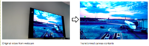
左下逆时针开始设置四个点。
透明融合
Ref: https://simpl.info/videoalpha/
太酷了!视频流改为网络视频流,试一试?
-
HTML
<!DOCTYPE html>
<html lang="en">
<head>

<script>
    //  philipwalton.com/articles/the-google-analytics-setup-i-use-on-every-site-i-build
    window.ga = window.ga || function() {
      (ga.q = ga.q || []).push(arguments);
    };
    ga('create', 'UA-33848682-1', 'auto');
    ga('set', 'transport', 'beacon');
    ga('send', 'pageview');
</script>
<script async src="https://www.google-analytics.com/analytics.js"></script>

<meta charset="utf-8">
<meta name="description" content="Simplest possible examples of HTML, CSS and JavaScript.">
<meta name="author"      content="//samdutton.com">
<meta name="viewport"    content="width=device-width, initial-scale=1">
<meta itemprop="name"    content="simpl.info: simplest possible examples of HTML, CSS and JavaScript">
<meta itemprop="image"   content="/images/icons/icon192.png">
<meta id="theme-color" name="theme-color" content="#fff">

<link rel="icon" href="/images/icons/icon192.png">

<base target="_blank">


<title>Video alpha channel</title>

<link rel="stylesheet" href="../css/main.css">
<link rel="stylesheet" href="css/main.css">


<style>
    input::-webkit-color-swatch-wrapper {
      padding: 0;
    }
    input {
      border:   none;
      height:   18px;
      position: relative;
      top:      4px;
      width:    18px;
    }
    p {
      color: black;
      background-color: rgba(255, 255, 255, 0.5);
      padding: 5px;
    }
</style>

</head>


<body>

  <video id="video1"            autoplay src="video/dancer1.webm" loop muted playsinline></video>
  <video id="video2"            autoplay src="video/soccer1.webm" loop muted playsinline></video>
  <video id="chrome" class="transparent" src="video/chrome.webm"  loop muted playsinline></video>

  <div id="container">

    <h1><a href="../index.html" title="simpl.info home page">simpl.info</a> Video alpha channel</h1>

    <p>Drag videos to show CSS filters; tap or double click to trigger CSS animation. Resize page to resize videos.</p>
    <p>Tap or click background to swap between image and video.</p>
    <p>Select video background colour: <input id="colorInput" type="color"> (<span id="clearSpan">clear</span>)</p>

    <p class="strong">This demo works in current versions of Firefox and Chrome on desktop and (sort of) on mobile, but not Safari.</p>

    <script src="js/main.js"></script>    ---->

  </div>

  <a id="viewSource" href="https://github.com/samdutton/simpl/blob/gh-pages/videoalpha" title="View source for this page on GitHub">View source on GitHub</a>

</body>
</html>
-
JS
'use strict';

var chromeVideo  = document.getElementById('chrome');
var containerDiv = document.getElementById('container');
var colorInput   = document.getElementById('colorInput');
var clearSpan    = document.getElementById('clearSpan');
var video1       = document.getElementById('video1');
var video2       = document.getElementById('video2');

colorInput.onchange = function() {
  video1.style.backgroundColor = this.value;
  video2.style.backgroundColor = this.value;
};

clearSpan.onclick = function() {
  video1.style.backgroundColor = 'transparent';
  video2.style.backgroundColor = 'transparent';
};

////////////////////////
// “摄像头视频流背景切换”
////////////////////////
function toggleChromeVideo() {
  if (chromeVideo.classList.contains('transparent')) {
    // 正常显示并播放视频
    chromeVideo.classList.remove('transparent');
    chromeVideo.play();
  } else {
    document.body.style.backgroundImage = 'url(images/crissyField.jpg)';
    // video变透明,且后台暂停播放
    chromeVideo.classList.add('transparent');
    chromeVideo.pause();
  }
}

chromeVideo.onclick  = toggleChromeVideo;
containerDiv.onclick = toggleChromeVideo;


///////////////////////////
// "目标视频拖拽与显示"
///////////////////////////
function addEventListeners(video) {
  video.ondblclick    = handleDblclick;
  video.onpointerdown = handlePointerDown;
  video.onpointerup   = handlePointerUp;
  video.onpointermove = handlePointerMove;
}
addEventListeners(video1);
addEventListeners(video2);


///////////////////////////
// "双击目标视频“
///////////////////////////
function handleDblclick(event) {
  var video = event.srcElement;
  video.classList.remove('rotate-out');
  setTimeout(function() {
    video.classList.add('rotate-out');
  }, 5);
  event.preventDefault();
}


////////////////////////////////
// "目标拖动"
////////////////////////////////
var isPointerDown = false;

function handlePointerDown(event) {
  isPointerDown            = true;
  var video                = event.srcElement;
  video.style.opacity      = 0.7;
  video.style.webkitFilter = 'blur(3px) grayscale(1)';
  video.style.zIndex       = video.style.zIndex + 1;
  event.preventDefault();
}

function handlePointerUp(event) {
  isPointerDown            = false;
  var video                = event.srcElement;
  video.style.opacity      = 1;
  video.style.webkitFilter = 'blur(0px)';
  event.preventDefault();
}

function handlePointerMove(event) {
  if (!isPointerDown) {
    return;
  }
  var video        = event.srcElement;
  var videoWidth   = video.clientWidth;
  var videoHeight  = video.clientHeight;

  // 这里需要改进下,TODO
  video.style.left = (event.clientX - videoWidth / 2) + 'px';
  video.style.top  = (event.clientY - videoHeight / 2) + 'px';

  event.preventDefault();
}
-
CSS
a#viewSource {
  border: none;
  bottom: 1em;
  color: #36f;
  padding: 0 0 0 1.5em;
  position: absolute;
  width: 200px;
  z-index: 10;
}

body,
html {
  height: 100%;
  margin: 0 0 0 0;
  padding: 0 0 0 0;
}

body {
  background-color: #141;
  background-image: url(../images/crissyField.jpg);
  background-repeat: no-repeat;
  background-size: cover;
  position: relative;
}

div#container {
  background: none;
  max-width: 100%;
  position: relative;
}

p {
  color: black;
}

span#clearSpan {
  color: #7af;
  cursor: pointer;
}

span#clearSpan:hover {
  text-decoration: underline;
}

video#chrome{
  bottom: 0;
  position: absolute;
  -moz-transition: opacity 1.5s ease-in-out;
  -ms-transition: opacity 1.5s ease-in-out;
  -o-transition: opacity 1.5s ease-in-out;
  -webkit-transition: opacity 1.5s ease-in-out;
  transition: opacity 1s;
  width: 150%;
}

video#chrome.transparent {
  opacity: 0;
}


video#video1,
video#video2 {
  -moz-animation-duration: 3s;
  -ms-animation-duration: 3s;
  -o-animation-duration: 3s;
  -webkit-animation-duration: 3s;
  animation-duration: 3s;
  background: transparent;
  position: absolute;
}

video#video1{
  bottom: 0;
  left: 10%;
  width: 50%;
  z-index: 1;
}

video#video2 {
  bottom: 50px;
  right: 10%;
  width: 25%;
  z-index: 1;
}


////////////////////////////////////////////////////

.rotate-out {
  -moz-animation-name: rotate-out;
  -ms-animation-name: rotate-out;
  -o-animation-name: rotate-out;
  -webkit-animation-name: rotate-out;
  animation-name: rotate-out;
}


@-webkit-keyframes rotate-out {
  0% {
    -webkit-animation-timing-function: ease-in;
    animation-timing-function: ease-in;
    opacity: 1;
    -webkit-transform: rotate(0) scale(1);
    transform: rotate(0) scale(1);
    -webkit-transform-origin: center center;
    transform-origin: center center;
  }

  50% {
    opacity: 0;
    -webkit-transform: rotate(-2000deg) scale(0);
    transform: rotate(-2000deg) scale(0);
    -webkit-transform-origin: center center;
    transform-origin: center center;
  }

  100% {
    -webkit-animation-timing-function: ease-out;
    animation-timing-function: ease-out;
    opacity: 1;
    -webkit-transform: rotate(2000deg) scale(1);
    transform: rotate(2000deg) scale(1);
    -webkit-transform-origin: center center;
    transform-origin: center center;
  }
}


@keyframes rotate-out {
  0% {
    animation-timing-function: ease-in;
    opacity: 1;
    transform: rotate(0) scale(1);
    transform-origin: center center;
  }

  50% {
    opacity: 0;
    transform: rotate(-2000deg) scale(0);
    transform-origin: center center;
  }

  100% {
    animation-timing-function: ease-out;
    opacity: 1;
    transform: rotate(2000deg) scale(1);
    transform-origin: center center;
  }
}

 浙公网安备 33010602011771号