

CSS之多个div一行排列
使多个div横着排的两种方法,一种是浮动float,一种是布局display
一、使用float
元素一旦浮动,脱离文档流(不占页面空间,后面未浮动元素会上前补位。
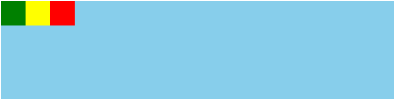
1、代码示例


<!DOCTYPE html>
<html lang="en">
<head>
    <meta charset="UTF-8">
    <meta http-equiv="X-UA-Compatible" content="IE=edge">
    <meta name="viewport" content="width=device-width, initial-scale=1.0">
    <title>测试</title>
</head>
<body>
  <div class="box">
    <div class="child-1"></div>
    <div class="child-2"></div>
    <div class="child-3"></div>
  </div>
</body>
<style>
    .box {
        width: 800px;
        height: 200px;
        position: absolute;
        top: 50%;
        left: 50%;
        transform: translate(-50%,-50%);
        background-color: skyblue;
    }

    .child-1 {
        width: 50px;
        height: 50px;
        background-color: green;
        float: left;
    }
    .child-2 {
        width: 50px;
        height: 50px;
        background-color: yellow;
        float: left;
    }
    .child-3 {
        width: 50px;
        height: 50px;
        background-color: red;
        float: left;
    }
</style>
</html>
2、float引发问题
2.1)父元素高度坍塌:
父元素不写高,靠子元素撑起高度,所有子元素都浮动,那么所有子元素都脱离文档流,父元素认为自己内部没有元素了,所以父元素就没有高度了。
解决方法:
a、父元素也浮动。缺点是影响父元素后的非浮动元素
b、给父元素写高度。缺点是有时我们并不知道父元素的高度
c、overflow:hidden。 缺点是会让真正要溢出不能显示
d、直接在父元素里面增加一个块级元素。没有内容、没有高度。缺点是莫名多了一个div,不好维护。
<div class="box">
    <div class="child float-left"></div>
    <div class="child float-left"></div>
    <div class="clear"></div>
<div>

.clear {
    clear: both
}
.float-left {
  float: left
}
e、父元素利用伪元素:after,并且清除浮动(推荐)
<div class="box">
    <div class="child float-left"></div>
    <div class="child float-left"></div>
<div>

.box::after {
    display: block;
    content: '';
    clear: both
}
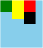
2.2)子元素高度不一致时,浮动位置错乱
如图黑色div本应该在绿色div的下面,解决方法是使用display布局
<!DOCTYPE html>
<html lang="en">
<head>
    <meta charset="UTF-8">
    <meta http-equiv="X-UA-Compatible" content="IE=edge">
    <meta name="viewport" content="width=device-width, initial-scale=1.0">
    <title>测试</title>
</head>
<body>
  <div class="box">
    <div class="child-1"></div>
    <div class="child-2"></div>
    <div class="child-3"></div>
    <div class="child-4"></div>
  </div>
</body>
<style>
    .box {
        width: 180px;
        height: 200px;
        position: absolute;
        top: 50%;
        left: 50%;
        transform: translate(-50%,-50%);
        background-color: skyblue;
    }

    .child-1 {
        width: 50px;
        height: 50px;
        background-color: green;
        float: left;
    }
    .child-2 {
        width: 50px;
        height: 80px;
        background-color: yellow;
        float: left;
    }
    .child-3 {
        width: 50px;
        height: 50px;
        background-color: red;
        float: left;
    }
    .child-4 {
        width: 50px;
        height: 50px;
        background-color: black;
        float: left;
    }
</style>
</html>
二、使用display
display常用属性:
a、inline,使元素变成行内元素,行内元素共享一行,没有宽高属性
b、block,使元素变成块级元素,独占一行
c、inline-block,理解为不独占一行的块级元素
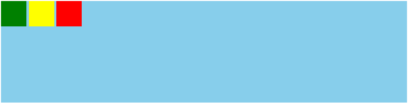
1、代码示例
<!DOCTYPE html>
<html lang="en">
<head>
    <meta charset="UTF-8">
    <meta http-equiv="X-UA-Compatible" content="IE=edge">
    <meta name="viewport" content="width=device-width, initial-scale=1.0">
    <title>测试</title>
</head>
<body>
  <div class="box">
    <div class="child-1"></div>
    <div class="child-2"></div>
    <div class="child-3"></div>
  </div>
</body>
<style>
    .box {
        width: 800px;
        height: 200px;
        position: absolute;
        top: 50%;
        left: 50%;
        transform: translate(-50%,-50%);
        background-color: skyblue;
    }

    .child-1 {
        width: 50px;
        height: 50px;
        background-color: green;
        display: inline-block;
    }
    .child-2 {
        width: 50px;
        height: 50px;
        background-color: yellow;
        display: inline-block;
    }
    .child-3 {
        width: 50px;
        height: 50px;
        background-color: red;
        display: inline-block;
    }
</style>
</html>
可以看到三个子元素之间有缝隙,这是由于换行引起的,去除方法是在父元素添加 font-size:0
演示去除缝隙,并且子元素高度不一致不会引起布局错乱
<!DOCTYPE html>
<html lang="en">
<head>
    <meta charset="UTF-8">
    <meta http-equiv="X-UA-Compatible" content="IE=edge">
    <meta name="viewport" content="width=device-width, initial-scale=1.0">
    <title>测试</title>
</head>
<body>
  <div class="box">
    <div class="child-1"></div>
    <div class="child-2"></div>
    <div class="child-3"></div>
    <div class="child-4"></div>
  </div>
</body>
<style>
    .box {
        width: 180px;
        height: 200px;
        position: absolute;
        top: 50%;
        left: 50%;
        transform: translate(-50%,-50%);
        background-color: skyblue;
        font-size: 0;
    }

    .child-1 {
        width: 50px;
        height: 50px;
        background-color: green;
        display: inline-block;
    }
    .child-2 {
        width: 50px;
        height: 80px;
        background-color: yellow;
        display: inline-block;
    }
    .child-3 {
        width: 50px;
        height: 50px;
        background-color: red;
        display: inline-block;
    }
    .child-4 {
        width: 50px;
        height: 50px;
        background-color: black;
        display: inline-block;
    }
</style>
</html>

