
Android开发----Button组件的使用与练习
Button
学习目标:
- 文字大小、颜色
- 自定义背景形状
- 自定义按压效果
- 点击事件
创建一个新的Activity以增加控件
1、文字大小、颜色
直接在xml文件中定义即可
<Button
        android:id="@+id/btn_1"
        android:layout_width="match_parent"
        android:layout_height="wrap_content"
        android:text="这是一个Button"
        android:textColor="#000000"
        android:background="#ff00ff"/>
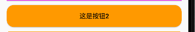
2、自定义背景形状
在res/drawable目录下创建btn_2.xml文件用于自定义按钮的形状(表示颜色为橙色,形状为圆角)
<?xml version="1.0" encoding="utf-8"?>
<shape xmlns:android="http://schemas.android.com/apk/res/android"
    android:shape="rectangle">
    <solid
        android:color="#ff9900"/>

    <corners
        android:radius="15dp"/>
</shape>
(一个只有边框的形状)
<?xml version="1.0" encoding="utf-8"?>
<shape xmlns:android="http://schemas.android.com/apk/res/android"
    android:shape="rectangle">
    <stroke
        android:width="1dp"
        android:color="#ff9900"/>

    <corners
        android:radius="5dp"/>
</shape>
在Activity.xml中按钮组件上应用这个背景
<Button
        android:id="@+id/btn_2"
        android:layout_width="match_parent"
        android:layout_height="wrap_content"
        android:text="这是按钮2"
        android:textColor="#000000"
        android:layout_marginTop="10dp"
        android:layout_below="@id/btn_1"
        android:background="@drawable/btn_2"/>
最终效果如图:
或者有

3、自定义按压效果
在drawable下新建btn_4.xml
<?xml version="1.0" encoding="utf-8"?>
<selector xmlns:android="http://schemas.android.com/apk/res/android">
    <item
        android:state_pressed="true">
        <shape>
            <solid android:color="#ff0099"/>
            <corners android:radius="5dp"/>
        </shape>
    </item>
    <item android:state_pressed="false">
        <shape>
            <solid android:color="#00ff99"/>
        </shape>
    </item>
</selector>
在Activity.xml中引用
<Button
        android:id="@+id/btn_4"
        android:layout_width="match_parent"
        android:layout_height="wrap_content"
        android:text="button4"
        android:layout_below="@id/btn_3"
        android:layout_marginTop="10dp"
        android:background="@drawable/btn_4"
        />
4、点击事件
对btn_4进行利用,使其点击都生成消息提示框
方法一:
在Activity.java中使用setOnClickListener
public class ButtonActivity extends AppCompatActivity {
    private Button button_3;
    @Override
    protected void onCreate(Bundle savedInstanceState) {
        super.onCreate(savedInstanceState);
        setContentView(R.layout.activity_button);
        button_4 = findViewById(R.id.btn_3);
        button_4.setOnClickListener(new View.OnClickListener() {
            @Override
            public void onClick(View view) {
                Toast.makeText(ButtonActivity.this,"这是一个提示消息",Toast.LENGTH_SHORT).show();
            }
        });
    }
}
方法二:
在Activity.java中创建showToast方法
public class ButtonActivity extends AppCompatActivity {
    @Override
    protected void onCreate(Bundle savedInstanceState) {
        super.onCreate(savedInstanceState);
        setContentView(R.layout.activity_button);
    }

    public void showToast(View view)
    {
        Toast.makeText(this,"这是一个提示消息",Toast.LENGTH_SHORT).show();
    }

}
并在btn_4控件中添加android:onClick="showToast"即可

 浙公网安备 33010602011771号