


Control Template与style类似,也可以修改控件的属性,两者区别如下:
| name | style | Control Template |
| 功能 |
style可以设置控件的属性,但是只能设置控件已有的属性。 eg:修改一个button的background,Width,Height等。 |
Control Template不仅可以设置控件已有的属性,也能完全修改控件的样式。 eg:修改一个button的background,并将button的样式改为圆形按钮,而不是传统的方形按钮。 |
| 属性引用 |
在style设置的属性,控件引用style这个时,属性可以自主改变。 eg:在style设置好button的background=red, 当按钮button1引用这个style时,可以在后面重新设置 background=green 最终按钮背景显示绿色 |
在control Template设置好的属性,控件引用这个Control Template时,属性只能为Control Template设置好的属性,不能自主改变。 eg:在Control Template设置button的background=red, 当按钮button1引用这个Control Template时,在后面重新设置 background=green 最终按钮背景显示红色,但是control Template中设置的属性可以通过Background="{TemplateBinding Background}"这句话设置背景,这样最终的按钮属性也会显示绿色。 |
| 嵌套 |
style可以设置控件的所有属性,而Control Template是控件的一个属性之一,因此可以在style中设置控件的Control Template。 |
Control Template设置控件的样式,而控件包含的内容(content),则在ContentPresenter中进行设置。 |
下面的例子展示了3个按钮,3个按钮采用了不同的controltemplate
xmal中
在usercontrol中添加:

 代码
代码

<!--Style一般在XXX.Resources里面设置,ControlTemplate一般在Style中进行设置-->
<Grid.Resources>
<!--Style One and ControlTemplate One-->
<Style x:Key="ButtonTemplateOne" TargetType="Button">
<Setter Property="Width" Value="500" />
<Setter Property="Height" Value="15" />
<Setter Property="Background" Value="Green" />
<Setter Property="Template">
<Setter.Value>
<ControlTemplate TargetType="Button">
<Border Background="Red">
<!--设置button的显示内容的相关属性,内容的文字排版为左上显示-->
<ContentPresenter
HorizontalAlignment="Left"
VerticalAlignment="Top"/>
</Border>
</ControlTemplate>
</Setter.Value>
</Setter>
</Style>
<!--Style Two and ControlTemplate Two-->
<Style x:Key="ButtonTemplateTwo" TargetType="Button">
<Setter Property="Width" Value="500" />
<Setter Property="Height" Value="15" />
<Setter Property="Template">
<Setter.Value>
<ControlTemplate TargetType="Button">
<!--设置button的显示内容的相关属性,内容的文字排版为绑定控件设置-->
<Border Background="{TemplateBinding Background}" >
<ContentPresenter
HorizontalAlignment="{TemplateBinding HorizontalContentAlignment}"
VerticalAlignment="{TemplateBinding VerticalContentAlignment}"/>
</Border>
</ControlTemplate>
</Setter.Value>
</Setter>
</Style>
<!--Style Three and ControlTemplate Three-->
<Style x:Key="ButtonTemplateThree" TargetType="Button">
<Setter Property="Width" Value="50" />
<Setter Property="Height" Value="50" />
<Setter Property="Template">
<Setter.Value>
<ControlTemplate TargetType="Button">
<!--圆形填充按钮-->
<Grid>
<Ellipse Fill="{TemplateBinding Background}"/>
<ContentPresenter HorizontalAlignment="Center"
VerticalAlignment="Center"/>
</Grid>
</ControlTemplate>
</Setter.Value>
</Setter>
</Style>
</Grid.Resources>
<TextBlock Text="ControlTemplate" Margin="0,20,10,20"
FontFamily="Verdana" FontSize="18" FontWeight="Bold"
Foreground="#FF5C9AC9" Grid.Row="0" />
<Button Name="button_one" Content="I'm button one"
Style="{StaticResource ButtonTemplateOne}"
Background="LightGray" Width="400"
HorizontalAlignment="Center"
Click="Button_Click" Margin="0,63,0,221" />
<Button Name="button_two" Content="I'm button two"
Style="{StaticResource ButtonTemplateTwo}"
Width="400" HorizontalAlignment="Center"
Background="LightBlue"
Click="Button_Click" Margin="0,101,0,183" />
<Button Name="button_three" Content="I'm button three"
Style="{StaticResource ButtonTemplateThree}"
Click="Button_Click" Margin="152,138,198,112" />
</Grid>
xmal.cs中:
{
MessageBox.Show("You clicked the button");
}
以上的例子界面如下:
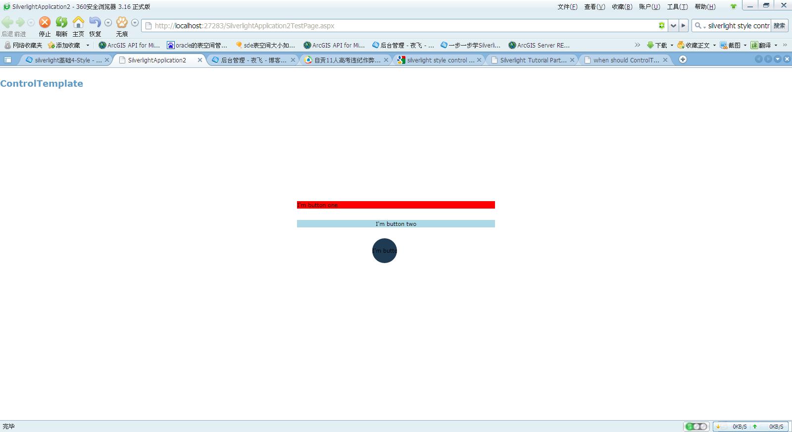
从中我们可以看到:
模板:ButtonTemplateOne中,style中设置了button的background=Green,ControlTemplate中设置了Background=Red
1号按钮引用了ButtonTemplateOne,并设置了Background=LightGray
最终结果,1号按钮背景显示红色,可见ControlTemplate设置好的属性,不可以后面人为改变。
模板:ButtonTemplateTwo中,style中设置了button的background=Green,ControlTemplate中设置了Background="{TemplateBinding Background}"
2号按钮引用了ButtonTemplateTwo,并设置了Background=LightBlue
最终结果,2号按钮背景显示淡红色,可见style设置好的属性,后面可以人为改变。
因此,当想设置完ControlTemplate的属性后,控件也能自主改变该属性,就在ControlTemplate中将该属性(XXX)设置为
XXX="{TemplateBinding XXX}"
模板:ButtonTemplateThree中,按钮设置为圆形
3号按钮应用了ButtonTemplateThree,按钮样式为圆形按钮
