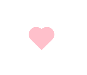
FCC---Create a More Complex Shape Using CSS and HTML---一个粉色爱心
One of the most popular shapes in the world is the heart shape, and in this challenge you'll create one using pure CSS.
But first, you need to understand the ::before and ::after pseudo-elements.
These pseudo-elements are used to add something before or after a selected element.
In the following example, a ::before pseudo-element is used to add a rectangle to an element with the class heart:
.heart::before {
  content: "";
  background-color: yellow;
  border-radius: 25%;
  position: absolute;
  height: 50px;
  width: 70px;
  top: -50px;
  left: 5px;
}
For the ::before and ::after pseudo-elements to function properly, they must have a defined content property.
This property is usually used to add things like a photo or text to the selected element. When the ::before and ::after pseudo-elements are used to make shapes, the content property is still required, but it's set to an empty string.
In the above example, the element with the class of heart has a ::before pseudo-element that produces a yellow rectangle with height and width of 50px and 70px, respectively.
This rectangle has round corners due to its 25% border radius and is positioned absolutely at 5px from the left and 50px above the top of the element.
练习题:
Transform the element on the screen to a heart. In the heart::after selector, change the background-color to pink and the border-radius to 50%.
Next, target the element with the class heart (just heart) and fill in the transform property. Use the rotate() function with -45 degrees.
Finally, in the heart::before selector, set its content property to an empty string.
练习代码:
 1 <style>
 2   .heart {
 3     position: absolute;
 4     margin: auto;
 5     top: 0;
 6     right: 0;
 7     bottom: 0;
 8     left: 0;
 9     background-color: pink;
10     height: 50px;
11     width: 50px;
12     transform: rotate(-45deg);
13   }
14   .heart::after {
15     background-color: pink;
16     content: "";
17     border-radius: 50%;
18     position: absolute;
19     width: 50px;
20     height: 50px;
21     top: 0px;
22     left: 25px;
23   }
24   .heart::before {
25     content: "";
26     background-color: pink;
27     border-radius: 50%;
28     position: absolute;
29     width: 50px;
30     height: 50px;
31     top: -25px;
32     left: 0px;
33   }
34 </style>
35 <div class="heart"></div>
效果:
刚刚自己又抄写了一遍。
- 先做个粉色的方形
- 再做2个伪元素,调好边界半径,依次叠加出2个心型的圆屁股


