简单的网页应用项目,客户提供了简单的Dashboard数据展示需求;
对于那些 PowerBI那些专业数据钻取、统计、分析展示平台,这个客户的需求真的算是很简单了;
但是 难者不会 会者不难... 只好赶鸭子上架 去找 网页 柱状图、饼图等控件来学习;
无意中,找到了 ECharts ,真的发现极其非常适合本人的开发需求,简单、轻量、以及不错的自定义和扩展性;
https://echarts.apache.org/zh/index.html
写个随笔记录下自己研究的过程,主要是结合自己的开发工具及开发环境;
开发工具: VS2019 开发环境: .net core 3.1 采用MVC架构;
实现目标:网页显示 饼图、柱状图 ,动态从后台调取数据到前台来展示。
虽然我知道 Echarts 实际上是JS 轻量级图表解决方案,最合适的应该不是.net core mvc来搭配...
但是不是一个项目赶到这了... 项目是 .net core mvc 做的,再去换java 时间精力也不够了... 就一条道走到黑吧...

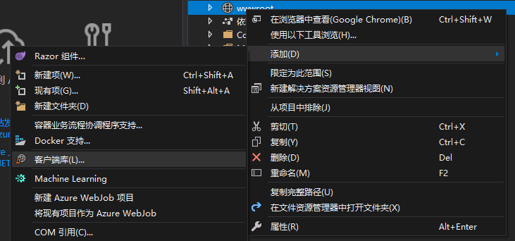
在VS2019中安装Echarts不是在NuGet里, 而是右键点击 wwwroot 再选择添加 -> 客户端库
输入 echarts 会出现最新的 @4.8.0版本,下面的文件就先全选上吧...然后点 安装

在_Layout.cshtml 视图的head段,加入js :
<!DOCTYPE html>
<html lang="en">
<head>
    <meta charset="utf-8" />
    <meta name="viewport" content="width=device-width, initial-scale=1.0" />
    <title>@ViewData["Title"] - EchartTry</title>
    <link rel="stylesheet" href="~/lib/bootstrap/dist/css/bootstrap.min.css" />
    <link rel="stylesheet" href="~/css/site.css" />
    <script src="~/echarts/echarts.min.js"></script>
</head>
然后把Home对应的视图改成:
@{
    ViewData["Title"] = "Home Page";
}

    <div class="text-center">
        <h1 class="display-4">Welcome</h1>
        <div class="container">
            <div class="row">
                <div class="col" id="left" style="width: 400px;height:400px;">

                </div>
                <div class="col" id="right" style="width: 400px;height:400px;">

                </div>
            </div>
            <div class="row">
                <div class="col" id="bottom" style="width: 800px;height:400px;">

                </div>
            </div>
        </div>
        <script type="text/javascript">
            var myleftChart = echarts.init(document.getElementById('left'));
            var myrightChart = echarts.init(document.getElementById('right'));
            var mybottomChart = echarts.init(document.getElementById('bottom'));

            var leftoption = {
                title: {
                    text: '生产情况'
                },
                legend: {
                    data: ['正常','异常']
                },
                series: [{
                    type: 'pie',
                    data: [{ name: '正常', value: 1080 }, { name: '异常', value: 220 }],
                    label:
                    {
                        formatter: '{b}:{c}\n{d}%'
                    }
                }]
            };

            var rightoption = {
                title: {
                    text: '产品型号比例'
                },
                legend: {
                    data: ['型号A', '型号B', '型号C', '型号D']
                },
                series: [{
                    type: 'pie',
                    data: [{ name: '型号A', value: 380 },
                        { name: '型号B', value: 100 },
                        { name: '型号C', value: 80 },
                        { name: '型号D', value: 400 }],
                    label:
                    {
                        formatter: '{b}:{c}\n{d}%'
                    }
                }]
            };

            var bottomoption = {
                title: {
                    text: 'ECharts 入门示例'
                },
                tooltip: {},
                legend: {
                    data: ['销量']
                },
                xAxis: {
                    data: ["衬衫", "羊毛衫", "雪纺衫", "裤子", "高跟鞋", "袜子"]
                },
                yAxis: {},
                series: [{
                    name: '销量',
                    type: 'bar',
                    data: [5, 20, 36, 10, 10, 20]
                }]
            };

            myleftChart.setOption(leftoption);
            myrightChart.setOption(rightoption);
            mybottomChart.setOption(bottomoption);
        </script>
    </div>
跑起来看看:
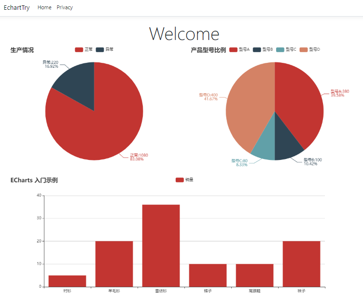
哈,像那么回事。。。
下面要继续的研究工作:
1、一些需要的特殊显示要求的实现;
2、如何从后台动态调数据到前台;
3、第2个项目调数据时 需要ajax方式;
初步考虑思路:
1、增加一个WEB API 提供数据;
2、视图中通过ajax 调WEB API获取数据后,刷新图表;
3、先做 柱状图 ,以月份为输入条件,然后横坐标显示月份内的每一天的生产产量;
第一步,先定义一个模型
    public class SummaryData
    {
        public string title { get; set; }
        public string[] categories { get; set; }
        public int[] data { get; set; }
    }
第二步:加一个WEB API控制器,就用默认名字 ValuesController
就通过日期来模拟出一个月的产量数据(用随机数代替...正常的应该是去数据库取数据)
     [HttpGet]
        public ActionResult<SummaryData> Get()
        {
            return GetMonthlyData(null);
        }

        [HttpGet("{id}")]
        public ActionResult<SummaryData> Get(DateTime id)
        {
            return GetMonthlyData(id);
        }

        private SummaryData GetMonthlyData(DateTime? month)
        {
            var newData = new SummaryData();
            DateTime chartMonth;
            if (month == null)
            {
                chartMonth = DateTime.Today;
            }
            else
            {
                chartMonth = (DateTime)month;
            }
            newData.title = chartMonth.Year + "年" + chartMonth.Month + "月 每日生产量";
            int days = DateTime.DaysInMonth(chartMonth.Year, chartMonth.Month);
            newData.categories = new string[days];
            newData.data = new int[days];
            for (int i = 1; i <= days; i++)
            {
                newData.categories[i - 1] = i.ToString().PadLeft(2, '0');
                newData.data[i - 1] = GetRandomNumber(50, 400);
            }
            return newData;
        }
        private int GetRandomNumber(int min, int max)
        {
            int rtn = 0;
            Random r = new Random();
            byte[] buffer = Guid.NewGuid().ToByteArray();
            int iSeed = BitConverter.ToInt32(buffer, 0);
            r = new Random(iSeed);
            rtn = r.Next(min, max + 1);
            return rtn;
        }
Home视图改下:
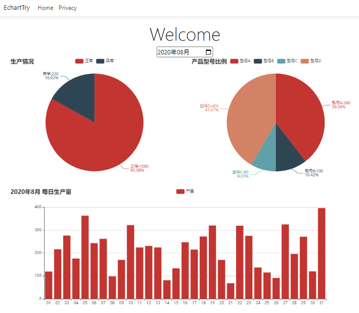
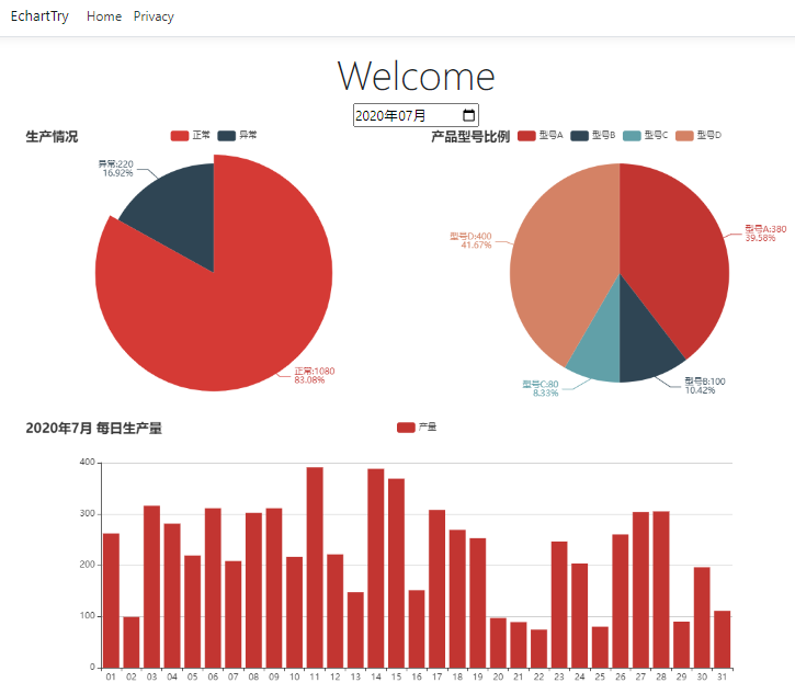
@{
    ViewData["Title"] = "Home Page";
}

    <div class="text-center">
        <h1 class="display-4">Welcome</h1>
        <div class="container">
            <div>
                <input type="month" id="inputdate" onchange="refresh(this.value)" value="@ViewData["SearchDate"]"  />
            </div>
            <div class="row">
                <div class="col" id="left" style="width: 800px;height:400px;">

                </div>
                <div class="col" id="right" style="width: 800px;height:400px;">

                </div>
            </div>
            <div class="row">
                <div class="col" id="bottom" style="width: 1600px;height:400px;">

                </div>
            </div>
        </div>
        <script type="text/javascript">
            var myleftChart = echarts.init(document.getElementById('left'));
            var myrightChart = echarts.init(document.getElementById('right'));
            var mybottomChart = echarts.init(document.getElementById('bottom'));
            var leftoption = {
                title: {
                    text: '生产情况'
                },
                legend: {
                    data: ['正常','异常']
                },
                series: [{
                    type: 'pie',
                    data: [{ name: '正常', value: 1080 }, { name: '异常', value: 220 }],
                    label:
                    {
                        formatter: '{b}:{c}\n{d}%'
                    }
                }]
            };
            var rightoption = {
                title: {
                    text: '产品型号比例'
                },
                legend: {
                    data: ['型号A', '型号B', '型号C', '型号D']
                },
                series: [{
                    type: 'pie',
                    data: [{ name: '型号A', value: 380 },
                        { name: '型号B', value: 100 },
                        { name: '型号C', value: 80 },
                        { name: '型号D', value: 400 }],
                    label:
                    {
                        formatter: '{b}:{c}\n{d}%'
                    }
                }]
            };

            var bottomoption = {
                title: {
                    text: ''
                },
                tooltip: {},
                legend: {
                    data: ['']
                },
                xAxis: {
                    data: []
                },
                yAxis: {},
                series: [{
                    name: '',
                    type: 'bar',
                    data: []
                }]
            };

            myleftChart.setOption(leftoption);
            myrightChart.setOption(rightoption);
            mybottomChart.setOption(bottomoption);

            window.onload = function () {
                $.ajax({
                    url: "/api/values/",
                    type: "get",
                    dataType: "json",
                    success: function (data) {
                        mybottomChart.hideLoading();
                        mybottomChart.setOption({
                            title: {
                                text: data.title
                            },
                            legend: {
                                data: ['产量']
                            },
                            xAxis: {
                                data: data.categories
                            },
                            yAxis: {},
                            series: [{
                                // 根据名字对应到相应的系列
                                name: '产量',
                                data: data.data
                            }]
                        });
                    }
                });
            }

            function refresh(month) {
                mybottomChart.showLoading();
                $.ajax({
                    url: "/api/values/" + month,
                    type: "get",
                    dataType: "json",
                    success: function (data) {
                        mybottomChart.hideLoading();
                        mybottomChart.setOption({
                            title: {
                                text: data.title
                            },
                            legend: {
                                data: ['产量']
                            },
                            xAxis: {
                                data: data.categories
                            },
                            yAxis: {},
                            series: [{
                                // 根据名字对应到相应的系列
                                name: '产量',
                                data: data.data
                            }]
                        });
                    }
                });
            };
        </script>
    </div>
Run起来看看效果:
下一步:在月度每日的柱状图上点击后,再显示一个当日的分时柱状图;
在Home视图增加一个Div 放入 月柱状图的下面:
            <div class="row">
                <div class="col" id="bottom" style="width: 1600px;height:400px;">

                </div>
            </div>
            <div class="row">
                <div class="col" id="dailybar" style="width: 1600px;height:400px;">

                </div>
            </div>
然后在JS语句后面继续增加以下代码:
var mydailybarChart = echarts.init(document.getElementById('dailybar'));

var dailybaroption = {
                title: {
                    text: ''
                },
                tooltip: {},
                legend: {
                    data: ['']
                },
                xAxis: {
                    data: []
                },
                yAxis: {},
                series: [{
                    name: '',
                    type: 'bar',
                    data: []
                }]
            };

mydailybarChart.setOption(dailybaroption);

mybottomChart.on('click', function (params) {
                mydailybarChart.showLoading();
                $.ajax({
                    url: "/api/DailyDatas/" + inputdate.value + "?selectindex=" + params.dataIndex,
                    type: "get",
                    dataType: "json",
                    success: function (data) {
                        mydailybarChart.hideLoading();
                        mydailybarChart.setOption({
                            title: {
                                text: data.title
                            },
                            legend: {
                                data: ['产量']
                            },
                            xAxis: {
                                data: data.categories
                            },
                            yAxis: {},
                            series: [{
                                // 根据名字对应到相应的系列
                                name: '产量',
                                data: data.data
                            }]
                        });
                    }
                });
            });
增加一个DailyDatas 的WEB API控制器:
   public class DailyDatasController : ControllerBase
    {

        [HttpGet("{id}")]
        public ActionResult<SummaryData> Get(string id, [FromQuery] int selectindex)
        {
            DateTime dt_Select = DateTime.Parse(id + "-" + (selectindex + 1) + " 00:00:00");

            return GetDailyData(dt_Select);
        }
        private SummaryData GetDailyData(DateTime day)
        {
            var newData = new SummaryData();
            newData.title = day.ToString("yyyy-MM-dd") + " 小时生产量";

            newData.categories = new string[10];
            newData.data = new int[10];
            for (int i = 8; i <= 17; i++)
            {
                newData.categories[i - 8] = i.ToString().PadLeft(2, '0') + ":00";
                newData.data[i - 8] = GetRandomNumber(10, 50);
            }
            return newData;
        }

        private int GetRandomNumber(int min, int max)
        {
            int rtn = 0;
            Random r = new Random();
            byte[] buffer = Guid.NewGuid().ToByteArray();
            int iSeed = BitConverter.ToInt32(buffer, 0);
            r = new Random(iSeed);
            rtn = r.Next(min, max + 1);
            return rtn;
        }
    }