
微信小程序自学#1
小程序构成
.js(页面脚本文件)
.json(页面配置文件)
.wxml(模板结构文件)
.wxss(页面样式表文件)
/
创建新的页面,如图
于app.json中添加
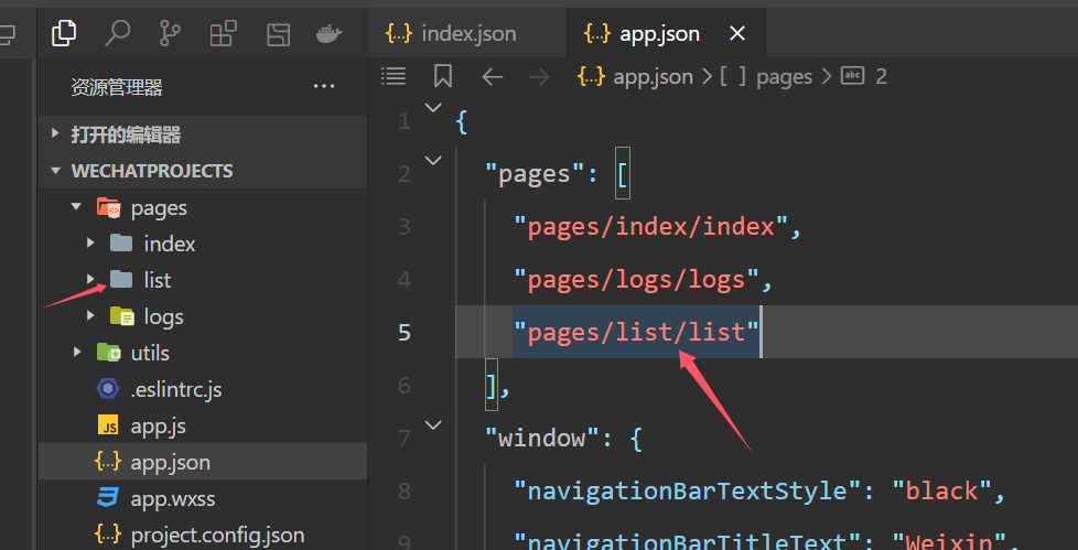
第一行便是首页,与文件名无关。
\\\\\\\\\\\\\\\\\\\\\\\\\\\\\\\\\\\\\\\\\\\\\\\\\\\\\\\\\\\\\\\\\\\\\\\\\\\\\\\\\\\\\\\\\\\\\\\\\\\\\\\\\\\\\\\\\\\\
视图容器组件:
view普通视图区域
scroll-view滚动条视图
swiper swiper-item轮播图容器和轮播图item组件
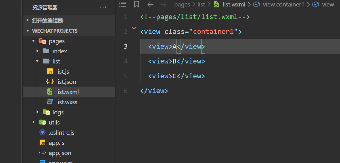
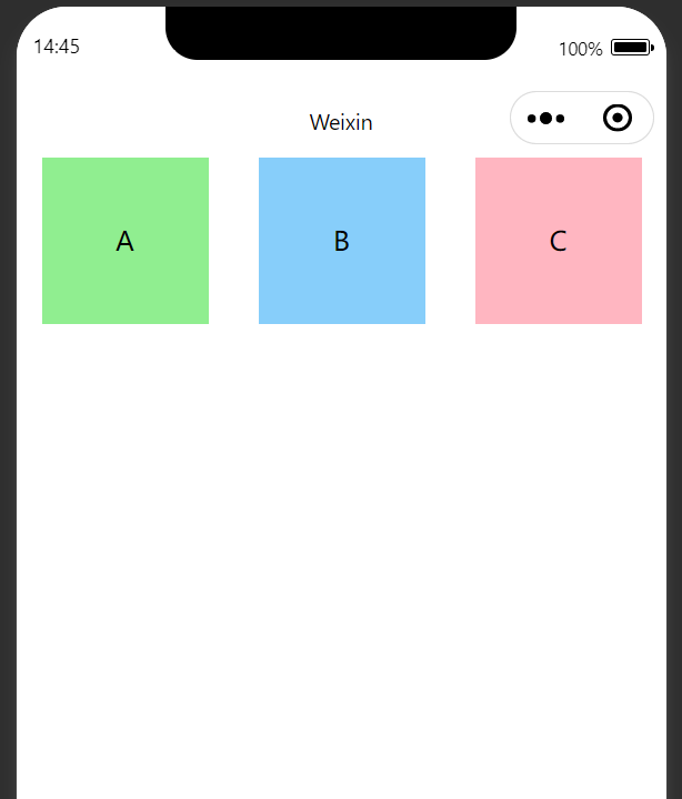
view:
利用.wxml与.wxss进行页面视图的设置
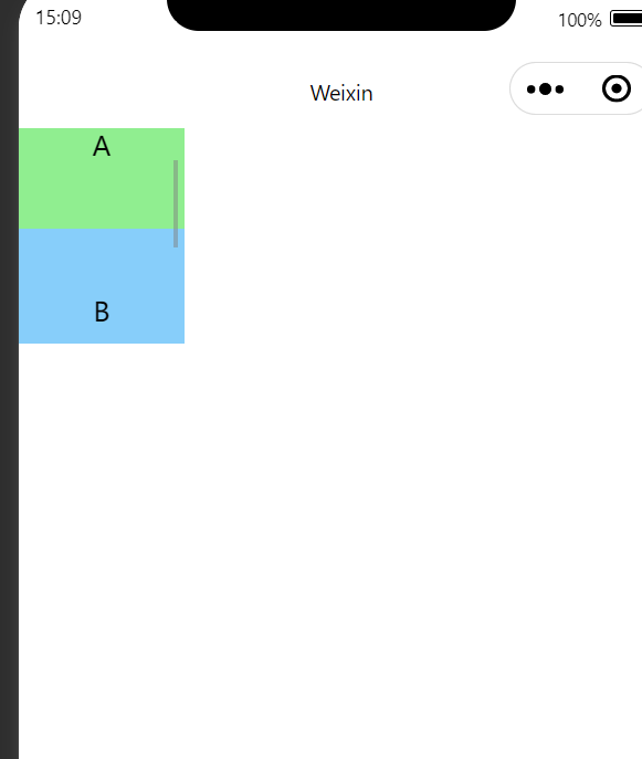
scroll-view:
<!--scroll-y表示纵向滚动,-x则是横向滚动-->

<scroll-view class="container1" scroll-y>
  <view>A</view>
  <view>B</view>
  <view>C</view>
</scroll-view>
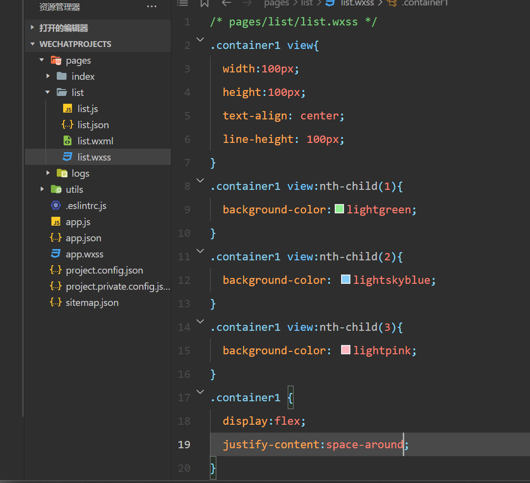
/* pages/list/list.wxss */
.container1 {
  height: 130px;              /* 高度设置为130px */
  width: 100px;
}

.container1 view {
  width: 100px;               /* 每个子元素的宽度 */
  height: 100px;              /* 每个子元素的高度 */
  text-align: center;
  line-height: 100px;         /* 文字居中 */
}

.container1 view:nth-child(1) {
  background-color: lightgreen;
}

.container1 view:nth-child(2) {
  background-color: lightskyblue;
}

.container1 view:nth-child(3) {
  background-color: lightpink;
}
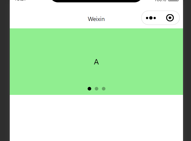
swiper
<!--pages/list/list.wxml-->
<!--scroll-y表示纵向滚动,-x则是横向滚动-->

<swiper class="swiper-container" indicator-dots autoplay="true" interval="3000">
  <swiper-item>
    <view class="item">A</view>
  </swiper-item>
  <swiper-item>
    <view class="item">B</view>
  </swiper-item>
  <swiper-item>
    <view class="item">C</view>
  </swiper-item>
</swiper>
.swiper-container{
  height: 150px;
}
.item{
  height:100%;
  line-height:150px;
  text-align: center;
}

swiper-item:nth-child(1) .item{
  background-color: lightgreen;
}
swiper-item:nth-child(2) .item{
  background-color: lightskyblue;
}
swiper-item:nth-child(3) .item{
  background-color: lightpink;
}
\\\\\\\\\\\\\\\\\\\\\\\\\\\\\\\\\\\\\\\\\\\\\\\\\\\\\\\\\\\\\\\\\\\\\\\\\\\\\\\\\\\\\\\\\\\\\\\\\\\\\\\\\\\\\\\\\\\\
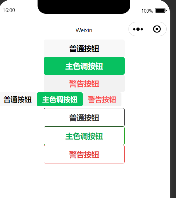
按钮组件
<!--pages/list/list.wxml-->
<button>普通按钮</button>
<button type="primary">主色调按钮</button>
<button type="warn">警告按钮</button>

<!--小号-->
<button size="mini">普通按钮</button>
<button type="primary" size="mini">主色调按钮</button>
<button type="warn" size="mini">警告按钮</button>


<!--镂空-->
<button plain>普通按钮</button>
<button type="primary" plain>主色调按钮</button>
<button type="warn" plain>警告按钮</button>
图片组件
<image></image>
<image src="/images/1.png" mode="heightFix"></image>


【推荐】国内首个AI IDE,深度理解中文开发场景,立即下载体验Trae
【推荐】编程新体验,更懂你的AI,立即体验豆包MarsCode编程助手
【推荐】抖音旗下AI助手豆包,你的智能百科全书,全免费不限次数
【推荐】轻量又高性能的 SSH 工具 IShell:AI 加持,快人一步
· 无需6万激活码!GitHub神秘组织3小时极速复刻Manus,手把手教你使用OpenManus搭建本
· Manus爆火,是硬核还是营销?
· 终于写完轮子一部分:tcp代理 了,记录一下
· 别再用vector<bool>了!Google高级工程师:这可能是STL最大的设计失误
· 单元测试从入门到精通